
From all the digital innovations we are looking forward to seeing advance in 2018, perhaps none are more critical than telemedicine. Defined as the administration of critical medical services through telecom devices, telemedicine is poised to provide better, cheaper, and more accessible healthcare to anyone with a smartphone.
After the success of our last instalment, where Codal examined the popular mobile platform Zocdoc, we thought we would continue our streak of analysing personal healthcare apps and train our UX sights on to Talkspace – one of the most popular telemedicine apps available today.
Founded in 2012, Talkspace connects users to licensed therapists and counsellors that provide remote psychotherapy. There is no hunting down the right therapist and no scheduling of appointments. The app matches you with the appropriate professional, and all treatment is provided over the phone, through video, audio, or in-app text messaging.
Last year, Talkspace announced they had hit half a million users and over a thousand therapists. The telemedical platform has been heralded as a huge success, so I downloaded the latest version for my iPhone 7 to see if it offered a mobile user experience to back it up.
Onboarding
Think about your last visit to the doctor’s office – not a therapist necessarily, but any medical professional. How long were you sitting in the waiting room? How many forms did you have to fill out? Onboarding for any healthcare process, either in the real world or the digital one, tends to be a severe headache.
However, Talkspace manages to avoid this pitfall by masterfully implementing a strategy we have seen before – breaking up their onboarding into more digestible segments and presenting them to the user piecemeal, weaving it throughout the user experience while proffering reasons why users should onboard.
Before we get into the details of this strategy, let us take a look at Talkspace’s initial signup screen.
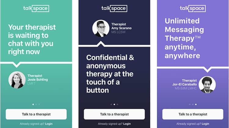
Talkspace offers three essentially identical screens for the user to swipe through, with the only real difference being the copy and colour of each. It is a bit superfluous as these pages would be better suited as screenshots in their App Store listing, where they could serve a promotional role and convince the user to download Talkspace. In this case, though, I have already got the app, and it seems like a high interaction cost for what is mostly redundant information.
The rest of the signup screen is relatively boilerplate: a well-written call-to-action is emphasised with a secondary login option available as well. Including the therapist names and photos helps to humanise the app a bit, we want our therapy to be with people, not an application. This platform needs to remind the viewer that it is just a conduit, that it is a real, licensed professional on the other end of the line.
I press ‘Talk to a therapist’, and begin a brilliantly minimalistic onboarding process. Three screens, three forms, no frills.
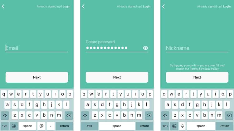
I should note that it is advisable to use the ‘horizontal dot’ convention here, similar to the one Talkspace employed in its login page. It is good practice to show how many screens the user will have to swipe through, and why not show off the fact your initial onboarding is only three screens?
By now, you have probably realised that this indeed cannot be the only onboarding for a process as complicated as undergoing medical treatment. You are right – there is still a slew of form-filling the user will eventually have to endure, including personal information, insurance filings, and of course, the reasons they are seeking psychotherapy.
However, as we will see, Talkspace breaks all of this up by delaying those particular user tasks until they are already immersed in the app. After I enter my nickname and press next, I am ushered to the home screen.
Tutorial / Home Screen
Just when I was falling in love with this app, they go and hit me with the much-maligned tutorial. I am sure you have heard the old UX adage – if your app needs a tutorial, it has already failed. I may not go that far as some apps are complex enough to warrant a quick walkthrough. That being said, it is especially frustrating to see a tutorial here because Talkspace does not need one. In fact, the app has managed to keep their entire functionality contained to just three screens, yet the tutorial itself is four.
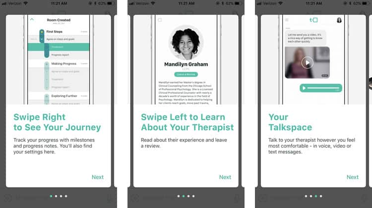
Personally, I think this sort of training is unnecessary. These tutorial screens do not offer any information the user would not find if they just swiped right or left. A better method might be just to let the user know they can swipe, perhaps with a simple text overlay. Once they do, the purpose of the ‘Journey’ and ‘Therapist’ screens become obvious. We will dive into them in a bit, but first, let us take a look at Talkspace’s home screen.
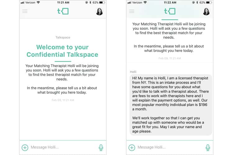
Talkspace’s home screen is effortlessly simple, almost boldly so, for the sole fact that it is mainly a text message conversation. Any semblance of a menu or feed has been replaced by the same interface you see when you open up one of your conversations in iMessage. We talk about using conventions that are familiar to the user – Talkspace takes this to the extreme by stripping their home screen down to a mechanic that every smartphone user knows.
I am not saying that the interface is a carbon copy of your text messages. Indeed, Talkspace tinges the interface with its own stylistic choices, namely the teal colour scheme and iconography from the school of flat design. The message font is readable and clean, and my ‘consulting therapist’, Holli, offers a warm and friendly user experience. I assumed she was an AI, but when I swiped left to the therapist screen, it appears she is a real person – a good sign for a telemedicine platform like Talkspace.
Journey / Therapist Screens
The Therapist screen, easily accessed by swiping left, offers a relatively comprehensive overview of the human on the other end of the line, as well as an easily accessed review feature.
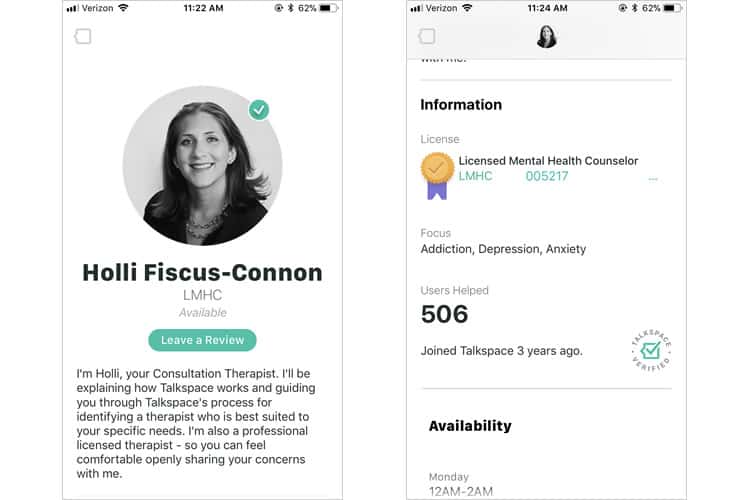
Talkspace continues its strategy of design choices that humanise the platform and placate any qualms the user may have with telemedical therapy. The screen includes Holli’s specific license, her focuses, how many users she has helped, her availability, and a nice ‘Talkspace verified’ icon. It is a primary, well-designed screen that plays a permanent role in the user experience.
A more slightly more visually exciting screen, the Journey one, can be accessed by swiping right from the home page.
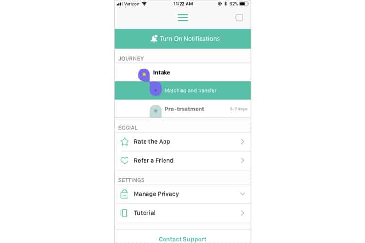
By tapping the journey graphic, users can see the progression of their treatment and mental health milestones. This layout extends the minimalist iconography established on the home screen, while also adding a bit of variety to what has been a two-tone colour scheme of teal and white everywhere else in the application.
Final Verdict
While there are some extraneous screens, and mechanics with a bit of an imbalance regarding interaction cost, Talkspace’s overall user experience provides an exemplary template for telemedicine platforms in the future.
Moreover, though this is accomplished through segmented onboarding, minimal screens, and clean user interface design, I would argue the essence of Talkspace’s usability ultimately lies in its clear scope. This app sets out to do one thing, and one thing well-connect users to therapists and remotely administer high-quality medical treatment. It can hone that mission into a bare-bones home screen that anyone who has ever sent a text message is familiar with.
Telemedicine apps, while booming, are still in their nascent stage. However, with simple, user-friendly experiences like the one Talkspace serves up to prove that this blossoming industry is poised to disrupt the intersection of healthcare and technology seriously.
More from the UX Case Study Series
-
- UX Case Study: Google Maps vs. Waze Mobile Apps
- UX Case Study: Spotify Vs. Apple Music Mobile Apps
- UX Case Study: Acorns Mobile App
- UX Case Study: Lumosity Mobile App
- UX Case Study: Talkspace Mobile App ? You are currently reading this
- UX Case Study: Zocdoc Mobile App
- UX Case Study: Calm Mobile App
- UX Case Study: Overcast Mobile App
- UX Case Study: SoundCloud’s Mobile App
- UX Case Study: HBO GO App
- UX Case Study: Venmo
- UX Case Study: CNN’s Mobile App
- UX Case Study: ESPN’s Fantasy App
- UX Case Study: Duolingo
- UX Case Study: Bumble
Want to learn more?
If you’re interested in mobile UX, then taking the course on Mobile User Experience, which includes templates you can use in your own projects. If, on the other hand, you’d like to…
- learn all the details of Usability Testing
- get easy-to-use templates
- learn how to properly quantify the usability of a system/service/product/app/etc
- learn how to communicate the result to your management
… then consider to take the online course Conducting Usability Testing.
Lastly, if you want to brush up on the basics of UX and Usability, the online course on User Experience could provide you with the necessary knowledge. Good luck on your learning journey!
(Lead image: Depositphotos – affiliate link. All other photos in this article are screenshots taken during usage of the Talkspace app.)
