
And we are back in action! It has been awhile since our last UX Case Study so that I will give a brief refresher for our returning readers and an intro for the uninitiated. *Ahem*.
In a blogosphere full of articles honing in on single, often granular components of user experience design, Codal‘s UX Case Study aims to examine UX from a holistic perspective, panning the camera back to explore how an experience functions as a whole.
That is the elevator pitch at least. In the past, we have conducted UX reviews of apps ranging from Bumble to Overcast, Duolingo to Venmo, covering mobile experiences of all sizes, sectors, and levels of quality. You can see a complete list of the UX Case Study series at the bottom of this page.
However, for this instalment of UX Case Study, we will be doing something a bit different. Rather than a single platform, we will be pitting two against each in a contest of user experience. Moreover, what better way to start with two of the largest, polarising mobile platforms on the market today: Spotify and Apple Music.
The two music streaming giants have a well-documented history of feuding, as well as stubbornly devoted fanbases. They have spawned countless articles and infographics comparing the two platforms regarding cost, music library, feature lists, and more. So we will not be using those metrics to evaluate the two. Instead, we will be comparing from a purely UX perspective. (That means we will not be docking points just because Spotify does not have your band’s EP on it).
Because Spotify and Apple Music are incredibly complex and expansive platforms, we will not be combing through screens or modules like we usually would. Instead, we will pick out functions that both apps share, and compare them directly. So while Apple Music’s video content is excellent, it will be a non-factor in this head-to-head showdown.
The Player
We begin with the most crucial component of any music app, whether its Spotify, Apple Music, or even Soundcloud: the music player itself.
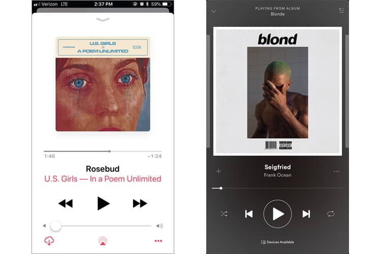
Placing the two players side-by-side immediately reveals the blatant contrast between the two. Both interfaces want to highlight their cover art, but choose different strategies for achieving this: Apple Music selects a predominantly white colour scheme (a move that aligns with their larger branding conventions), Spotify goes dark (a choice I discuss in this piece about light vs dark UIs).
Spotify’s player offers more functionality, with more options accessible from the main player (play, skip, shuffle and repeat). The reason they can provide more functions is that they have wisely not offered a volume control on their UI, knowing that users would instead adjust volume using the volume buttons on the side of the phone.
Apple has not done this. Their entire volume bar is a waste of space. I know as I never use it. I adjust my volume with my Apple headphones or the physical volume buttons on the side.
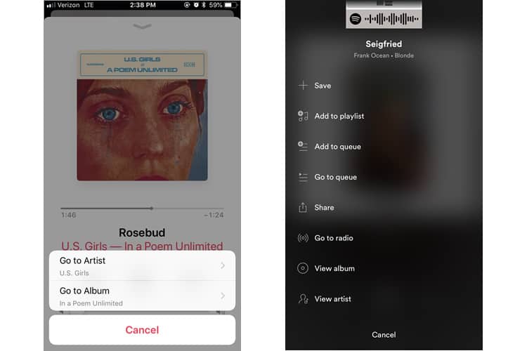
Another critical difference is the interaction cost of going to the artist page of the track you are listening to. Apple lets you do it in two taps, whereas Spotify requires two taps and a scroll.
Winner: Spotify
The Home Screen
Like their music players, Spotify and AM take diverse approaches to their home screens, based on two different philosophies.
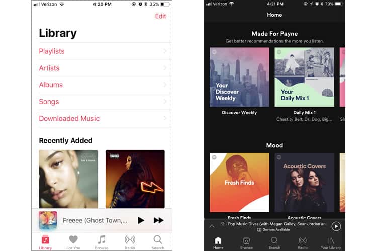
Apple’s UX philosophy here is personalisation to the extreme. Its home screen is the user’s library and devotes nearly all of the phone’s real estate to provide different access points to it. Playlists, artists, albums, songs – all of these are merely different paths to the user’s library. The rest of the screen is dedicated to Recently Added music.
This home screen layout belies Apple’s target audience: the obsessed music lover. This is someone who wants as much accessibility as possible to their existing music library – not curated playlists, nor the top charting songs of the week. They want their own personal library, first and foremost.
Compare that to Spotify’s, which contains the users’ library to the navbar on the bottom, and instead offers up their discovery feature and curated mood playlists. This is not for your music geek. This is for someone who is more into using music to set moods or create ambience.
Verdict: Depends on how you consume music!
The Discovery
Though the platforms prioritise differently, both Spotify and Apple Music boast Discovery features to help their users explore the overwhelming amount of music they offer. Both platforms employ algorithms to curate and cater to the user’s specific tastes, and both claim their machine learning functions improve over time and frequency of use.
The major difference? Spotify’s discovery feature is excellent, while Apple’s … looks like this:
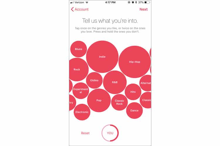
This is one of the input mechanisms for Apple’s algorithm. It weighs its recommendations based on your preference of these genres. The problem is that its quirky interface seriously harms the usability. It is annoying to click each circle when they are bouncing around the interface, moving with every swipe of the finger.
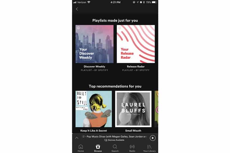
In contrast, Spotify’s Discovery page has been regularly lauded for its quality user experience, especially its Discovery Weekly feature. Compiling a playlist explicitly catered to the user’s taste, the feature was so successful that even Google had to mimic it for their streaming platform.
Verdict: Spotify, hands down
The Final Tally
While both streaming platforms offer expansive music selection, discovery features, and an easily accessible, manageable library, Spotify’s user experience and user interface is a cut above Apple’s.
Spotify succeeds in its dark interface, its ergonomic music player, and a hands-down better discovery feature and page. There is a reason the platform has over 160 million users and counting. That is a testament to an engaging, immersive, user experience.
More from the UX Case Study Series
- UX Case Study: Google Maps vs. Waze Mobile Apps
- UX Case Study: Spotify Vs. Apple Music Mobile Apps ? You are currently reading this
- UX Case Study: Acorns Mobile App
- UX Case Study: Lumosity Mobile App
- UX Case Study: Talkspace Mobile App
- UX Case Study: Zocdoc Mobile App
- UX Case Study: Calm Mobile App
- UX Case Study: Overcast Mobile App
- UX Case Study: SoundCloud’s Mobile App
- UX Case Study: HBO GO App
- UX Case Study: Venmo
- UX Case Study: CNN’s Mobile App
- UX Case Study: ESPN’s Fantasy App
- UX Case Study: Duolingo
- UX Case Study: Bumble
(Lead image: bruce mars via Pexels. All other photos in this article are screenshots taken during usage of the Spotify and Apple Music apps. The opinions expressed in this article are those of the author, and do not reflect in any way any scientific analysis related to performance or otherwise. The objective of this article is to educate about good practices in mobile application development.)
Want to learn more?
If you’d like to become an expert in UX Design, Design Thinking, UI Design, or another related design topic, then consider to take an online UX course from the Interaction Design Foundation. For example, Design Thinking, Become a UX Designer from Scratch, Conducting Usability Testing or User Research – Methods and Best Practices. Good luck on your learning journey!
