
With the rise of Spotify and the attempts of the tech industry’s usual suspects – Apple, Amazon and Google to stake their claim in the music streaming space, it is easy to forget about one of the early pioneers of audio streaming and distribution, SoundCloud.
SoundCloud is the grassroots movement of music platforms. Powered by independent artists and creators, it houses the unlicensed, the unsigned, and the underground (or as underground as a service with 175 million monthly listeners can be).
The Soundcloud Mobile Application
Because of its independent nature, SoundCloud’s mobile application shoulders some complications that its competitors might not be considering. Both Apple Music and Shopify encourage users to explore new music, but it is an absolute necessity for SoundCloud. There is no Katy Perry or Kanye West on this platform, so discovering music becomes just as essential as listening to it.
SoundCloud is undoubtedly the dark horse of the major music streamers, making it an excellent candidate for Codal’s recurring UX case study series. So let us plug into SoundCloud’s User Experience (UX), and discover what they do well, where they can improve, and how we learn from their successes and mistakes.
Onboarding
I tap the SoundCloud app and am greeted with a clean, visually appealing sign-up page that is almost immediately interrupted with an intrusive pop-up, asking me to enable notifications.
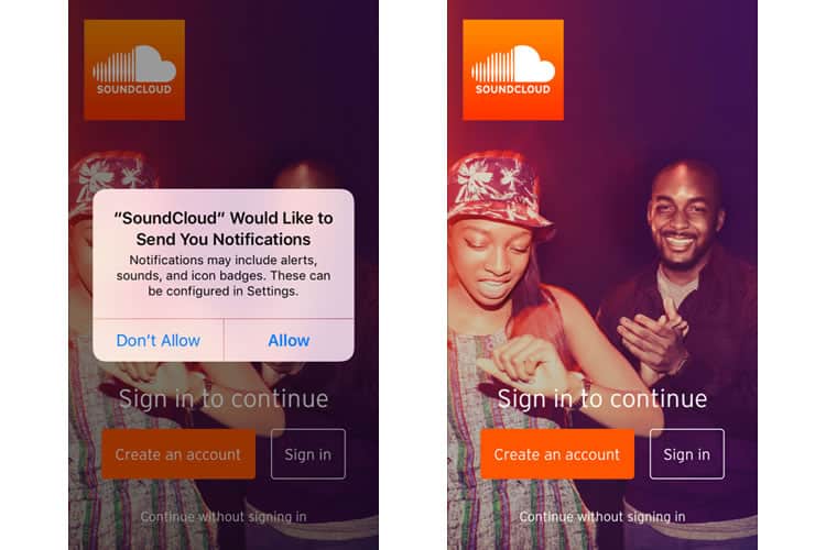
I know these are a necessary evil, and in the overall experience it is a small pain point, but this particular UX faux pas always aggravates me. Say I was not familiar with SoundCloud at all – why would the app begin its user experience with this request, before they have demonstrated any value?
When asking for notifications, it is essential to recognise opportunities. This pop-up would have been much more well-received if it had occurred after I had listened to a few tracks.
Maybe I have listened to three songs in a row by a particular artist, and then a pop-up says “Do you want to receive notifications every time *this artist* posts new music?” It is a small thing, but as I said, it is a pet peeve of mine.
With that rant over, I exit out of the pop-up and see a typical sign-in screen. SoundCloud offers two pathways, account or non-account while encouraging the former rather than the later. I oblige and tap the “Create an account” button.
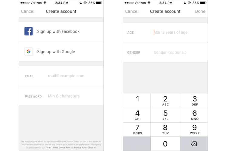
SoundCloud adheres to conventions of the account creation process, offering the ability to sign up with Facebook, Google, or general email. I select the third option, and after painlessly entering my address and password, I am brought to a screen that asks my age and gender.
SoundCloud does not explain why it needs either of this information, but I assume it is for their analytics, or maybe to generate music recommendations for me. Judging from the default text, it looks like the app has an age requisite.
I decide to provide my age and gender, I agree to the terms and conditions, and the onboarding process is complete. Overall quick, simple, and nothing especially exciting. Just as it should be.
Home Feed
Soundcloud’s user interface (UI) deftly employs a card-based, minimalist aesthetic that accentuates its more striking visual elements, like album art or profile photos. Their choice of soft, contoured fonts inject the interface with a warm and inviting feel.
I understand SoundCloud takes cues from Twitter by using a follow-based model, so I expected my initial screen to be suggestions on who to follow, and what music to discover. Instead, SoundCloud wants to cut right to the tunes and offers two curated playlists for especially common listening use cases.
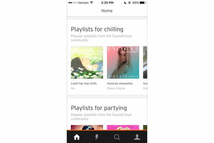
There is nothing wrong with offering these two playlists above-the-fold, but even when I scroll down, I do not see any mechanisms that allow the user to discover music actively. No genres I can select from, no algorithm or questionnaire to fill out that might deliver suggestions based on my musical taste.
Eventually, the home screen does offer recommendations based on tracks I have liked. But there is no solid jumping-off point to help you discover artists (besides the search function, which we will see is severely lacking). That is an issue for a platform whose lifeblood is artists that need to be discovered, and fans that want to find them.
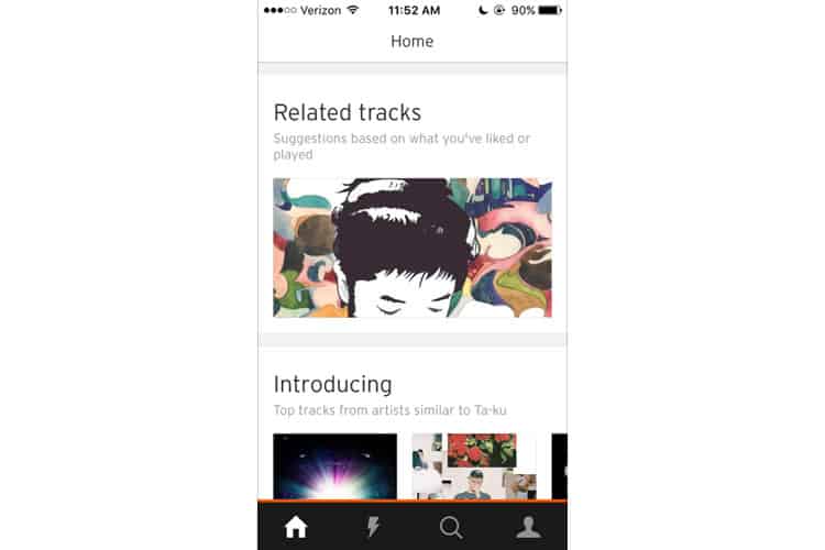
Lining the bottom of the screen we see a simple navigation bar with four icons: home, a lightning bolt (whatever that means), the search function, and what I assume is my profile.
We will be delving into some of these individually, but for now, I would like to remark that it is an exciting choice moving the search function here, rather than its typical residency at the top of the screen – especially when that space is empty, save for a feeble “Home” label.
But before we methodically page through the navbar, let us check on the keystone feature of any music streaming application: the player.
The Player
If you peruse the players of the most popular streaming platforms, notably Apple Music and Spotify, an interesting design trend emerges – a clear emphasis on the visuals. This is a bit counterintuitive for inherently audio-based apps, where you think you would want to devote the screen’s real estate to various playback features.
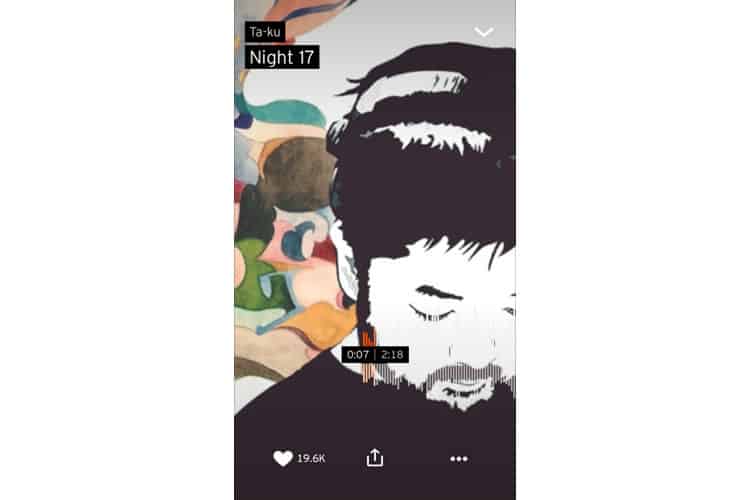
SoundCloud takes this visuals-first approach to the extreme. It is a matter of personal taste, but I love the paramount importance given to the accompanying album art here, even when it sacrifices utility (three notable functions are awkwardly shoehorned in the ‘three-dots’ button at the bottom right).
But despite its flashiness, SoundCloud’s player still manages to be seamlessly functional, relying on gestures instead of buttons. A tap anywhere on the screen acts as your play/pause, with horizontal swipes replacing the skip and back buttons.
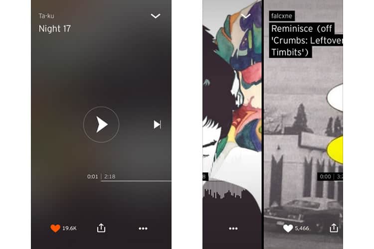
The prominence of the share button is welcomed – it is a product of that goal of discoverability, and a blessing for the tastemakers of your friend group, the people who always want to show you the latest track they have been playing.
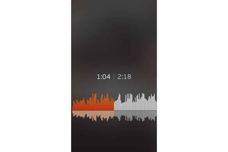
I was most impressed with the eponymous cloud feature. It strikes that delicate balance between conventional and creative. It is simple enough to figure out and easy to use, acting just like a traditional dot slider. It even doubles as the tracks actual waveform, meaning you do not have to search blindly for your favourite part of the song if you know how relatively loud or quiet it is.
Search & Stream
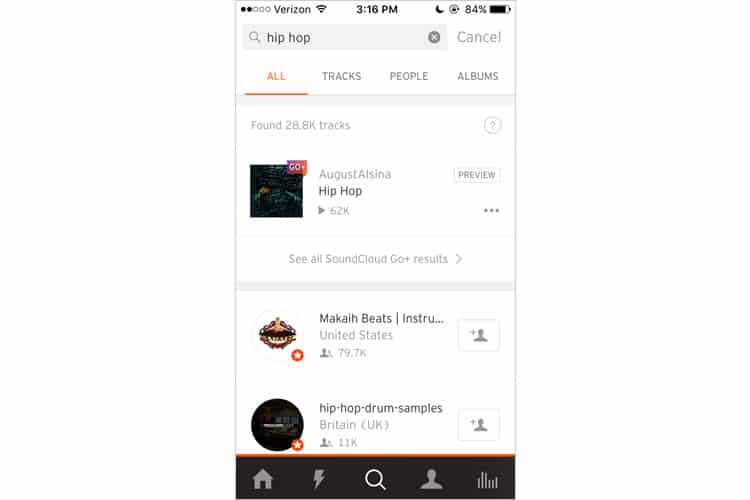
While I would argue SoundCloud succeeds in the kernel of its app – as a music player, it completely bungles its search function (which is another key feature). I have been harping on the importance of discoverability in this application, but judging from the way this is designed, the search feature does not share that goal.
For starters, it is too literal. If I want to search a genre of music I enjoy, say, “hip hop”, SoundCloud will only show me results with hip-hop in their titles. I do not get the most relevant results to the genre I have searched for.
In addition to this, the search function punishes the user for spelling mistakes, offering no suggestions or “did you mean…” feature. This is particularly brutal when you consider SoundCloud’s most popular genres are EDM and hip-hop, artists of which are not renowned for their conventionally-spelt stage names. Overall, SoundCloud’s search UX is a severe disappointment.
The “Stream” tab (designated by the lightning bolt icon in the navbar), acts a bit more like a standard social media feed. The artists I follow (just the one for now), can post and repost their tracks, or ones by other artists.
It adheres to the card-based design and does not seem to be making any flagrant UX transgressions, but one of Codal’s designers has found some bugs in it, most notably the fact the repost button does not always seem to work. I tried to replicate the glitch and found an identical result – I would hit the repost button, go to my profile to see it, and get nothing.
SoundCloud Summary
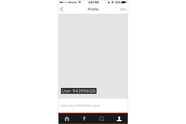
We have covered a considerable amount of ground in his UX case study, and there is still some aspects of the application yet unexplored. The profile page, for example, has a bizarre feature stashed away in a hard-to-find menu. Plot twist: turns out I was User 943996126 the whole time.
Based on some guerilla testing (read: asking the SoundCloud users at our UX design agency) and my research in the app’s reviews, it appears SoundCloud’s app also suffers from a disconnect between web instance and mobile instance (you post something on their site, but it’s not showing up on the app), as well as some strange notification bugs.
To recap, SoundCloud succeeds in its actual music player and the overall aesthetic of its UI. But when it comes to other key features, especially the search function, the user experience falls flat. The app should suit just fine if you want to listen to music you are already familiar with, but when it comes to finding music’s Next Big Thing, stick to SoundCloud’s website.
More from the UX Case Study Series
- UX Case Study: Google Maps vs. Waze Mobile Apps
- UX Case Study: Spotify Vs. Apple Music Mobile Apps
- UX Case Study: Acorns Mobile App
- UX Case Study: Lumosity Mobile App
- UX Case Study: Talkspace Mobile App
- UX Case Study: Zocdoc Mobile App
- UX Case Study: Calm Mobile App
- UX Case Study: Overcast Mobile App
- UX Case Study: SoundCloud’s Mobile App ? You are currently reading this
- UX Case Study: HBO GO App
- UX Case Study: Venmo
- UX Case Study: CNN’s Mobile App
- UX Case Study: ESPN’s Fantasy App
- UX Case Study: Duolingo
- UX Case Study: Bumble
Want to learn more?
If you’re interested in mobile UX, then taking the course on Mobile User Experience, which includes templates you can use in your own projects. If, on the other hand, you’d like to…
- learn all the details of Usability Testing
- get easy-to-use templates
- learn how to properly quantify the usability of a system/service/product/app/etc
- learn how to communicate the result to your management
… then consider to take the online course Conducting Usability Testing.
Lastly, if you want to brush up on the basics of UX and Usability, the online course on User Experience could provide you with the necessary knowledge. Good luck on your learning journey!
(Lead image: Depositphotos – affiliate link. All other photos in this article are screenshots taken during usage of the SoundCloud app.)
