
Whether it is the notch in the new iPhone X or the unceremonious removal of the headphone jack, Apple’s UX design principles have always polarised users. However, even the most fervent supporters of the Cupertino company will concede one of Apple’s major design missteps lies in its universally maligned podcast app.
What was once a niche medium, the vestiges of radio, the podcast is currently experiencing a full-blown renaissance. Whether it is for news analysis, entertainment, or education, 42 million Americans download and tune in every week.
The Overcast Mobile Application
Disappointed with the maddeningly frustrating UX of Apple’s in-house app, many of these listeners have turned to other options in the App Store, searching for a friendlier user experience. Of these third-party podcast apps or podcatchers, one has risen to the forefront: Overcast.
Dubbed the premier podcatcher by a slew of tech publications such as The Verge, The Sweet Setup and Macworld, Overcast boasts overwhelmingly positive reviews in the App Store. However, does its user experience live up to the hype? Or is it merely a good-enough substitute, a filler to the gaping hole Apple left with its lacklustre app? In this edition of UX Case Study, we review Overcast’s user experience to find out.
Onboarding
After downloading the Overcast app (using the latest version of iOS on my iPhone 7), I tap the icon and am taken to a no-frills sign-up screen with minimal colour and imagery. Overcast presents three traditional options (sign up, log in, and proceed without an account), but describes them with a more casual copy (I’m new to Overcast, I Already Have An Account, I Don’t Want an Account). We will see this conversational tone frequently used throughout the app, in attempt to deliver a warmer, more friendly overall experience.
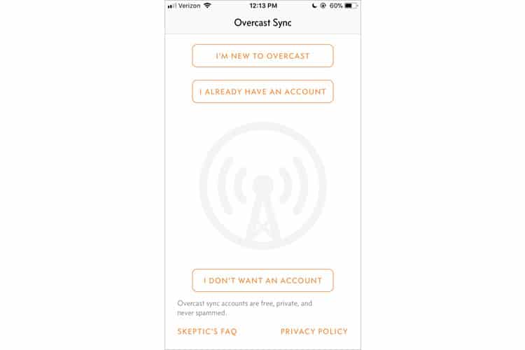
Overcast obviously wants users to sign up, as evidenced both by the placement of its options (I’m New To Overcast is at the top), and by assuring users who are considering skipping signup that accounts are “free, private, and never spammed”. I figure I will glean better insight of the app’s UX if I have an account, so I select “I’m New”.
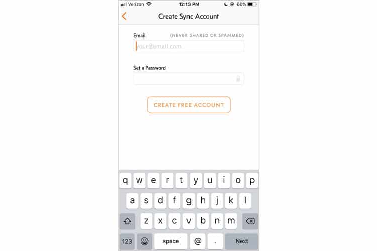
I am brought to another bare-bones sign-up screen with two key fields. Interestingly, there is no option to log in with Facebook or Google, which can typically speed up the onboarding process. However, in this case, onboarding itself is so simple (just two fields) that it is likely the UX designers behind Overcast deemed it unnecessary. I quickly enter my email and password, and the setup is complete. Laughably easy, the way onboarding should be.
Home Screen / Navigation
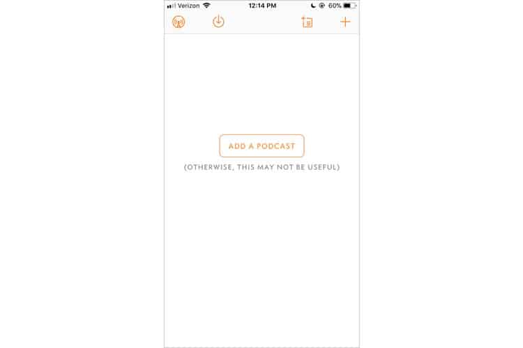
Overcast’s home screen continues the minimalist aesthetic presented during onboarding, utilising a four-option navigation bar with no text, and an unadorned home screen with a single button (Add A Podcast), and some quirky copy. It is obvious where the app wants to direct me, so I oblige, tapping “Add A Podcast”.
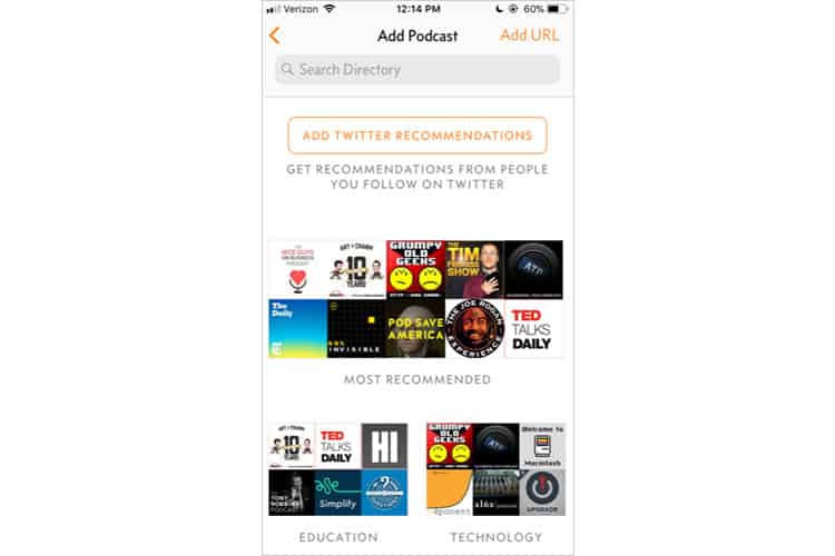
The subsequent screen excels at coaxing me into the app, serving up a variety of avenues for me to access the podcasts I want to listen to. In contrast to the previously-reviewed Soundcloud app, which could arguably be considered a podcatcher app, Overcast offers recommendations for both popularity and genre. I can opt to receive suggestions from Twitter, search their directory, or even input a URL manually. No matter the program, Overcast provides a way to not only find the podcast I want to listen to but allows me to explore others like it.
I start subscribing to a few podcasts I enjoy and notice that Overcast automatically starts downloading the most recent episode. I later learn this is because it is set to auto-download when I am connected to Wi-Fi, an option I can easily toggle in the Settings tab. With a few episodes downloaded, I plug in my headphones and start examining the audio player.
The Player
So far, Overcast’s user experience has been exceptionally seamless. In just a few short minutes, I was able to create an account, find my preferred podcasts, explore some new ones, and have all of their latest episodes downloaded to my iPhone. The interactions were intuitive and supremely simple. I have yet to find myself confused or lost in this mobile application.
However, having said all of that, the real moneymaker for Overcast, the reason it has supplanted Apple’s shoddy podcatcher, is the audio player.
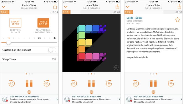
The captures above show the three screens of Overcast’s audio player, with the centre one acting as the default when I select a podcast to listen to. Like most players, the majority of the screen’s real estate is dedicated to the cover art. Here we see Overcast’s low-colour UI pay off – the juxtaposition between the interface and the podcast art really makes the cover pop, especially when it is as colourful as Song Exploder’s, shown above.
The remaining screen is dedicated to the controls, with a distinct play/pause function and skip buttons that cannot be mis-tapped. One aesthetic touch I really enjoy is the pause button doubling as a volume indicator. It does not serve much functional value, but it is cool to see it jump up and down as the podcast plays.
Finally, at the top, we have our audio timeline. It is smaller and a bit more subdued than what you would see in Apple Podcasts or SoundCloud. That being said, I did not have much trouble navigating to specific parts of the podcast I wanted to listen to. Still, it may be harder for users with larger, less dexterous fingers.

Just beneath the cover art are three horizontal dots, indicating that I can swipe left or right to access different screens. The dots actually do clue the user into what these screens are – the right dot is a circled ‘i’ that signifies info, the left is a gear to denote settings, but the icons are so small that I honestly did not notice it until I had been using the app for several days. Regardless, the horizontal dot convention alone is enough for the user to realise there is more to see if they swipe.
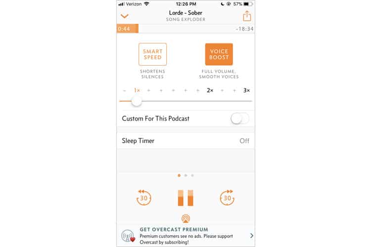
There is not much to report on the info screen, but when I swiped left to access settings, I was delighted with the different features Overcast offered. Seriously, it blows Apple’s podcast player out of the water. The smart speed function, as the copy explains, shorten silences, which I found to be a godsend for some podcasts, but awkward for others.
The voice boost functionality is fantastic to the point where I can say that I will never go back to regular podcast audio again. The sound quality is crisp and clear, offering a fuller, richer, aural experience. Finally, the custom speed setting is significantly more robust than Apple’s, providing a much higher degree of granularity when it comes to adjusting speed.
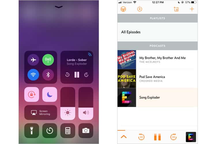
My last test for the player was to check its usability when performing other tasks on my phone. Within the app, the player condenses to the bottom of the screen, maintaining its most fundamental functions for quick access. No matter where I went in the app, the player followed, with the curious exception of the “browse podcast” screen. When searching for other programs, the player disappeared.
Outside of the app, the player integrates seamlessly with the iOS control centre, allowing me to pause, skip forward, and reverse while performing other tasks on my iPhone.
Final Verdict
Before downloading Overcast, I had been using Apple’s in-house Podcasts app. The difference in user experience between the two is undeniable: Overcast dominates by just about every measure of quality UX, whether it is usability, pure functionality, or aesthetic.
I have already noted the app’s dedication to an ascetic feel, but I would also like to note its typeface and font choice as well. I feel it strikes a balance between clean professionalism and a warm, friendly vibe.
I have yet to experiment with other third-party podcast apps, but I believe there is a reason Overcast has cemented itself as the unquestioned favourite. If you do listen to podcasts, I recommend giving this mobile app a try. If you are not a fan of podcasts, I would download it just the same as it is an excellent example of a holistic, well-crafted mobile user experience.
More from the UX Case Study Series
- UX Case Study: Google Maps vs. Waze Mobile Apps
- UX Case Study: Spotify Vs. Apple Music Mobile Apps
- UX Case Study: Acorns Mobile App
- UX Case Study: Lumosity Mobile App
- UX Case Study: Talkspace Mobile App
- UX Case Study: Zocdoc Mobile App
- UX Case Study: Calm Mobile App
- UX Case Study: Overcast Mobile App ? You are currently reading this
- UX Case Study: SoundCloud’s Mobile App
- UX Case Study: HBO GO App
- UX Case Study: Venmo
- UX Case Study: CNN’s Mobile App
- UX Case Study: ESPN’s Fantasy App
- UX Case Study: Duolingo
- UX Case Study: Bumble
Want to learn more?
If you’re interested in mobile UX, you could take the online course on Mobile User Experience. It includes templates you can use in your own projects and you’ll get an industry-recognized certificate to improve your career. If, on the other hand, you’d like to…
- learn all the details of Usability Testing
- get easy-to-use templates
- learn how to properly quantify the usability of a system/service/product/app/etc
- learn how to communicate the result to your management
… then you might take the online course Conducting Usability Testing.
Lastly, if you want to brush up on the basics of UX and Usability, the online course on User Experience could provide you with the necessary knowledge. Good luck on your learning journey!
(Lead image: Depositphotos – affiliate link. All other photos in this article are screenshots taken during usage of the Overcast app.)
