Analyzing the UX Design of Thermostat Apps
In this article, we will be looking at the app designs from two of the most popular smart thermostats: Nest and ecobee. As someone who has used both, I’d like to analyze them from a UX perspective — the flow, usability, and which app (in my humble opinion) has a better design.
Before diving into the comparison, there are some things to keep in mind:
- I will be focusing on the design within the apps, and therefore not covering the hardware, compatibility, and so forth.
- The two apps contain a very large scope including the entire smart home system. This article will mainly be about the thermostat section.
So let’s start with the users. Users who purchase smart thermostats, or, more generally speaking, smart home devices, normally enjoy and are more familiar with new technologies. The most important aspects for these products to provide to the target users are:
- Convenience — They are willing to spend the initial effort to set up so that it can make their lives simpler afterward. If the product makes them spend more time tweaking the temperatures, they will ditch it.
- Sense of control — The fact that they can check and change the current temperature anywhere and anytime gives them peace of mind.
- Efficiency — Last but not least, many folks expect by turning down the HVAC when not needed (whether manually or automatically), it’s supposed to reduce energy usage and lower their bills.
Having understood the users, now let’s dive into four important tasks (and screens) for interacting with the thermostats.
The Home Screen
The home screen is where users can glance at the current status. Both apps consist of many smart home devices, and we will be comparing how easy it is to retrieve thermostat information within the list.
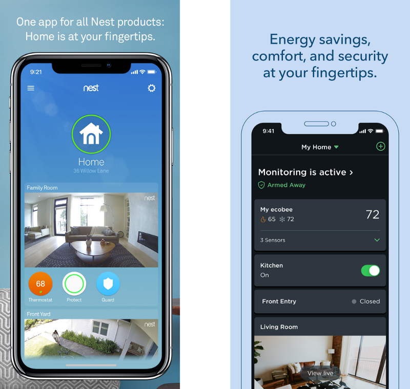
Both screens have a similar vertical list view that shows all devices. Visually, Nest has a blue theme that feels natural, easy, and friendly. Ecobee has a dark theme that feels modern, high-tech, and professional.
Nest’s uses background color to indicate active mode, which is more visible. Ecobee shows more information including the preferred temperature settings, but the active mode isn’t that obvious at a glance.
Nest groups everything under the room concept. Ecobee, on the other hand, groups all external sensors with the reporting thermostat even though they belong to different rooms. Both are valid ways but ecobee’s approach more allows users to quickly see all temperatures tied to that thermostat.
Nest’s home screen uses almost a third of the space to show the home icon. I think there could be a better way to utilize the space so that users don’t need to scroll as much. However, they also allow users to switch to a more compact grid view.
One thing I wish I could do on both apps is to manually sort my devices. I look at or operate some devices much more frequently than the others. Unfortunately, I have yet to find a way to do so on either of them.
Winner: it’s a tie as they both have their pros and cons
Thermostat Details
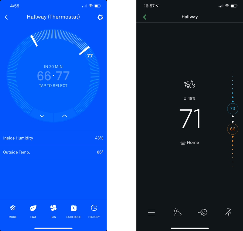
The overall layouts are pretty similar. While Nest uses the entire background to show the current mode, Ecobee uses a tiny icon color to do so. I prefer Nest’s version but wonder if there’s a sweet spot in between. The temperature controls on both apps are straightforward. On this screen, ecobee utilizes dragging better and the thresholds are more clear.
In terms of information architecture, Nest did a better job at the bottom buttons. Each button is an important and frequent function accompanied by a label that takes out the guesswork. Ecobee, on the other hand, puts most of the frequent functions such as schedule and comfort settings under the leftmost menu button, which require extra clicks to get to. And without the labels, the icons aren’t that self-explanatory and have confused me from time to time.
Winner: Nest due to better information architecture and display
Editing Weekly Schedule
As this is a critical feature and where the two apps differ the most, we will be doing a deeper dive into each app in this section.
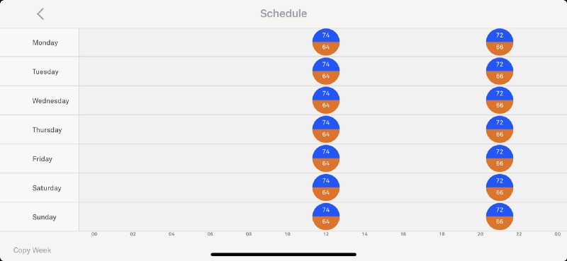
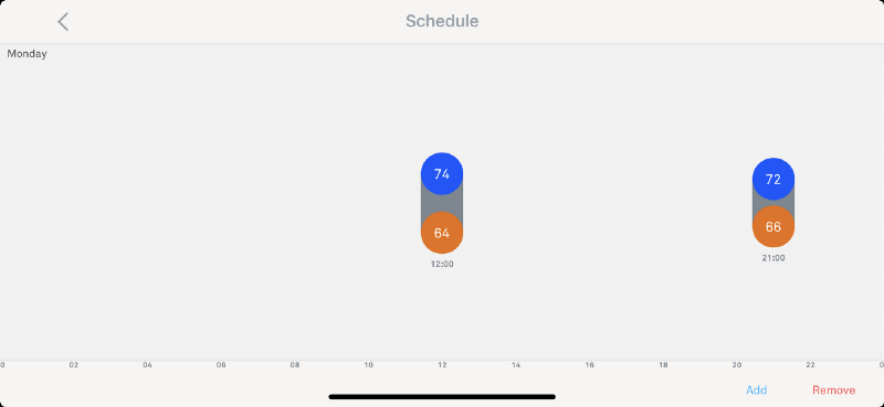
Nest’s scheduling UI has two levels: week overview and day schedule. The concept is simple: select a day, then select add, drag horizontally to change the time, and vertically from the numbers, to change the temperatures.
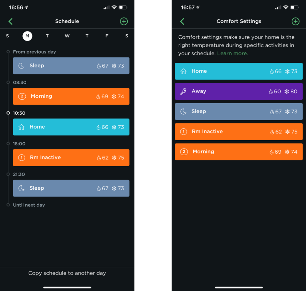
While Nest’s two screens represent a vertical hierarchy (week and day), Ecobee uses the schedule and comfort settings in a completely different, yet very interesting parallel hierarchy. Users first define activities (there are some predefined ones) and their preferred temperatures on the Comfort Settings Screen. Then they go a specific day under the Schedule Screen and adjust the time and sequence of these activities.
Where Nest Designs well
Low learning curve
The setup is straightforward. Just add the desired temperature at the desired time. Most people would get it without the need for a tutorial. Ecobee’s parallel hierarchy requires some thinking to finish the setup (but for a valid reason).
Clear weekly view
Being able to see the whole week at a glance is quite convenient. This helps users to make sure their schedules for different days are consistent (when needed). On ecobee, you’d have to tap on each day to confirm.
Intuitive dragging interaction
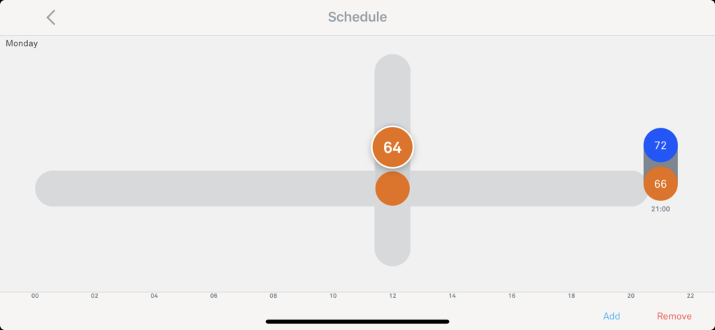
When adjusting the schedule, Nest allows users to quickly choose what to change (time, AC temp, and heat temp) all using the same interaction — dragging. This allows users to stay on the screen and complete the task faster.
Where Ecobee Designs Well
Easier to copy schedules
On the Nest app, you need to long-press on a day, which is not visible to users, and not a good practice in terms of discoverability. Ecobee not only has an obvious button but also allows you to copy to multiple days, which is a common user need, making it much faster compared to Nest.
Clever activity concept
I found this paradigm truly compelling. When needing to update the temperature of a time, e.g. sleep time, ecobee’s paradigm shines. Users only need to update the temperature of the sleep activity, and voila, that’s it! On Nest, users need to update for all other days, whether to do so manually or using the slow copy and paste.
Instead of treating each temperature setting as just separated numbers, ecobee understands why people set them differently at various times — because they have different activities! By using the power of abstraction, it extracts meanings from a set of temperatures into activities and provides a design that’s much closer to real life.
More control in room prioritization
Although both systems provide remote sensors, ecobee offers more customization. It lets you pick which room or multiple rooms to prioritize in each activity. While Nest only lets you choose one primary sensor, ecobee understands that users may have more sophisticated needs.
Winner: ecobee due to better understanding of user activity and easier temperature modification
Smart Energy-Saving & Reports
Both apps claim to help energy saving with some smart mechanisms, which include presence sensing, outdoor temperature accommodation, smart schedule adjustments, etc. However, based on my experience, they are not that reliable yet. The idea of schedule learning is nice, but it’s not intelligent enough and sometimes will cause weird settings and make users puzzled (also mentioned by Wirecutter).
Ecobee previously didn’t have many energy-saving features. But in their recent update, it was addressed quite well. Understanding the user’s needs and concerns, ecobee provides detailed settings which give users in-depth controls and explains the impact of each option, all organized in one place.
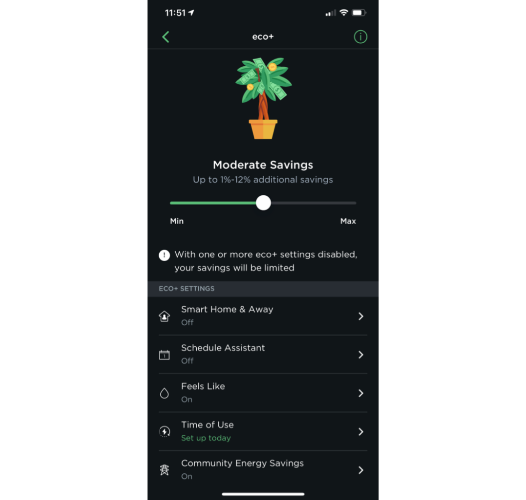
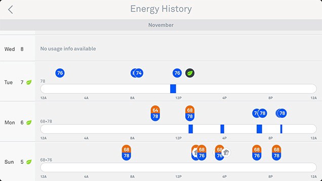
Reports allow users to monitor the HVAC usage, and to help them better decide how to set up their preferences. Nest has an Energy History screen that shows the user when the HVAC was running, what triggered it, and for how long. It’s great that users can easily access this information with a click on their phone. However, it lacks some critical data such as the temperature history.
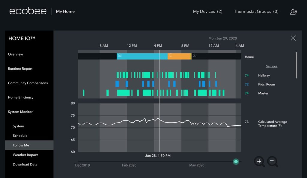
Ecobee’s reports are quite the opposite. It provides almost all the data you need, including thermostat AND external sensor temperature histories, how efficient is your usage compared to your neighbors, and so much more. However, it’s only accessible through the website or tablet app. I wish there was a simplified version that I can quickly reference via the phone app.
While it is ideal for these smart devices to learn and make predictions to potentially save energy, it is important to let users understand what’s going on and why it is making this decision. This will make the design better comply with the usability heuristic: visibility of system status and provide that sense of control the users need.
Winner: ecobee due to more preference settings and richer report details
The Bottomline
Both Nest and ecobee incorporate the entire smart home system. It’s not an easy task to design for so many different elements (cameras, thermostats, security, etc.) and put them together nicely. I think both apps have done a great job overall. While the thermostat is just a subset of the entire app, it is often an independent task that the users would execute, and therefore can be discussed distinctly.
Nest provides a simple UI with a low learning curve and does a great job executing the interaction design. But it has some flaws that require users to spend more effort tweaking the temperatures. Ecobee has a sleek visual design, shows that they have a deep understanding of user needs, and can translate them into clever designs such as the schedule + activity paradigm. They offer more customization to accommodate advanced users but can improve on things such as the IA and micro-interactions.
Based on their designs, it does seem like they have slightly different target users and therefore different priorities. But if I have to choose, the ecobee app provides a better user experience to their target audience in my humble opinion.
Thank you for reading! If you have any constructive feedback, feel free to let me know!
Update— Oct, 12 2020
After I finished my analysis, Nest released a new update, in which the thermostat screens on the Google Home app have more similarities with ecobee.
Notes:
- Most of the screens captures were directly taken from my or my friend Senpo Hu’s phone (thanks a lot Senpo!)
- I do not work for, nor am I affiliated with either Nest or ecobee.
- The opinions stated in this article came from the author’s point of view, and are not a reflection of any analytical studies. The objective of the article is to practice examining the apps’ design in detail, and communicate with the audience in an organized and clear fashion.
References
- Nest on the iOS App Store
- ecobee on the iOS App Store
- Discoverability | Article on Interaction Design Foundation
- 10 Heuristics for User Interface Design | Article by Jakob Nielsen
- The Best Smart Thermostat for 2020 | Reviews by Wirecutter
Where to Learn More
To dive deeper into interaction design, consider the following advanced online design courses by the Interaction Design Foundation:
- How to Create Intuitive Products by Imitating Physicality
- Affordances: Designing Intuitive User Interfaces
If you’re new to user experience design, check out the course User Experience: The Beginner’s Guide.
