
Nobody can critique a user experience quite like a UX designer, but video game enthusiasts certainly get close. After all, game designers are a specialised breed of UXer, one with the unique challenge of making user experiences more than just usable – they have to be fun.
By viewing a video game experience through the lens of web & mobile UX designers like us, we can gain valuable insight into injecting some levity into own our creations. So that is why for this edition of UX Case Study, I wanted to review a video game.
However, because my manager still adamantly refuses to let me play Super Mario Odyssey on company time, I resorted to the same failsafe strategy employed by any kid who needed to convince authority a video game was actually good: claim it was educational.
While this argument may have mixed results for middle schoolers touting the edifying merits of Call of Duty (history, maybe?), it helps my case that the UX design agency I write for, Codal, has substantial experience in designing for the academic sector. Brainpower indeed is the ultimate goal of my subject today. It is merely hidden under the familiar guise of gamification.
About Lumosity
Lumosity is a ‘brain training’ program comprised of games that claim to enhance cognitive abilities such as memory, attention, processing speed, and problem-solving. Available as both a web app and mobile app, Lumosity offers 50+ different ‘brain games’ packaged as daily workouts, and the ability to track and analyse cognitive areas of expertise.
While Lumosity’s efficacy is disputed, its purported shortcomings are not reflected in its user base as Lumosity boasts 85 million members and counting. This immense popularity, in tandem with the unique challenges of designing an enjoyable user experience, makes Lumosity an excellent candidate for our UX Case Study series. The fact I got to play brain games at work all day had nothing to do it.
Onboarding
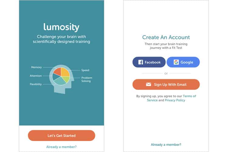
While Lumosity’s opening screen is not very visually interesting, it does posit the app’s thesis and central use case (‘challenge your brain with scientifically designed training’) and elaborates by showing the five cognitive skills it claims to improve: memory, attention, flexibility, speed, and problem-solving.
Lumosity then follows this with an unnecessarily separate screen for the actual signup. Most apps combine these initial screens to streamline onboarding and curb user fatigue. It is a small snag, nothing major, but still, a puzzling choice when you consider how much free space is available on the initial screen. Real estate is not exactly scarce.
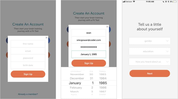
I select the “sign up with email” option, and Lumosity ushers me to some boilerplate form-filling, with a few extra fields thrown in for demo research. It is not as effortless as other onboarding processes we have seen here on UX Case Study, though it is clean and partitioned well. However, when I have finished my info input, I realise I still have a few more screens to go before I can start playing games and training brain.
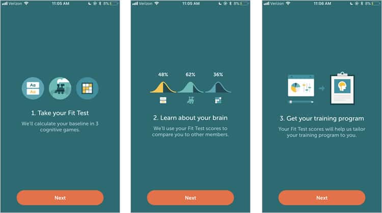
I hesitate to call this a tutorial, especially when there are actual tutorials for each in-app game. This is more of a primer to something called the Fit Test, a preliminary evaluation of the user’s current cognitive ability. Again, it is only three quick screens, but when compared the onboarding process of a similar app, like Duolingo, it is clear Lumosity falls short.
The Fit Test / Games
Finally! We have drilled to the app’s core. While it is not feasible for me to review the specific user experience of every brain game, the Fit Test actually provides a neat sample platter of three games all indicative of Lumosity’s more extensive experience.
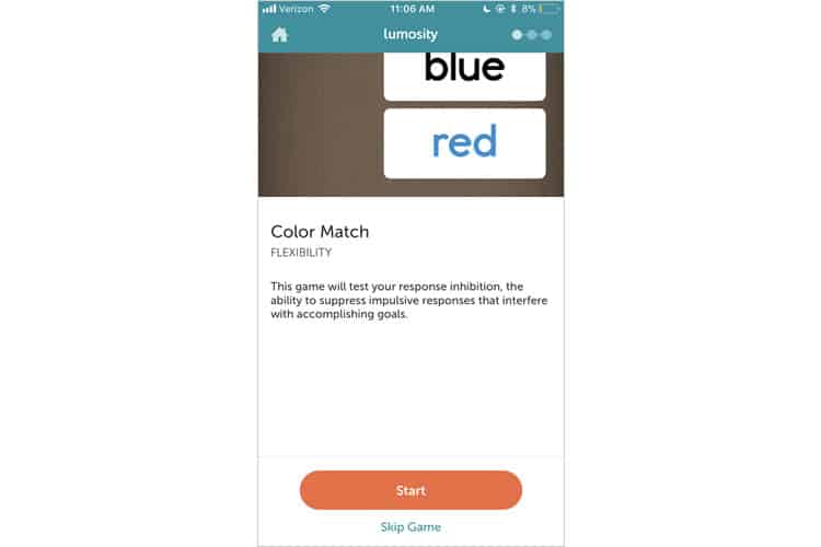
The first game, Color Match, has an introductory screen that, again, leaves swaths of unused real estate. Negative space can serve a valuable purpose in UI design, but I do not think this is a reasonable application of it — especially when that space could be used to provide further instruction to the user.
We also start to get a glimpse at the app’s primary UI — specifically, the home icon at the top left, and the horizontal dots opposite it. The horizontal dots denoting progress is UX convention, but its placement in a location where an essential function would typically inhabit is an interesting choice.
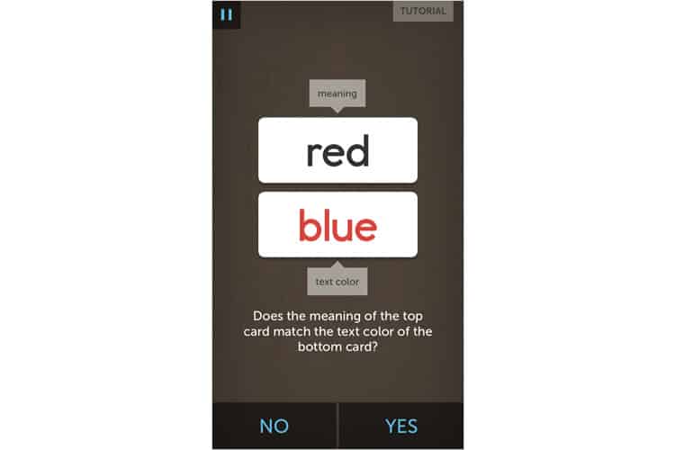
Each Lumosity game begins with a tutorial, a device UXers typically try to eschew in mobile app design but is often unavoidable in game-based experiences (though some designers have come up with clever ways to circumvent it).
After my round of Color Match, Lumosity reveals how I compare to other users in my demographic, and then provides a bit of context for the game by elaborating on the psychological principles behind it.
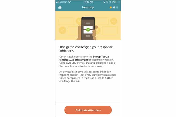
This is an apparent attempt to inject some credibility into the user experience, and I suppose its success depends on your knowledge of psychology and the credence you give The Stroop Test. What is much more disappointing is that awful call-to-action, ‘Calibrate Attention’. Oof.

As I complete the two remaining games in my ‘Fit Test‘, I note the overall aesthetic and style of Lumosity’s interface. Their art and illustrations follow material design trends, and the smooth, rounded typography follows suit.
The aural experience of Lumosity also complements the visual one. In-game sounds include the soft crinkling of paper when advancing screens, an encouraging bell for correct answers, and a mournful two-tone for incorrect ones (take notes Family Feud).
With my Fit Test completed, I am finally brought to the app’s “main interface”, but it is really not much more than a basic container for the games, which are much more visually appealing. It is clear the brunt of the design work went into the brain training, and not these auxiliary pages.
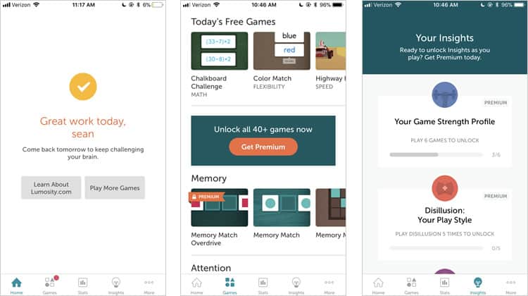
Most of these screens follow standard design conventions — sensible iconography and a card-based layout. However, the decent amount of the content is hidden behind paywalls, enticing the user to upgrade to Lumosity’s premium version.
Final Verdict
While Lumosity succeeds in creating fun, visually appealing games (I cannot speak for their medical benefits), the user experience surrounding their activities could use some work — especially the onboarding process.
I cannot help but return to the comparison between Lumosity & Duolingo. These are two apps with similar use cases; user flows, and likely even user bases. However, their onboarding strategies, and by extension their entire user experiences, are different — and it shows in the quality of the app.
More from the UX Case Study Series
- UX Case Study: Google Maps vs. Waze Mobile Apps
- UX Case Study: Spotify Vs. Apple Music Mobile Apps
- UX Case Study: Acorns Mobile App
- UX Case Study: Lumosity Mobile App ? You are currently reading this
- UX Case Study: Talkspace Mobile App
- UX Case Study: Zocdoc Mobile App
- UX Case Study: Calm Mobile App
- UX Case Study: Overcast Mobile App
- UX Case Study: SoundCloud’s Mobile App
- UX Case Study: HBO GO App
- UX Case Study: Venmo
- UX Case Study: CNN’s Mobile App
- UX Case Study: ESPN’s Fantasy App
- UX Case Study: Duolingo
- UX Case Study: Bumble
Want to learn more?
If you’re interested in mobile UX, you could take the online course on Mobile User Experience. It includes templates you can use in your own projects and you’ll get an industry-recognized certificate to improve your career. If, on the other hand, you’d like to…
- learn all the details of Usability Testing
- get easy-to-use templates
- learn how to properly quantify the usability of a system/service/product/app/etc
- learn how to communicate the result to your management
… then you might take the online course Conducting Usability Testing.
Lastly, if you want to brush up on the basics of UX and Usability, the online course on User Experience could provide you with the necessary knowledge. Good luck on your learning journey!
(Lead image: Depositphotos – affiliate link. All other photos in this article are screenshots taken during usage of the Lumosity app.)
