Today, we are back in business with another app showdown! To give a recap for those of you that are new here: in this UX case study series, we put two similar apps head-to-head and see which boasts the better UX.
The last matchup we looked at Shopify and Apple Music, with Shopify taking the gold when it comes to the user’s experience. In this Olympic style face-off, I am going to be looking at two of the most popular navigation apps: Google Maps and Waze.
Each is boasting a nearly five-star rating in the App Store, Google Maps ranks #1, while Waze holds the #2 spot in navigation.
Personally, I am rather excited for this matchup, as I am the ideal candidate. I continuously use navigation while I drive and just so happen to be terrible with directions.
So throughout this matchup, I am also going to be turning introspectively, asking myself, “which of these apps do I believe can get me to a destination without getting lost?”
I am going to analyse the UX of these navigation apps and determine, for my bad navigators everywhere, which is worth their time.
Let us buckle up and get ready to go full throttle into the UX of these navigation apps.
1. Home Screen
The first thing that a user sees when they launch each of the apps after a brief onboarding process is their multidimensional map screens.
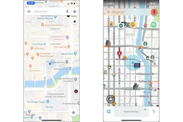
The UI is simple and functional for each. As a user arrives in each of the home screens, they have a clear idea of the locality of themselves, in contrast to their surroundings. Each app was extremely responsive: a user could pinch and swipe the screen to take a bird’s eye view of the map.

As we place Waze’s home screen next to Google Maps’ screen, we immediately begin to see stark contrasts in their design choices. Waze has a much more crowded interface, while Google Maps has a cleaner one. Waze’s is more playful; Google’s a bit more utilitarian.
However, Waze’s design makes it easier for their user to customise their navigation experience and offers more functionality. Although a messier design, their popups on the map alert their driver of traffic, construction, restaurants in their area, photo enforced traffic lights, police officers, and other Wazers.
With a cleaner interface, Google Maps sacrifices their experience feature list, to a degree. They do not provide their users with as many options to get an idea of their surroundings while they are driving.
As we look at the UX of these two apps, Waze outshines Google Maps in the way that they give their users an updated and in-depth way to grasp what is in their vicinity. In this battle of the home screens, Waze takes the cake.
Winner: Waze
2. Search Options
One of the other most essential elements in a navigation app is the ability for the user to search for and enter their destination. Moreover, both navigation apps similarly present this search option.
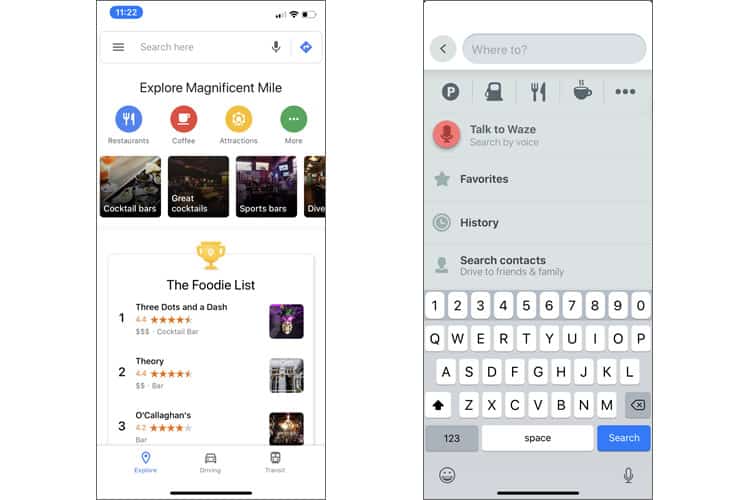
At the top each screen, each app has their search bar. So the function of this feature could be understood by any user, with any range of experience. Waze asks “Where to?” while Google Maps tells users to “Search here.”

However, each app varies with the level of modification that they are able to provide their user. Waze gives their user popular search modifications through their use of graphics: their fork image stands for food, the gas can for gas stations … you get the idea.
Google Maps, on the other hand, presents their suggestions with flashy and eye-catching graphics, to show their users what is in the area. They even include a ranking list of what ‘foodies’ like in the area.
With a sleek and captivating design choice, I have to give Google Maps the win in this category. Google Maps streamlines the search process for their users and makes these options pop with the UI that they were paired with.
Winner: Google Maps
3. Navigation Itself
For bad navigators everywhere, the moment you have been waiting for: which app offers the better navigating experience.
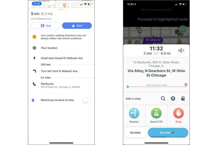
For this UX showdown, I chose to go to my local Starbucks and requested that each app take me there.
Lining up these interfaces next to one another, they are almost opposite in their design. Waze’s popup is chock-full of buttons and navigation options, with their ETA being the most significant number in the screen; whereas, Google Maps has the directions to the location neatly stacked down the screen.

Google Maps is going with the ‘less is more’ approach. However, Waze is using all of their screen space for customisations that a driver could use to modify their experience better.
Moreover, if we look at which of these options would give the user the most information to enhance their driving experience, Waze would win hands-down. With their app, a user can get different route options, a way to stop, a way to send their ETA, and can easily see their arrival time/the distance.
When it comes to bad navigators far and wide, I speak for them when I say: Waze wins this navigation challenge.
Winner: Waze
Looking At The Scoreboard
Although it may surprise most (because of its App Store ranking), I have to deem Waze as the winner of this challenge. While both apps provide a navigating experience on an easy to understand interface, Waze provided more customisation options for their user’s routes.
While Google Maps takes the cake in its UI, Waze beats out this navigating giant in the experience they provide their user.
More from the UX Case Study Series
- UX Case Study: Google Maps vs. Waze Mobile Apps ? You are currently reading this
- UX Case Study: Spotify Vs. Apple Music Mobile Apps
- UX Case Study: Acorns Mobile App
- UX Case Study: Lumosity Mobile App
- UX Case Study: Talkspace Mobile App
- UX Case Study: Zocdoc Mobile App
- UX Case Study: Calm Mobile App
- UX Case Study: Overcast Mobile App
- UX Case Study: SoundCloud’s Mobile App
- UX Case Study: HBO GO App
- UX Case Study: Venmo
- UX Case Study: CNN’s Mobile App
- UX Case Study: ESPN’s Fantasy App
- UX Case Study: Duolingo
- UX Case Study: Bumble
(Lead image: Depositphotos. All other photos in this article are screenshots taken during usage of the Google Maps and Waze mobile apps. The opinions expressed in this article are those of the author, and do not reflect in any way any scientific analysis related to performance or otherwise. The objective of this article is to educate about good practices in mobile application development.)
Want to learn more?
Want to get an industry-recognized Course Certificate in UX Writing, UX Design, Design Thinking, UI Design, or another related design topic? Online UX courses from the Interaction Design Foundation can provide you with industry-relevant skills to advance your UX career. For example, Design Thinking, Become a UX Designer from Scratch, Conducting Usability Testing or User Research – Methods and Best Practices are some of the most popular courses. Good luck on your learning journey!
