
In a blogosphere full of articles honing in on single, often granular components of user experience design, Codal’s UX Case Study series aims to examine UX from a holistic perspective, panning the camera back to explore how an experience functions as a whole.
So far in our budding case study series, we have examined two apps with esteemed user experiences: Duolingo and Bumble. While the platforms were not without flaws, both investigations concluded with a positive review.
Today’s subject is a different story.
The NFL season has finally arrived, which means Sunday tailgates, bizarre Peyton Manning commercials, and for roughly 32 million Americans, fantasy football. The fantasy industry hit the multi-billion dollar mark back in 2013 and has since has ballooned, even more, thanks to the rising popularity of the daily fantasy format.
While companies like CBS, Yahoo, and even the NFL itself offer fantasy league hosting, ESPN remains the most popular portal for fans to conduct their leagues. ESPN’s fantasy football mobile app boasts millions of users, which is no small feat, especially when you consider the UX of this app is … lacking.
Today, we will dissect the ESPN fantasy app, examining its features and functions, diagnosing its pain points and lauding its successes.
Not a football fan? No problem. You do not need to know the lingo, care about the players, or even have a rudimentary knowledge about the rules of fantasy football. User experience (UX) is a universal language, and quality of design (or lack thereof) is easy to recognise.
Onboarding
As always, we will begin by reviewing the app’s onboarding process. Arguably the most crucial component of any user experience, onboarding should seamlessly familiarise the user with the application, efficiently easing them into the interface.
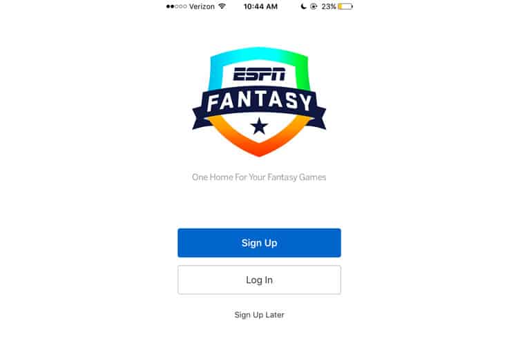
ESPN’s initial screen is fairly boilerplate: a clean background, logo, the two standard “Sign Up” and “Login” buttons. There is also a third, “Sign Up Later” button – an interesting gamble. Having users create an account beforehand is a protocol for a reason, but we have already explored cases where delaying signup can actually be beneficial.
I press “Sign Up Later”, and am immediately brought to the app’s home screen, a crowded page dominated by a “sign up today” module with three different buttons, a nav bar of sports icons, a banner ad, and some ESPN articles. When I click the “menu” icon in the top left corner, I am treated to four different games ESPN offers, all hawking thousands of dollars in prizes.
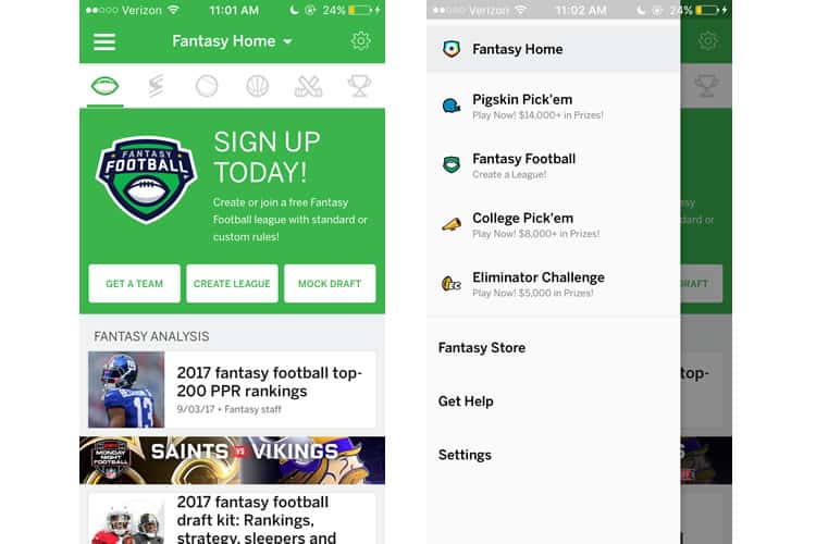
This is all very overwhelming, but maybe it is because I have not signed up for an account yet. I backtrack to the initial screen and select “Sign Up”.
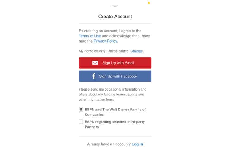
Ugh. A wall of text, a tactless ask about sending me promotional material, a disclaimer about the terms of use & privacy policy, and two “Sign Up” options. Yes, I pressed Sign Up so I could press Sign Up again. I click email and am brought to a screen full of forms for me to populate.
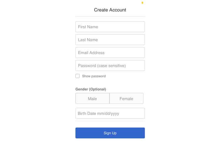
No explanation is given for why ESPN needs my gender or birthday, but okay. Hopefully, now that I have signed up, the interface will be a bit more navigable or at least provide some guidance for what I should do first.
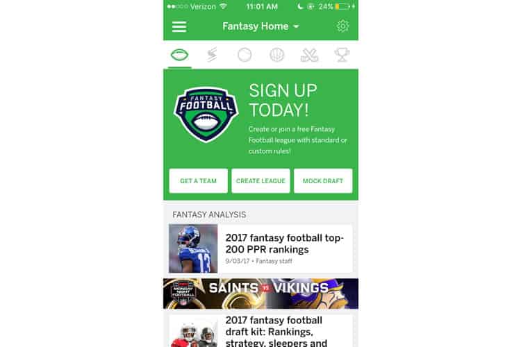
After I have signed up, most of the screen’s real estate is dedicated to asking me to..sign up?
Or…it could be the exact same thing. That is right ladies & gentlemen; I have to sign up twice. First to create a fantasy account, and then again to actually to create or join a league.
I am a longtime fantasy football fan, so I have used this app before and am familiar with the interface. But for a first-time player, this onboarding process is a nightmare. There is no easy-to-find guidance on how to use the application.
This is surprising to me, as fantasy football attracts a significant amount of football novices. It is like the NCAA’s March Madness – people enjoy the excitement of laying down some money and “participating” in the sport or the camaraderie of joining a league with their friends or co-workers.
The fantasy football newbie is a legitimate user persona, and ESPN’s Fantasy app seems to ignore it completely.
A Quick Fast-Forward
At this point, I am going to fast-forward to having a team. Putting a fantasy league together is a collaborative effort (usually between eight to twelve people), and if I diligently combed through the journey from signing up to having a roster, I would be here for days.
Here is what my ESPN fantasy home screen looks like now.
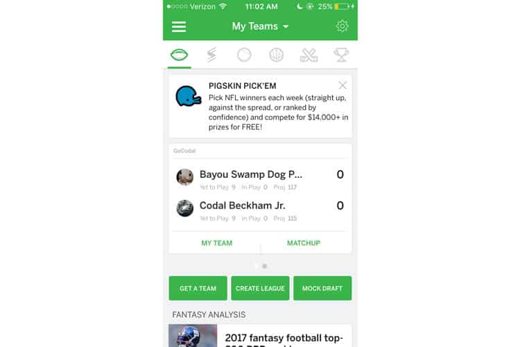
Now that I have joined a league and drafted a team, the interface prominently features more useful information: a module displaying my opponent for this week, complete with an updating score, the projected points, how many players on my team are currently in-game, and more.
The second largest module is an advertisement to join any ESPN game, “Pigskin Pick’em”. It quickly briefs me on what the game entails and promises the opportunity to win money, but it is essentially an ad taking up nearly 25% of the home page. Again, not the time, ESPN.
To make matters worse, those three green CTAs are still there. Granted, many fantasy users have more than one team, but I am not sure their emphasis on the home screen matches how often they will be accessed.
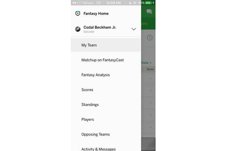
When I select the menu button on the top left, not much has changed. To my frustration, most of the menu is still devoted to promoting other ESPN games to play. I understand the importance of cross-marketing other use cases for the app, but not when it is this detrimental to my experience.
The “My Team” Module
I select my team from the left-hand toolbar, which expands a second, even longer menu. This module is where users will spend a majority of their time on the app, and while the app has made improvements since last year, it is still, in a word, cramped.
To be fair, fantasy football entails an enormous amount of information. Owners demand as much data as possible, hungry for any important metric that could be the key to clinching their weekly matchup. Here is the most frequented module for fantasy football: “My Team”.
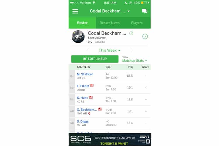
It is still a bit much, though I recall a previous version of the app that was even more disorganised. This year’s edition is cleaner, but it is not without issues.
When you press “Matchup Stats”, you expect a drop-down menu, as signified by the arrow. However, what happens is that a new page opens, just to change the statistics that appear next to your team.
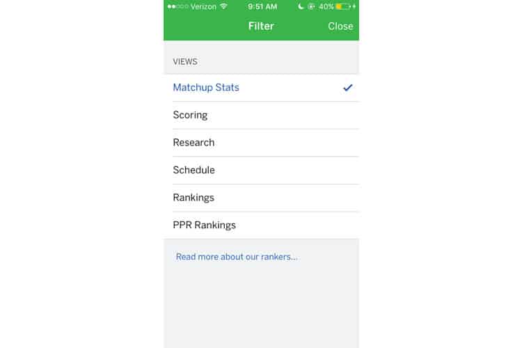
While I do not like this misleading design, I am not sure what a better solution might look like. I do not like the idea of a popup or overlay – the screen is already jam-packed with different buttons and icons to press. I return to my Roster and select the Roster News tab from the upper navbar.
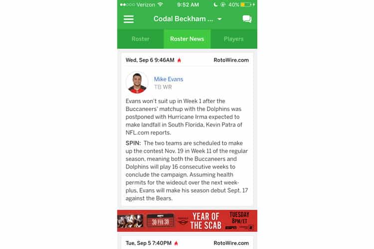
I am torn on the Roster News tab. First, I am not even sure if it is necessary. The same information, (and more) can be found by just pressing the red newspaper icon next to the player on the Roster tab. At the same time, I suppose it is nice to have all player news in a centralised location.
Final Verdict
While we usually cannot tackle every nook and cranny of an application, the sheer scope of the ESPN Fantasy app forces us to end our case study a bit more prematurely than usual. It is a pity, really as I am a diehard football and a UX fan, yet I would not want to read more than 2,000 words on this app.
As I am sure you have gleaned by now, my opinion of ESPN’s Fantasy application is not the highest one. Their onboarding is a mess, they offer no guidance in navigating an extremely convoluted interface, and they seem to completely ignore a significant user persona, the fantasy football newbie.
We have been taught again and again that a poor user experience is a sure-fire way to ruin an app. So how does ESPN remain the most popular fantasy football application, in spite of its poor UX design?
For starters, the competition is not great either. Both Yahoo’s & CBS’s applications suffer from many of the same design pitfalls ESPN’s does, as well as their pain points for good measure.
The second reason is that ESPN Fantasy Football may be too big to fail. I have played fantasy through ESPN for years, returning to it every time September rolls around. The app may suck, but I have gotten used to it. It is a tradition now. We are creatures of habit, and it is likely I am doomed to suffer through ESPN’s UX for the rest of my days.
Still, there is hope. ESPN could hire a UX design agency to clean up their platform, or maybe someone will come along with a fantasy app that can integrate with ESPN’s hosting but offers a much cleaner, more usable experience.
People care about UX but this is a necessity. Maybe they can get away with it. It doesn’t do anything to help people who may be joining, which does not make sense … and onboarding is tough.
More from the UX Case Study Series
- UX Case Study: Google Maps vs. Waze Mobile Apps
- UX Case Study: Spotify Vs. Apple Music Mobile Apps
- UX Case Study: Acorns Mobile App
- UX Case Study: Lumosity Mobile App
- UX Case Study: Talkspace Mobile App
- UX Case Study: Zocdoc Mobile App
- UX Case Study: Calm Mobile App
- UX Case Study: Overcast Mobile App
- UX Case Study: SoundCloud’s Mobile App
- UX Case Study: HBO GO App
- UX Case Study: Venmo
- UX Case Study: CNN’s Mobile App
- UX Case Study: ESPN’s Fantasy App ← You are currently reading this
- UX Case Study: Duolingo
- UX Case Study: Bumble
Want to learn more?
If you’re interested in mobile UX, then taking the course on Mobile User Experience, which includes templates you can use in your own projects. If, on the other hand, you’d like to…
- learn all the details of Usability Testing
- get easy-to-use templates
- learn how to properly quantify the usability of a system/service/product/app/etc
- learn how to communicate the result to your management
… then consider to take the online course Conducting Usability Testing.
Lastly, if you want to brush up on the basics of UX and Usability, the online course on User Experience could provide you with the necessary knowledge. Good luck on your learning journey!
(Lead image: Depositphotos – affiliate link. All other photos in this article are screenshots taken during usage of ESPN’s Fantasy app.)
