
Welcome to the first UX case study of 2018! Codal hopes you have had a fantastic start to the new year. For those who have followed along with our long-running UX Case Study series, welcome back, and to new readers, welcome aboard.
For those who are just joining us: UX Case Study is a regular series written by UX design agency Codal, where we conduct in-depth examinations of different mobile apps. An exercise in scrutiny, we place apps under a microscope and critically examine them through a user experience lens, acknowledging both their successes and failures.
The ultimate goal is to view UX holistically and examine how different design techniques coalesce to work as a whole in a functioning application. To kick off the new year, we have decided to study the 2017 winner of Apple’s “App Of The Year” award: Calm.
About Calm
Calm is a mindfulness and mental health app that offers free exercises and programs that help users do everything from meditating and improving sleep to reducing stress and increasing focus. Offering a range of ASMR-like readings, ambient music, and relaxing nature sounds, Calm aims to help their users become more mindful through daily sessions and regular practice.
As always, I will be conducting my analysis using an iPhone 7 with the latest iOS release, and the most updated version of Calm as well.
Onboarding
Before I even open Calm, its icon sets the stage for the app’s aesthetic motifs and visual language. Set against a soft, azure gradient, the app’s name is written in a spindly, naturalistic typeface that evokes tranquillity and serenity.
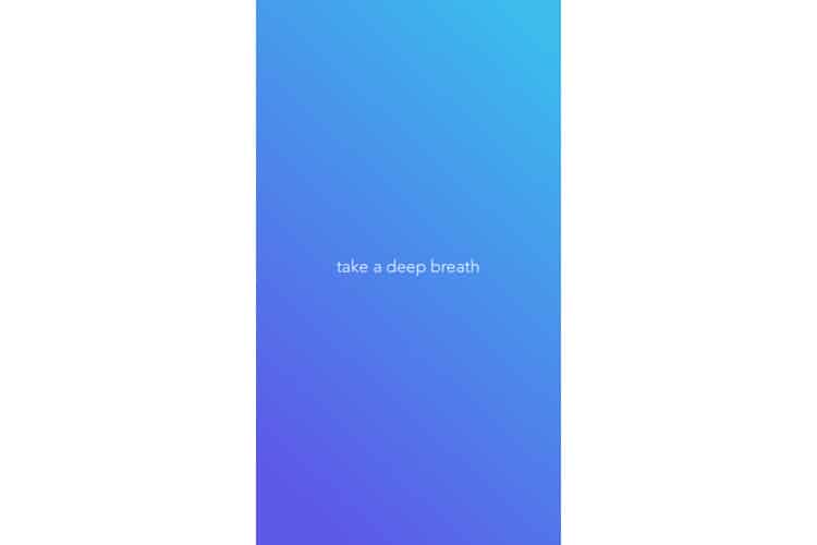
When I tap the icon, Calm’s splash screen appears, though “splash” seems too strong a word. It is more of a single drop of water-the words “take a deep breath” imposed upon the same soothing blue gradient used for the app’s icon. I oblige, though I hope it is not to prepare me for what is going to be a lengthy and tedious onboarding process.
Expecting the standard “sign up / login” screen, I am instead greeted with a display that asks me to choose my top goals. Here, Calm shows off the benefits of using its programs, offering everything from “Build Self-Esteem” to “Increase Happiness”.
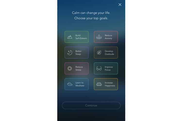
This is both an excellent marketing strategy and a savvy UX move-the app is offering the user value upfront, providing a reason why I should sign up for Calm. Moreover, it does it not by listing features or functions, but by end results. It does not say “over 100+ programs and exercises”. It promises the resulting benefits: better sleep, less anxiety, reduced stress.
Assigning each goal a distinct colour and icon is an aesthetically pleasing choice as well. I tap a few goals and select “Continue”.
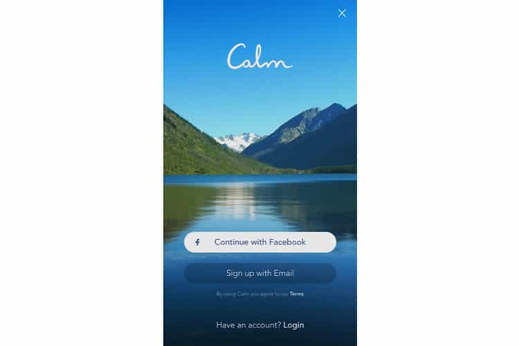
I am brought to the sign-up/login screen. Calm uses a standard template for this standard display, offering sign-up functions with both email and Facebook. The most striking design feature of the screen is easily the picturesque background. We see that omnipresent gradient as the sky, coupled with a mountain terrain and a tranquil body of water.
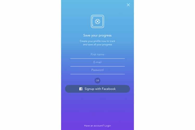
I select sign up via email and am brought to another conventional screen in the onboarding process. There is not much to mention here, other than the fact Calm once again demonstrates value by offering a reason why the user should create a profile-to track and save progress.
After creating an account, Calm serves up two interstitials between account creation and the home screen. The first: an offer to unlock the full version of Calm with a seven-day trial period, and the laundry list of features that accompany it.
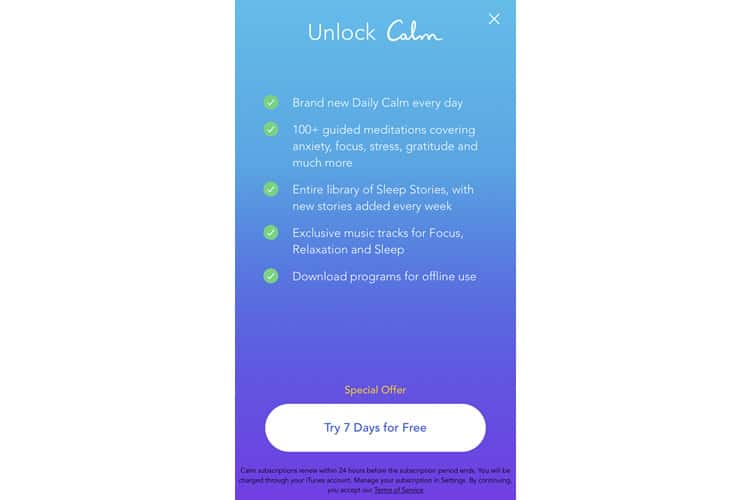
The feature list is not much help to me for now- I am not familiar with in-app jargon like ‘Sleep Stories’ or ‘Daily Calm’ – and I do not know if I will even enjoy the app yet. However, to be fair, they are offering a free trial, so I am sure it does convert some users that want to begin with the full app experience.
The second interstitial is a classic prompt to enable Calm to send notifications. Long-time readers will know of my personal pet peeve with these untimely interruptions, especially when they do not reveal what I will be notified or why I should enable them.
Home Screen / Tutorial
With the onboarding process complete, I am brought to Calm’s home screen, a modest, unadorned page with the same picturesque backdrop as the login. In the upper corners of the screen are two icons, one which appears to be the “my profile” page, and the other which I am unsure of.
The app’s primary navigation lies across the screen’s bottom, and is only three options: Music, Meditate and Sleep. The meditate option is given priority, as evidenced by its larger size and placement in the centre. An overlay appears above it that reads “Start your journey” here.
In-app tutorials are a hotly debated topic in mobile app design, with some designers claiming that if your app needs one, you have already failed. While that is an admirable ideal for a UX designer to hold, I personally do not subscribe to it (though I am sure some of Codal’s UXers would disagree with me).
As it stands, Calm’s in-app tutorial is relatively painless, essentially guiding me along the platform’s fundamental user journey, rather than taking the time to illustrate and explain every feature and function. Displayed below, the tutorial takes me the beginner’s meditation program, “7 Days of Calm”.
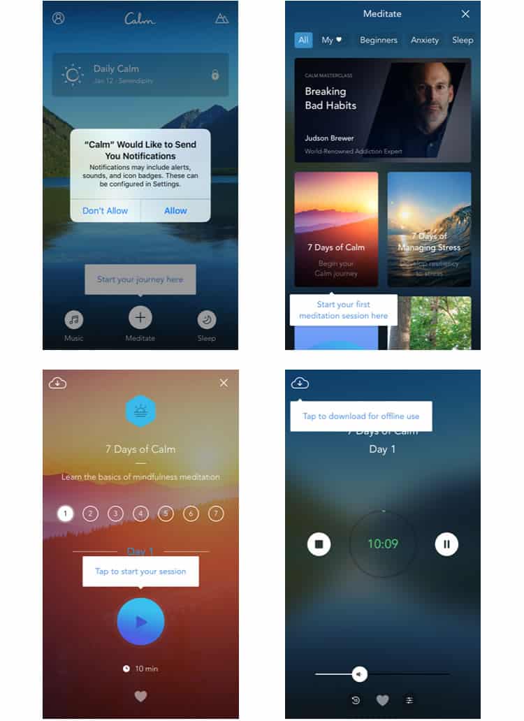
All-in-all, it is only four overlays, and it works well in efficiently immersing me in Calm’s first program. Some UX designers may disagree with me here, but I think Calm’s in-app tutorial is a strong design choice.
The Player
As indicated by the navigation bar, Calm offers three primary features for mindfulness: Meditate, Music, and Sleep. While all three contain different programs for different goals, they also all rely on the same playback functionality, making this interface the perfect closer to our UX case study. Another reason Calm’s playback feature deserves scrutiny: it is unlike any standard player you have probably ever used.
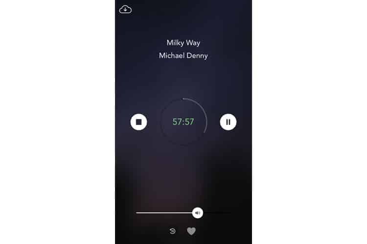
The most striking feature is its lack of features. Subscribing to a minimalist strategy, Calm’s player has only two main buttons: play/pause and stop. There is a necessary volume control, and a “favourite” function too, but other than that, there is not much else to write.
There is a jarring lack of a fast-forward function (Calm does not want you skipping through its programs), and even the reverse feature can only be used in fifteen-second intervals. This lack of granularity is rare for playback mechanics, but for Calm it makes sense.
Calm’s player is a rare example of taking distinct features away to improve the user’s experience. The user should not be able to fast-forward or rewind incessantly-this is a meditation app.
Final Verdict
I only used Calm for about three or four days (I guess meditation is not really my thing), but overall I was pleased with the user experience. Its content well-produced and the app’s commitment to a card-based design keeps it well-organised and easy to traverse.
While I did not notice it during my initial use when I plugged in my headphones the app began to play nature sounds while I was interfacing with it, which was a nice touch as well.
Overall, it is easy to see why Calm was named Apple’s 2017 App of the Year. Their calming, meditative feel extends from their programs and content to envelop the entire user experience. Traversing Calm feels seamless as if you are floating in the lake that adorns the app’s home screen.
More from the UX Case Study Series
- UX Case Study: Google Maps vs. Waze Mobile Apps
- UX Case Study: Spotify Vs. Apple Music Mobile Apps
- UX Case Study: Acorns Mobile App
- UX Case Study: Lumosity Mobile App
- UX Case Study: Talkspace Mobile App
- UX Case Study: Zocdoc Mobile App
- UX Case Study: Calm Mobile App ? You are currently reading this
- UX Case Study: Overcast Mobile App
- UX Case Study: SoundCloud’s Mobile App
- UX Case Study: HBO GO App
- UX Case Study: Venmo
- UX Case Study: CNN’s Mobile App
- UX Case Study: ESPN’s Fantasy App
- UX Case Study: Duolingo
- UX Case Study: Bumble
Want to learn more?
If you’re interested in mobile UX, then taking the course on Mobile User Experience, which includes templates you can use in your own projects. If, on the other hand, you’d like to…
- learn all the details of Usability Testing
- get easy-to-use templates
- learn how to properly quantify the usability of a system/service/product/app/etc
- learn how to communicate the result to your management
… then consider to take the online course Conducting Usability Testing.
Lastly, if you want to brush up on the basics of UX and Usability, the online course on User Experience could provide you with the necessary knowledge. Good luck on your learning journey!
(Lead image: Depositphotos – affiliate link. All other photos in this article are screenshots taken during usage of the Calm app.)
