
I have written a considerable amount of articles on a variety of UX design topics, covering subjects as niche as mobile app pop-ups to concepts as spacious and all-encompassing as design itself.
But instead of honing in on one issue, it is often beneficial to study UX by viewing it holistically, examining how different design techniques coalesce to work as a whole in a functioning application.
UX is more than just a checklist of design practices and techniques – they need to work in harmony to become something greater than the sum of their parts.
So as to explore this holistic view of UX, I conducted an in-depth UX case study of a mobile application. An exercise in scrutiny, this article places an app under a microscope and critically examines it through a user experience lens, acknowledging its highlights and diagnosing its pain points.
While the UX case study described in this article is about a particular application, it will hopefully inspire you on how to conduct a UX case study
on any app, website or interface of your choice.
For this case study, I selected an application I have never interacted with before, partially to avoid any bias, and to provide myself with the opportunity of examining the platform’s onboarding process (an important segment that must have excellent UX).

Bumble, a popular dating app, met both criteria. A Tinder offshoot that looked to remedy some of their forbearers’ less desirable qualities, Bumble offers a similar swipe/match platform with one simple twist: only women can make the first move with an initial message.
Their gimmick paid off. Boasting over seven million users, Bumble is one of the most popular options today. But does Bumble’s UX back up their numbers? What do they do well? Where can they improve? And how we learn from their successes and mistakes?
I downloaded the latest version of Bumble to my iOS device and found out.
Onboarding
Upon opening the app, we are greeted with a well-crafted login screen featuring a short, conspicuous call-to-action: ‘Sign In With Facebook’. Bumble then couples their sole CTA with a disclaimer that reassures the user their Facebook will never be flooded with posts from Bumble.
Right off the bat, Bumble breaks a market-tested standard in mobile UX design. Typically, apps should offer several ways a user can sign up, including via Google account, or a simple email address & password – not just Facebook (which not everyone has!).
But Bumble’s different UX choice here is correct because it prioritises one of their objectives: to provide its users with authentic matches. By restricting their signup to Facebook members exclusively, their user base contains fewer trolls, bots, or any other low-quality matches.
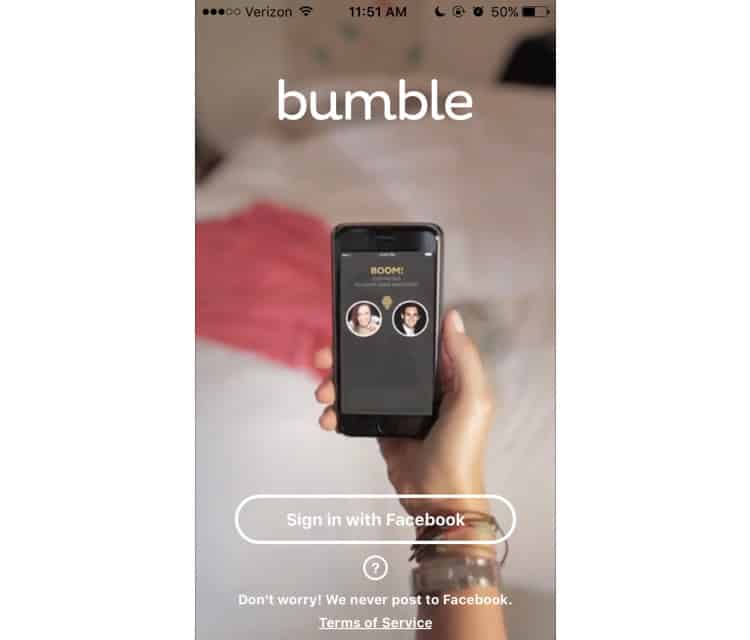
Overall, Bumble’s login screen is sleek, concise, and a little bit sneaky. Most UX designers agree that if your app requires a tutorial, it is poorly designed. Bumble manages to slyly slip a video tutorial in the background of their home screen, featuring a woman using the dating app as she goes about her day.
As she swipes, scrolls, and chats through the app, she subconsciously teaches new users (like me) how the app works. Though this wordless, faux-tutorial technique is not uncommon, Bumble executes it masterfully.
After signing in and granting Bumble’s permission to access my location, we are taken to a screen that summarises the app’s gimmick in four simple steps. It is simple, straightforward, and does not commit any glaring UX offences; so we will forgo its analysis and dive right into the application.
Main Screen
Before I can catch a glimpse of the central feed, I am interrupted by a promotional pop-up for Bumble Boost, the app’s premium content service. This is not ideal UX, and that is not just because it is a pop-up. Rather, it is the intrusive box’s timing and relevancy to me, or lack thereof.
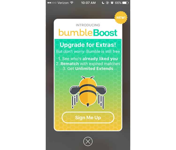
I am a brand new user to Bumble – why would I be interested in premium content before I have even had a chance to try the standard version? The pop-up offers “Unlimited Extends”, but as a Bumble novice, I am not even sure what an Extend is.
After exiting the pop-up, I finally see the hub of Bumble’s interface. Like any dating platform, the users are the focal point, so Bumble wisely dedicates roughly 90% of the screen real estate to photos of your potential match, with the other 5% allocated to their name and a brief bio.
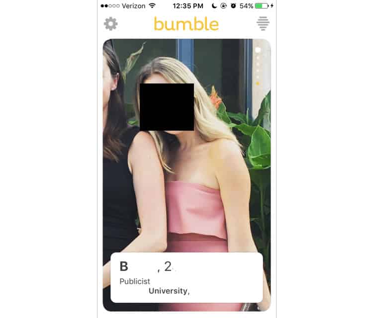
The dots in the top right corner of the picture signal that the user can vertically scroll to view more photos, though the lowest dot distinguishes itself with a golden colour. When we navigate to view, we discover a more comprehensive bio of the potential match.
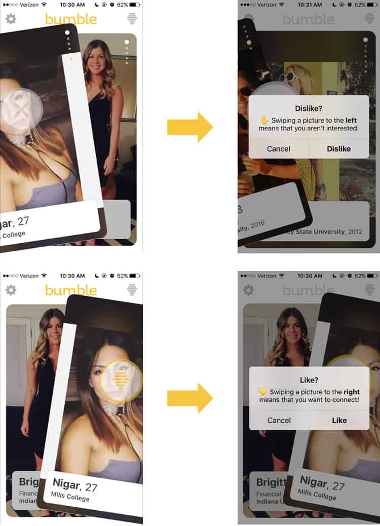
For their swiping mechanism, Bumble borrows the conventions Tinder popularised, designating a left to dislike, and right to like. This is never explicitly taught, but Bumble’s UX designers know that this is their users’ initial instinct. The first time you swipe, they validate the action with an animated overlay (hive logo for like, X for dislike) and a wordy confirmation pop-up.
The final elements of the main screen consist of two buttons, each nestled in the top corners: on the left, a gear to signify the Settings screen, on the right, Bumble’s hive logo, a bit more ambiguous. Let us start with the latter.
Matches
Tapping the hive logo on the top right-hand corner of the main screen navigates to the matches page, where you can manage your connections and conversations. Because it is my first visit to this screen, two informational bubbles pop up.
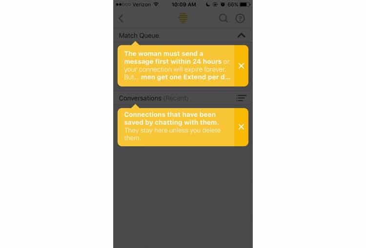
Both informative, though the first bubble cuts off its message completely – I tried tapping, scrolling, and swiping, but I could not advance the text. After clearing the pop-ups, a relatively intuitive content management screen appears.

Bumble combines standards from two different platforms to design this screen. The first, for the Match Queue, is mostly lifted from Tinder. It is not the most elegant system, but the convention exists for a reason. Bumble does add their twist – when tapping a match, an abridged version of their profile appears, allowing users to quickly refresh their memory about a match before striking up a conversation.
The architecture of the screen’s second module, Conversations, is design with conventions of a standard messaging system, primarily the one used in iOS. Again, it is similar to its rival dating apps, but Bumble’s sorting feature adds an intuitive, usable touch to the functionality.
At the top right corner of the screen, we see a clearly labelled search function and a question mark symbol. I tap, and this wall of text appears.
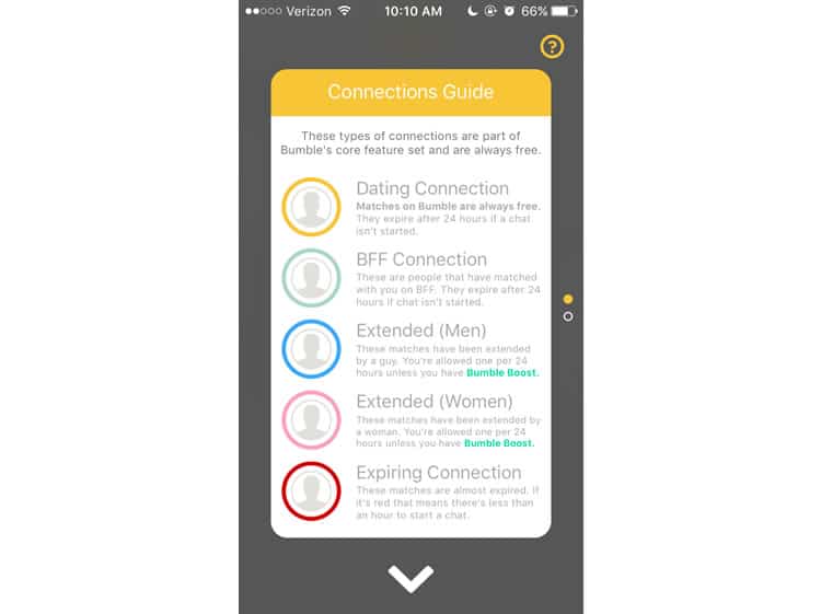
I am not saying Bumble’s color-based system for designating types of connections is flawed, but this guide to it certainly is. It is essentially a wall of text, offering an overwhelming amount of information in a clunky, dense package.
Even worse, when we scroll down, we get something completely unrelated: Bumble’s premium features. If it were not for those annoying pop-ups, I would have no idea where to find the app’s upgrade package – it seems tucked away in this section as an afterthought.
Returning to the feed, I tap the gear icon in the top left corner to access my profile and adjust the app’s settings.
Profile/Settings
I am taken to a screen that shows exactly what my profile looks like to other Bumble users, with a horizontal button on the top of the screen that lets me toggle between profile and settings. The first thing I notice is that Bumble has automatically selected photos for me, based off my Facebook profile pictures.
The jury’s out on whether or not this is a solid design choice – I rarely update my Facebook, so several of these photos are from years ago, and definitely not the images I would want to feature on a dating profile. For some though, this alleviates the task of digging through your favourite selfies and uploading them one by one to the app.
In addition to the profile settings toggle, there is a small “pen & paper” icon, which usually signifies editing or modifying. Sure enough, it navigates to a screen allowing me to make changes to my profile.
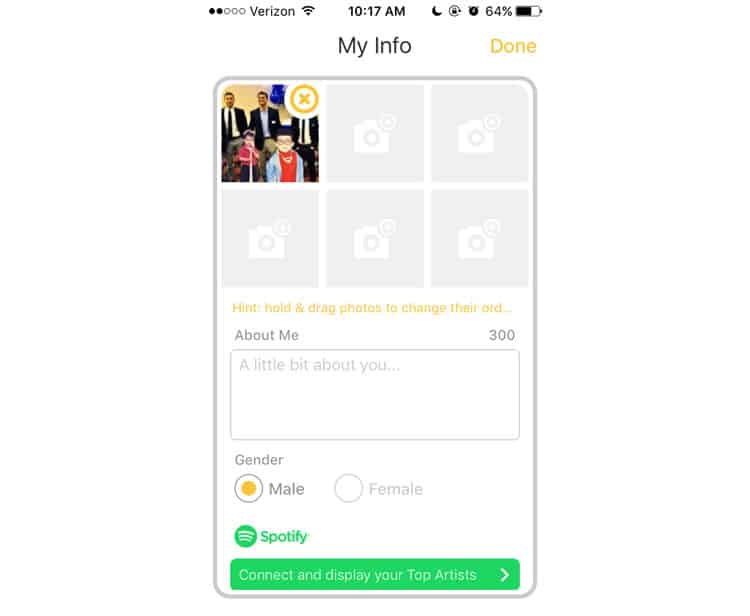
Overall, this screen’s UX is solid, but there is some room for improvement. Again, the “hint” that teaches the user how to reorder their photos is cut off, with no discernable way to see the rest of the text.
The ‘About Me’ default text is a bit redundant as well – we already know what the box is for. It is clearly labelled. Often, users do not know what to put in their bios, so I think Bumble misses an opportunity to make the default text more helpful. “What is your favourite movie?” maybe, or “what is the last concert you went to?”.
Satisfied with my profile, I tap the toggle at the top of the screen and navigate to the settings interface. A screen with a straightforward UX design, Bumble sticks to the standards.
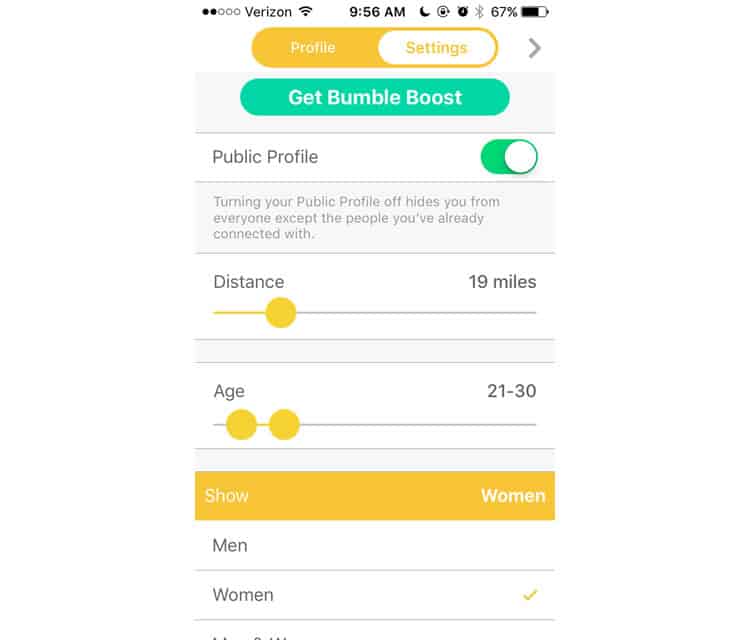
My only complaint is the sliders – it is a bit difficult to adjust your age and distance preferences precisely.
Final Verdict
While there are still some in-app processes we have not analysed (messaging, for example), we have covered a reasonable amount of territory in our diagnosis of Bumble. The app’s UX is mostly intuitive, sensibly borrowing the swiping app conventions Tinder invented.
There are some snags in the user experience, mainly the tactless pop-ups, the frequently cut-off text, and the obtuse explanation of their color-coded matches system. While these flaws are consequential, it is nothing an experienced UX design agency cannot smooth out.
Indeed, immersing yourself in an unfamiliar application is one of the best ways to study its user experience.
More from the UX Case Study Series
- UX Case Study: Google Maps vs. Waze Mobile Apps
- UX Case Study: Spotify Vs. Apple Music Mobile Apps
- UX Case Study: Acorns Mobile App
- UX Case Study: Lumosity Mobile App
- UX Case Study: Talkspace Mobile App
- UX Case Study: Zocdoc Mobile App
- UX Case Study: Calm Mobile App
- UX Case Study: Overcast Mobile App
- UX Case Study: SoundCloud’s Mobile App
- UX Case Study: HBO GO App
- UX Case Study: Venmo
- UX Case Study: CNN’s Mobile App
- UX Case Study: ESPN’s Fantasy App
- UX Case Study: Duolingo
- UX Case Study: Bumble ← You are currently reading this
Want to learn more?
If you’re interested in mobile UX, you could take the online course on Mobile User Experience. It includes templates you can use in your own projects and you’ll get an industry-recognized certificate to improve your career. If, on the other hand, you’d like to…
- learn all the details of Usability Testing
- get easy-to-use templates
- learn how to properly quantify the usability of a system/service/product/app/etc
- learn how to communicate the result to your management
… then you might take the online course Conducting Usability Testing.
Lastly, if you want to brush up on the basics of UX and Usability, the online course on User Experience could provide you with the necessary knowledge. Good luck on your learning journey!
(Lead image: Depositphotos. All other photos in this article are screenshots taken during usage of the Bumble app.)
