Branding is an essential design feature for any professional firm. Consistency across all mediums is a branding strategy that should not be overlooked. Developing an understanding of a user’s mental model, that is, what a user will need to use during certain situations, be it mobile or desktop, will ensure a positive user experience through consistency.
1. Define the Differences Between Desktop and Mobile
Identifying user tendencies, dislikes, backgrounds, and interests can be a great initiative for the design of a desktop or mobile solution because it helps in decision-making. Going one step further would be to develop an accurate understanding of the user’s mental model for each platform. Our goal here is to keep this understanding positive and engaging.
Some notable differences in mental models center around defining the essentials for our two environments: desktop and mobile. Outside of those elements that are specific to the platform being used, everything else should be consistent in design.
Let’s take a dating application that has both a desktop and mobile platform. As far as design consistency is concerned, everything ought to be in the same colors and logical flow. Some key, global features of such an application should be available on both desktop and mobile:
- Browse
- Filtered Search
- View Profile
- Messaging
Other secondary features should be available only on the desktop. The user will theoretically be willing to go through the dating website at length. A full feature list of options should be made available in this regard. A leisurely mental model motivates a willingness to have more usable features.
As for the mobile user we must assume there are situational restraints on how much functionality it can have as compared to its desktop counterpart (such as restraints due to a smaller screen and less processing power). However, this should not mean the mobile application ought to look and act completely different than its desktop version. It is just a question of availability. The mental model of the mobile user would create a need for location-based functions and viewing a profile. However, a larger effort needs to be made for images on mobile. This is a dating application after all and the image of a user profile is central to its purpose. Optimizing that for an easy user experience needs to be considered just from a design perspective.
2. Don’t Make Users Relearn the App.
The goal of any desktop or mobile application is to keep users engaged. In their initial onboarding experience users may go through some sort of tutorial or learn just by perusing. This is what motivates intuitive usability among similar platforms.
Of course gesture and navigation controls may function differently, but the information architecture of a desktop and mobile app’s structure or flow need to be similar. Introducing a foreign set of features is one thing that reduces consistency and may severely impact the user experience.
3. Don’t Confuse Your User – Brand by Cross-Channel
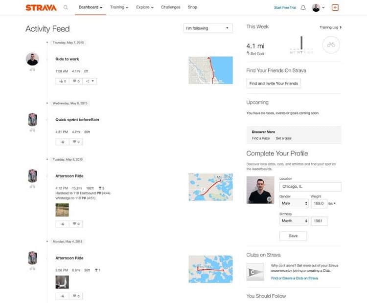
Let’s take the biking application Strava. This application has both a desktop and mobile version. The primary version is the mobile version which records the time the user was biking, his or her yeartodate miles rode, time, trips, a map based log of where the user traveled, and sharing functions for like minded bike enthusiasts.
For all intents and purposes the application tracks user data very well. In this aspect the mental model developed for the mobile user actually does have more features because it is designed as a mobile experience first. After all, users can’t really ride a bike with their desktop in their pockets! It goes as far as offering more in-depth data on their website, which is where an inconsistent design is apparent.
Their mobile design:

Strava’s mobile app is branded with a black and orange design frame. It remains consistent throughout the mobile app and provides a very modern UI at the same time.
On the other hand, their desktop site, which offers all the recorded data associated with a boarded account does not look like its mobile counterpart:

In terms of functionality, the desktop version looks somewhat similar to the application, but it is obviously a departure as far as the color scheme is concerned. In the long run this may confuse users and may turn them away from using the desktop as a resource. In this particular case it would involve a simple fix to change the color. The logos are the same across the platforms but it still leaves room for improvement in terms of consistency.
Considering theming throughout the design process commands a certain sense of uniformity. Elements of this need to be shared even on the desktop version. The sense of movement and
personal records, however that may be conveyed, needs to be shared among both platforms.
Imagery is also a key function in the design process. The maps with the sharing option in the above example are somewhat different. This leads to more work on the user’s behalf trying to delineate the functions he or she knows are there, but can’t identify the because the imagery or specific iconage is not consistent. Even typography needs to be consistent. Yes this is a cardinal rule but in some cases one design team works on one platform and another team works with something else under the same brand. Communication is key here for consistency.
4. Consistency is a Priority During Research.
In the research phase of design and development it is crucial that as a researcher you constantly evaluate if your mockups, wireframes, and prototypes look the same across different platforms.
This is particularly true if development is staggered and one platform comes before the other. It creates a sense of credibility and uniformity that can help integrate brand strategy into business-related measurables and decision-making. Uniform branding on applications makes the marketing aspect of a particular desktop or mobile app easier and more recognizable. All of this needs to be considered during the research phase.
In Conclusion
Incorporating design functions should have the intent of being seamless across channels. Considering the role of each function and its capacity to work well on different platforms means being able to do something on mobile and pick it up on desktop after, without any difficulty whatsoever.
Want to learn more?
If you’re interested in the intersection between UX and UI Design, then consider to take the online course UI Design Patterns for Successful Software and alternatively Design Thinking: The Beginner’s Guide. If, on the other hand, you want to brush up on the basics of UX and Usability, you might take the online course on User Experience (or another design topic). Good luck on your learning journey!
(Lead image: Depositphotos)
