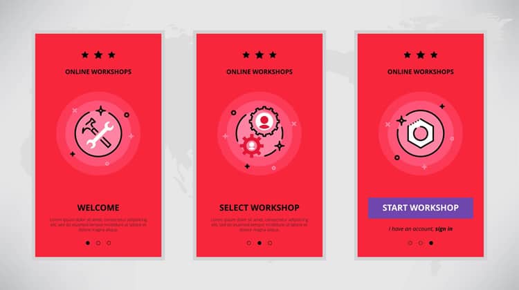
Once a user realizes the impact that a particular product has on his or her life, the odds of them continuing to use that product increases immensely. Unless the user truly “gets it”, they will most likely abandon you and look for a better solution.
That moment of wonder, when they realize they must continue to use that product, is what we call the “wow” moment. Every successful product is looking to create that moment, be it prototyping software made for Interaction Designers or a tool for sales teams. User onboarding is about constructing the journey that takes users to that moment – everything that happens between the first time a user signs-up until the point they say “wow.
We will now walk you through how to identify this moment and how to construct your onboarding journey (and what makes for great user onboarding). We will show some examples of products that do a good job at it and point you to tools that can help you in the design process.
Why is User Onboarding Important?
If you dive into the analytics of new products, you will observe that in the majority of them, users create new accounts, try out a product briefly, maybe just once, and never come back. The company then tries to get that user back, more often than not by sending emails which, unsurprisingly, rarely work.
The reason why this happens is because the user did not “get” why that product is relevant or how it will improve their life in the first place.
There are enough alternatives out there so it is easier for these potential users to find something else, instead of spending time trying to figure out your product. Winning them back is really tough because the first experience really matters – a lot.
For example, picture a sales team.
They might look for a new sales tool if their current solution does not allow them to properly manage leads. When they arrive at your product, they will have two key questions in mind: “How does this work?” and “What should I do first?”.
If they feel overwhelmed, lost, and if after some time using your product, they still do not know how it works or what to do, the easiest thing is to move on to something else. It does not matter the effort you spent to get them there in the first place. The marketing dollars are irrelevant if onboarding is terrible.
On the other hand, if you offer a solid user onboarding experience, users will quickly know what your product is for and how it works. And if they see you as the solution to their problems, they will not need to look for another one. Instead, your product will become a part of their workflows.
You will also observe low churn, higher retention, higher profits, more word of mouth referrals and higher customer satisfaction.
What Makes a Great User Onboarding?
It is unique
The first thing you have to have in mind when working on your product’s user onboarding experience is that the actual experience will be unique to your product. However you construct your onboarding needs, you must have in mind what is it that you are solving, for whom you are solving it, and what value you will bring to the table.
What works for one company and one product might not, and probably will not, work for another company and another product. Put in the hours, do the research.
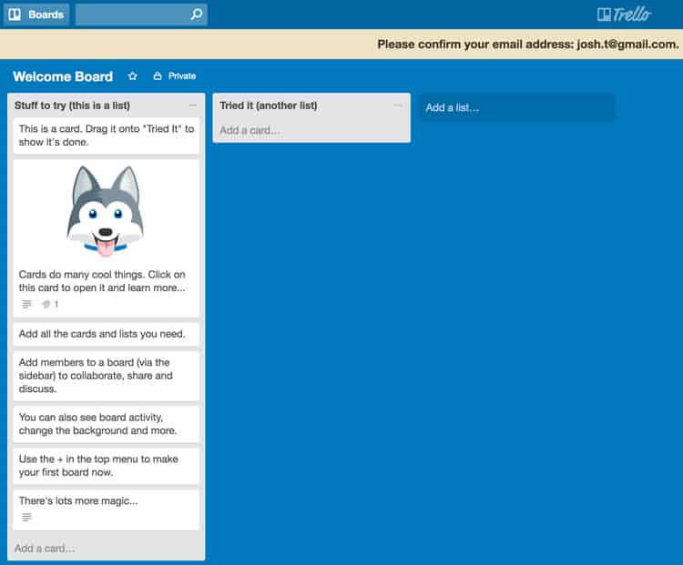
Trello is a good example. They have created a unique onboarding process that takes account of their own interface and value proposition. When you open the “Welcome Board”, you will notice cards in the first column telling users about their features.
It is not time consuming
You want to get the user to reach the “wow” moment as soon as possible. Their time is valuable and the more time that has to be spent before the user understands you how will you make life better, the greater the chance that they will give up. So, the golden rule is: do not create long onboarding experiences. Create short, effective ones.
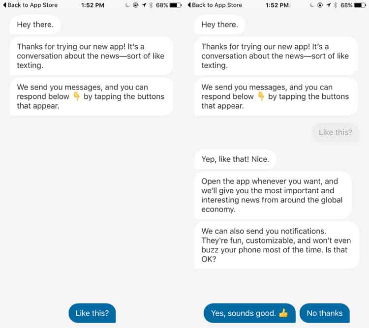
The Quartz app is really good at doing this. It plays with its conversational UI to get the user up to speed in just a few text messages. In less than a couple minutes users know what the product is about and can start experiencing it.
It is not a feature
You do not have “onboarding” as a tick box in your design process as though it is a feature you can add to your product. Onboarding is built when you build a user experience and not when you decide to add a few introductory screens. You cannot expect the user to read them and suddenly go “oh yes, now I understand”.
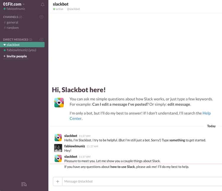
Slack is a great example. After introducing you to a few basic features via tooltips, the “Slackbot” remains available to serve as your bridge with the platform. It will help you complete your profile, set-up notifications and more, using a conversational UI. After this initial onboarding, it will remain useful by integrating with multiple products and services.
It is about value, and about how your product creates value for the user
Surprisingly, great user onboarding experiences are not about the product showcasing itself. It does not involve telling your customers about all the cool things your product does, or how good it is in doing all of those things. It is about making sure the user actually gets value from your core product. The rest will come later if onboarding was done correctly.
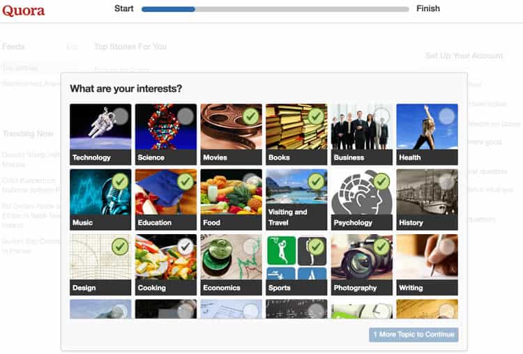
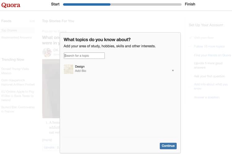
Quora does a really good job at this. When you first create an account, you will have to select a list of interests and areas you have knowledge in. It not only helps the platform show you relevant content right off the bat, but also makes the user excited to see what will come out of their choices.
It is about momentum
Last, but definitely not least, it is about momentum. It is about making users excited after experiencing the “wow” moment that has them eager to explore the product and learn more about it. It is about making them so happy that they have found a solution that they look forward to using it in their daily routine. A truly great onboarding experience will make the user feel good about that new tool, and not dread having to use it.
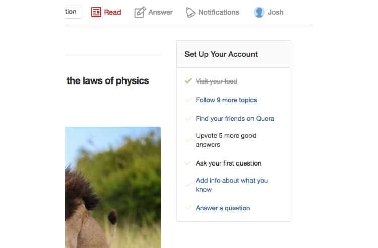
Once again, Quora nails it. The question and answer site shows you a checklist of things to do when you start to use the platform, and each new item improves the user’s experience. It allows a momentum to be built.
Identifying Your “Wow” Moment
Since the onboarding experience revolves around getting the user to experience the “wow” moment in your product, knowing what that “wow” moment is and where it is located is essential. It is not an easy job – and most of times it is far from being obvious.
Understand who you are and who your customers are
The first thing you should do is understand the company you are. What is the problem you are trying to solve? How are you solving that problem? Who is your target audience? Why is that your target audience? List out everything you know about that audience. Have detailed questions for these answers. (You should know this anyway, not just for working on onboarding.)
Define success
What are your key performance metrics? In other words, what does success look like for your product? In order to achieve user retention, this could mean Week 8 retention, for example. If that is the case, then what correlates with Week 8 retention? You need to do two things in order to both assess this and answer the questions.
Talk to customers
This is a must, and something you should be doing anyway. Identify customers who represent your target audience and reach out to them. Ask them about why they are using your product, what aspects of it do they love the most, what are the killer-features for them that competitors are lacking. Understand their perspective and, when talking to users about their onboarding experiences, try to observe patterns.
But do not only talk to successful customers who are still paying. Try to reach out to customers who churned out. Those who created accounts but never came back, those who stopped paying after a brief period of time. Try to learn what happened. Were their expectations met? What did they need? What could you have done differently? You will gain valuable insights as to what you could have done and that will impact your overall user onboarding experience.
Look at data
Last, but not least, you must look at data. Use analytics and event tracking platforms, observe how users use your product and try to cross-refer that with what you learned from the interviews. What paths lead to better user retention? How does the behavior of churned users differ from the behavior of successfully retained users? Data is important, so put the hours in here.
And keep trying
This is not an exact science. There is no right or wrong process. Most likely you will not discover the “wow” moment in your first attempt, and that is ok. Remember that trying and testing is the key. It is an ongoing search and for every fail, grow from what you have learned through the research and use that to get closer to the right result next time. As I mentioned in the beginning, identifying your “wow” moment is not an easy job, so it will take effort and research but it can be done.
Onboarding Patterns
There are several ways to build a user interface in a way that will lead the user to their “wow” moment. If you decide to go through web and mobile apps, you will notice that it is possible to draw a few common UI patterns from them. These range from welcome messages to product tours. Below are a few examples.
Progress bars
You choose to sign up for a website and start by filling out basic account details. With an account now created that is giving you access to the product, you might see a progress bar showing the proportion of progress already made towards completing the full form. You might feel compelled to fill that bar a little more. Then a little more. Just so you can see its completion and feel good.
It is natural for humans to feel compelled to complete tasks they are given. You can play with this by including progress bars in your UI, which in turn will incentivize new users to go through your onboarding flow. To make them feel as if they were closer to completion, start your bar with a good percentage of it already filled, and make sure that they will experience the “wow” moment while completing the bar.
Hotspots
Context is key. What your user needs will depend on where they are currently located in your product. Two different features will most likely require different guidance for the user to comprehend them. Hotspots, a familiar pattern in SaaS tools, provide exactly that contextual help in a non-invasive way. They are not usually as invasive as tooltips or popups and can have different animation intensities depending on their importance. Hotspots can be ignored if the user feels more comfortable doing things by themselves or if they already understand how the product works.
Welcome messages
Welcome Messages are pretty ubiquitous in onboarding experiences. They are one-time greetings that are shown to new users and usually go a little further than just saying “Hello”. They are an opportunity to guide the user to action. Since they will be clearly visible, non-invasive and feel warm (as in, welcoming), they are the perfect opportunity to guide the user to a workflow or feature that will provide value. When designing a UI you should make sure that there is clear visual contrast between the message and the rest of the application to make sure the user actually notices it.
Product tours
Product Tours guide the user through a workflow to enable them, in the fastest and smoothest way possible, to reach the “wow” moment and experience how the product will improve their life. How exactly product tours are presented in a UI varies. They are often in the form of tooltips, but simple arrows or overlays could be used.
It is not easy to create a good product tour. Unless it is short, concise, easily digestible and relatable, the user will have an impulse to get rid of it so they can do their own thing or try to figure it out by themselves. Also, never create a product tour that shows the user writing on screenshots before they are actually using the product. When properly crafted with good copy, product tours are a fantastic onboarding tool.
Do your research
These are just some of the patterns out there. You might find that one or more of these examples works for your product and your users but alternatively, you might find that none work or that you will have to come up with something new. Whatever you do, make sure to do a thoughtful job and do your research. Understand what you are trying to do and look for the best way of doing it. The idea here was for you to become familiarized with what other products do.
A Quick Note
Do not only focus on the UI. Although I mentioned a few UI patterns you can use, and of course, constructing a UI will be a part of your onboarding mechanism, do not think that good onboarding is just part of your actual graphic interface. It will also involve the emails you send during the customer’s lifecycle, blog posts, calls, customer support, and much more.
As Usual, Test and Iterate
It is worth mentioning once again that constructing a good, solid user onboarding experience that results in better metrics is not an exact science. Instead, it is the result of a highly iterative approach.
You will probably find along the way that your assumptions were wrong. That the “wow” moment you were so sure of turned out not to be the real one. You might find that you used the wrong UI approach and possibly dozens of other things – but this is absolutely fine. It is part of the process so make sure to include usability testing early on. Get your users involved, test along the way and re-iterate after you learn from each testing session.
Tools You Should Try
You will find multiple tools, from open source to SaaS, that will help you build onboarding experiences that encompass several (if not all) of the patterns I mentioned in this article. Once you know what you want to build, it is worth doing a search for the best ones out there. One of them might be right for you.
Speaking of tools, one of the tools that comes to mind is Intercom. They provide a suite of products for live chat, marketing, support and feedback. You can add their chat button overlay to key areas, for example, where you find that most of your customers have difficulties. There is also AppCues. From Welcome Messages to Product Tours, their product allows you to implement a wide variety of different onboarding UI patterns. They also integrate with other apps and allow for A/B Testing. These are of course two tools that I have used but like I said, there are others that you may actually like more.
That brings us to the end of this article, which I hope has served to tie in some of the loose ends that you may have had about onboarding. While hoping to have covered most of the areas, if you think I should include other aspects, please do suggest in the comments below.
Want to learn more?
If you’d like to…
- get an industry-recognized Course Certificate in Usability Testing
- advance your career
- learn all the details of Usability Testing
- get easy-to-use templates
- learn how to properly quantify the usability of a system/service/product/app/etc
- learn how to communicate the result to your management
… then consider taking the online course Conducting Usability Testing.
If, on the other hand, you want to brush up on the basics of UX and Usability, then consider to take the online course on User Experience. Good luck on your learning journey!
(Lead image: Depositphotos)
