Have you ever played Go?
The board is plain and straightforward, the objective of the game is self-explanatory and the rules of the game are very few and pretty logic.
Nonetheless, the game is infinitely more complex than other strategy games like chess because every new stone on the board creates a universe of new possibilities that not even a supercomputer can deal with. That’s why it is so extraordinary that a machine won against a human opponent at a game that involves pure strategic thinking and intuition.
Complexity in the game is not connected to the interface as it happens with other games like craps or a flight simulator. Complexity, in this case, is connected to the processes that lead to the objective of the game and is linked to the fact that each decision is a door that leads to a corridor full of new doors.
Each door is clearly marked but the problem is following the right steps throughout the entire process and reach the goal in the most efficient way.
Game developers introduce complexity in steps, the more users become familiar with the environment and its rules. And players are onboarded directly within the very same application.
Why Should Software Contain Walkthroughs
Most of the software out there follows rigorous design rules which draw from familiar elements that create an almost universally accepted language and information is structured in ways that facilitate usability.

So, why are software walkthroughs necessary despite all the great UX design features and specific UI nuances?
Because the problem has nothing to do with the interface or information architecture.
The problem with certain applications (especially in the B2B sector) stems from the complexity of the processes.
Users are totally onboard with the interface and know exactly where they are but don’t know how to go from A to B in the most efficient way.
Additionally, we all explore new environments using experience and proxies. Our background determines how we interpret signals and there will always be a group of fringe users who don’t have the knowledge of the main target group.
How to Implement Guidance
If a product is essentially doing a very limited amount of simple tasks that don’t require many steps, decisions, setup or customization, there really is no need to delay direct experimentation.
A very inefficient way of using on-screen guides is showing people around the interface.
I’ve seen that quite a few times when trying new software. A set of speech bubbles and arrows pointed at elements within the UI telling me what each icon, button or drop-down menu did.
At one point, I was informed that the ‘New Project’ button would open a new project…you don’t say!
Software walkthroughs should be used to explain processes within the application, not the application itself.
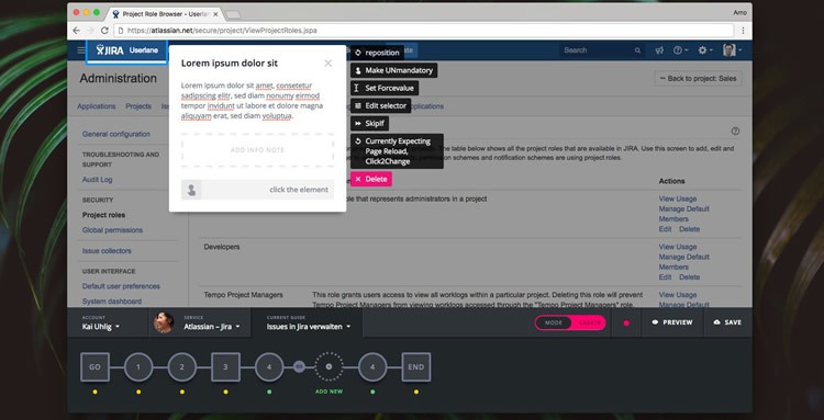
Guides should be interactive and steer people through the actual application so that users are actively involved and accomplish tasks.
Guidance helps users to quickly reach their goals and be productive with a solution without any frustration or delay.
In a CRM solution, for instance, interactive guides shouldn’t be implemented to present all the different tabs.
However, a walkthrough would be very handy when a user needs to merge and export multiple reports with different filters or when they need to connect specific actions to triggers generated by external events logged in other platforms.
Additionally, guided tours should be optional. Expert users should not be forced to go through a whole onboarding tour if they’re already familiar with similar applications.
When to Deploy Software Walkthroughs
Software walkthroughs are particularly effective as onboarding tours.
This delicate phase permanently sets the mood for the relationship that a user will have with the brand.
What trial users expect is to be able to sign up, set up the whole environment and see an immediate output without going back and forth from Q&As, video tutorials, or forums.
When onboarding new users, interactive guides need to steer people through all the steps that are necessary to successfully use the application while also presenting unique features and benefits in the correct order of complexity and importance.
Users who:
- Immediately comprehend the purpose of a product
- Can quickly achieve the first results within the application
- Are aware of the benefits of that specific solution
are happy users who will be a lot more likely to turn into loyal, paying customers.
And this can only be achieved through a seamless integration of UI design, UX design and support.
Walkthroughs are also beneficial at later stages, when users need to perform complex operations.
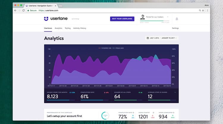
Userlane is not a solution that aims to replace UX design. Userlane is a proactive tool that product managers, product marketers and UX designers need to implement to enhance customer experience and to ensure customer success.
Disclaimer: This content is sponsored via Syndicate Ads.

Want to learn more?
Want to get an industry-recognized Course Certificate in UX Design, Design Thinking, UI Design, or another related design topic? Online UX courses from the Interaction Design Foundation can provide you with industry-relevant skills to advance your UX career. For example, Design Thinking, Become a UX Designer from Scratch, Conducting Usability Testing or User Research – Methods and Best Practices are some of the most popular courses. Good luck on your learning journey!
(Lead image: Go (Game) Courtesy of Depositphotos – affiliate link)
