
Simply put, the term heuristics means to find, discover, or determine. In a broader sense, heuristics can be taken to mean a problem solving approach that employs practical methods to form judgement that aids in decision making.
Heuristics were first introduced by two Israeli psychologists, Amos Tversky and Daniel Kahneman, who divided them into three categories:
- Availability
- Representativeness
- Anchoring and adjustment
Soon after, psychologists added many different heuristics, including control, contagion, effort, familiarity, fluency, and social proof, to the list.
The theory of heuristics is applied in many fields other than human psychology. Jakob Nielsen developed 10 usability heuristics for evaluating software interfaces in the late 90s. After that there has been no looking back – heuristic principles are now applied to everything from web design to chat bot algorithms.
So let us now examine how some of the Jakob Neilsen’s heuristics apply to email marketing.
Visibility of System Status
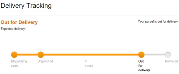
In UI parlance, visibility of status can be interpreted as a notification or a system that demonstrates the progress of a task. The simplest example would be of the progress bar you see on your computer or the checkout progress bar that shows you how many steps are remaining in an online purchase. The progress bar allows you to discover the progress of a task.
You can apply this principle in emails in many different ways. My first example, a tad predictably, comes from Amazon. Their order, shipping, and delivery confirmation emails serve a dual purpose – 1) you are always on top of your package’s current location and 2) they are always on top of your mind (inbox) until your order is delivered.
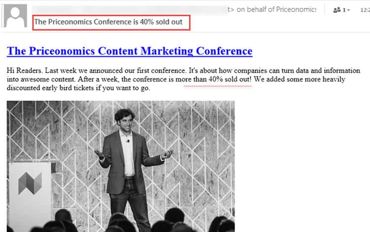
If you are selling goods, tickets or subscriptions, you could also try being transparent about the actual numbers instead of trying to lure customers with “Only Few Left,” “Seats Almost Full,” “Stock Running Out,” and so on. The following email shows the exact status of a conference, leaving out all ambiguity, which most email subscribers would respect.
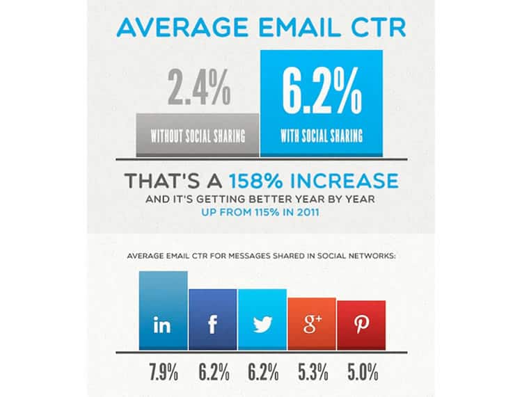
Finally, do not forget to also add those ubiquitous social media sharing buttons to your emails. Social media has become an integral part of brand building and without a doubt enhances your brand visibility. In fact, emails with social sharing buttons generated an improvement of more than 150% in CTR than those with none as can be seen in the infographic below.
Match Between System and the Real World
Jakob Nielsen emphasizes speaking the language of your users, with words, phrases and concepts familiar to the user, rather than system-centered jargon. He also insists on making information appear more natural to the user.
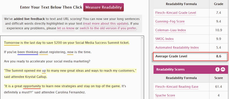
When sending emails to customers and clients, use shorter sentences with simpler words. Try to keep your Readability Index around 5 and Grade Level around 8. I tested an email from Social Media Examiner for readability and it passed with flying colors. They have also used common and conversational phrases such as “Now is the time” to make the text read more natural.
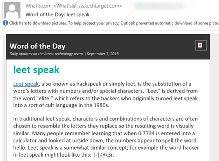
You can also simplify your business by making it easier for subscribers to understand what you do. I receive a “Word of the Day” email from WhatIs on a regular basis – a godsend because they allow me to expand my knowledge of the tech industry, one word a day. Most importantly, they simplify these terms, giving real life examples so I can understand them easily.
User Control and Freedom
Nielsen’s third heuristic states that users need a clearly marked “emergency exit” so they can leave without having to go through an extended dialogue. This is very appropriate for email marketing. Based on this heuristic, we can unanimously agree to the following:
Always make the unsubscribe button prominent. Further, make the actual unsubscribe process simple, with just one click or tap if possible.
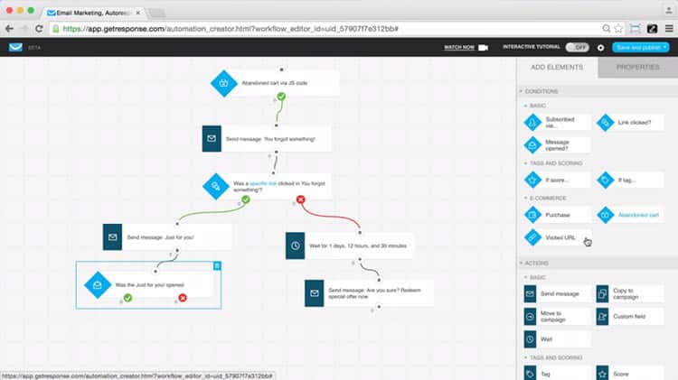
Popular email marketing tools and solution providers have traditionally offered a one-click unsubscribe button as well as customizable templates for better personalization. This feature has been left simple because it is effective. This functionality contrasts sharply with the trend of how email marketing providers have evolved whereby leading providers such as GetResponse are nowadays offering entire “email marketing solutions” that enable users to perform more complex functionalities that would have otherwise required development skills.
Consistency and Standards
This one is pretty self-explanatory. Your email campaigns, especially the tone, should match the overall tone of your website and marketing campaigns. Stick to the theme of your campaign; it will reinforce your brand’s image as well as message in recipients’ minds.
The best way to maintain consistency in emails is to create a newsletter template. For instance, if you have always been sending out emails with a blue background and a formal tone, do not throw users off balance by sending a bright red email with hearts and unicorns.
Also ensure the tone of your emails match that of your website and other marketing material. While Amazon has a lot of data and knows what works, it may still come across as an unemotional company because of their formal, business-like emails. On the other hand, Zappos’ emails are cool, and sound as if you are having a conversation with a friend.
Error Prevention
Error prevention is an essential part of a good email marketing campaign.
- Always use spelling and grammar checking services before sending out any email – Grammarly is easily one of the best.
- Follow the APA format to prevent any discrepancies in punctuation, abbreviations and presentation of numbers and statistics.
- Make sure you double check the subject line as well as the TO, CC, and BCC fields before hitting Send.
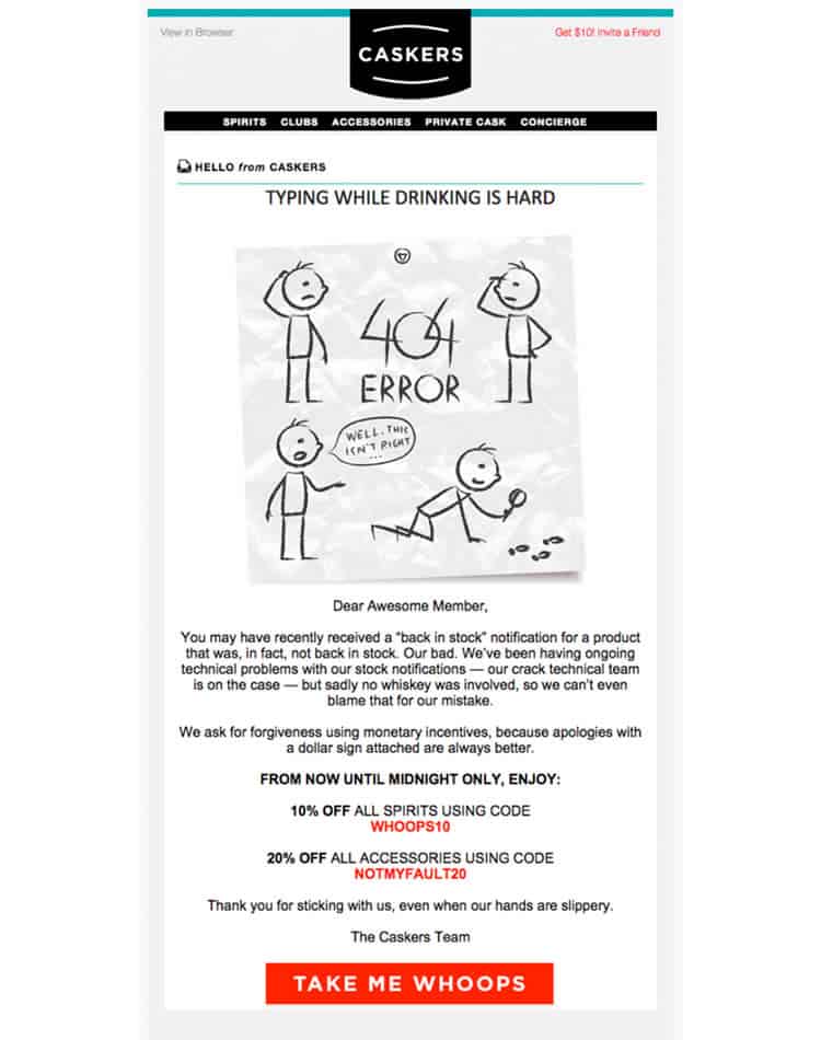
In spite of everything, if you do mess up, fess up, try to laugh at yourself, and make amends. When booze brand Caskers mistakenly sent out back in stock emails to their customers, they made it up with a funny email and discounts:
Recognition rather than Recall
Your email subscribers have to deal with more than one email in a day. When they are scrolling through their inbox, you do not want them to give your email a quick skim and hit the Delete button.
The first step to build recognition is to maintain consistency, which we covered in the third point. Subscribers should at no point have to wonder when or why they agreed to receive emails from you. On the contrary, the moment they see mail from you, they should know what you are getting at. The best emails in my inbox – TechTarget, Priceonomics, The Daily Egg, and Best Ads on TV, have had the same pattern and template for over a year, to the best of my knowledge. This helps immensely in building brand recognition over time.
You can also minimize the load on users’ memory by simplifying (and cutting down) your messages and giving each mail a central, unambiguous focus with a clearly visible call to action.
Flexibility and Efficiency of Use
Use accelerators that can speed up the interaction for returning and advanced users. Also allow users to choose templates, content and email frequency.
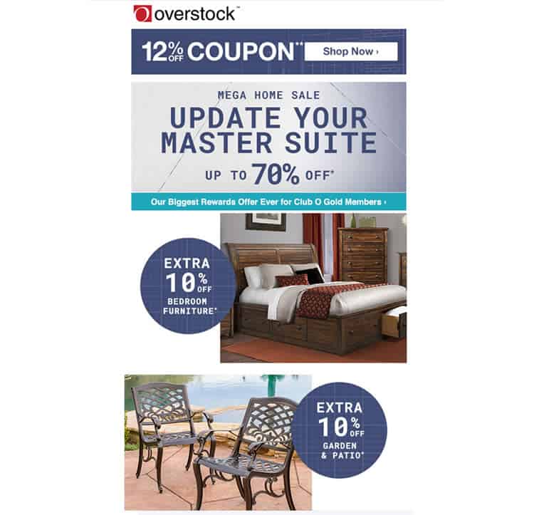
For instance, in the Overstock.com example below, you can see the 12% off coupon for regular users and the 70% off coupon for their Club O Gold Members at the top. These are followed by other campaign/category-specific offers. Such prioritization allows frequent buyers to quickly click through without having to scroll down to see other options that might not interest them as much.
Aesthetic and Minimalist Design
“Dialogues should not contain information which is irrelevant or rarely needed,” Jakob Neilsen wrote in way of explaining this heuristic. Truer words have seldom been spoken when it comes to email newsletters. Most emails from drip campaigns read like essays, fluffed with unnecessary and irrelevant images.
Use a minimalistic design which is aesthetically pleasing on both desktop and mobile screens. While the perfect mix of content, design and deals is hard to come by, you should certainly strive for it.
Summing Up
Other than Jakob Neilsen’s heuristics, there are a several others that can be applied to your email newsletters. You can determine heuristics based on what works best for you by A/B testing your emails. Today’s email marketers are lucky in that there are many marketing automation tools that allow you to track a variety of metrics and get unique insights. You can easily customize your analytics to find out how well your heuristics are working for you.
Want to learn more?
Are you interested in the managerial and strategic aspects of UX? The online course on UX Management and Strategy can teach you the necessary skills on the subject and earn you an industry-recognized course certificate to advance your career. If, on the other hand, you want to brush up on the basics of UX and Usability, the online course on User Experience might be a better fit for you (or another design topic). Good luck on your learning journey!
(Lead image source: Unsplash – Creative Commons)
