
In Part 1 of this article, we have seen the usability problems encountered by users when they try to book cinema tickets for kids on a Saturday morning. The websites that were tested were all UK cinema websites: CineWorld, Empire Cinemas and Odeon Cinemas. This article shows two other tasks that were performed by users during the same usability testing session, namely the purchase of a ticket and the reservation of a preferred seat from each of these three websites.
Buying a Cinema Ticket Online
Conversely, the second part of our user experience test produced more positive results and comments all round, though not without some aggravation.
We asked our users to find a film they and two friends would genuinely want to see, and to book three tickets – seats together if possible – and to make some amendment to their booking along the way.
In the test, most users decided on the film they wanted to see and appeared to make the assumption it would be showing at a cinema local to them. They began by using the ‘quick start panels’ on the right of each site’s homepage:
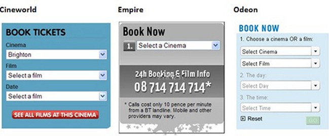
Both Cineworld and Empire insist that the first step is the choice of Cinema. On the other hand, Odeon offers users ‘Select Film’ as a helpful alternative starting point and subsequently displays only those cinemas showing the selected film.
Cineworld caused confusion with their apparently arbitrary order of films – in particular the 2D and 3D prefixes. One user decided Transformers was not showing at her chosen cinema despite it being available in both formats. At least Empire grouped formats effectively. Odeon wisely added the format as a suffix, understanding that most users will initially search alphabetically, but let themselves down through inconsistency:
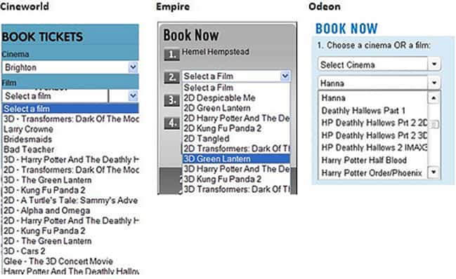
Some users commented on how they would want to plan a specific night out and hence they would prefer that the date is the determining factor. In this regard, they would choose where to go and what to see. This was not an option on any of the sites.
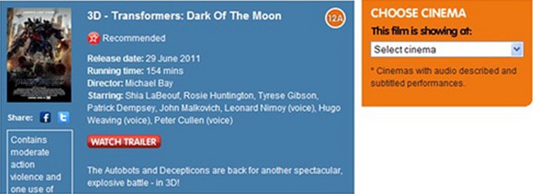
If proceeding to book at this point, users found all three sites to be relatively easy, straightforward and obvious, but stumbled and hesitated if they accessed a specific film’s own page.
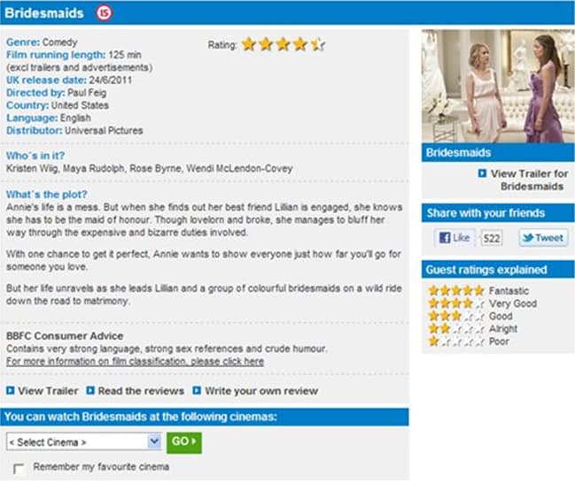
On Cineworld, users found the contrasting orange ‘Choose Cinema’ panel jarring and looked for a ‘Book Tickets’ button:
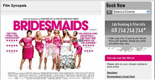
Whilst Empire thoughtfully retained the ‘Book Now’ form, our users expected it to be “intelligent enough” to pre-populate with the film featured in the synopsis:
Users found Odeon dealt with this a whole lot better, providing helpful information and an opportunity to view the trailer and choose a cinema all in the same place. However, a consistent ‘Book Now’ button would have been preferable:
Choosing The Cinema Seat
Seat selection caused the most drama and while users liked Empire and Odeon’s seat plan idea, the difficulty they experienced and the amount of learning that was required to book specific seats made them question the benefits. Watch this clip to see one user face the challenge presented by Empire:
http://www.youtube.com/watch?feature=player_embedded&v=iwuVg4Nx-AI
Clever vs. usable: ?Odeon works in a similar way, but they include some on-screen instructions and now, with some experience behind them, our users managed to the select the seats they wanted. However it did provoke the following response from one of them: “I’m sure somewhere there is a very very proud designer but it’s not necessarily the most easy thing”.
In this part of the test none of the three sites ran away with gold, but if forced to decide it appears to be a toss-up between Cineworld for its ease of booking, and Odeon for all the important information being available on the same page. Empire’s difficult seat selection setup definitely pushed users towards the other two.
Conclusion
Yet again, simply by observing users attempting to complete tasks on a website has revealed
very significant usability issues that are causing frustration for the three cinemas’ customers, so much so that some users said they would find using the phone easier!
All in all, far from the pleasurable experience it should have been; perhaps some Harry Potter wizardry was required!
Want to learn more?
If you’d like to…
- learn all the details of Usability Testing
- get easy-to-use templates
- learn how to properly quantify the usability of a system/service/product/app/etc
- learn how to communicate the result to your management
… then consider to take the online course Conducting Usability Testing.
If, on the other hand, you want to brush up on the basics of UX and Usability, then consider to take the online course on User Experience. Good luck on your learning journey!
(Lead image: Depositphotos)
