
Mobile Apps are born from ideas, substantiated by a purpose. As entrepreneurs, designers, or developers, our job is to give our users and customers a wholesome experience – we should help them get a smooth customer journey from start to finish.
According to research, nearly 65% of users form a negative view of a brand with a poor app experience. What becomes crucial, then, is to simplify the interface design so that users have hassle-free access to solutions of their problems.
In his article, Usability: Navigation is More Important Than Search, Gerry McGovern reveals that 70% of the technical audience started the task by clicking on a link; 30% used search.
With this in mind, navigation becomes a crucial part of user experience and usability since it requires little effort. In this article, we will look at the different types of Navigations, their functionalities, and their advantages.
However, before we get there, here is how Amazon casts the spell of excellent user experience:
A Peek Into Amazon’s History
Amazon began as an online bookstore to meet the global demand for literature with a large number of titles under its wing besides selling compact discs, computer hardware, computer software, videos the following year.
Eventually, Amazon evolved as an e-Commerce giant that sold (and still does) almost every retail item imaginable.
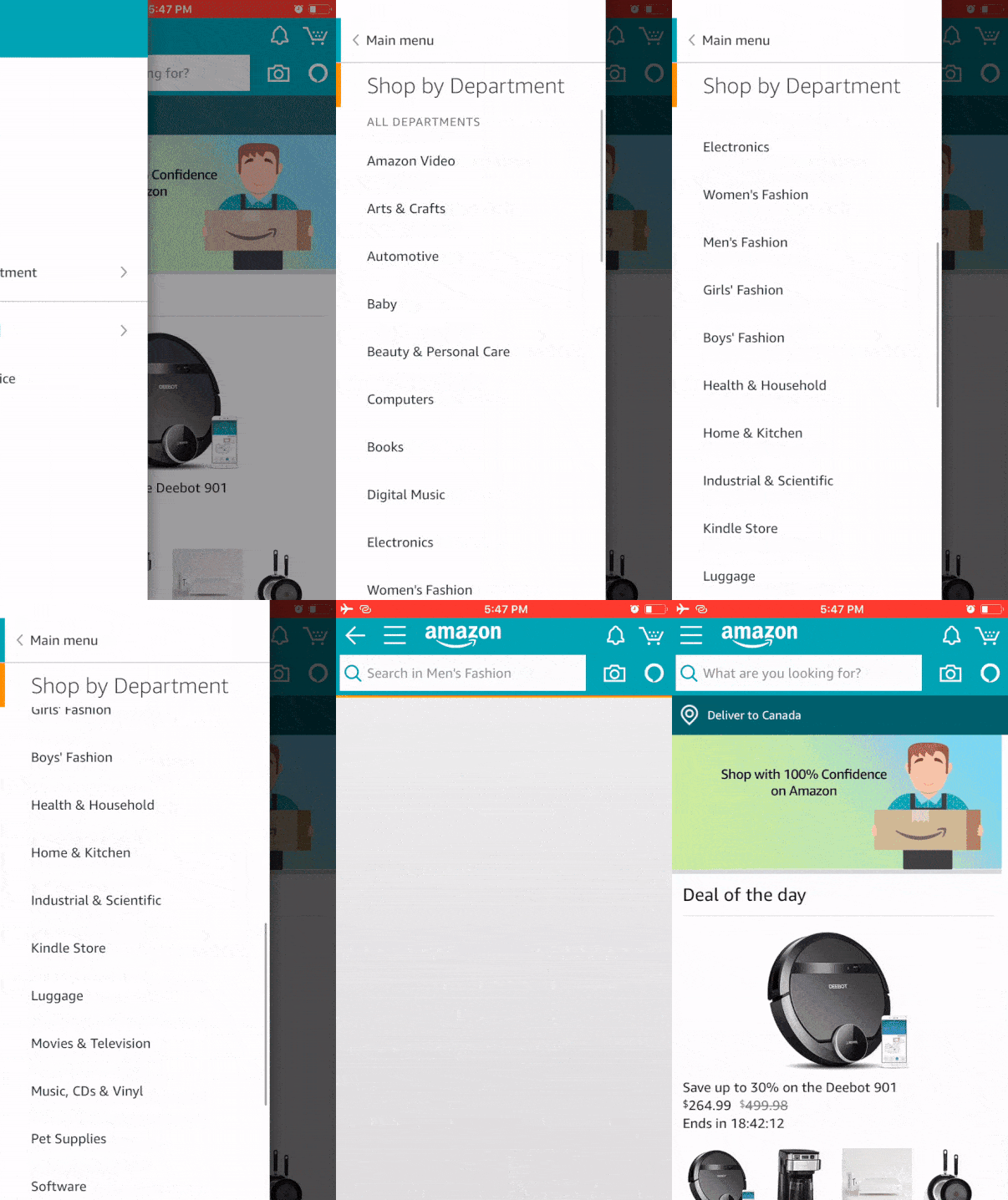
Despite having more than 606 million products and adding 1.3 million products every day, Amazon manages to neatly distribute commodities into categories and department.
Its navigation spells simplicity with clarity. Users can shop, track, view, and sell products without having to go through trials and tribulations of searching, typing, or getting the brand/product name right.
Now that you have a firm grasp of the significance of good navigation, user flows, and customer journeys, then let’s get started with the top mobile navigation patterns:
1. Full-Screen Flat Menu Navigation
If you are building an app as a knowledge/information sharing or skill-building platform, Full-Screen Navigation should be your go-to option.
On a 5-inch screen, excessive information could not only intimidate users but also confuse them. To give your users an impressive experience of what you have to offer, categorising your content becomes key.
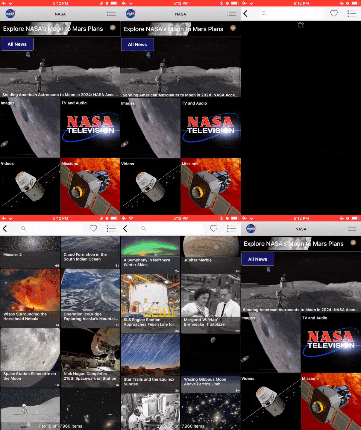
A classic example of Full-Screen Navigation is the Nasa App. It showcases a vast collection of their latest developments labelled under several categories such as Images, TV and Audio, Videos, Missions, Featured Stories, and Tweets.
Here, the full-screen navigation allows users to consume content in large amounts without distracting them from their primary goal. They can move back and forth in a category and to the main menu by clicking the back button on the top left.
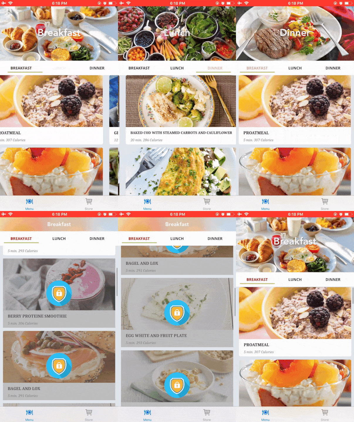
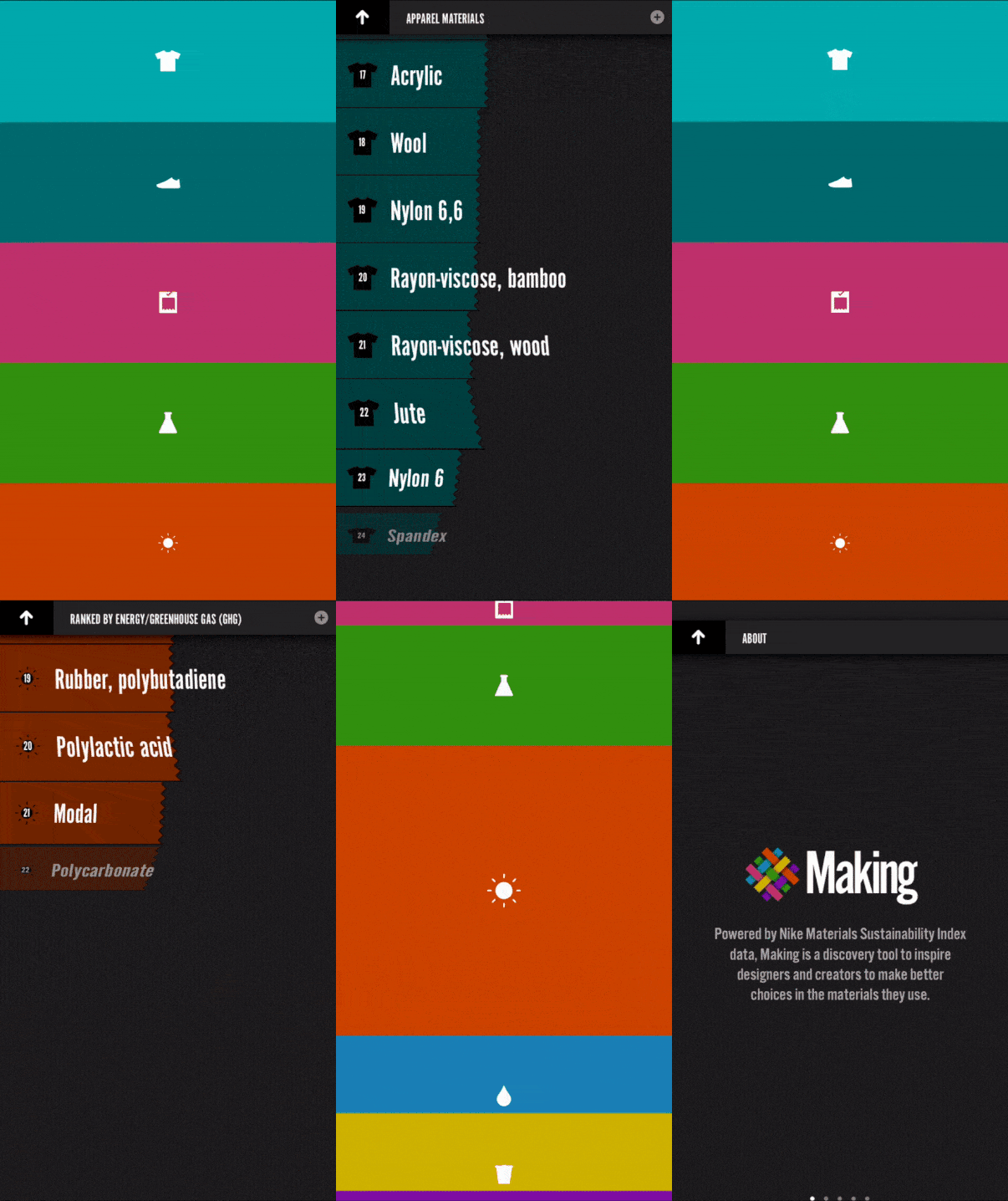

2. List Type Menus
Popularly known as the Hamburger Menu, this compact actionable button, placed on the top left of an app, acts as a façade to accommodate a lengthy list of contents.
This pattern allows designers to steer less essential elements away from the main screen and into the side panel.
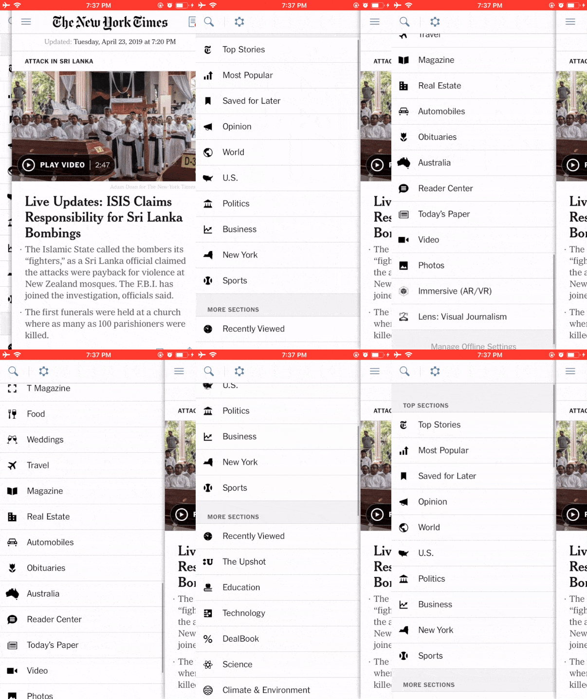
The New York Times beautifully divides its menu into two: top section with ten popular categories and more segments with an extended list. The moment users enter the app; they see current news headlines, intended to get the readers up to the speed of new developments.
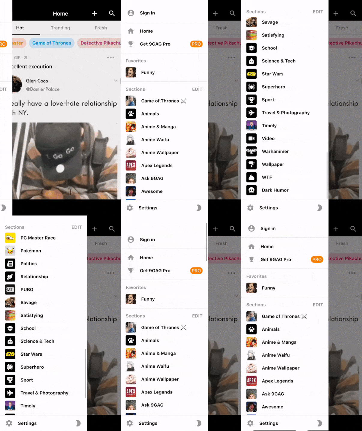
This pattern allows designers to clean the main screen off less critical content and manoeuvre it into the side panel.
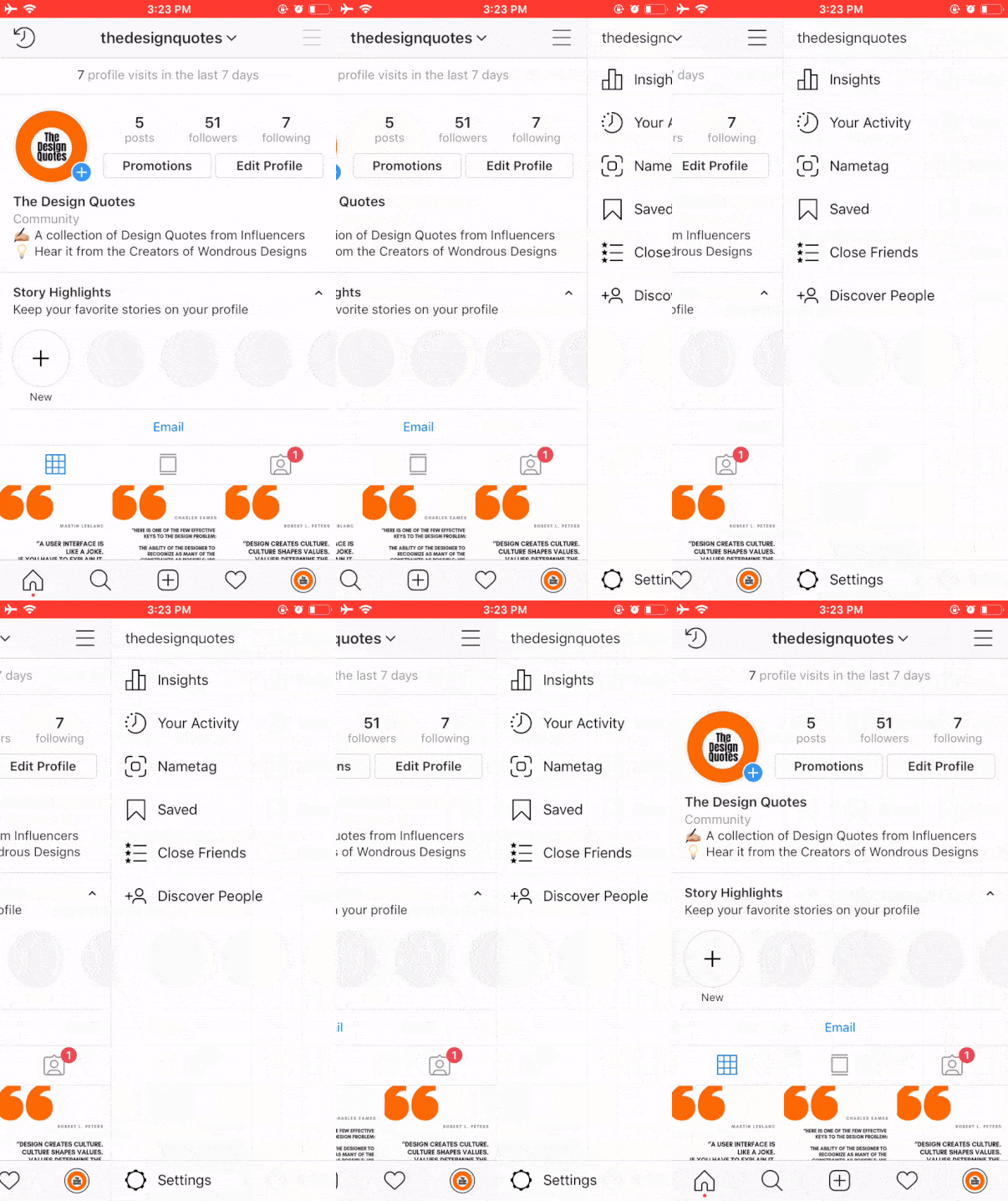
However, this pattern is not limited to large lists alone. Many apps hide elements like Profile, Help, Settings, Bookmarks, and similar others that are less used or have little contribution to the primary experience.

3. Bottom Bar Menu
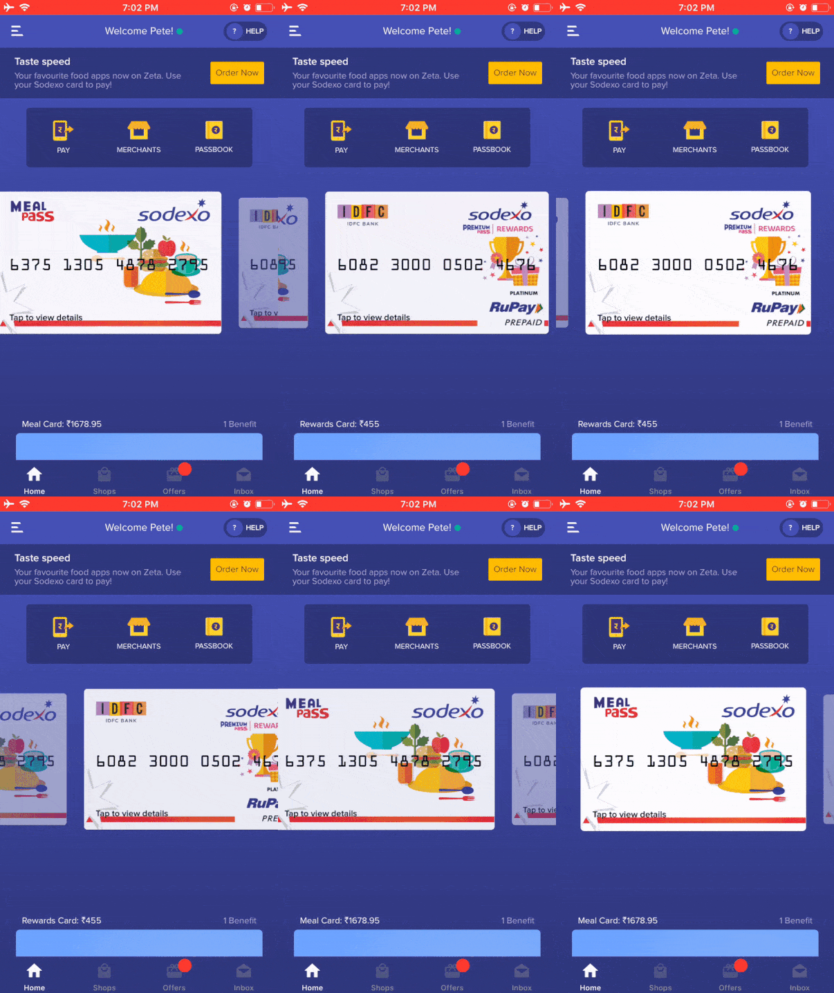
The Bottom Bar is a sticky menu that comprises hotkeys pinned to the foot of an app. It gives users direct access to the features that propose the value of your offerings.
However, this menu can get tricky and backfire if not done right. The two cardinal rules to bear in mind:
- Keep not more than 5 keys in the shelf.
- In case you are not adding text, create buttons that are comprehensible.

The Fast Company Magazine App transitioned its design from the classic Hamburger Menu to the new Bottom Navigation Bar with four recognisable hotkeys that enable users to watch, view, read, and save articles on technology, leadership, world-changing ideas, and design.
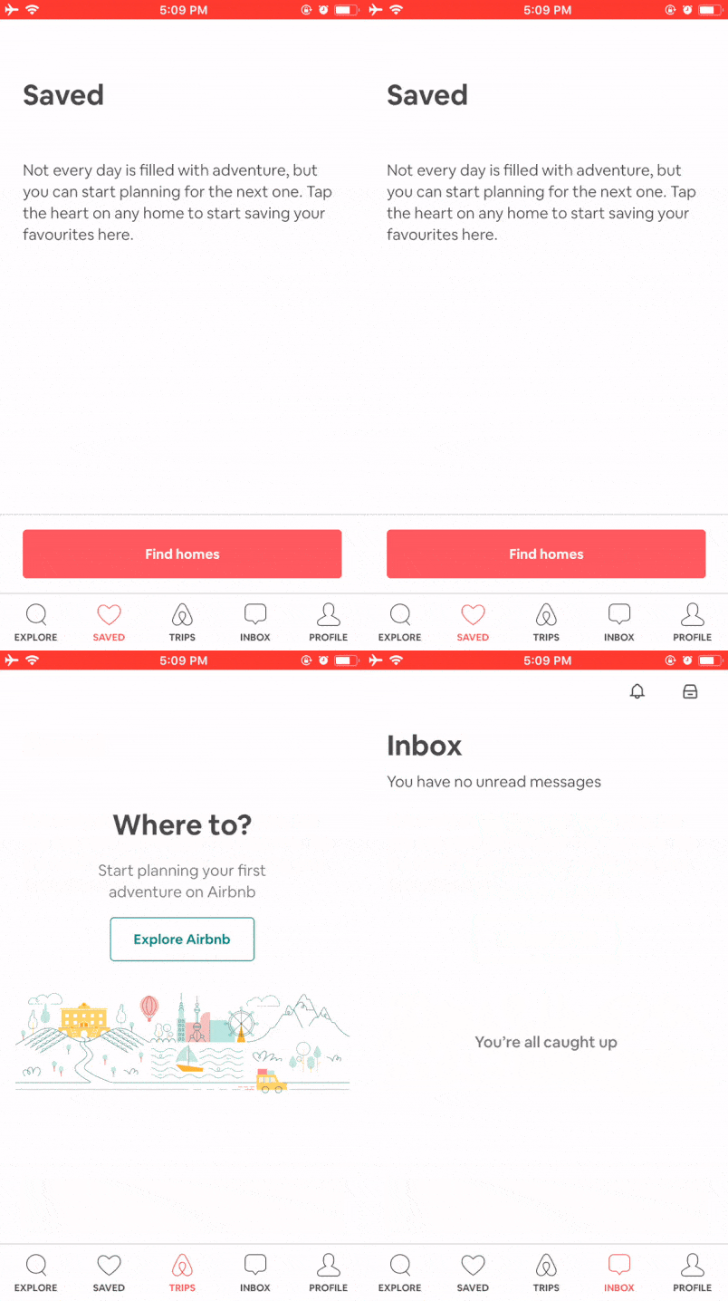
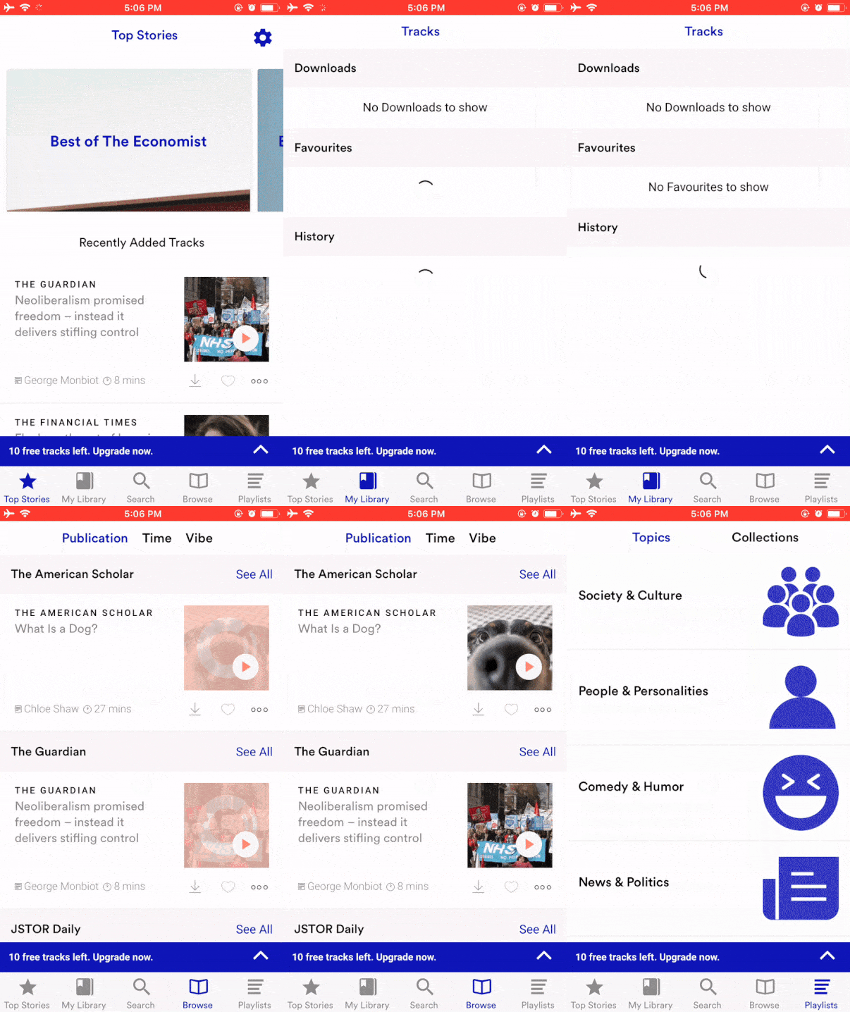
With that said, designers who fancy this Bar Menu can tweak it with an actionable button in the centre of the bar or above it.
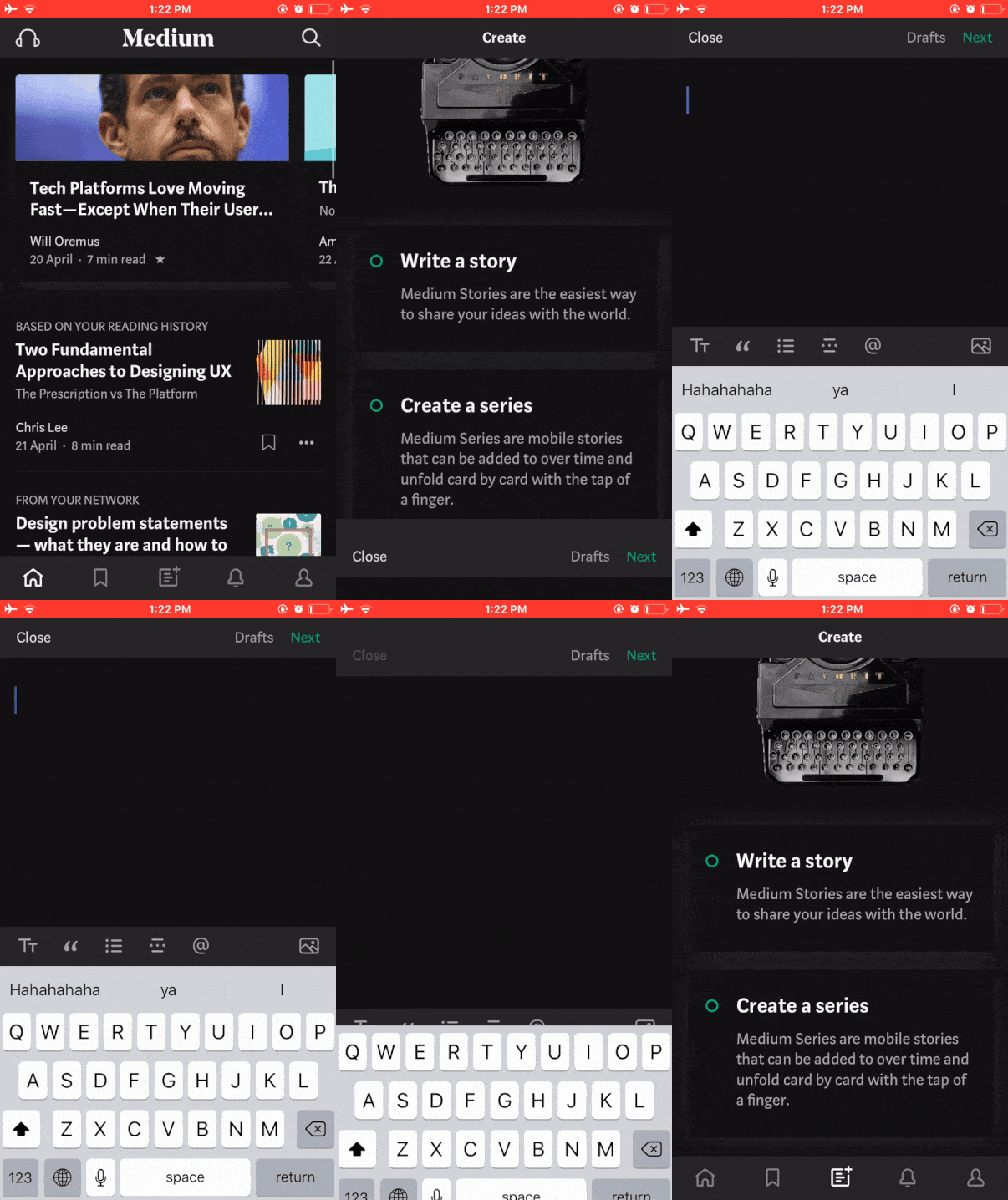
We also have another variation: Bottom Bar Menu + Grid Style.
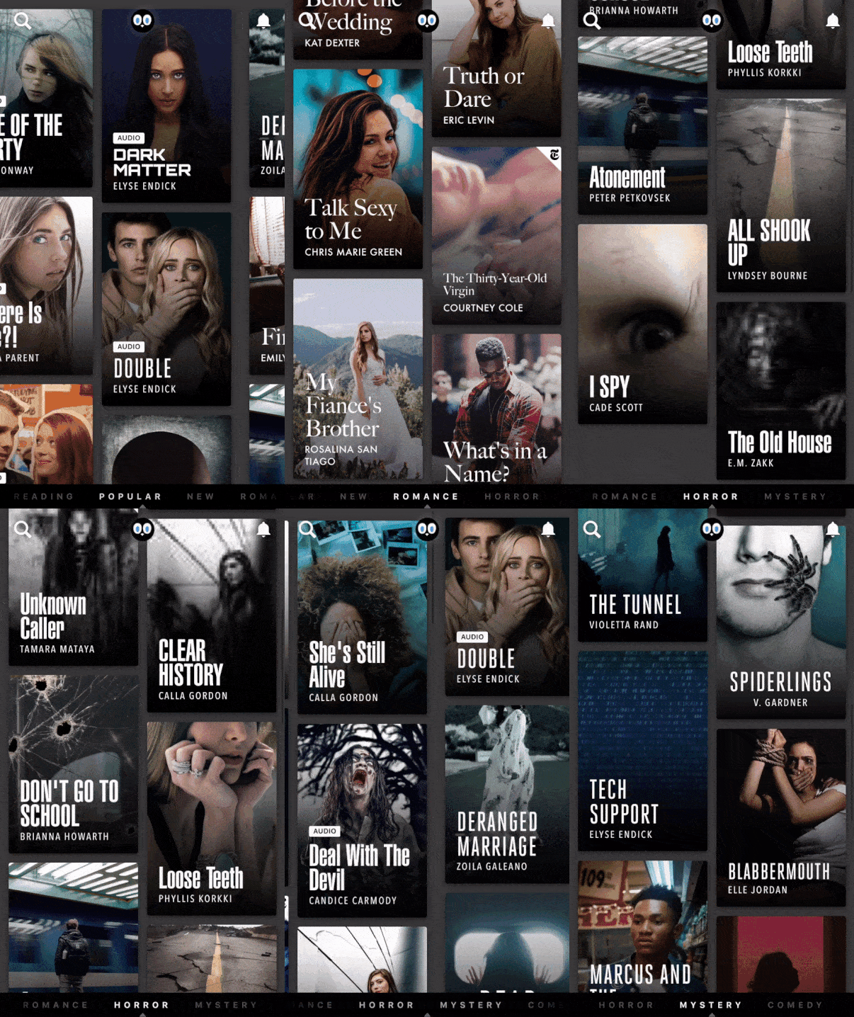

Hooked and MasterClass are great examples of Bottom Navigation.
Masterclass, in its unique style, uses a cover image of Masters to speak for their sessions. On the other hand, we have Hooked that showcases popular video stories from different categories distinguished with grids.
4. Top Tab Menu
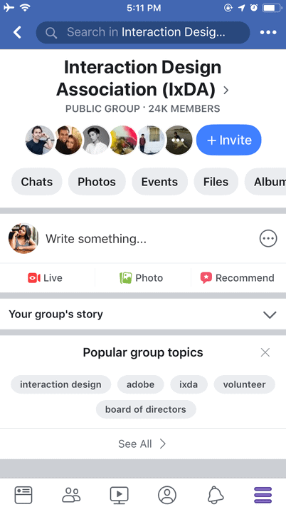
The Top Tab Menu contrasts with the Bottom Bar Menu claiming its place on top of the screen.
Facebook has optimally employed its elementary features such as Create Posts, Go Live, Post Images, and Receive Recommendations to its Top Tab Menu.
5. Pictorial Circle Menus
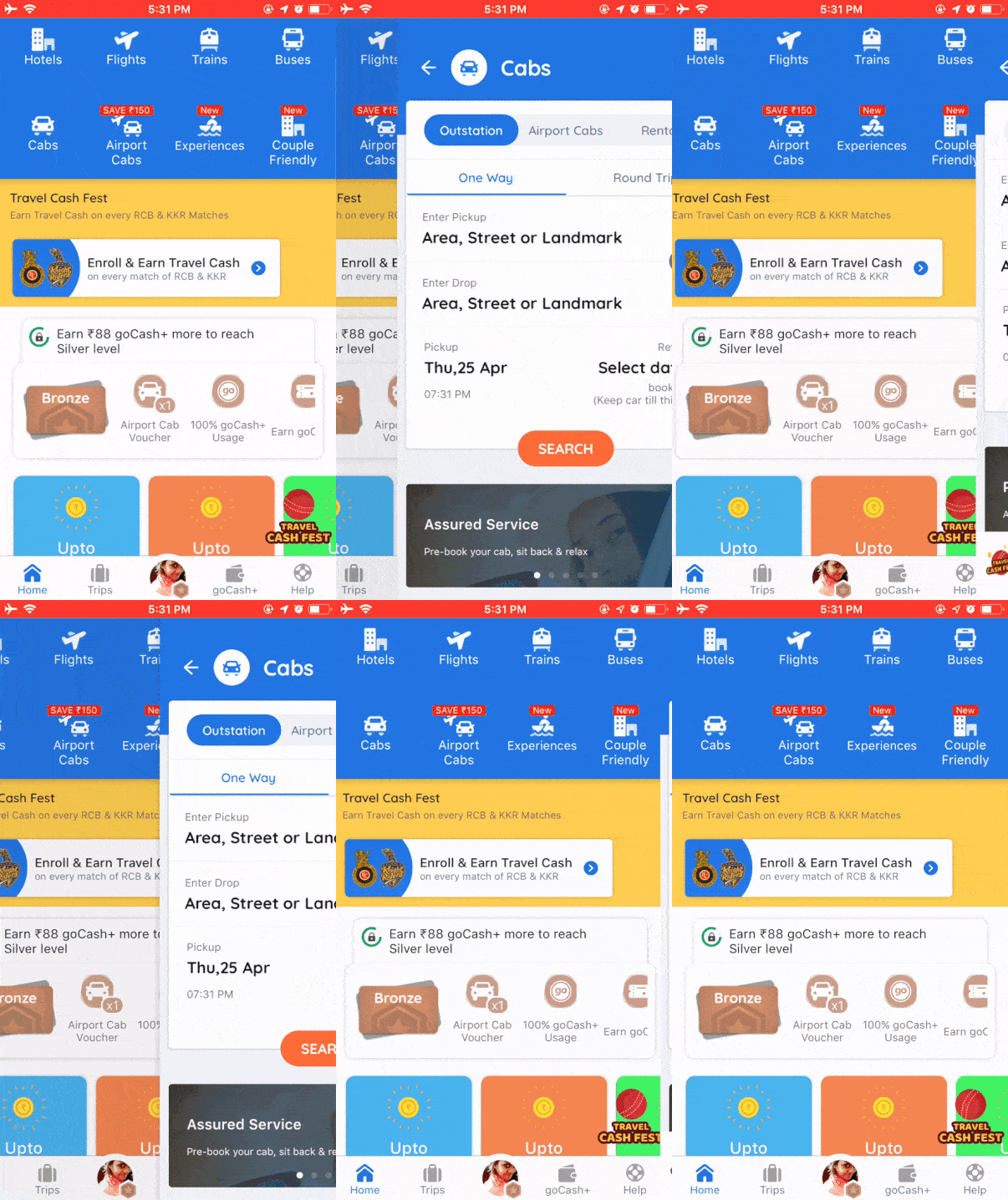
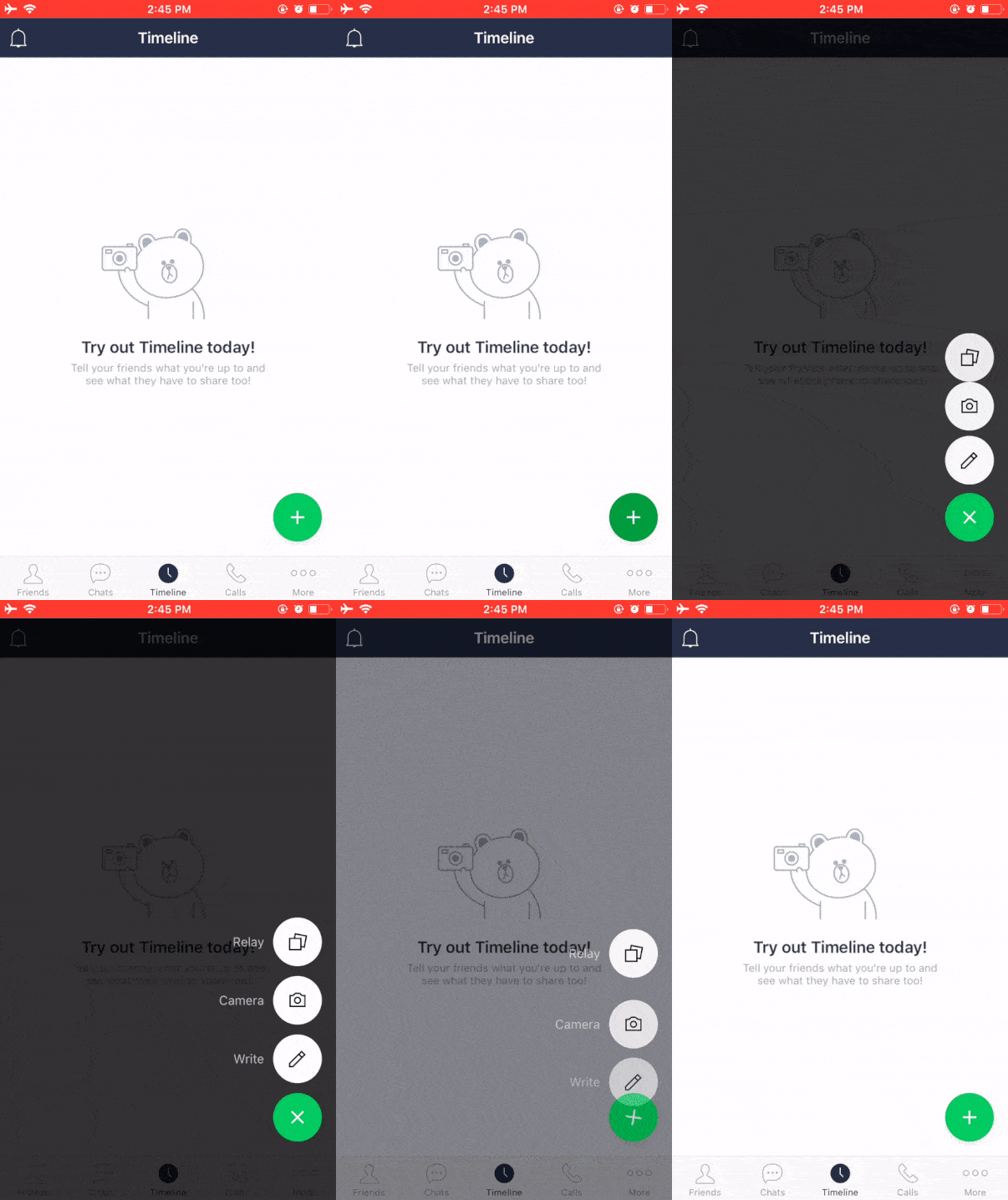
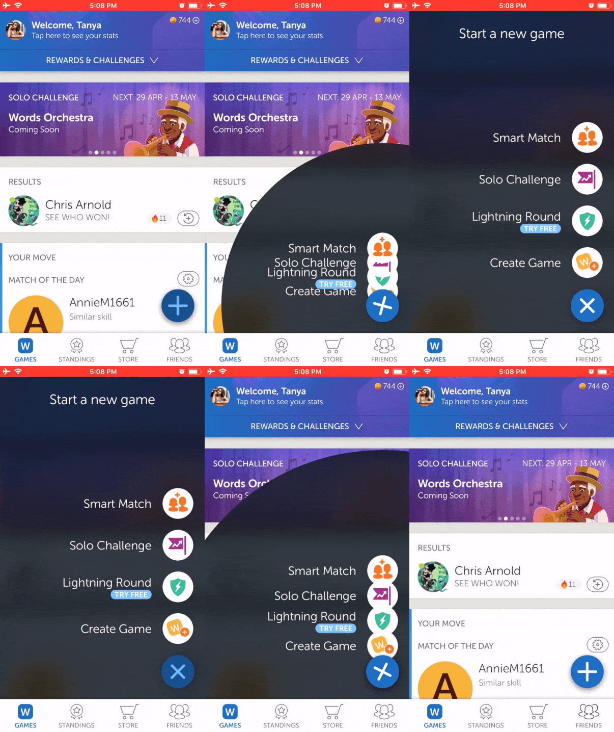
The Pictorial Circle Menu is a great way to express a company’s brand identity and create a lasting impression on users. This navigational pattern can work as an independent actionable button, all the while fitting in the bottom bar menu with other features.

Tumblr is one among the few apps that graphically represents its primary functions across the bottom bar. The blue pencil stands out from the other keys that makes it intuitive.
6. Gesture-Based Navigation
In 2009, Luke Wroblewski conducted a study that analysed gestures based on its frequency, infrequency, cultural differences, and disparities between novices and experts.
Turns out, gestures like delete, multi-object selection, print, requesting help, cut, and scroll were much the same for the entire audience. However, there were disparities between zooming gestures, back, forward, and scroll up and down.
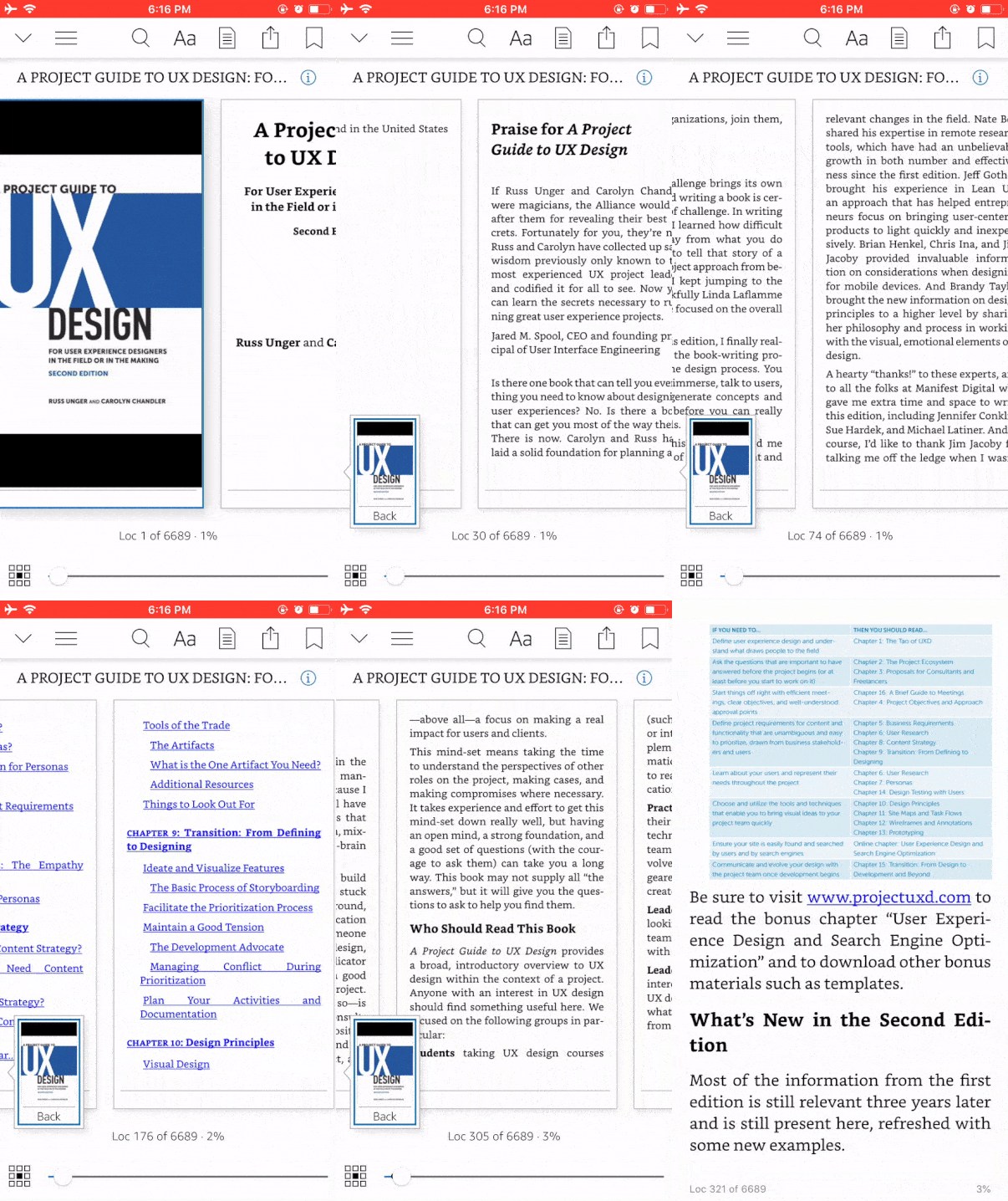
With the increasing popularity of smartphones, Gesture Based Navigation has become an invisible, yet inevitable part of mobile app design.

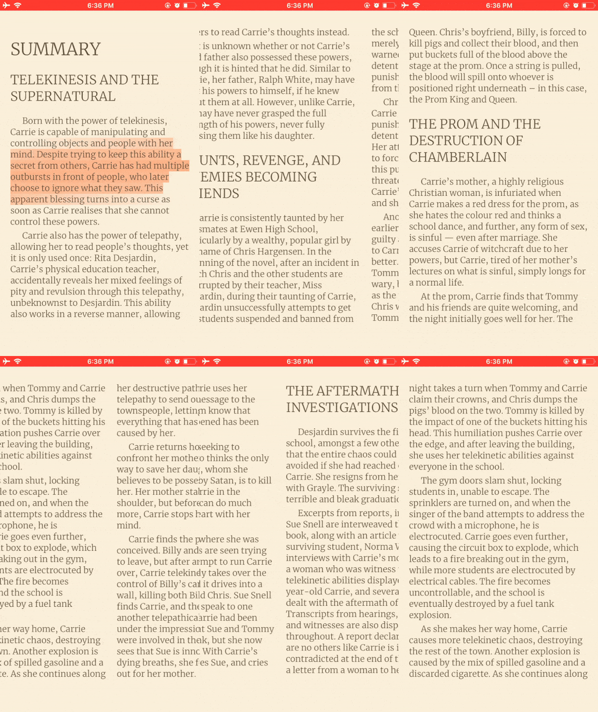
Gestures became more visible when the widely used dating app, Tinder popularised the concept of swiping right or left instead of employing the more traditional means of navigation.
This pattern is typical in e-Books Applications. For instance:
Conclusion
Design is not just what it looks like & feels like. Design is how it works
Steve Jobs
Navigation must be invisible, yet an unescapable detail to a user’s eye. Since 94% of first impressions are design-related, we have limited shots to appeal to their fingers.
Keeping that in mind, these patterns independently or in combination as long as they tip the scale in favour of optimised user experience!
Want to learn more?
If you’re interested in the intersection between UX and UI Design, then consider to take the online course UI Design Patterns for Successful Software and alternatively Design Thinking: The Beginner’s Guide. If, on the other hand, you want to brush up on the basics of UX and Usability, then consider to take the online course on User Experience (or another design topic). Good luck on your learning journey!
(Lead image: Depositphotos. All other photos in this article are screenshots and animations taken during usage of the respective apps. They are being used in this article for educational purposes as they represent outstanding best practices.)
