With the global mobile penetration going up to 67 percent this year, businesses cannot afford to ignore the growing importance of mobile apps. People are spending an increasing amount of time on their smartphones. No wonder, mobile apps are a popular medium for businesses to connect with their audience.
Yet, customers have little patience for apps with poor UX. In fact, according to Google, 29 percent of smartphone users will switch to another app if they aren’t happy with the UX. Also, 70 percent of these switches are due to extended load times. Hence, it’s critical to pay attention to good UX design practices to be able to offer the best UX to your users right from the time they access the app.
The launch screen is the first page that opens when a user taps the app icon. It plays a critical role in creating a first impression for both new and existing customers. It is critical that this is designed well as it might either encourage them or discourage them to stay with you as the app loads. The launch screen reduces the sense of extended load time, making the process of waiting less tedious and more enjoyable.
Launch screens also help strengthen your brand image, giving you an edge over the competition. They boost UX which is a vital factor for improving the app’s user retention rate.
When creating a suitable launch screen for your business you can use either a skeleton or a logo launch screen. Read on to learn about these launch screens and how you can use them to boost your app’s UX.
Logo Launch Screen
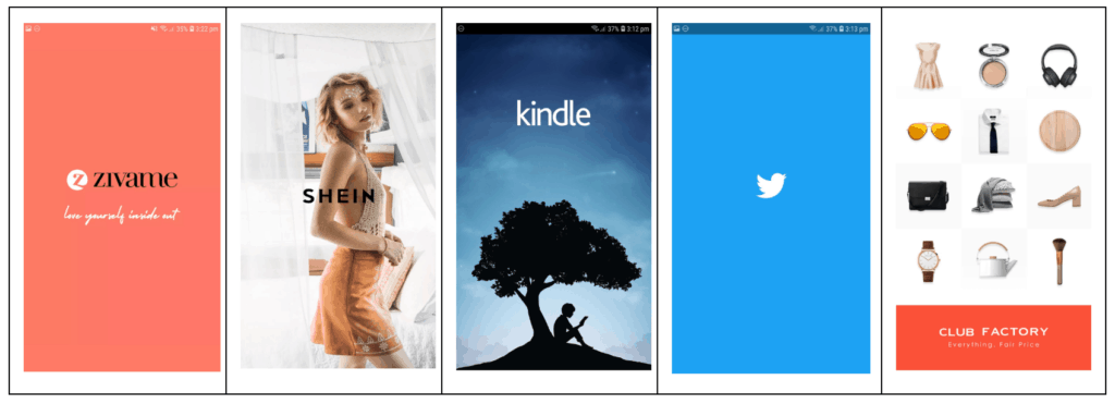
Logo launch screens feature the brand logo, icon, tagline, and/or the other brand elements. Notice how these brands use their logo, tag line, and brand color to enhance the UX of their mobile apps.
Several businesses use an animated version of their brand logo to make the launch screen to briefly entertain their audience, thereby adding to customer delight. Popular brands like Airbnb and Skype have used creative animations of their logo to make the launch screen more appealing.
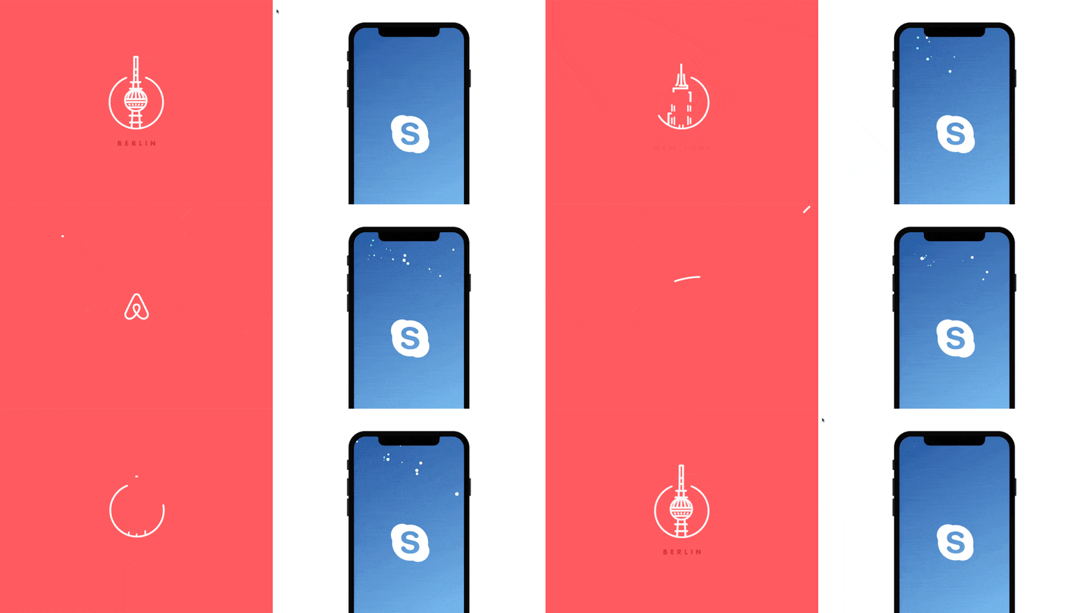
Right Gif Source: https://dribbble.com/shots/4262991-Skype-Splash-Animation
Regardless of how fast your app is, it always takes a few seconds for the operating system or the app code to get to work. Whether your app needs time to load tailored content for the user or the product catalog, using a logo launch screen can help. Rather than flashing a blank screen, use this opportunity to boost UX and improve brand exposure.
Use the logo launch screen when –
- You want to send a strong marketing message or communicate your vision to the users.
- Your app takes time to load the user interface (UI).
- Your brand is new and needs extra exposure.
- Your brand is established but you desire to enthuse your customers with superior UX.
Skeleton Launch Screen
Skeleton launch screens use the non-interactive layout of the app’s actual UI. These are commonly referred to as placeholders (or the bones of the skeleton). The gray or neutral-toned layout creates an illusion of the page getting progressively populated. Thus, as the app loads the content, such as text and images will fill in.
Well-known brands like Facebook, YouTube, Apple, WhatsApp, and Instagram use the skeleton screen for their mobile apps.
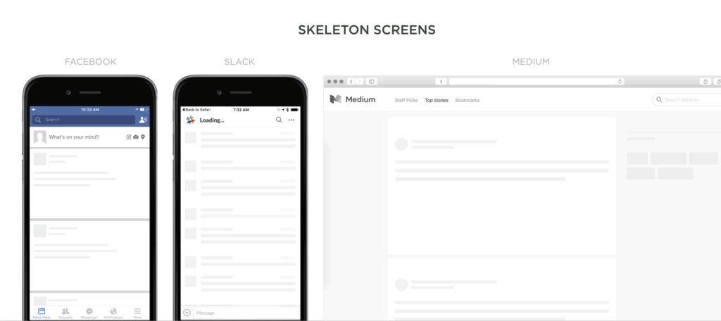
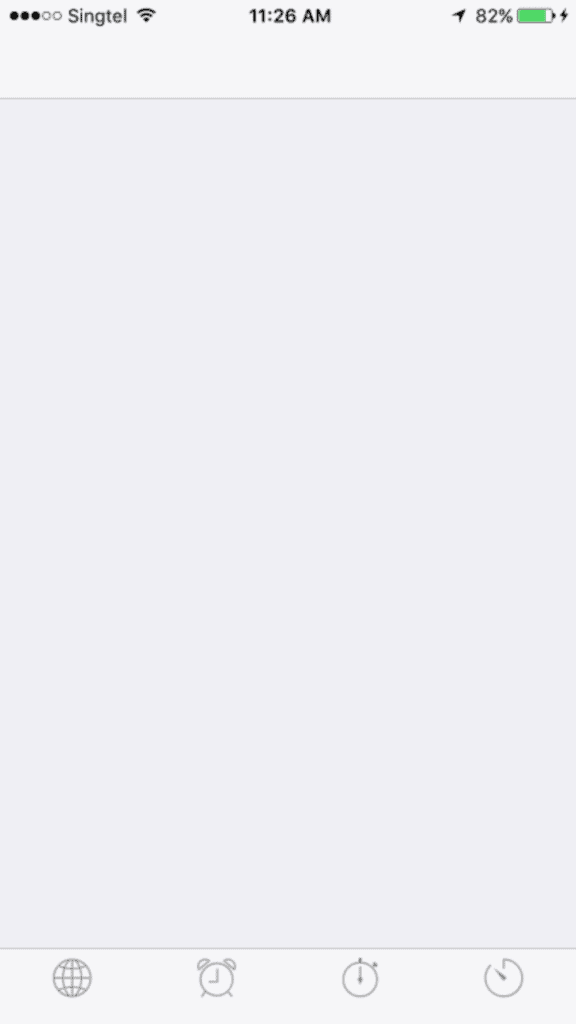
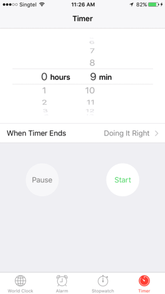
Apple incorporated the skeleton screen into their app by showing an outline of the initial application screen, devoid of any content or UI elements.
Notice how Apple’s Clock uses the skeleton launch screen to set the expectation of what the app will look when it’s loaded. This creates an illusion of the app loading fast. Once the loading is complete, all the content and the UI elements fill in.
Source: https://www.sitepoint.com/how-to-speed-up-your-ux-with-skeleton-screens/
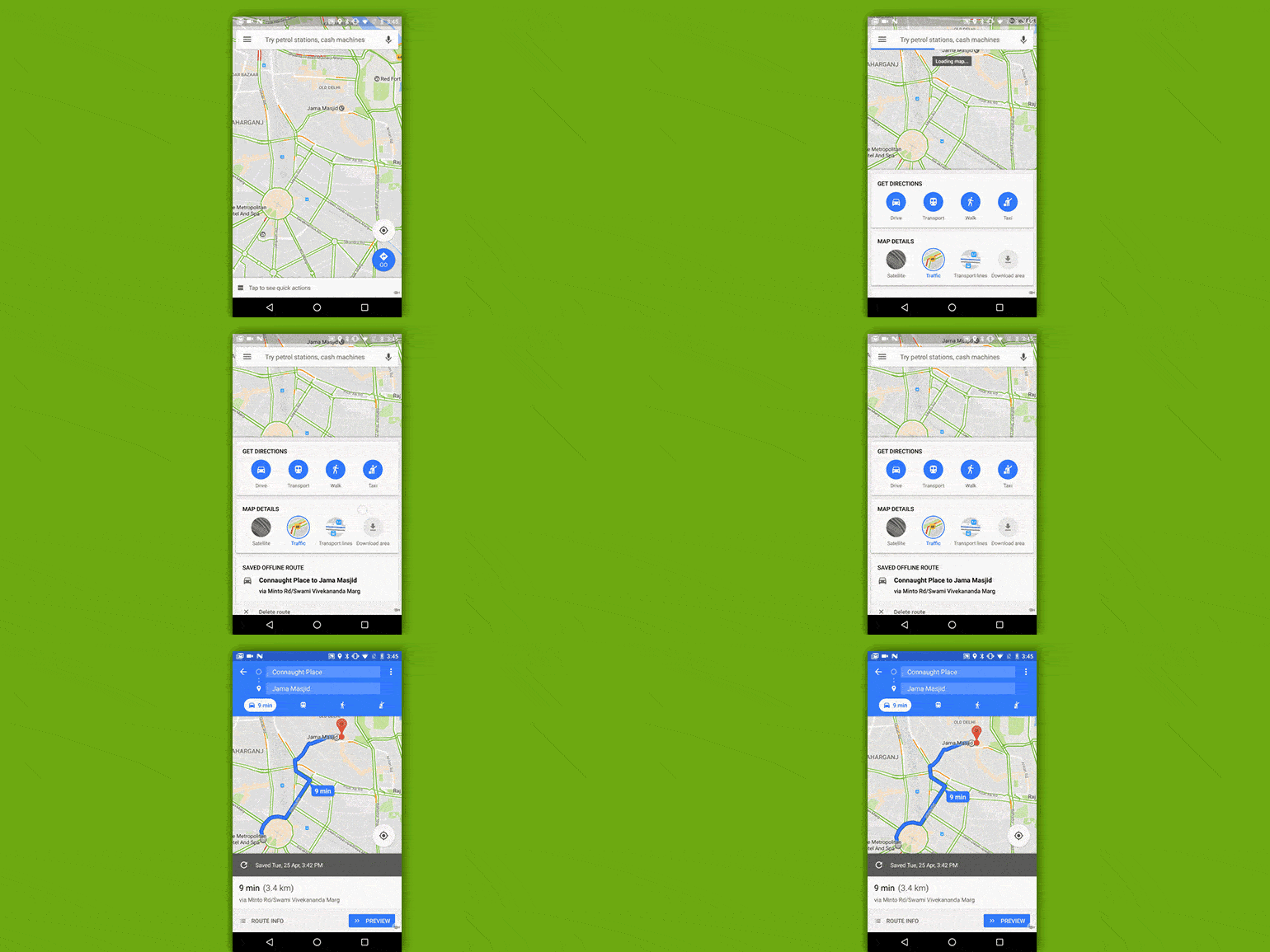
Check out the launch screen of Google Maps. The screen comprises of the plain map background (the white grids) and the other elements load gradually.
Skeleton launch screens improve the feel of any action that takes a long time to load. Applying them to your app can make the feel of your UI design feel faster and your audience happier.
The skeleton screen can be used when –
- The app is being used often (WhatsApp, Facebook, or Instagram) or in haste (time-management or navigation apps)
- The brand doesn’t need too much exposure or is instantly-recognizable in the niche, such that just the layout is enough for brand recall.
Also, use the skeleton launch screen only if the initial screen outline fits perfectly with the upcoming screen. This will avoid unpleasant and unexpected shifts in the position of the UI elements, making the app look neat and cohesive.
Creating the Perfect Launch Screen for Your Business App
Here are a few handy tips to bear in mind when creating a suitable logo launch screen for your mobile app.
Go for a Minimalist Design
Simplicity is the key. Experiment with your brand colors and background, and use engaging animation to wow your audience. Yet, remember not to go over the top.
The launch screen isn’t a place to talk about your company history, product discounts, or how you are better than the competitors. So, keep the content minimum and use stunning imagery to flaunt your values and the true spirit of the brand.
Leave generous whitespace with minimal graphical elements in the app’s UI design. White space tends to draw attention to the core element on the screen, the logo, thereby boosting your brand identity.
A minimalist and professional design can work wonders for your app’s UX, encouraging users to stay longer.
Use the Right Screen Size and Resolution
Every smartphone has a unique size and resolution. So, make sure your launch screen works on all screens and is not distorted or poorly proportioned.
For Android devices, create a flexible layout that’s responsive to small variations in screen size. This will help adapt the user interface to different types of screens. Experts also recommend creating launch screens in three sizes, small, medium, and large. That way, the size that’s closest to the screen resolution of the phone will be used.
Refer to the table below to create a suitable launch screen for iPhone screen sizes. Create a launch screen that fits the largest screen size. This is because it’s easier to shrink images onto smaller screens that stretch them. So, when the screen is shrunk, the elements have enough space between them to prevent overlap.
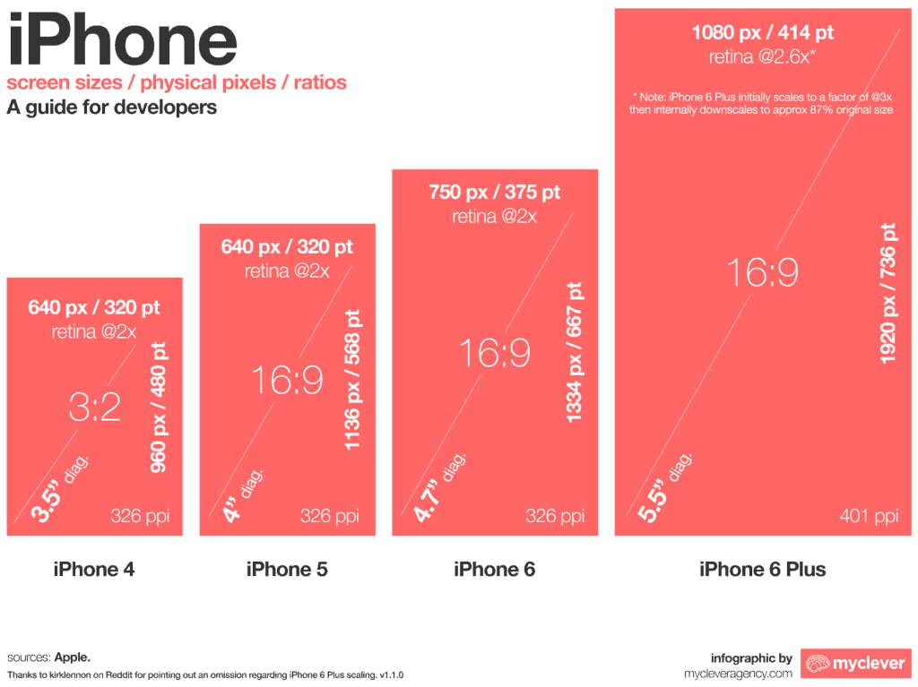
Apple recommends using an Xcode storyboard or a set of images that are static for any mobile device.
Finally, use high-resolution images only. The placeholder should work perfectly if you are including a high-quality image. Using clear and appealing images add to customer delight.
Show Them the App Launch Progress
Displaying the launch progress on the launch screen can help users know what to expect. For instance, if users see how each element of the page loads they will be excited to wait and watch what unveils.
Include Your Slogan
The brand slogan reveals the central idea of your app. If you are using the logo launch screen, add your brand’s catchphrase using a clear typeface. This will not only enhance the screen’s appeal but also boost its UX. Further, it will instantly set you apart from your competitors.
Think Outside the Box
If your business app is complex (a gaming or VR app) or has to access user data, it may take some time to load. In such a case, merely displaying your logo or a loader may not help. Get creative and use entertaining graphics and content to capture user attention. This will help your audience to connect with your brand.
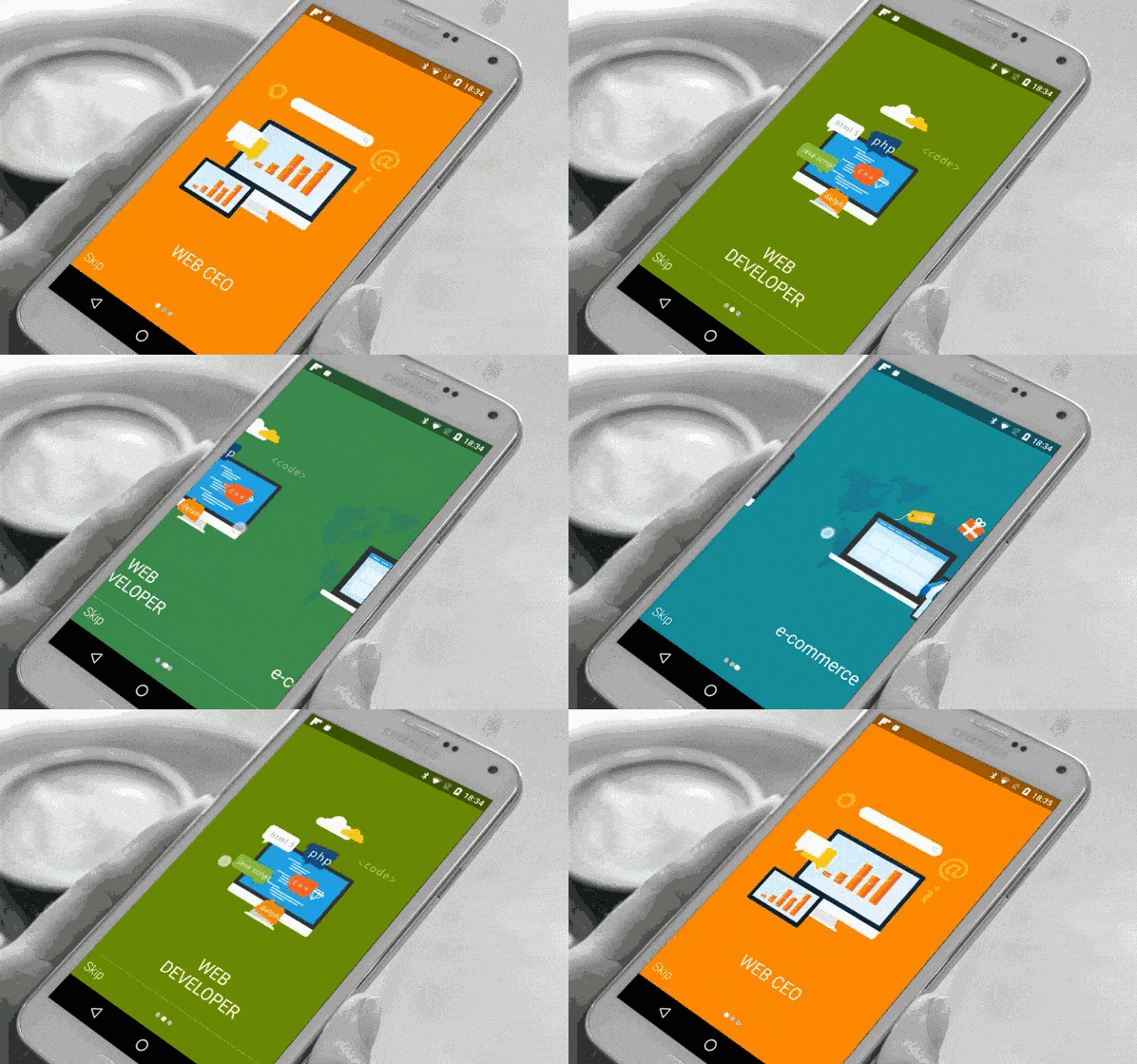
Check out how Cleveroad, a software development firm, has created a sliding tutorial to boost its UX. Incorporating such the parallax scrolling effect will keep users entertained until the app is loaded.
Final Words
Launch screens make opening an app a delightful experience. They are effective in driving brand loyalty and improving the UX of mobile apps. Launch screens engage users when they are forced to wait for the app to load completely. Thus, they are a pleasant break from an unappealing blank screen.
Despite their critical role in boosting an app’s UX, launch screens are rarely a priority for designers and developers. First Impressions are critical. So, use the valuable information shared in this post to give your app a polished look and impress your users.
Want to learn more?
Are you interested in the intersection between UX and UI Design? The online courses on UI Design Patterns for Successful Software and Design Thinking: The Beginner’s Guide can teach you skills you need. If you take a course, you will earn an industry-recognized course certificate to advance your career. On the other hand, if you want to brush up on the basics of UX and Usability, try the online course on User Experience (or another design topic). Good luck on your learning journey!

