
1. Lust
Consumers click ads to seek solutions. Remind readers you understand the problem by echoing their concerns rather than covet advocacy and subsequent account registry.
This brand’s ad is a result for a ‘fat loss.’ The landing page looks like:
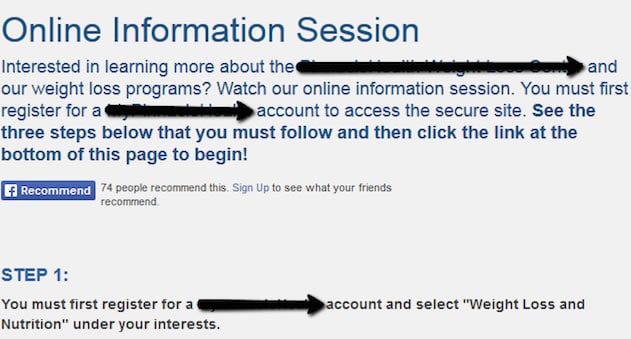
They question the obvious, then follow with repeated urges to register… a bit creepy. And, the copy does not present added promise about a solution.
There is intense lust to start an ongoing relationship (Hey, recommend us to your friends too!), but no immediate attention to existing consumer anxieties and wanted solutions. Actually, asking them to register could create another anxiety.
Redemption: Ensure that the copy speaks to consumers and their expectations. A common mistake is mentioning features rather than benefits.
2. Greed
Those seeking news are bound to get WSJ natural results, yet clicking through comes with a proposed price.
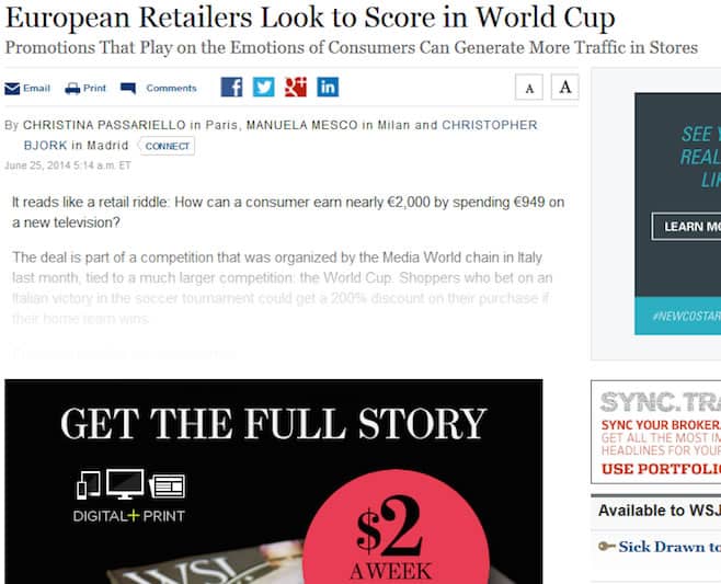
WSJ-related results proliferate and paid-like ads become integrated with natural results. Grow excited to find information on a topic, only to get disappointed to find it locked behind a pay-wall and brand greed.
Redemption: Sometimes you have to give to get. Pay attention to how your brand uses freebies and time-sensitive trials. Sometimes, maintaining consistency is more important than generating revenue.
3. Gluttony
Apps and digital solutions flourish. Yet brands have but seconds to deliver punchy and effective copy to get reactions. This is one section of a long, scrolling landing page:
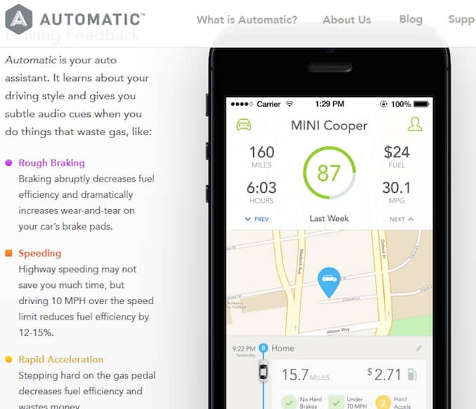
It got the attention of copy experts who advise revision. The copy is gluttonous and in need of a diet.
We get it; the app helps save gas. The supplemented copy about drivers wasting gas is interesting and useful, but extraneous here.
Redemption: Add by subtracting elements from landing pages and copy. Ensure why each element must be there. If it doesn’t serve a purpose, eliminate.
4. Sloth
Digital consumers want things quickly, whether using a laptop, mobile phone, etc. Brands make landing pages load quickly to facilitate user experience, yet it may surprise some to know that widgets (‘Follow us on Twitter’ / ‘Like Us on Facebook’) and unnecessary images and text influence load time and ad appearance.
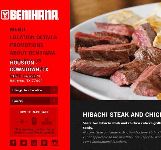
Aside from a slow load, trying to do too much makes a landing page appear ill constructed. Notice how integrating widgets for Facebook, Twitter, YouTube, etc. could have created the visual error above. Benihana is well known, but this page makes their marketing appear lazy and distasteful.
Redemption: Don’t be lazy when it comes to on-page SEO. Have developers comb pages for errors related to loading and appearance (optimized for mobile devices and smart phones).
5. Wrath
At its core, anger is self-destructive, inviting differences and confusion. A misused and expensive ad campaign quickly grows destructive. This company improved submissions by 115% with a small change.
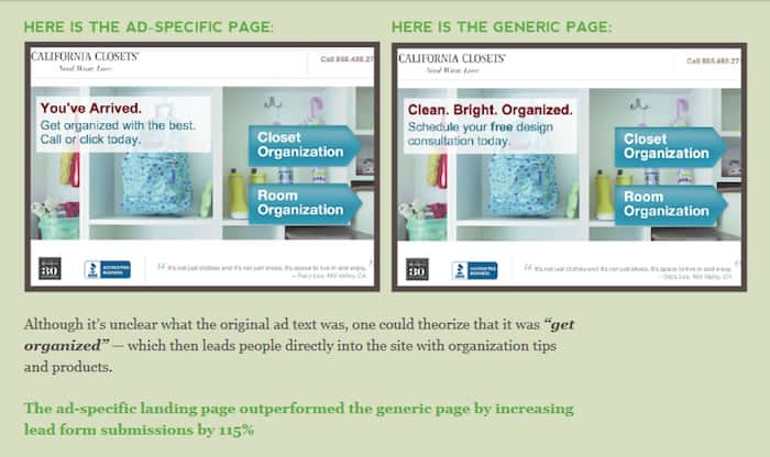
Stop making ‘content king’ and blaming roles, rankings, and social shares for successes and failures. Start understanding intent and ambiance better.
Redemption: Slick A/B testing and formulating consumer personas helps refine and repeat ad processes, illuminating ‘sweet spots’ regarding ads and personas, device leveraged, and page hosting content.
6. Envy
Taking classy jabs at the competitor is clever and ‘a part of the game.’ However, companies go overboard. ‘Taking a piss’ referring to competitors and consumer alternatives in awkward, misplaced, and inappropriate ways.
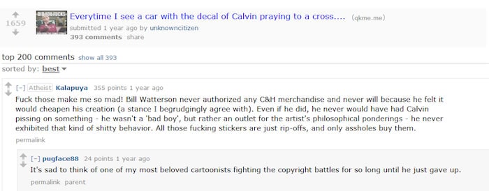
Some are pissed to view Calvin taking a pee, although a number of independent and mainstream brands use the popular advertising icon. Often, being irreverent is only good for irreverent brands.

Redemption: Be humble in addressing consumer alternatives and your competitors. Allow efficiency of services and products do the ‘talking.’ BMW’s ‘checkmate’ stung more because Audi ‘started it,’ instigating with “your move.”
7. Pride
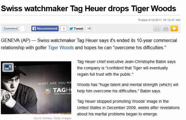
Making top-hundred, twenty, ten, five lists, being featured in major news sources and having quotes used by influential peers is a notable achievement. Yet, there is a proper place for expressing pride. Secondly, achieving high-profile advocacy and partnerships is great and profitable but it does not always work well for brands.
Once upon a time, you had your swag on when wearing a Tiger TAG. And, then:
In other sporting news:
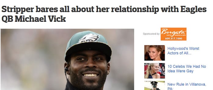
I hate to dog him out, but Vick’s and other athletes’ actions influence perception and ad dollars of teams and associated endorsers.
Redemption: Be careful in associating a brand with a celebrity or mainstream personality. A personality that takes on a life of its own, takes your brand name along with it.
Want to learn more?
Are you interested in the managerial and strategic aspects of UX? The online course on UX Management and Strategy can teach you the necessary skills on the subject and earn you an industry-recognized course certificate to advance your career. If, on the other hand, you want to brush up on the basics of UX and Usability, the online course on User Experience might be a better fit for you (or another design topic). Good luck on your learning journey!
(Lead image: Depositphotos)
