
Crédit Agricole S.A. is the leading customer-focused banking group in France and the second largest in Europe. This article is a responsive web design case study that documents the thought process, implementation and results obtained when Crédit Agricole S.A re-designed their website from a fixed width to one which is responsive. To undergo this transition, the bank engaged Symetria – a Polish agency which provides comprehensive e-business and user experience services. The agency has developed two websites for Crédit Agricole – “Discount Club” and “Join Crédit Agricole.” In both cases Responsive Web Design was applied and assured optimization for all screen sizes.
The Challenge
“Discount Club” is a page presenting partners of Crédit Agricole and features discounts which are provided by them to the bank customers. On the other hand, “Join Crédit Agricole” is aimed at new customers, and its main purpose is to encourage visitors to open an account in the bank. Although the users’ needs in both cases are different, in each case the agency’s task was to provide solutions maximizing both websites’ usability. In accordance with the current trends, it was found that Crédit Agricole website is more often visited by people using mobile devices. Therefore, Symetria challenge included development of the websites that will provide an optimal viewing experience.
Selection of the mobile strategy presence
Symetria experts involved in the project unanimously recommended Responsive Web Design approach, which enables to create solutions for all sizes of screens (including even those appliances, which are not available on the market yet).
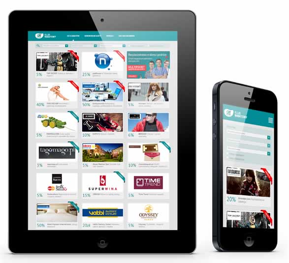
“Nowadays, responsive websites are more often standard solution, rather than just a curiosity. When we create projects such as Crédit Agricole, our goal is always to provide great experiences for all users, regardless of the size of the screen they use” says Andrzej Pyra, UX specialist in Symetria.
Consistency of marketing communication, the better effectiveness of the website in search engines (responsive website is available on all platforms under a single URL) and cost optimization (single solution instead of several independent) were also important arguments to choose a responsive web design approach.
Project Implementation
Due to the fact that mobile context forces to focus more on the key features and content, the process of creating “Discount Club” and “Join Crédit Agricole” websites was started from the smallest screens. Compliance with the “mobile first” rule enable to plan a clear structure and provide effective solutions, focused on the primary objectives of particular pages.
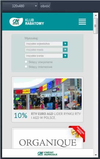
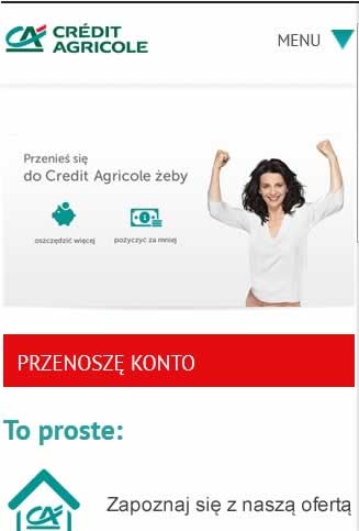
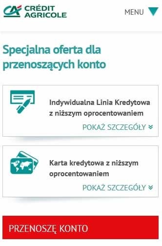
New responsive designs enable working efficiently on touch screens and provide quick change the screen orientation.

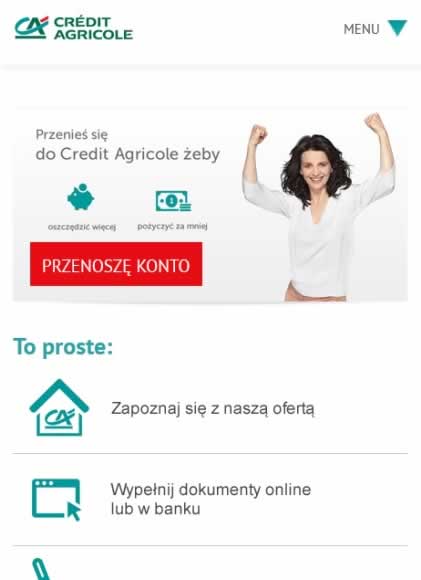
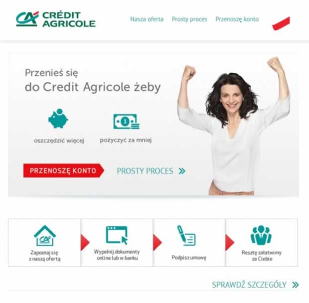
Another important element of the design process of responsive websites was to plan which items would be available on larger screens (e. g. expanded graphics) and how the structure of the layout components would change.
On these screens we are able to see: changes of the main menu display, change of the “switch account” button location and presentation, scalability of the graphics and the main message, different presentation of the process of transferring the account.

Conclusion Of This Responsive Web Design Case Study
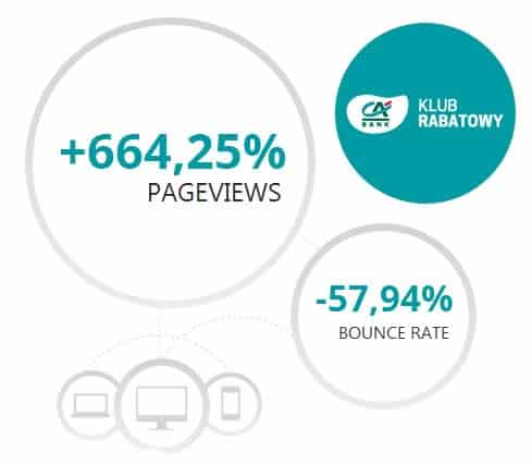
Improvement of adopting a responsive web design approach was reflected in the statistics. Looking at the data on the “Discount Club” website for the period 24-28 August 2012 (before the change) and December 14-18 2012 (after changes) we can see a significant increase in website performance indicators:
- 200% increase in traffic from mobile devices
- 10.5% of all views now come from mobile devices
- 664.25% increase in the number of page views
- 216.73% increase in the number of visits
- 161.45% increase in average duration of visits
- 57.94% decrease in the bounce rate
The latter refers to the situation when a user finishes the visit immediately after entering the site. Almost 60 percent decrease in bounce rate indicates an increase of the interest in content on the website, as well as interest in the Crédit Agricole brand.
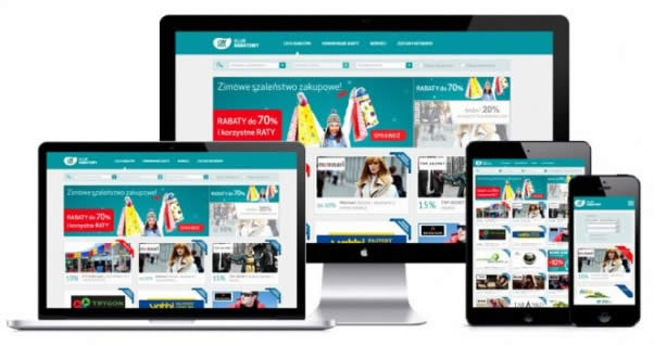
The advantage of the websites is their availability for all clients of Crédit Agricole, regardless of the device they use. Pages automatically react to the size of the screen on which they are displayed, and thus allow users to freely explore their content.
Want to learn more?
If you’d like to…
- learn all the details of Usability Testing
- get easy-to-use templates
- learn how to properly quantify the usability of a system/service/product/app/etc
- learn how to communicate the result to your management
… then consider to take the online course Conducting Usability Testing.
If, on the other hand, you want to brush up on the basics of UX and Usability, then consider to take the online course on User Experience. Good luck on your learning journey!
