It is no news to say that the days when users access websites via desktop based devices only are long gone. Even with the advent of the smartphones in the mid 2000’s, a need had already been created to have a mobile version of a website. The technique that was used then was to to check (using JavaScript) whether the user was making use of a mobile phone to access a website – in which case, a different Cascading Stylesheet (CSS) would be loaded. This Stylesheet would typically restrict the width of the site and display it in a vertical style. Back then, it was already evident that the technique would be short lived since it was impossible to find a common agreement over essential decisions such as how wide a mobile website should be.
With the advent of a multitude of new devices such as the iPad (which ironically I am using right now to write this article), this problem became a major issue since mobile websites were being developed either too wide, requiring horizontal scrolling or too narrow – in which case they were not making use of the available screen space. Usability guru Jakob Nielsen had stated (way back in 2002) that horizontal scrolling and non adaptable widths are usability violations.
Responsive Web Design
Enter Responsive Web Design – a technique that overcomes this limitation. A responsive website (a website that has been designed with responsive web design techniques) will automatically adapt and make the most of any screen layout and size through the use of Media Queries and CSS. This concept was initially conceived by Ethan Marcotte in an article that appeared in A-List Apart. To view the effect of a responsive website, simply access it via different devices such as your desktop computer and your mobile phone. You can also adjust your screen size or, more simply, adjust your browser window and you will notice how the website adapts itself. The obvious advantage is that a responsive website will make the most use of the available screen real estate while providing an optimal layout to create the best possible user experience.
These are exciting times in web design. Responsive web design is the way forward, especially in view of the latest mobile usage statistics. Several prominent websites have been re-designed to embrace responsive web design. To name a few, we have Smashing Magazine, The Next Web, Webdesigner Depot and, more recently, Mashable.
As Dmitry Fadeyev correctly points out, the common attributes in tech websites that have been re-designed with responsive web design in mind are:
- Design that takes up the whole or most of the screen
- Wide, simplified navigation bar at the top of the page
- Navigation bar drop down menus on mouse hover
- Fixed sidebar columns, or columns that scroll independently
- Big typography, especially for headlines
- Most headlines coupled with images
- Flat style, and flat, single color icons


FamousBirthdays.com – A Responsive Web (Re-)Design
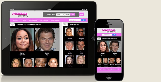
Instead of creating yet another “What is Responsive Web Design?” article or showcasing the top tech blogs that have been re-designed for responsive web design, I have been in touch with Mr. Evan Britton, the CEO of FamousBirthdays.com. What is interesting is that this website has been around since 1996 and yet, it has been recently re-designed to adapt responsively. This provides a different perspective in that it shows that responsive web design makes a big difference even in websites operating in sectors which are way different than online publishing magazines. I was very curious at what he had to say so I will reproduce his narration in the same way he said it to me:
Our website, Famous Birthdays, is a celebrity entertainment website. For years, we didn’t have a mobile optimized experience, so users would have to zoom in to enjoy our content from a smartphone. A few months back, we were very surprised to see in our analytics that traffic from smartphones had increased over 60% year over year. This happened without any optimization or focus on our mobile experience. We figured, if mobile traffic is going to grow this fast without us worrying about it – imagine if we did worry about it! And with that, we set out to drastically improve our mobile experience.
We decided to build a responsive site as opposed to a separate mobile site hosted on a sub-domain because we didn’t want to worry about managing two sites. We are adding a lot of content and technology to our site each month and the thought of concerning ourselves with two separate sites wasn’t exciting. Plus, back in April, Google announced that Responsive Design was their suggested method of handling Mobile Traffic – so this made the decision all the more easy.


The first step when going responsive was to ensure that our pages were converted to CSS driven div tags. This allowed us to be compliant with the HTML5 standard. The next step was to ensure that our CSS implemented the media query description, which allowed our site to respond based upon the screen resolution of the specific visitor. At the get go, since we developed two versions of our website, we had to select a resolution width to be our decision point. Once that width was selected, we were able to load our desktop site – for complete browsing to any resolution above our decision point. And, for any resolution below our decision point, we displayed the compact version of our site which is optimized for one touch browsing.
Our responsive design recently went live and we have been excited about the instant benefits. For instance, our bounce rate on the iPhone and iPod have already dropped by 10% and our page views per visit on the iPhone and iPod are already up 15%. This happened on our first iteration of our responsive site – with more improvements and testing we expect these metrics to continue to improve.
The key to our responsive site has been simplicity. Before, it was painful to use our site on a smartphone. Now, we have made it extremely simple by using our data to identify the important content that people want on a given page – and we then made it easy for the user to access that content from a mobile phone. On the technology side – we are using media queries to load either our desktop or mobile view based upon the screen resolution that the user visits our site from. Our next step will be to create a third view, for the Amazon Fire and the iPad Portrait view so that we can optimize for users with screen resolutions larger then a smartphone but smaller than a desktop or laptop.
This has been an extremely fun project and to see the metrics improve so quickly, has confirmed that this was a wise initiative for us to pursue.
Want to learn more?
If you’d like to…
- learn all the details of Usability Testing
- get easy-to-use templates
- learn how to properly quantify the usability of a system/service/product/app/etc
- learn how to communicate the result to your management
… then consider to take the online course Conducting Usability Testing.
If, on the other hand, you want to brush up on the basics of UX and Usability, then consider to take the online course on User Experience. Good luck on your learning journey!
