You ‘may’ have noticed, that there have been a couple of changes in the overall look and feel of UsabilityGeek. The most visible changes are of course in the user interface of the site. These, together with other, less-evident changes in content reflect the overall direction that UsabilityGeek will be undertaking this year.
From a visual perspective, most of these changes can be summed up in a move away from the retro look. As I had stated last year, it was not contributing anything to the usability of the site. Furthermore, at times it was restrictive because of the imagery, the layout and the typography that were required to ensure its consistency. I am not saying that retro is not cool. On the contrary, I love retro design – hence the reason why I had designed UsabilityGeek that way.
The new branding
The overall idea behind the rebranding was to go for a contemporary & cleaner look and to move away from the original retro motif and color scheme. This is because in addition to the usability issues, it had started to lose consistency. This has been especially true eversince the new blog design earlier this year.
For this task I contracted Jean Karl Izzo, long-time friend and founder / creative director of Projet Noir – a branding agency based in Malta. He is the same guy who had designed the retro logo in the first place (and a number of branding tasks which I contracted him for). So I immediately thought that he was the person up for the job.
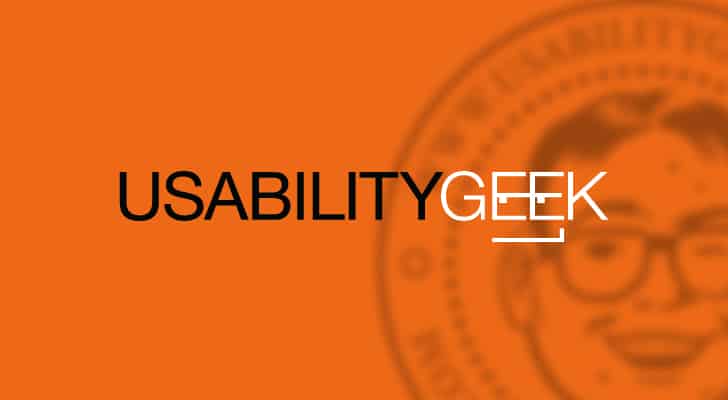
Upon some late night consultations, we decided that it would be better if the new look and feel consisted of a simpler and a flatter logo combined with a bold color scheme, which could be easily used and applied anywhere. So at this point, you might ask why orange? Apart from the fact that it is actually my favorite color, orange evokes a sense of happiness, vitality and energy which fuels the dedication behind UsabilityGeek.
The New UsabilityGeek Logo
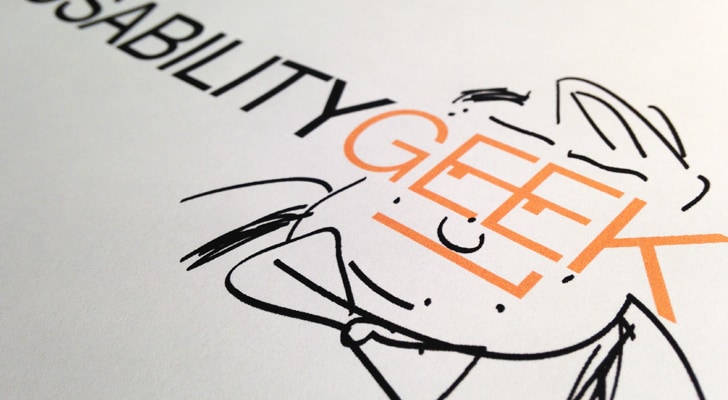
The new logo contrasts sharply with its predecessor. From a visual perspective, gone is the geek motif as this was too bulky and unfortunately was being mistakenly associated with a ‘nerd’. In fact, during our brainstorming session, we started by asking ourselves ‘what is a geek?’ and, ‘what does a geek look like?’. It was then that we noticed the current logo represented a nerd. The geek, on the other hand is a techie, an early adopter who is curious about all that is around him / her. In fact, we had to be careful not to thread on the nerd or hipster stereotypes.

In the words of Jean Karl himself, “Our approach on this new logo was to create a type-based one built on Helvetica mixed with a couple of geometrical interventions on the word geek so as to keep the figurative element in the logo present– this time, however, as mild as possible. By connecting the middle parts of both the letters ‘e’ and adding a couple of dots to illustrate the eyes we created a stylized pair of spectacles with two tiny eyes looking to the right. We just had to include a smirk to make the stylized face of our geek a whole. The sharp-edged and line-based features are also reminiscent of 8 bit graphics – hence staying within the IT and technology spectrum.“
Consistency Across All Channels
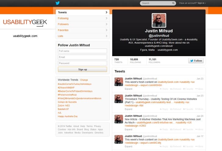
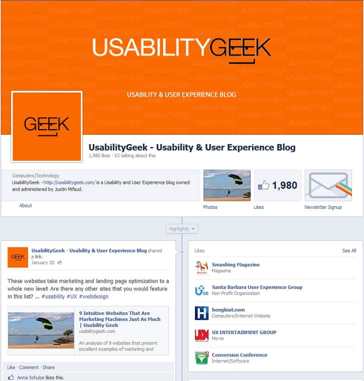
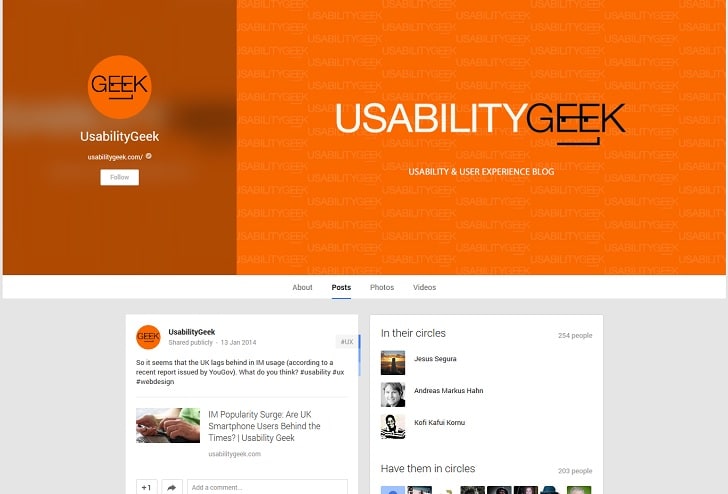
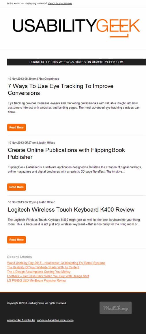
So as to deliver a consistent user experience, we have rebranded the social media channels for UsabilityGeek as well:
Twitter (@justinmifsud)
Facebook (Facebook.com/UsabilityGeek)
Google Plus (plus.google.com/+Usabilitygeek)
Newsletter
More Content
UsabilityGeek will continue to publish articles that are primarily about usability, user experience, human computer interaction and interaction. We will also continue to publish articles written by guest authors because we firmly believe that different perspectives genuinely add more quality. That being said, we do not publish cheap, re-purposed ‘articles’ that exist for the sole purpose of link building. So please do read our publishing guidelines before submitting any articles.
In addition to this, and due to the positive response we have received, we will continue to review products that appeal to the typical readers of this blog. Thanks to the new design, we have also introduced a number of advertising opportunities which will help towards maintaining and improving both the infrastructure and the quality of UsabilityGeek.
Well that’s more or less it. I hope you like the new branding. I would love to hear your opinions in the comment box below.
Want to learn more?
If you’d like to become an expert in UX Design, Design Thinking, UI Design, or another related design topic, then consider to take an online UX course from the Interaction Design Foundation. For example, Design Thinking, Become a UX Designer from Scratch, Conducting Usability Testing or User Research – Methods and Best Practices. Good luck on your learning journey!

