
The web development market is a crowded one and consumers are spoilt for choice. Therefore, having a website that serves as a business card is no longer competitive. Your site should act as a direct selling tool. So luck is not a plan here.
We are big subscribers to the idea that psychology in design rules. By using certain psychological triggers, you can influence consumer choice, that is, nudge users to take a desired path or action. Moreover, that will lead to a better return on investment for you.
Now that you know website design can drive sales let us have a closer look at particular techniques and effects used to meet that end.
The Serial Position Effect
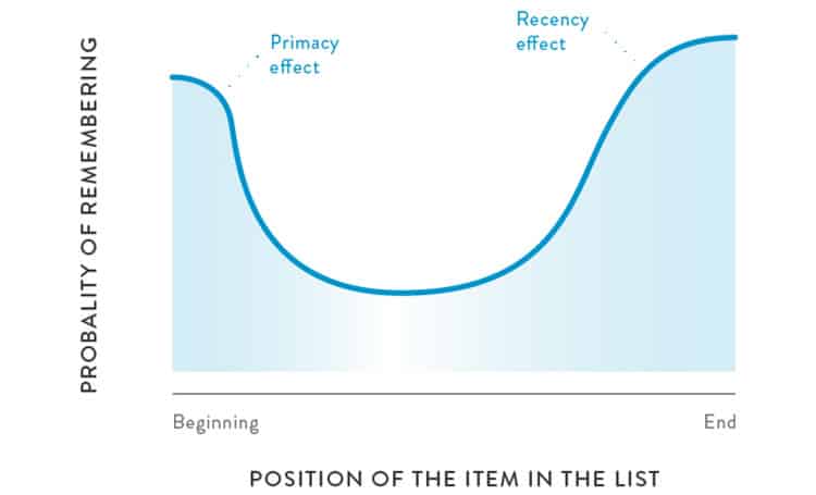
Coined by Hermann Ebbinghaus, this refers to a user’s tendency to recall the first and last items in a series, rather than the middle ones. Depending on the position people pay greater attention to, the serial position effect is subcategorised into the primacy effect and the recency effect.
The primacy effect states that users tend to recall first items with greater accuracy due to the small amount of processing effort spent rehearsing the item. Very similar to anchoring bias, the primacy effect presupposes that the first pieces of information are more important than the following ones.
Moreover, the theory behind the recency effect is that individuals are inclined to remember the items at the end of a sequence due to their preservation in the short-term memory.
The serial position effect makes it clear you can control user behaviour by placing items or information in a particular order. Now, let us take a look at some steps towards creating a better design to increase sales.
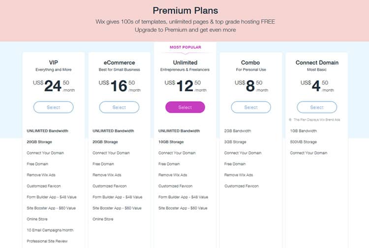
Start with the Priciest Item
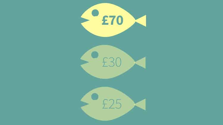
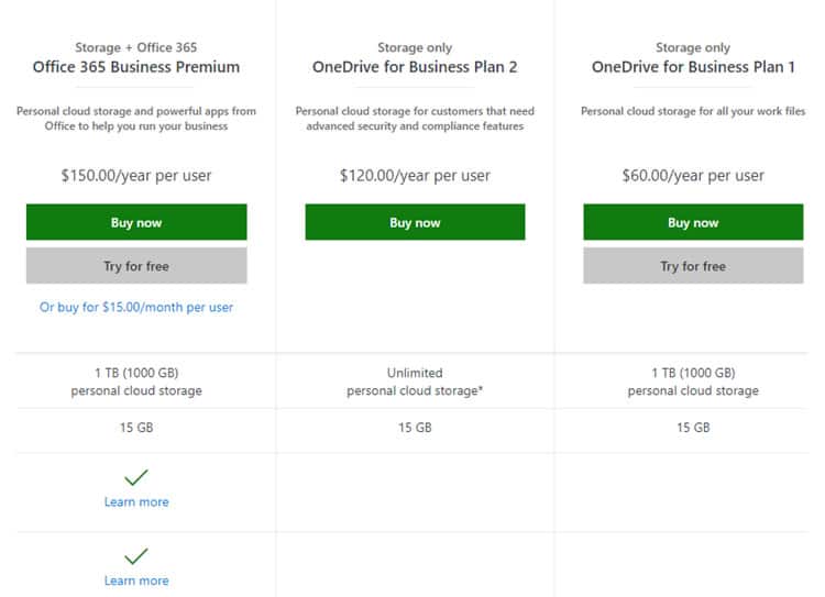
One of the ways to leverage the serial position effect is to put the most expensive item of your paid membership plan first – to attract customer attention.
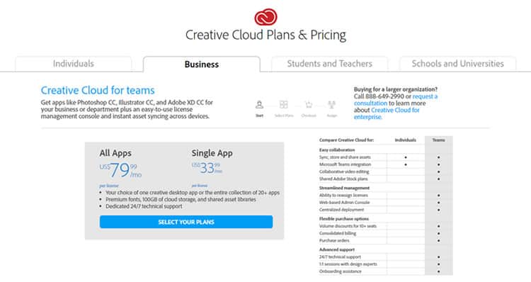
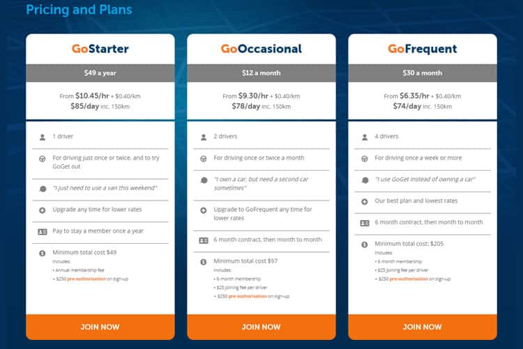
However, mind your target audience. Do not set too high a price for the first item – it will not work for experienced shoppers and people with higher cognitive ability. Instead, keep the prices realistic, within the bounds of your usual offerings.
Restructure The Navigation Menu
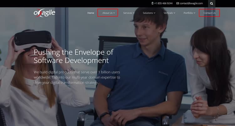
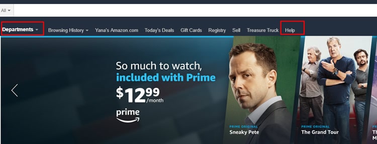
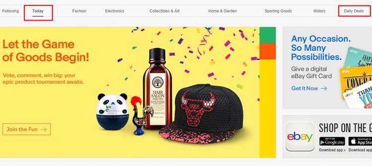
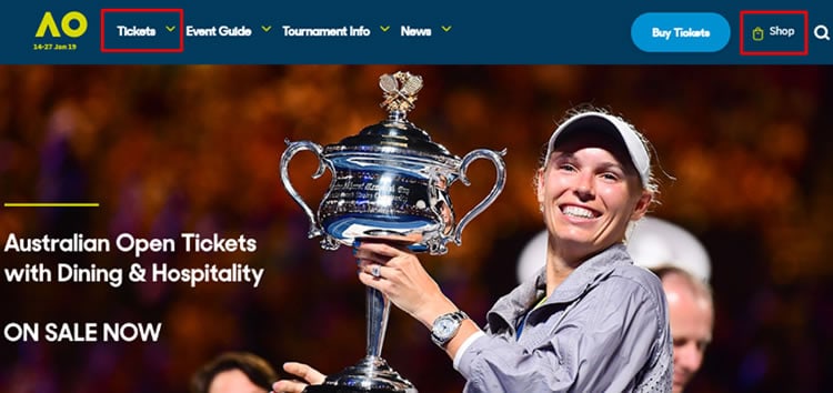
No matter the website type, remember to put the most important links at the beginning and the end of your navigation menu. This will help you get many clicks on the information you want to emphasise.
It may be the “about us” information, service or product pages, customer support, the “contact us” button, special offers, etc.
Outline The Major Benefits
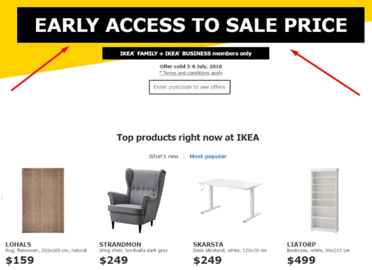
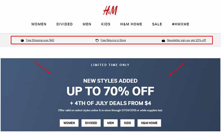
Another way to get the most out of the primacy effect is to put significant benefits in the very beginning. Whether your crucial deal clincher is free delivery or a free trial, shout it out to your clients. Make these offers the most memorable things as users continue navigating the website.

Optimise Page Content
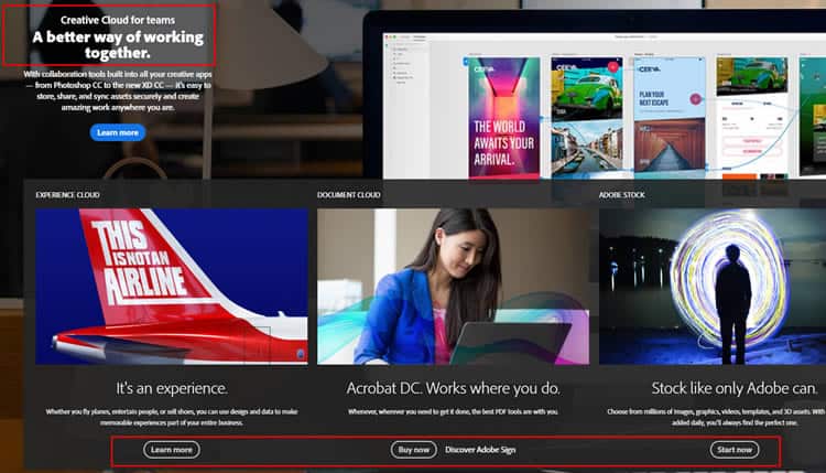
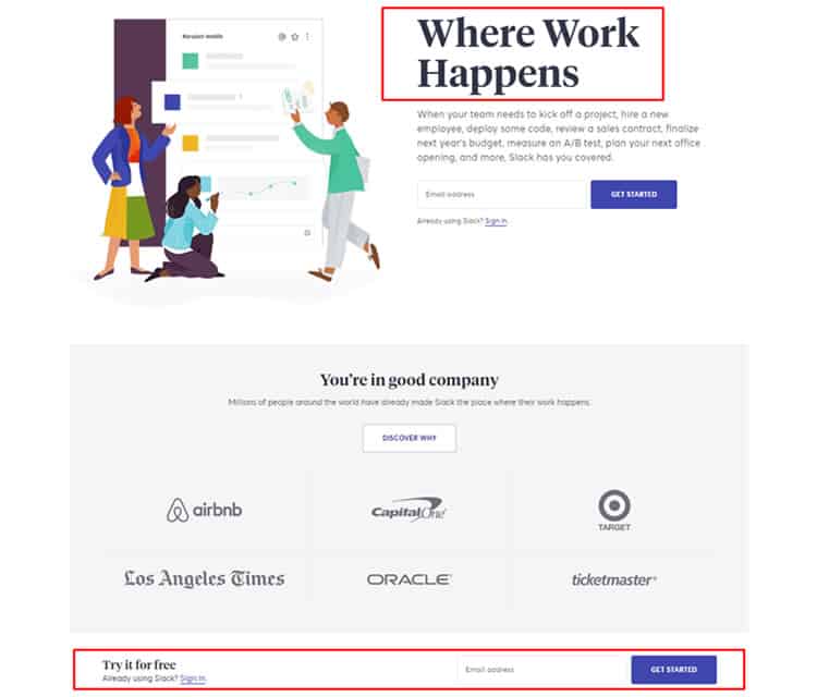
When it comes to designing a landing page, order the content based on the serial position concept. That means devoting the first section of your page to the key idea – usually a business benefit – and ending with a call to action (CTA).
The Von Restorff Effect
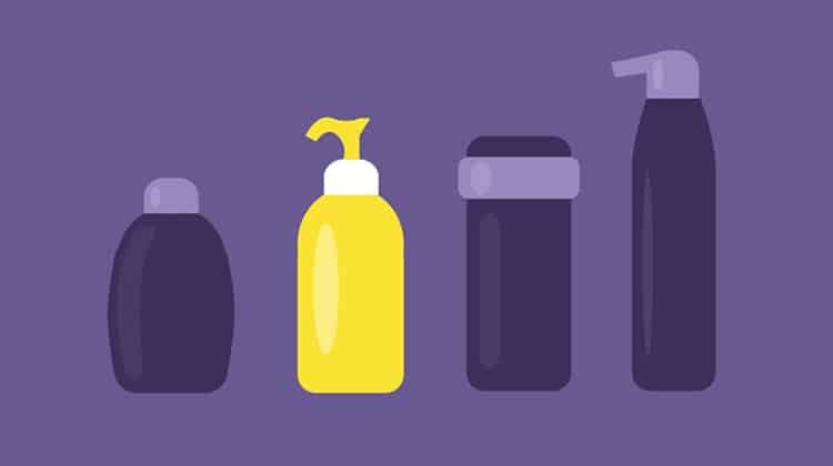
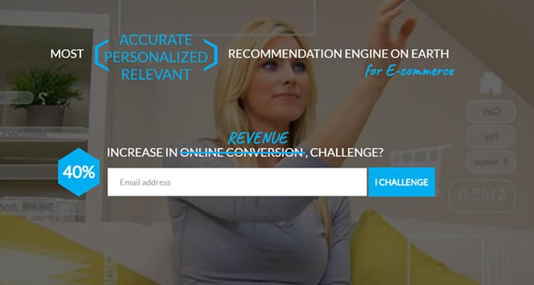
Also called “the isolation effect”, the Von Restorff effect states that users remember the things that stand out. To make your potential clients positively remember the unusual items, you can draw attention to light, colour, size, circumstances, image, animation, words, or sound.
Emphasise CTA Buttons
Whether you offer products or services, your aim is to make an individual perform a particular action while visiting your website. That usually means pressing such CTA buttons as “contact us”, “learn more”, “buy now”, “request demo”, “register”, “search”, etc. To maximise the chance of success, make that button more visible by:
Using a contrasting colour and/or size
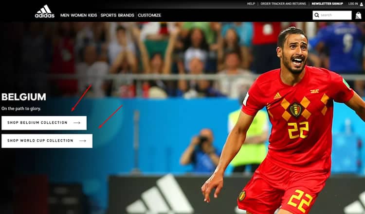
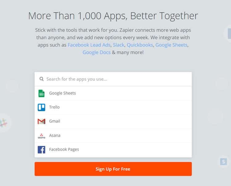
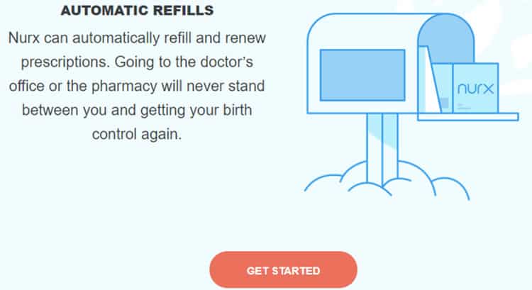
Increasing the amount of space around a CTA button
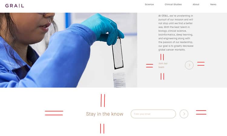
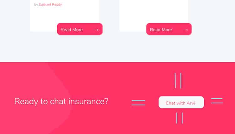
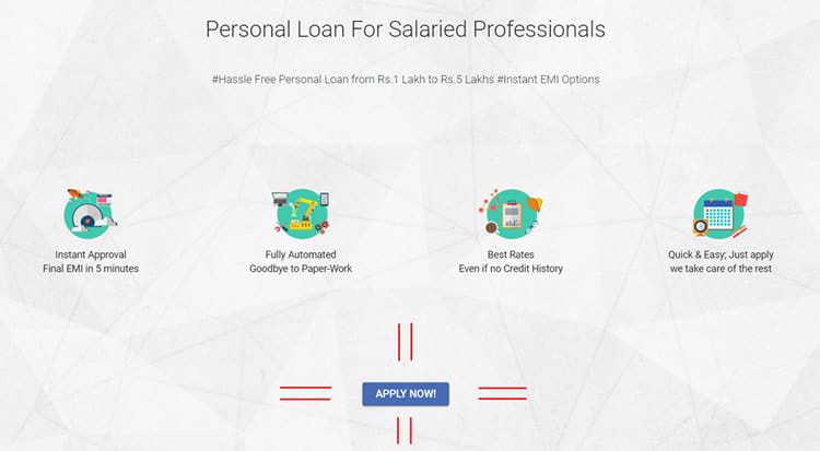
Fading or blurring background images


Emphasise the Items You Want to Sell First
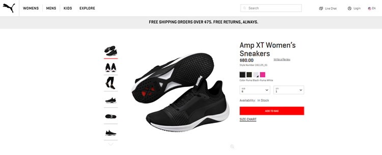
With the Von Restorff effect in place, you can draw user attention to particular items: the most expensive, best-selling, or new ones.



The Paradox of Choice
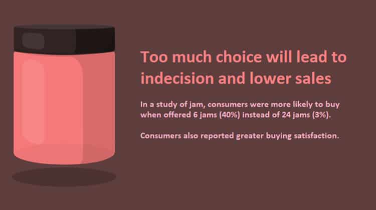
This is another effect set to control your clients’ behaviour. Coined by psychologist Barry Schwartz, the choice paradox states that too many options usually lead to indecision and, as a result, to lower sales.
To spare shoppers the possible decision fatigue, keep in mind the following recommendations:
Limit the number of CTA buttons
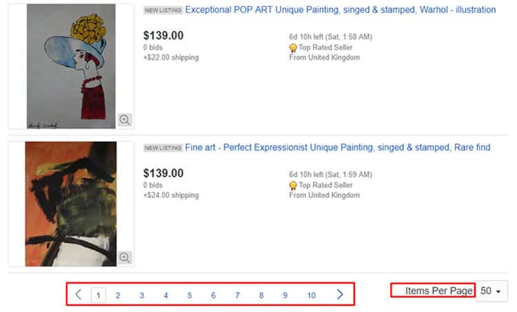
Use pagination or the “load more” button instead of infinite scrolling and allow users to adjust the number of items displayed
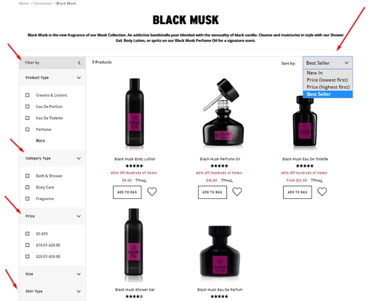
Reduce the number of default products on your home page

Enable smart filters to reduce the number of items displayed
The Zeigarnik Effect

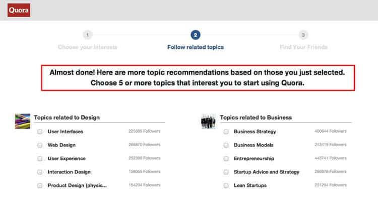
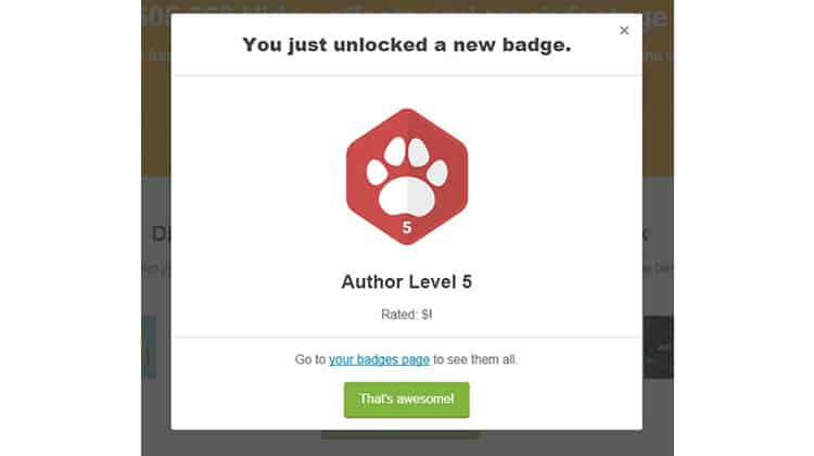
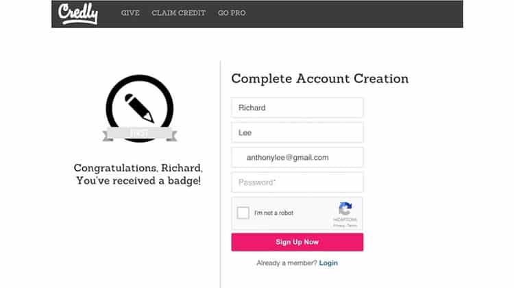
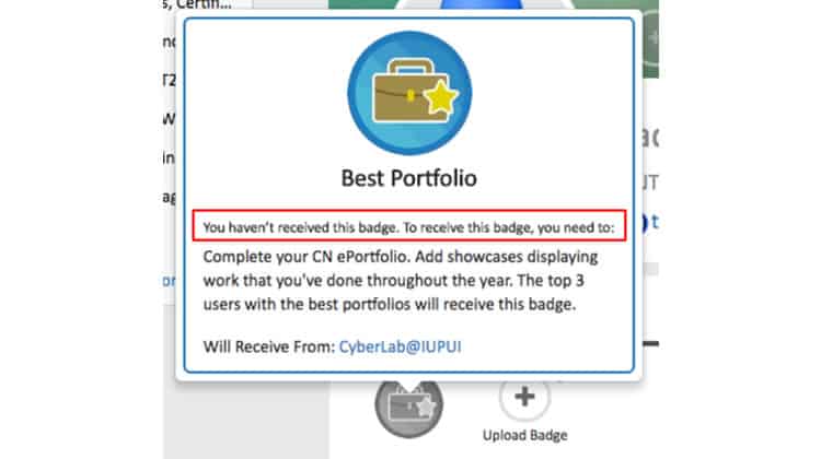
This is another persuasion tactic web designers cannot ignore. According to psychologist Bluma Zeigarnik, incomplete tasks stick in people’s minds, and they continue thinking about them again and again.
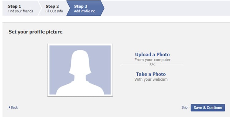
It stands to reason you should give potential clients motivation to finish the task, whether it’s a signup process, an online purchase, or profile filling. Here is how you can do that.
Show the progress bar

Give users incentives (for example, new badges)
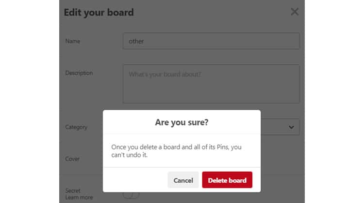
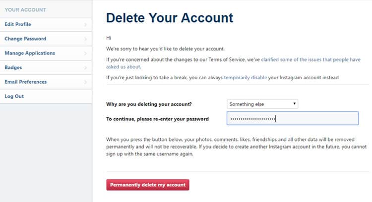
Warn users about irreversible changes
Conclusion
It is in your hands to make consumers buy a particular product and encourage them to visit your website over and over again. Depending on the site you are developing, you can use the tactics mentioned above or additionally rely on other psychological rules.
However, do not be guided by these techniques alone. In your hard effort to persuade clients to follow a specific path, do not forget that your objective is to make a site that enables users to achieve their goals. As long as this is fulfilled, you will be able to increase conversions, expand revenue channels, and hold down churn rates.
(Lead image: Shutterstock. All other photos in this article are screenshots taken when visiting the respective websites. They are being shown in this article for explanation purposes.)
Want to learn more?
Are you interested in the intersection between UX and UI Design? The online courses on UI Design Patterns for Successful Software and Design Thinking: The Beginner’s Guide can teach you skills you need. If you take a course, you will earn an industry-recognized course certificate to advance your career. On the other hand, if you want to brush up on the basics of UX and Usability, try the online course on User Experience (or another design topic). Good luck on your learning journey!
