According to mobile app user retention rates from Statista, 55% of mobile app users will abandon an app one month after downloading it. That number grows to 68% after three months. Localytics gives an even more alarming statistic: 21% of mobile app users will abandon an app after only launching it once. Today’s users will not even stick around to experience the app after downloading it. This means that user retention should be taken into account during the entire app design and development process, and should guide decision-making whenever possible.
Retention rate is the most honest and effective way to measure an app’s success and overall health. It is a better indicator of these goals than the number of downloads since downloads do not equate to active users. It is also a better indicator of app health than engagement since engagement rates can vary significantly across app categories. User retention rates point out whether your app is growing, stable, or showing signs of decline, and these fluctuations are directly affected by the decisions you make.
This article will give you a few essential tips on analysing and monitoring the right elements to keep up your retention rates and optimising your mobile UX design. Let us first take a look at what user retention is, and how to calculate it.
What Is Retention Rate?
An app’s retention rate is the percentage of users who are still using the app after a certain number of days since they first opened it
For example, if 100 users open the app for the first time on day 1, and then 40 launch it again the next day, then the app’s Day 1 retention rate is 40 users out of 100 or 40%. If out of the original 100, ten are using the app at the end of the month, then this month’s retention rate is 10%.

The way to measure ‘classic’ retention rate is to divide the number of users who opened the app again on any given day since they downloaded it (day N) by the number of users who launched it for the first time on the day they downloaded it. You can find more types of retention rates here.
How can you help optimise your mobile app for the highest possible user retention? Here are five tips on how to do just that.
1. Get In Analytics Early

A common mistake made by mobile app professionals is not integrating an analytics platform until their app is published. That is far too late in the game if you want to optimise your UX and increase your user retention. By that point, you will be bombarded with feature requests, performance and usability matters that will always be at the top of your priority list. Time will not be the only thing you will be short on: if you have not been collecting data and using an analytics tool until that point, you will not have anything on which to base your product decisions.
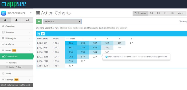
That is why it is essential to start using an analytics tool right away and implement it even for the testing phase of your app. For example, action cohorts can be used as a critical tool for analysing user retention. They allow you to understand how often users are returning over a set period of time. To power up your cohort tool, consider using user session recordings alongside it. That way, you will be able to see precisely how each user interacts with your app – users who churn and for users who stay.
2. Optimise The Onboarding Experience

Andrew Chen states that “the best way to bend the retention curve is to target the first few days of usage, and in particular the first visit.” That means one thing: your user onboarding has to be spot-on. Onboarding is the number one test for your app’s user experience. The bad news? You have only 20 seconds to make a good impression.
There are a lot of useful tips for creating an excellent onboarding user experience. Lots of them are dos: do keep it short, do show off your app’s unique advantages, and do show them how many onboarding screens remain with a progress bar. The key is to keep your users informed, engaged, and excited to start using the app, without tiring them out.
Then there are don’ts. Do not bombard your users with in-app messages right off the bat. Please do not ask them to rate your app before they have had a chance to complete onboarding. One piece of advice that many app professionals do not take often enough is: do not force your users to sign up before they have had a chance to check out the app.
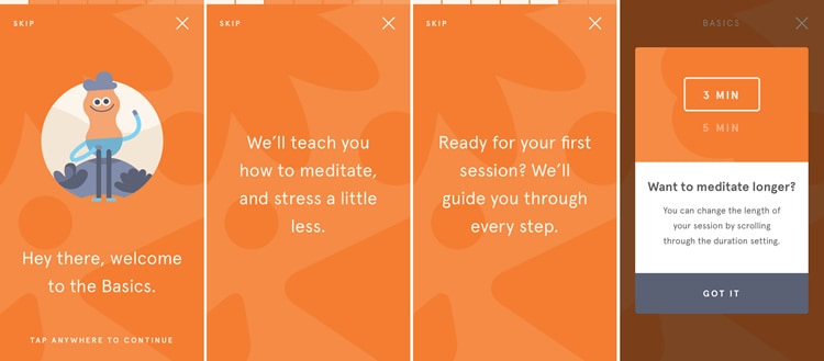
Get inspired by some remarkable user onboarding by looking at the Headspace, Slack, and Duolingo apps.
3. Ensure Frustration-Free Gestures

An example of touch heatmaps. Image source: Appsee
Measuring Gesture UX is becoming more and more critical as the iPhone moves away from the home button and Xiaomi adopts full-screen gestures. That is fantastic news for smartphone users. For mobile app professionals, it can be a challenge. Making your gestures smooth and easy to use is a crucial aspect of your app’s overall user experience.
When dealing with gesture usability issues, an oft-forgotten tip is: remember who your audience is. If your target audience is people on the move (for example a food-ordering app or a running app), senior citizens (for example a health app) or children (a gaming or education app), you should make sure that your UI and gestures are optimised for their dexterity levels. For even better user experience, place your most important elements within thumb reach.
Another problem that can come up with mobile app gestures is gesture-based usability issues. They are much harder to pin down because they do not result in a countable action that most analytics tools can pick up. Probably the sneakiest example of usability issues is unresponsive gestures. These happen when a user tap, swipes, or pinches the screen and expects the app to behave in a certain way … however, it does not. It might be a swiping or tapping gesture that the user expects but that you did not implement, or it might be a broken link on a button or icon. Unresponsive gestures are points of user frustration, and if not handled, they might lead to churn instead of retention. Touch heatmaps are typically the best tool for analysing gesture usability because they monitor the physical gestures and not just the interactions those gestures create. To learn more about them, check out this eBook.
4. Make Navigation Smooth As Butter

Navigation is hard to get right. There are a lot of different ways to create a layout or a menu – you will find some examples of menu designs in this article. However, your user retention will directly correlate to how your users navigate your app.
Users come to an app to perform specific tasks. If they cannot find what they are looking for, they will stop trying and go looking for your competitors. Every action associated with the progressing the user journey should be obviously simple, by having icons clearly marked and visible, and keeping the taps and interactions needed to complete a task to a minimum.
When it comes to avoiding common navigation mistakes, the best rule to keep in mind is simplicity. Avoid menus with too many options or too few, do not hide important navigation links, and keep navigations gestures and icons familiar to the user. Always keep the user journey in mind – make it simple, friendly, and smooth. Yummly, for example, manages to make the most out of both the top and bottom menus, by placing three key screens under tabs at the top of the screen and dedicating the bottom menu to the search function, personalised area, and the super-convenient shopping list feature.
5. A/B Test Retention-Risking Areas

If you are undecided about the best way to improve your retention rates, you can dip your toes in the water with an A/B test. A/B testing is a simple and efficient way to understand the decisions your users make in your app. They also help you improve your decision-making process about the product tweaks that might increase your user retention. Go ahead and run as many A/B tests as you can – you can consider having multiple A/B tests running in your app at the same time.
The most important thing to keep in mind when running A/B tests takes us back to item #1 on this list: analytics. To make the most of your A/B tests, use a robust analytics tool alongside your testing tool. Here is an example from Optimizely on running tests to understand customer behaviour and increase retention.
Summary
The reality today is that too many retention-related “decisions” are based on guesswork, gut feelings, and knee-jerk reactions. That means many iterations are wasted on details that will not affect the real retention problem. The way to get out of an inefficient iteration cycle (or avoid it in the first place) is to treat each element and interaction as part of a whole user journey – one that should encourage the user to keep using the product. This involves using analytics and A/B testing tools, optimising gesture UX and navigation, and encouraging users to stick around during onboarding. No matter how if your app is a bonafide “work of art”, users will never fully experience it if your retention rate is weak.
Want to learn more?
If you’re interested in mobile UX, you could take the online course on Mobile User Experience. It includes templates you can use in your own projects and you’ll get an industry-recognized certificate to improve your career. If, on the other hand, you’d like to…
- learn all the details of Usability Testing
- get easy-to-use templates
- learn how to properly quantify the usability of a system/service/product/app/etc
- learn how to communicate the result to your management
… then you might take the online course Conducting Usability Testing.
Lastly, if you want to brush up on the basics of UX and Usability, the online course on User Experience could provide you with the necessary knowledge. Good luck on your learning journey!
(Lead image: PC+ via Pexels)
