You know that feeling you get – the one that creeps up on you like rain in Summer, making you shudder from emotion? It happens when you get blindsided by something powerful, something meaningful, perhaps something from your past. It is entirely out of your control.
It can happen anywhere: a baby in a young mother’s arms may remind you of your first child? a song might remind you of the first time you heard it, when you were young and in love? perhaps a documentary evokes in you a vision of the earth’s bleak future.
Here is an unlikely (read: likely) place for such provocative imagery: UX design.
As a designer, you have the power to reach users on a level many tiers beyond usability and accessibility. Let’s talk about emotion. Let’s talk about maintaining full control over the user’s experience. Design is about passion as much as it is about, well, design.
One way of doing this is to create (and use) a mood board for your design. Let’s dig in.
What is a Mood Board?
Here is a definition you might find in a UX dictionary:
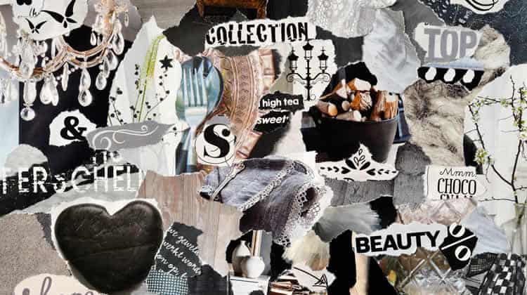
A collection of assets and materials intended to communicate the style, voice, direction, and language of a particular design, brand, or project.

But there is more to it. Mood boards can be used to communicate perhaps the most important tenet of design language – emotion. What will users feel when they use your product?
Use Mood Boards to Ignite Passion
UXDs, listen up: use your mood boards to target an emotional response. A good mood board will address the stylistic cues that define a product experience. An excellent mood board will define an emotional experience – everything else is merely there to support that experience.
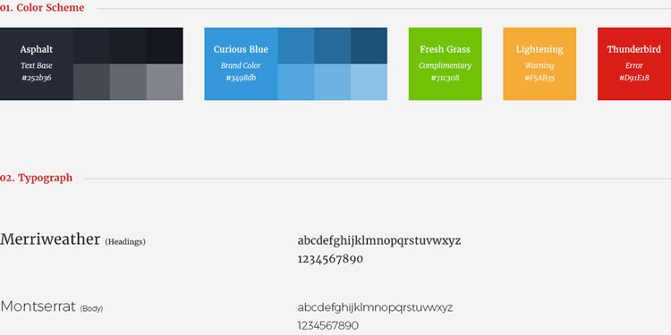
Determine what you want users to feel, and plan accordingly. You can put together imagery, color, language, and stylistic cues in such a way that you elicit the precise emotional response that you want.
In Beyond Emotion: Designing for visceral allure, Kevin Suttle talks about the socalled “mathematical formulas for beauty“, and how they promote usability by influencing the degree to which users want to interact with something.
Apply this principle as you go about creating your mood boards.
Consider the following:

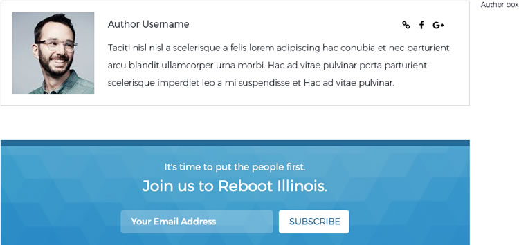
The above image illustrates the correct use of imagery to support a desired emotional response. By the time this mood board was created, UX research had identified the need to speak to the user on a personal level, to draw them into the politics discussed on the site.
Notice the personal nature of the author bio, the approachability of the head shot, the sans-serif font – a much less formal style than the traditional serif fonts used on other political blogs. The proposed CTA at the bottom entices the reader to “join the cause” in an effort to relate to them.
How to Know that you are doing it Right
So you have targeted an emotional response. You have put together supporting imagery, font styles, paragraph styles, and color palette – now what? How do you know that you have addressed your goals in an appropriate manner?
You could (and should) show your mood board to the stakeholders to survey their opinions and feelings, but how much does that tell you about your ability to target the right emotion? It might be difficult for the stakeholders to visualize the finished product from assets alone.
This is where your mood board graduates from basic to advanced.
Consider the following:

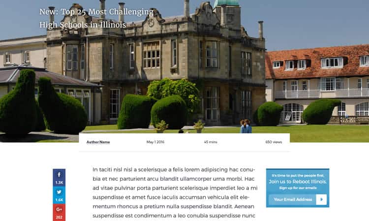
In order to ensure that your mood board captures the precise emotional response that you have determined to be necessary, it can often be beneficial to have an interface designer whip up a mockup of a critical page, using the assets and elements you have created for your mood board.
Upon completion, you will have a (rough) example of what you are going for, so that you can start surveying the stakeholders, your co-workers, and prospective users on their emotional response.
Then, simply adjust your assets to compensate for deviations from your intended response, and voila! You can now be confident that your mood board does exactly what you intended it to do.
Conclusion: Design for Emotion
UXD’s: the next time you are working on a mood board, ask yourself: am I designing for emotion? The difference between good design, and stunning, breathtaking design, is often a matter of emotional response.
Similarly, the difference between a good UX designer, and a really, really good one lays in their ability to not only simplify and optimize the product experience, but also to evoke profound emotion in the user.
Apply this advice everywhere you can. It will pay off.
Want to learn more?
If you’d like to become an expert in UX Design, Design Thinking, UI Design, or another related design topic, then consider to take an online UX course from the Interaction Design Foundation. For example, Design Thinking, Become a UX Designer from Scratch, Conducting Usability Testing or User Research – Methods and Best Practices. Good luck on your learning journey!
(Lead image: Depositphotos)
