We walk, we talk, we have opposable thumbs and we use these thumbs to interact with mobile apps. We are humans, and we are quite advanced.
Above all, however, humans (as app users) have needs that come in the form of emotional (I want to feel good), social (I want to look good), and functional (I want to be productive). I am self-centred, not because I am selfish, but rather because my life is the only one that accompanies me, day in and day out. These needs go hand in hand with how humans interact with mobile apps. App technology has advanced tremendously in 10 short years, and user needs have also developed as we become more aware of what we like and want. Due to this reciprocal impact, the technology/human need cycle never ends.
Maslow’s Hierarchy of Needs knows. We are needy. Or perhaps needs-y is a more appropriate word. Whatever the case may be, as app users, we want a positive experience with our mobile apps.
Remember, your app users are not robots. Since that is the case, we have put together some tips and tidbits that you can implement in your app. These points cater to building a successful app for humans and all of their needs.
Do Get So Emotional
For mobile app professionals, it is imperative that your app establishes an emotional connection – not an easy feat since emotions can be relatively irrational and tricky to wrap your head around.

Personalization is a crucial factor in building emotional trust from your user base. Emotions are what keep us alive and kicking, and we are also excited by the prospect of a unique app that is unlike anything we have ever seen.
If you can achieve relatable UX copy that is relevant and unique, while addressing your user in a non-generic manner, you are well on your way to breaking the ice. Not only will you demonstrate to your users that you and your product are unparalleled, but you will also be proving yourself to be a company that pays attention to what your users want and like.
Furthermore, people love visuals. Anything you can do differently that will catch their eye is gold, especially, again, if it is unique and of primo quality. According to a recent report, emojis, are proven to increase open rates in emails and push notifications, and apps that utilise emojis experience fewer uninstalls.
Be Easy
We are inherently lazy people! We want things delivered to us on a silver platter (even if we do not have the guts to admit it) because we just cannot waste a second of our day. Chew it up and swallow it for us, because we are not going to do it ourselves.

Wasting time is so passé, and with our busy schedules, we just cannot be bothered. Exerting the least amount of effort to produce maximum results is what drives us, and this mentality does not change when we are interacting with mobile apps. The Principle of Least Effort lends itself to this need because it pushes the notion of clean, simple, and straightforward
. Attention, focus, speed, and flexibility are cognitive elements that this theory embodies because, at the end of the day, people want their information delivered swiftly and naturally.
Users are not robots. They can navigate their way through life, let alone a mobile app, without any semblance of a thought or an emotion. Much of what we do is not calculated, and our actions are often completed unconsciously as a result of an emotion.
In truth, most of what we do, we do unconsciously, and then rationalize the decision consciously after the fact. – Joseph LeDoux
Humans prefer simple setup and will unconsciously steer clear of anything that remotely appears complicated. For example, if the login screen on your app is confusing or overloaded with features (or merely seems to be overloaded), this might wreak havoc on your users, potentially causing them to never return and certainly not recommend your app to their friends.
To build successful sign-up screens, you need to assess what your users want adequately. Since it is flat out impossible to ask a user what they like and expect to receive an unbiased answer, the better approach would be to analyse the user’s behaviour and choices in real-time, which can indicate user preferences.
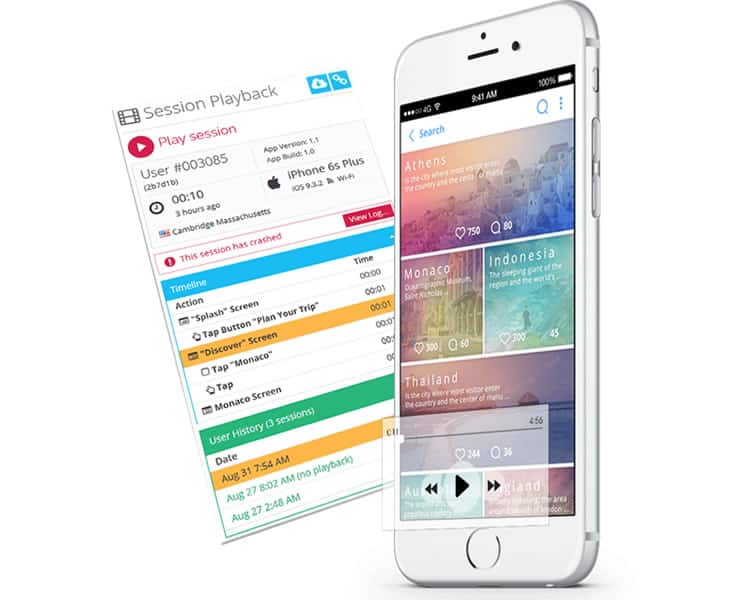
User Recordings help monitor on a qualitative level what struggles your users are experiencing. Through these visualisations, you will be able to identify any UI/UX issues, and you can be on your way to re-establishing that emotional connection with your users.

Embrace Your Inner Social Butterfly
What is cool today, has been cool since yesterday, and we do not want to go another day without being in the know. Ever. Social proof has so much power! Even those of us who claim to march to the beat of our own drum still end up following social norms to a certain extent because it is the norm, which means it is hard to avoid.
Through smart methods of persuasion, you can speak to your audience on their terms and in their language. By employing phrasing that emphasises motivation and understanding, you will reach your users on a personal level, on an emotional level, on a scale that will coax them to your app in a non-aggressive manner, and on a level that will get them to enter your app on a regular basis. Furthermore, for example with FOMO (Fear Of Missing Out), using trigger diction will make users really feel like they are behind the times and really need to jump on the bandwagon.

Not only do people want to feel part of the group, they also have trust issues when it comes to any marketing tactic. In fact, 84% of people trust online reviews as much as they believe reviews from friends. This is noteworthy because users/consumers will rely on a stranger for a review, as much as a friend or family member. Ultimately this means that you also rely on your users’ reviews to push the emotional appeal to others and bring them to your app.
Be Predictable
It is human nature to like what is comfortable, and we are accustomed to predictability. As Nir Eyal so cleverly pointed out, people do not want something new. They merely want the familiar done differently. If you can believe it, the California Roll is a perfect example of this. A big reason for the sushi craze exploding in the U.S. in the past few decades was due to marketing something new (sushi) with an air of familiarity (avocado, crab meat, and cucumber).

With this comfort, comes a tie to function as well. Perceptual Sets support the functional need of mobile users. This theory states that we are creatures of habit, and we are incredibly biased regarding how we see the world. We are influenced by our previous experiences, perceptions, and emotions. Therefore, when we interact with an app, we also have certain expectations. We expect designs to be in certain places. For example, we assume that the company logo, or even a search feature, would be on the top left or right of the screen, and if it is not where we expect it to be, then we quickly lose patience. This loss of patience can come in the form of tapping, swiping, or pinching all of the places to find what we are looking for, or worse, can result in ceasing all app activity.
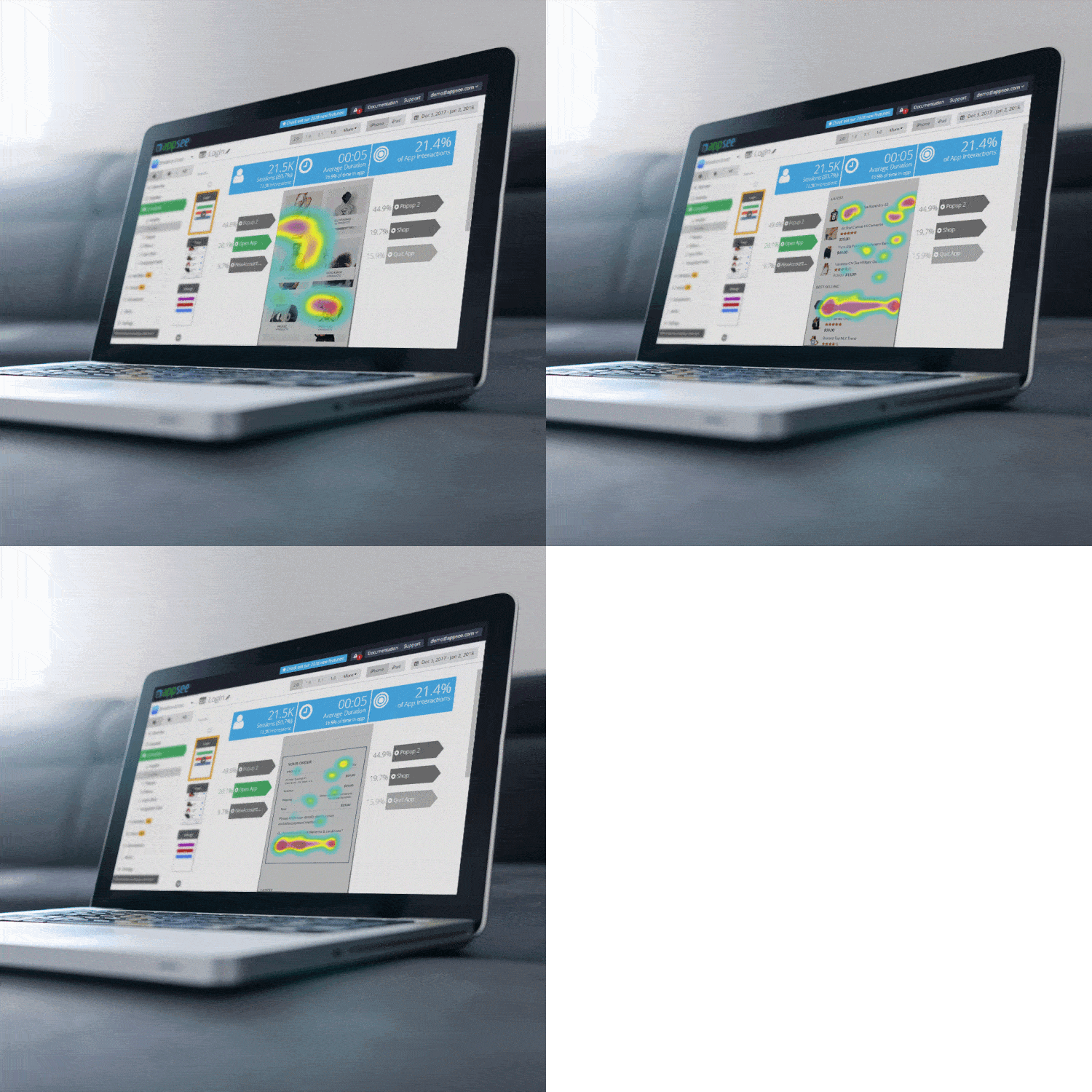
Still, how can you know if your users are struggling to find a button or frustrated that search feature is not where they expect it to be? Once again, qualitative analytics is your answer, but this time with Touch Heatmaps. This mobile metrics tool will leave you aghast with heatmap visuals of every gesture your user makes within your app – why were they trying to tap on that button that your UX team did not make tappable? Because your user assumed, perhaps due to perceptual sets, that that graphic was a tappable element.

With such profound insights, it is feasible to improve your app to a product that your users want, rather than trying to convince them to want your product. Understand their needs, their functional needs, and cater to them.
Design must be functional, and functionality must be translated into visual aesthetics without any reliance on gimmicks that have to be explained. – Ferdinand Porsche
Wear Your Heart On Your Sleeve
How can you implement emotional design into your app? The key is appealing to users and yielding a product that they want, not a product that you want.

Understand the frustrations that your users might be encountering, take these struggles, and create a positive emotional experience for them – one that will have them coming back more and more to your app. By embracing their needs, your app will render higher conversion rates, stronger retention rates, and greater app success.
Want to learn more?
If you’d like to become an expert in UX Design, Design Thinking, UI Design, or another related design topic, then consider to take an online UX course from the Interaction Design Foundation. For example, Design Thinking, Become a UX Designer from Scratch, Conducting Usability Testing or User Research – Methods and Best Practices. Good luck on your learning journey!
(Lead image: Depositphotos)
