Mobile phones are at once intensely personal objects, representing our interconnectedness with others, and symbols of how far technology has entered into our natural daily lives, often replacing more ‘human’ interactions.
However, mobile users still want and expect a human and personal touch. In a world that is more connected through technology than ever before, the challenge for mobile UX designers and product managers everywhere is to turn something impersonal into something personal, to manifest something technological in a very human way. After all, no-one wants a robotic robot.
The question is, how do you achieve this ‘human touch’ and deliver an experience that truly connects with your mobile audience? It is no mean feat. User personas definitely have their role during the early stages of app development, but do they become less relevant once your app is alive and out there in the world? Let us examine the usefulness of personas in more detail below.
User Personas During The Pre-App Launch Phase
As User-centered Design is all about understanding, empathising with, and speaking to the needs of users, the embrace of storytelling and personas for app UX during the pre-release stage makes much sense.
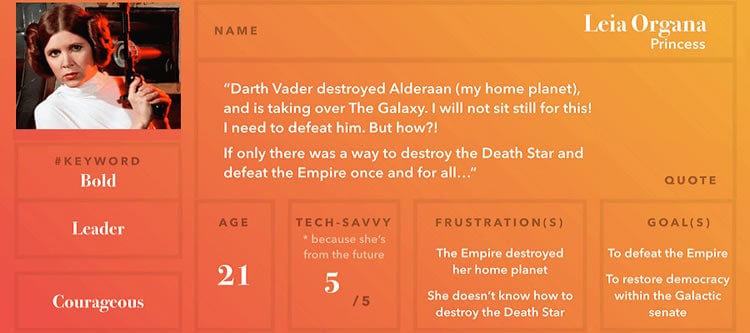
At this point, creating hypothetical user scenarios and user personas helps to create a human vision for theoretical users that do not exist in reality yet.

User personas entered software design as a principle because programmers failed to connect their work to the people that would be using their products. The key to remember is that although representations, user personas are not fictional characters in an ideal world. Personas created purely from imagination and assumption are equivalent to making numbers up on a spreadsheet and reporting this as ‘research findings’. User personas should always be composed of real data, collected from multiple individuals during the user research phase.
It can be tempting to skip the persona-building stage once you have collected a chunk of useful data from would-be users. This usually happens as a result of perceiving persona creation as a ‘document’, and not as an anthropomorphisation of your user research findings. The reality is, when you have got hundreds of data points to pour over, there is not really a better way to summarise your findings into a humanistic whole. For an excellent overview of the different types of persona available and the steps required to construct your own at this stage, please refer to this excellent article from the Interaction Design Foundation [Affiliate Link].
Post-App Launch: Moving Past User Personas To Real Behavior
One of the central tenets of user-centred design is that your product becomes more successful the more you learn about your users. Once your app has launched, you are no longer confined to hypothetical constructs and ‘say/do’ dilemmas where users suggest they would behave in one way, then do not. This is crucial. For long-term success, you need to continually assess your app’s product-market fit, learn more about your actual users’ behaviour, and gauge and how well your solution solves problems in the real world.
Once upon a time, combining quantitative data with qualitative methods like interviews, longitudinal diary studies, and customer surveys would have been the best methods available for assessing cumulative UX. However, over the last ten years, qualitative app analytics has taken off. In 2019, more than 60% of today’s top apps have adopted this type of analytics.

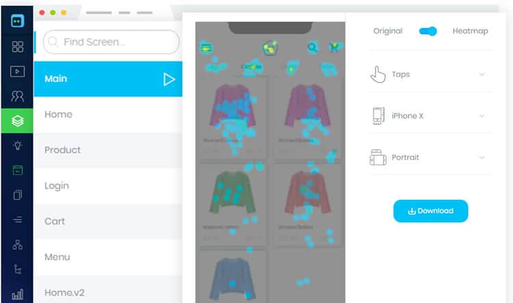
Where before, most tools took a ‘depth’ wise account of a user, qualitative analytics finally shows why users made certain behavioural decisions through tools like session replay and heat maps. As shown in the example above, this kind of technology lets you visualise which parts of a screen your users are most interested in, which features are underutilised, and real-case examples of incorrect touch gestures. This is powerful stuff for any UX or UI designer.
Becoming A ‘Behavioral’ Product Manager
Qualitative analytics has become a no-brainer for many. So much so, that we have seen the rise of the behavioural product manager, a PM that consistently integrates methods of behavioural science into their product design. In the app world, the critical difference between a traditional PM and a behavioural PM is that the former continues to build for a user persona or ideal customer, while the latter bases decisions on actual user behaviour.
Although personas help to provide a sense of tangibility during pre-release, they cannot account for the multifaceted nature of user behaviour in the long-run. You will find that once you have got real-life behavioural use cases to digest, things will become too cumbersome to condense into discrete representations of user personas.
Combining your original opportunity statement and behavioural goals with a Behavioural Analysis Matrix is a much better approach once you have reached the stage of validating your app with real users. Find out how to do this here.

Filling In The Missing Link
Until recently, the majority of app analytics platforms were not offering a means to stitch behavioural session data together at the user level. It was possible to see how users were interacting in general, but not patterns of behaviour among users over time. As a result, a substantial amount of extrapolation was still required when it came to grouping similar types of users together, making accurate targeting tricky.
That is where user analytics and query-building comes in. In 2019, we are finally seeing solutions that enable us to query, observe and learn from visual app session data in a way that covers the full history of interaction for any particular user or group of users.
Imagine being able to visualise not only how users behave in your app, but to filter any behavioural moment based on the scenarios that interest you. Today, you can run highly complex questions about your app’s users, and pull insights regarding their history of experience in a matter of seconds.
If your app is a game, you could query all users that logged into your app in the last week and paid more than $100 in the previous month to unlock a new level. As a retail app, you could filter sessions according to users in the USA and Canada that used iOS devices and added an item to their cart in the last 30 days. By exploring the session replays associated with these sessions, you will find that spotting behavioural patterns and identifying room for UX improvement is easier than ever before.

User analytics do so much of the grunt work when it comes to pulling insights about user behaviour, there seems little point in continually turning back to your user personas to understand your users. In 2019, with the tools available today, you do not need to represent your users, you have them in front of you.
In Summary
By creating ‘fictional’ archetypes that are nevertheless grounded in real user research during the pre-release app phase, mobile app teams can create and share useful human visions to work towards.
However, mobile app users today are one of the most complicated and critical audiences to please. They have high expectations, they are savvy, and they will be quick to jump ship if something goes wrong one too many times. If you are interested in long-term growth and increasing your customer LTV, it is vital you move from the assumption phase to knowledge validation phase once your product is out there and being used in the world.
This will require getting to grips with real-life scenarios and interactions with your product and moving past the original stage of user persona building. In 2019, combining qualitative analytics with user analytics and query-building is really your best bet for drawing insights in a way that will realise the most ‘human’ experience your app can deliver in the future.
Want to learn more?
If you’re interested in mobile UX, then taking the course on Mobile User Experience, which includes templates you can use in your own projects. If, on the other hand, you’d like to…
- learn all the details of Usability Testing
- get easy-to-use templates
- learn how to properly quantify the usability of a system/service/product/app/etc
- learn how to communicate the result to your management
… then consider to take the online course Conducting Usability Testing.
Lastly, if you want to brush up on the basics of UX and Usability, the online course on User Experience could provide you with the necessary knowledge. Good luck on your learning journey!
(Lead image: Depositphotos)
