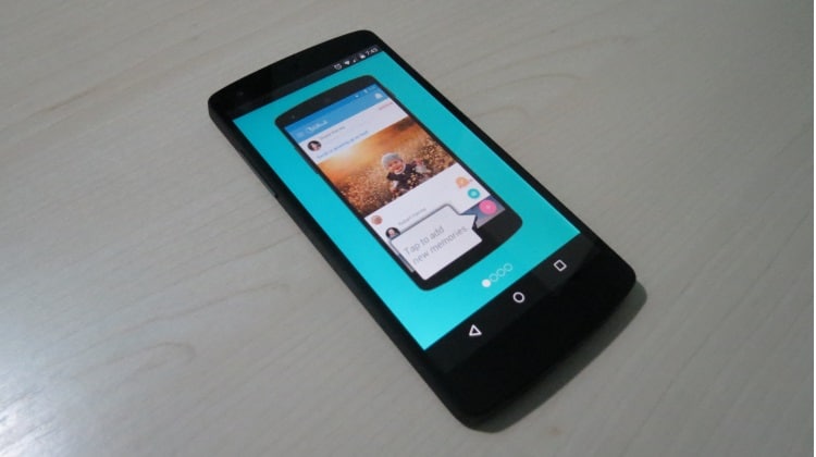
There are various factors that affect an app’s retention rate. But as the saying goes, “First impression is the last impression”, the first factor that comes into play is how good is your app’s onboarding screen.
Onboarding screens have become very common nowadays. They can be referred to as the simple walkthroughs that introduce users to how an app can be used and what it can accomplish. This obviously increases the likelihood that new users understand what it is about, what tasks it can do and how to use it to do them.
The rule of thumb states that your mobile app’s onboarding screen should be designed in the most user-friendly manner. However, there are plenty of app makers who often go wrong in their assessment of user-friendliness and end up creating an onboarding experience that only confuses the users.
So, how do you avert such a scenario? How can you be sure that the onboarding screens you are creating are serving their purpose? Adhering to good practices and monitoring app onboarding screens using visual analytics is the right combination technique that is offering mobile app developers an ideal opportunity to get it right first time.
Mobile app onboarding techniques
As stated by Rudenko, there are 3 main onboarding techniques:
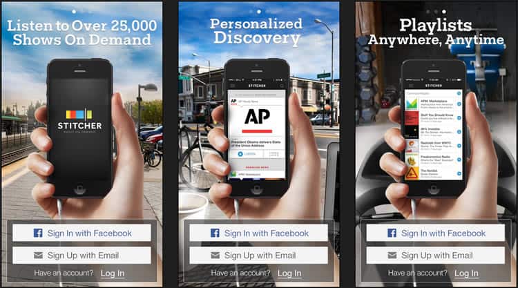
Benefits-oriented onboarding: Describes the benefits of using the app and informs the user on how to benefit from it.
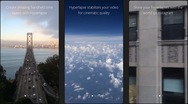
Function-oriented onboarding: Specifies the main functionality of the app, when you can use it and how.
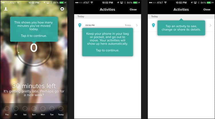
Progressive onboarding: Perhaps, the most popular of the three, it relies on the fact that users learn more by doing something. Onboarding is presented during the actual usage of the application. For example, if they are on a screen that allows them to take a photo, then the related instructions appear in context, pointing towards the icon that triggers the phone’s camera.
Mobile app onboarding guidelines
Based on the above classification, Germaine Satia provides a set of mobile app onboarding guidelines for each category:
- Benefits-oriented onboarding:
- Limit yourself to showcasing a maximum of 3 key benefits
- Each slide must contain 1 benefit
- Prioritize to only showcase the main benefits
- Use consistent vocabulary
- Onboarding must be presented before any registration process
- Keep the onboarding process as brief as possible
- Function-oriented onboarding:
- Do not explain obvious functionality
- Limit yourself to 3 slides with 1 functionality per slide
- Focus on helping the user get started
- Progressive onboarding:
- Use to show complex workflows
- … hidden functionality
- … or gesture-driven interaction
Mobile app onboarding best practices
In his brilliant article on Smashing Magazine, Alon Even provides a list of 3 simple guidelines that need to be adhered to so as to ensure a great onboarding process.
These are:
- Give an overview: This can be achieved by highlighting the important areas of the app while keeping the app screen itself visible. In this way users would be able to easily locate the functionality they are looking for.
- Show the value: Show the key strengths of your app by utilizing as few screens as possible during the onboarding process. Then proceed to engage them further after you have brought them onboard.
- Show what they need to do to get to the next step: Guide your users step by step (or screen by screen for all that matters), thus providing a smooth onboarding experience.
App onboarding … done right
There are some great examples of how onboarding should be correctly implemented. To mention just a few:
- YouTube Capture uses inline hints that educate the user about how they can play around with the app in a very simplified manner. The steps are explained with directly-intended text and really help maintain the users’ attention.
- Mailbox has a remarkably easy and effective way of providing a tutorial to its new users, showcasing the app’s features and how they can make use of them. The tutorial is a combination of several screens, each of which serves as a direct set of instructions needed to understand the app’s functionalities.
- Spring is a great example of how you can take a flowchart-like approach to introduce the users to the app’s benefits while they get around to understanding its workings. It also makes it possible for users to use their Facebook accounts to log into app and start using it.
- SwiftKey comes across as an inspiring example with an onboarding experience that makes it easy for end users to understand the interaction. It presents a sort of tutorial wherein the users are given instructions on how they can use the app, and these instructions follow a step by step format. Instructions are interactively given out and the overall onboarding process is very smooth and streamlined.
App onboarding … gone wrong
Now, for an example that one should not follow – the official app of the Sochi Winter Olympics. To begin with, the onboarding screen loads after taking a reasonable amount of time. Then, the process to set up the app is explained through 7 steps, each of which is advocated by a cluttered design. Finally, you reach a screen with text that is so small that you must strain your eyes to decipher. It did receive a lot of flak for its poor user interface.
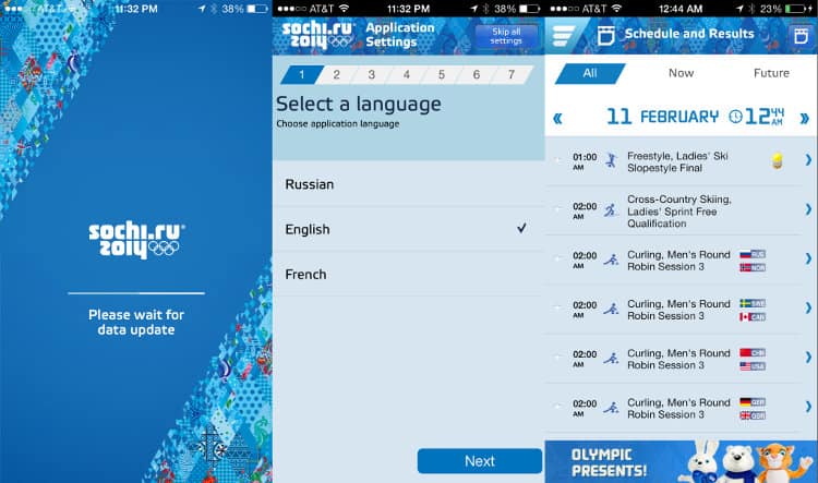
In order to make sure that your app’s onboarding screen is up to scratch, you need to monitor its usage through visual analytics
Visual analytics to analyze your app’s onboarding screens
Let’s take a look at the different visual analytic approaches available to measure the success and identify any interaction issues with your app’s onboarding screens.
- Touch heatmaps: When you want to get the most insightful picture of how your users engage with your app, touch heatmaps are probably the most reliable tools. They prove to be extremely handy when it comes to understanding the user behavior by identifying which part of the screen they pay most attention to and why they perform certain actions.
- Recording users’ navigation route: By collecting the data built around recording the navigational routes of multiple users, you get a greater insight into the user behavior. You can figure out which navigational elements are being perceived most intuitive by the user and what particular screens they are spending most time on.
- Real-time reporting: Using real time analytics, you can immediately identify what your users are doing at a specific moment in time. When you are analyzing in real time, one common outcome would be the observation of users spending a lot of time on a particular UI element or screen as they try to figure out if a particular element is a CTA button or simply an image file. In short, it will help you deliver more clarity in the user interface.
The final word
It can thus be concluded that there is no rocket science to building a user-friendly onboarding experience. A good starting point would be to follow some of the advice given in this article and, above all, do so while monitoring the users’ behavior from close quarters.
Want to learn more?
If you’re interested in mobile UX, you could take the online course on Mobile User Experience. It includes templates you can use in your own projects and you’ll get an industry-recognized certificate to improve your career. If, on the other hand, you’d like to…
- learn all the details of Usability Testing
- get easy-to-use templates
- learn how to properly quantify the usability of a system/service/product/app/etc
- learn how to communicate the result to your management
… then you might take the online course Conducting Usability Testing.
Lastly, if you want to brush up on the basics of UX and Usability, the online course on User Experience could provide you with the necessary knowledge. Good luck on your learning journey!
(Lead image source: ChildHud’s onboarding screen)
