
Few UX designers would consider themselves mathematicians. From my experience, most of them despise the subject. And why would not they? Their passion concerns art, design, the realm of conscious creativity — the apparent antithesis of the cold objectivity of numbers or data.
But all designers, not just UX ones, employ cornerstone principles of math every time they use a paintbrush, a pencil, or a touch-pad. In fact, some of the most fundamental techniques of design are rooted in mathematical concepts. You may be applying them without even realising it.
So why learn them?
Garnering a better understanding of the math behind art and design means you can consciously apply it to your work. Math loses its identity as a painful headache, a high school tormentor. Instead, it becomes an invaluable tool for both artists and UX design companies.
Below is a list of just three of these mathematical principles, how they relate to design as a whole, and how to apply them correctly in the web and UX design domain. These math concepts are old, ancient even, but despite their age, they remain as relevant as ever today.
We live in an era where seemingly everything is connected. What we do not realise is that most of it has been connected for a very long time.
1. The Golden Ratio
What do the Mona Lisa and the Google logo have in common? What possible relation could there be between arguably the most iconic painting in human history, and the emblem of a tech mogul started in 1998?
The answer is that both the painting and the logo employ the golden ratio, also known as the divine proportion. To mathematicians, the golden ratio is roughly 1.618.
According to Wikipedia, two quantities are in the golden ratio if their ratio is the same as the ratio of their sum to the larger of the two quantities.

Luckily, to artists, architects, and designers, the golden ratio can be more simply described as the proportion that is inherently pleasing to the human eye. It is probably best shown with the golden rectangle, shown below.
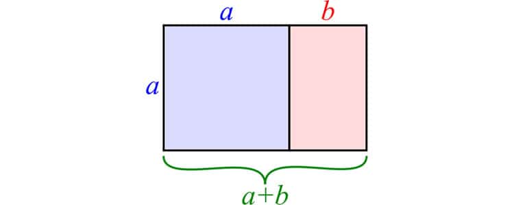
This, admittedly, does not seem like much. But the golden ratio is universal. It is everywhere, and it naturally draws the human eye to it. It has been the principle behind the design of many logos, fonts, and layouts—key design components when crafting UX.
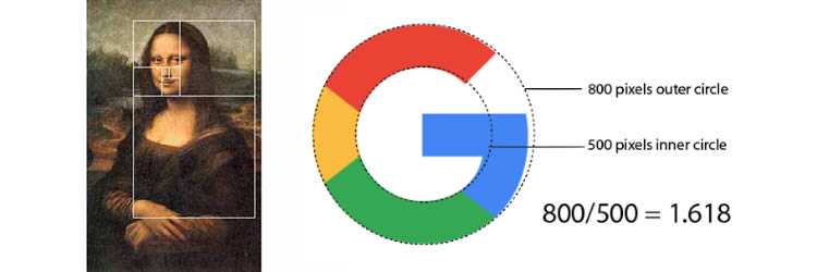
As mentioned above, Google’s logo utilises the golden ratio in the circumferences of the two circles in its logo. And it is not just Google that has used this principle to its UX advantage.
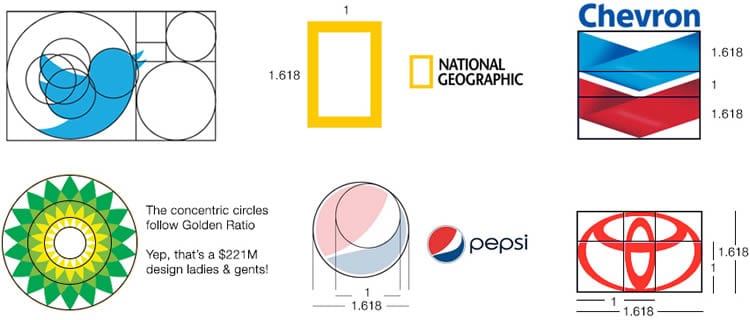
The golden ratio is ubiquitous, and a prime example of how math subtly influences our design practices.
2. The Fibonacci Sequence
The Fibonacci sequence describes a series of numbers where the next number in the sequence is the sum of the previous two. Starting from zero, it looks like this:
0, 1, 1, 2, 3, 5, 8, 13, 21, 34, 55, 89, 144…
This pattern is the basis of Fibonacci design, which works especially well for websites that are content-heavy, such as blogs or other online publications. Take a look at the example from Smashing Magazine below.
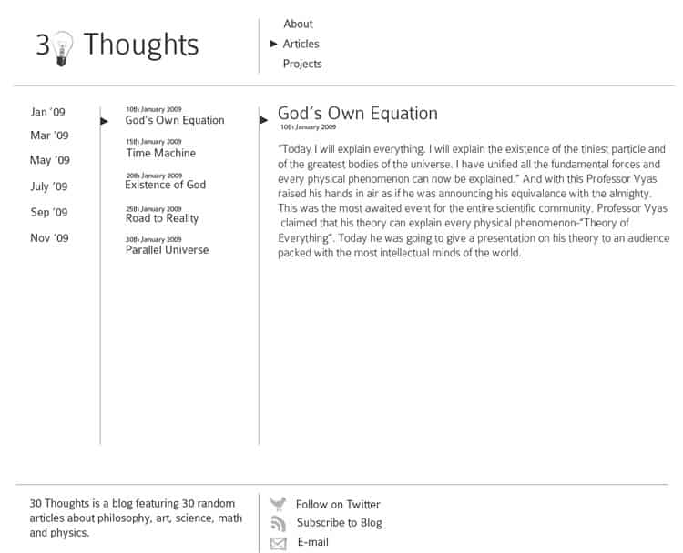
This above blog is simple but well-designed. The content is sensibly organised, the font sizes are readable and proportioned, and the layout itself looks crisp and clean. It’s also an excellent example of Fibonacci design.
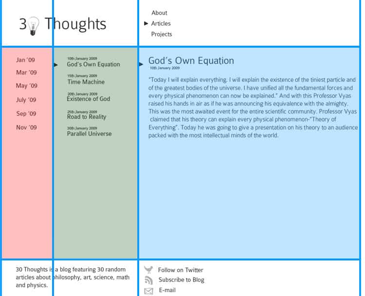
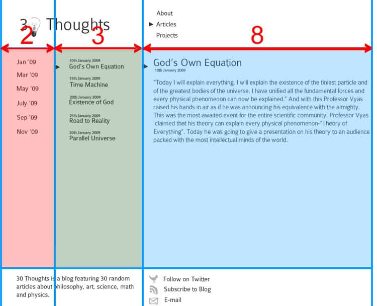
For example, the width of each of the three columns relates to each other by Fibonacci numbers (specifically 2, 3, and 8). The ratio of the widths of the first two columns is 3:2, and the second two columns is 8:3.
The Fibonacci sequence dictates even the font sizes. In this example, the page heading has a size of 55px, the article heading a size of 34px, and the content itself 21px. The result is all the text on the page appearing perfectly proportional, and aesthetically pleasing.
Another way to think of the Fibonacci sequence in design is by using the numbers as “building blocks” to create appealing site layouts. Look at the rectangle below, composed of smaller squares whose lengths are Fibonacci numbers (1, 1, 2, 3, 5).
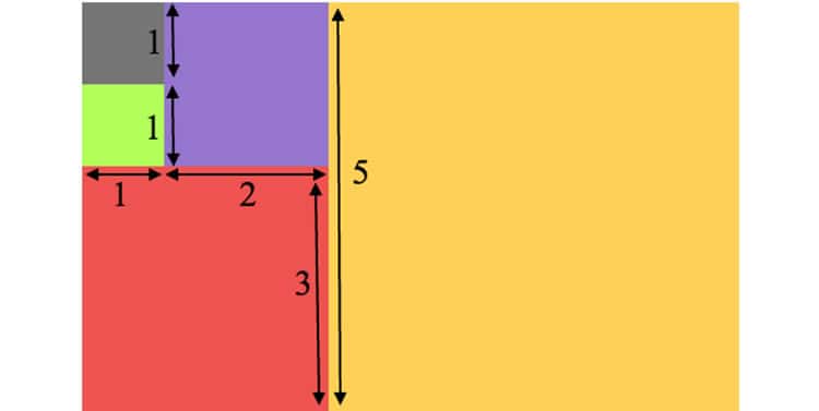
This is an immensely popular website design that you have probably seen or even used several times before. Take a look at FastCompany’s website for instance.

The site’s featured content is the largest block, labelled 1, with its search function and other navigation features in block 2.
A final note on the Fibonacci sequence—as you add numbers together to generate the next one in the sequence, a pattern emerges. If you divide a number in the sequence by the previous one, you eventually get closer and closer to 1.618, otherwise known as the golden ratio.
3. The Rule Of Thirds
Unlike the golden ratio or the Fibonacci sequence, the rule of thirds is well-known, even outside of design circles. While no UX designer needs a lesson in this concept, I would be remiss if I wrote an article about math’s role in web design and did not mention the rule of thirds.
The rule of thirds describes splitting a composition into nine equal parts by dividing it with two equally-spaced vertical lines and two equally spaced horizontal lines. This forms a basic grid that, when superimposed on a composition, can be used to layout key features.

For example, the four intersections on the rule of thirds grid are excellent locations to place elements of your design that you want to highlight. In web design, the top left intersection is the most potent. That is where the human eye is drawn to first when viewing a page.

Look at EQRec’s home page. The top left intersection highlights the major takeaway from the homepage: a call-to-action to visit the world’s best recording studio. The rest of the page is cleanly parsed via the rule of thirds, especially the nav bars on the top and bottom of the page.
It may not be as wholly impressive, or as subtle as Fibonacci design or the golden ratio, but the rule of thirds is an excellent example of math’s impact on UX.
UX By The Numbers
Do all designs need to be based on these math concepts? Absolutely not. They are not templates, but rather guidelines—another tool in your design toolbox to wield. No matter how significant a role math plays in UX design process, the user experience remains a creative endeavour.
But top UX design agencies recognise the importance of understanding the essence of design. And that includes not balking at math’s role in the UX realm, and even embracing what it can teach us.
These principles are not the only way math factors into UX.
Arguably the largest role math plays in the UX landscape is not shapes and geometry, but rather statistical data and empirical evidence. We will explore this further in our next post on math’s essential connection to the user experience.
Want to learn more?
Are you interested in the intersection between UX and UI Design? The online courses on UI Design Patterns for Successful Software and Design Thinking: The Beginner’s Guide can teach you skills you need. If you take a course, you will earn an industry-recognized course certificate to advance your career. On the other hand, if you want to brush up on the basics of UX and Usability, try the online course on User Experience (or another design topic). Good luck on your learning journey!
(Lead image: Unsplash – Creative Commons)
