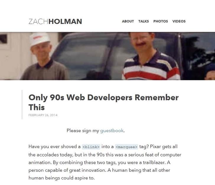
Remember how things used to look when web design was in its infancy? For some reason, back then the world seemed to have a fascination with small animated GiFs and marquees. Websites mostly consisted of scrolling text with animations of Pikachu getting cut in half. There would also probably be some Midi music playing in the background too and the whole thing pretty much gave you a seizure …
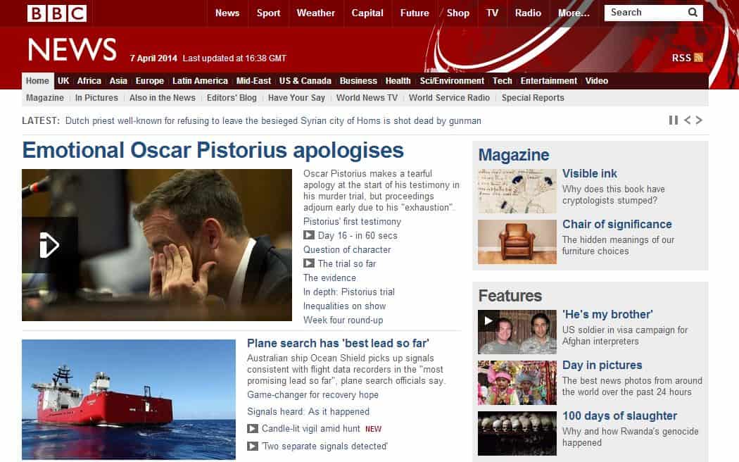
But then the web grew up and our approach to design changed. In many ways this was for the better, as pages became less graphically intense, less multi-coloured, and much more enjoyable to read and navigate. And naturally this improved the user experience.
But I have a criticism of this change too: which is to say that in many ways the design also became a lot more boring. Most sites look the same these days – there’s not a lot of movement, and there’s far too much white space. The average website seems to take zero advantage of the fact that it is on a computer, and it seems to be completely devoid of anything that could be considered vibrant or eye-catching.
Re-Thinking the Marquee
While web designers have pretty much given up on GiFs and marquees, the former at least seems to be making something of a comeback among users thanks to social media sites like Tumblr. GiFs are now generally short clips taken from movies or television, or from amusingly cute animal videos, and can be used to bring a smile to a friend’s face, to make a point, or to say something about who you are and what your favourite moments in TV are.

And if GiFs can make a comeback… why not marquees? Don’t be afraid of using them just because no-one else is. Ask yourself – can they be used in a similar manner to draw attention, to make a point or even to provide nostalgia?
Here are some benefits of marquees
- They allow you to fit a long stream of text into a small space with no need for scrolling
- They immediately draw attention to themselves
- They have an appealing ‘retro’ vibe
- They can fill thin spaces that look empty
- They are fun and quirky
- They’re still supported by most browsers
- And perhaps most of all: they are relatively rare meaning that they’ll be memorable and all the more likely to stand out
How to Use the Marquee
That said, marquees have largely died out for a reason, and they do have some drawbacks that you need to consider when you’re thinking about using them. They can be quite distracting for instance when you’re trying to read a page and they mean you can’t print the page. To avoid these problems, try to keep your marquees away from important blocks of text and if you want your page to be printable, ensure that the marquees move in such a way that they remain constantly visible.

Technically a marquee is a non-compliant HTML element, so if you want to get around that you can use JavaScript to achieve the same effect instead.
Finally, make sure you are creative with your marquees and use them where there’s a call for them rather than just to be different. Scrolling LED messages are currently very in vogue at the moment for instance and lend themselves perfectly to this forgotten element.
Want to learn more?
Are you interested in the intersection between UX and UI Design? The online courses on UI Design Patterns for Successful Software and Design Thinking: The Beginner’s Guide can teach you skills you need. If you take a course, you will earn an industry-recognized course certificate to advance your career. On the other hand, if you want to brush up on the basics of UX and Usability, try the online course on User Experience (or another design topic). Good luck on your learning journey!
(Lead image: Depositphotos)
