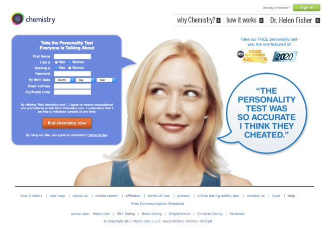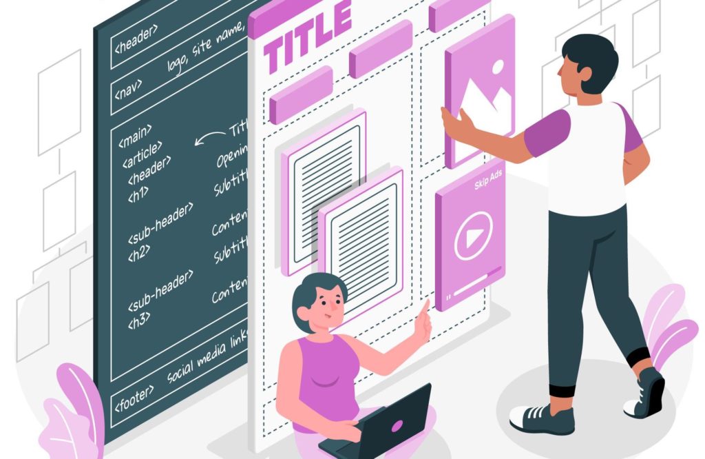
Picture this: You’ve just finished doing your research for a product you need and found that a specific website offers it. And to top it off, the website has several wonderful reviews. So, you excitedly click on the website, thinking that you’ll get exactly what you want.
But there’s a problem; you can’t find the product page because the website owner cleverly decided to give it a fancy name. Then by sheer luck, you bump into the product page, but the website offers countless other products.
So, you decide to use the website’s search feature to find the product you want faster. But you can’t seem to find it either.
And because you really need this product and from your research, this is the website that offers the exact product you’re looking for, you scroll through the products to find the one you want.
You get excited once you see it and think that finally, all the time you’ve wasted trying to find it will pay off. But there’s another problem; you can’t seem to find the “Buy Now” button.
So, you frustratedly go back to the search engine to find a product similar to what you wanted.
Having to go through all this can be frustrating. And not many people have this level of patience online.
Now, imagine taking your potential customers through that with a website that’s poorly designed. Not only will your users’ experience be horrible, but you’ll also lose good leads.
How much does your website design affect conversions?
Here are some facts showing how important your website design is for you to make more sales:
- 46% of customers believe that a website is credible based on how it looks. So, if you don’t put too much thought into designing your website, then your potential customers won’t trust you, and you’ll end up losing them
- 38% of web visitors don’t engage with an unattractive website. So, if your website is unattractive, you’ll lose leads
- 59% of visitors prefer engaging with a beautifully designed website compared to 41% who are okay with a plain and simple website. So, the better your web layout, the more your visitors engage with you
As you can see, your website design doesn’t only determine if you attract visitors to your website but also if you can keep them engaged long enough to become paying customers.
So, how do you design your website layout to make more conversions?
Designing your website layout for maximum conversions
From the colors you choose for your website to how you arrange your content to be visually appealing to potential customers, there are many different elements you should look into if you want to get more conversions from your website.
Let’s show you how you can do it.
Start with Navigation
Navigation determines how your visitors interact with your site.
Is it easy to find what they’re looking for on your site? Are they able to move from point A of your site to point B without hitches or waiting for too long?
These are some of the questions you should have in mind when creating your website because they help you make your visitors have a wonderful user experience.
So, what should you do to ensure your customers can easily navigate through your website?
1. Have a clear menu bar
Your menu bar is almost always the first point of interaction with your web visitors. So, the menu bar items have to be precise and not leave room for misinterpretation.
Therefore, use simple language to describe the menu bar items because your visitors don’t want to spend the little time they have trying to figure out where your product pages are.
So, you can use the most common description to make it as clear as possible what each page contains. You can use:
- “Home”, “Start Here”, or your logo for your home page
- “About” or “About Us” for the page with your personal and company information
- “Products” or “Services” for the page where you have listed your products or services
- “Contact” or “Contact Us” for the page with your contact information
- “Portfolio” for the page that showcases samples of the work you can do
With such descriptions, it saves so much time for your visitors and makes it easier for them to find what they’re looking for.
2. Have an intuitive search bar
The next item that’s a real gem, especially for eCommerce websites, is an intuitive search bar. The search bar should have autofill and auto-suggest features to make it easier for customers to find what they’re looking for.
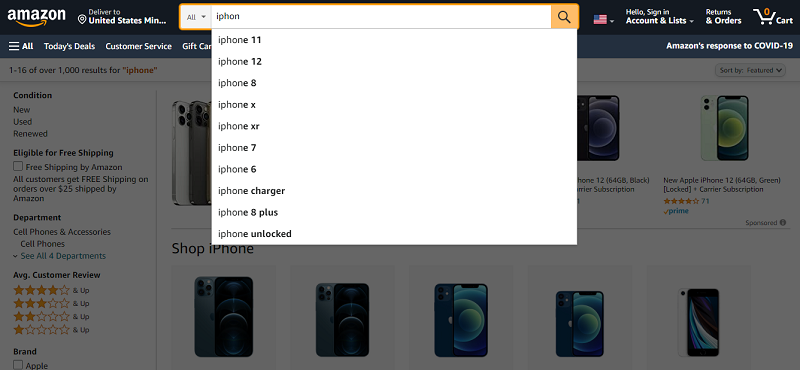
What’s more, having an auto-suggest feature allows your visitors to see what other products you have to offer, which gives you an opportunity to upsell and cross-sell.
The best position for the search bar is at the top right corner of your website. This way, it’s easy for your visitors to find it fast to get what they’re looking for.
Additionally, have a search bar on all your pages to give your visitors the opportunity to find what they want faster.
3. Keep your pages organized
If you are like most businesses, you have more than one product line. Now, having all your product pages displayed on the menu bar can make your site look so cluttered.
So, to make your website organized and clean-looking, have your products and services in subcategories and even sub-sub-categories if it calls for it.
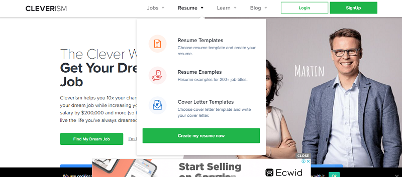
This way, when your visitors hover over “Products” on the menu bar, they can see the different pages representing all the products you sell at a go.
Now that your navigation is customer-centric, move on to the next element.
Position your content to keep your visitors engaged
Your content is what your visitors will consider when determining if what you offer is exactly what they need.
So, making sure that your content proves to your visitors that you’re the go-to source for all they need is paramount.
Today, we won’t go into details of how you should craft content that attracts your visitors’ attention. We’ll look at how you can position your carefully crafted content to create more engagement with your visitors instead.
Here’s what you should do.
1. Pre-empt and answer your customers’ questions right away
Your web visitors want to know whether you offer what they need immediately they get to your site.
Therefore, position yourself as the go-to source for what they need to solve their problems.
So, you should immediately:
- Tell your visitors your unique selling proposition
- Respond to the most common objections you faced with your previous and existing customers
- Tell your visitors how to get what they need
Here’s a great example of how you can address your customers’ pain points from the get-go.
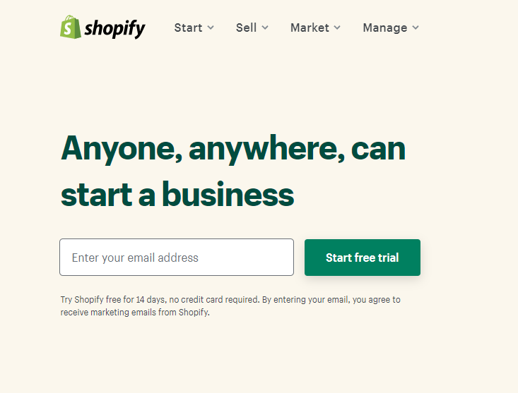
2. Create a hierarchy with your content
A hierarchy helps you to put more emphasis on the content you want your customers to see first.
Now, the most crucial information should be at the top of your web pages to leave no room for your customers to miss it.
Then any further explanation should follow for those visitors who need more information to make a decision.
3. Arrange your content in an eye-catching pattern
Experts advise that you should have your content follow how most readers read to make it easier for them to get all the information they need and make a decision fast.
Most people read from left to right. So, structure your content in a way that makes reading from left to right easier.
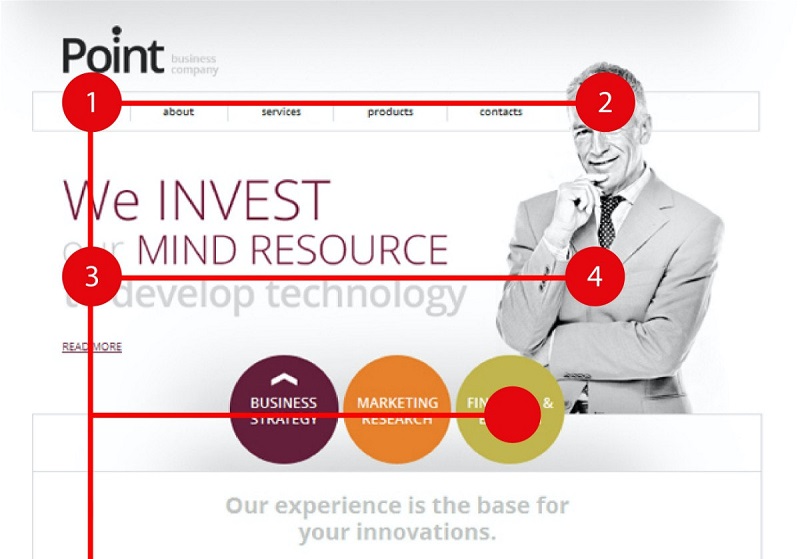
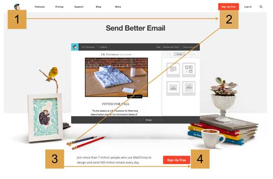
You can arrange your content in an F or Z pattern.
Here’s a heat map reaffirming the left to right reading style in the “F” reading pattern.
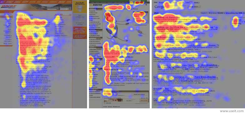
What’s more, it helps you see how readers lose interest the further down they read your content.
That’s why you should have the most important information first so your readers can view it before their interest level starts to dwindle.
You can also see that when you introduce a photo to your content, the readers’ attention is reignited just below the image, which gives you another opportunity to have content that will keep the readers engaged.
4. Use the rule of thirds
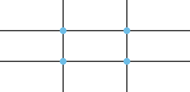
The rule of thirds dictates that you divide up your page into three distinctive parts both vertically and horizontally to get nine equal squares.
The rule goes ahead to say that you should place your content at the four middle intersections to get more impact.
In essence, this means that you should place your most important content in these four intersections to draw your readers’ attention more.
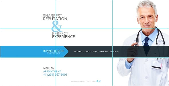
Here’s an example of a website that has nailed the rule of thirds.
5. Add social proof to your homepage
Remember, we said that your visitors judge your website’s credibility by its design.
Now, you can boost your trustworthiness in your visitors’ eyes by adding social proof. Social proof helps your visitors see how your products have solved other people’s needs which means that they can solve their needs too.
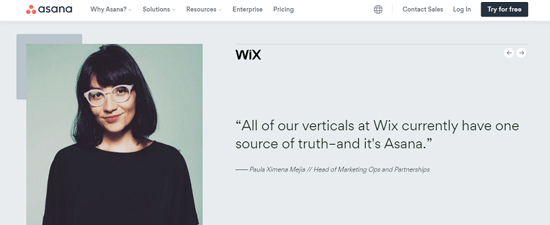
So, have social proof on your homepage, including:
- Testimonials like clients’ positive feedback and video stories
- Links to case studies
- Logos of well-known brands that have used your products or given you a review
You can place your social proof after providing all the relevant information a customer may need to make a buying decision.
But you can maximize the use of social proof by including it immediately after providing your value proposition. This way, it helps you convince your potential clients how much your products or services are the real deal.
6. Utilize whitespace to grab your visitor’s attention
Whitespace can mean the space you have between smaller content elements on your page like paragraphs or larger elements like photos and signup forms and your text.
For example, you can use this whitespace to draw more attention to your call to action to make it crystal clear to your visitors what they should do.
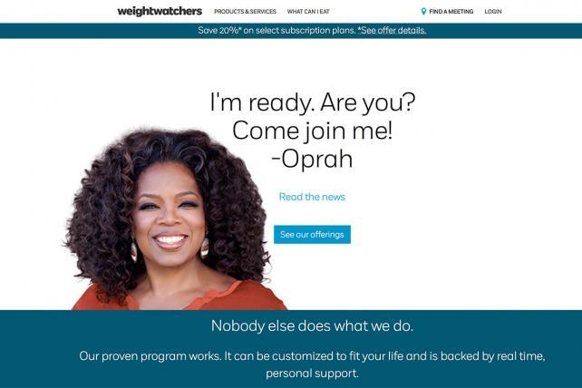
Here’s an example of using whitespace the right way.
Make your Call to Action distinctive
The last element of your website you should work on to ensure you make more conversions is your CTA.
Your CTA is the reason you want visitors to come to your website in the first place.
So, you should make it clear and straightforward for your visitors to know exactly what they’re getting. Moreover, it should be unmistakable, so your potential customers don’t miss it.
Here’s how you can make your CTA clear and unmistakable.
1. Make your CTA simple
You can have a beautiful website designed to attract potential customers, but if you can’t clearly tell them what to do after visiting your site, you’ll run the risk of losing potential sales.
Your visitors don’t have the time to spend figuring out where you’ve positioned the “Buy Now” button on your website. So if they can’t find this CTA on your site, they’ll just find another site that offers the same services or products you do, and you’ll lose that sale.
So, you should make your call to action as clear and straightforward as possible, so your visitors understand what you want them to do once they visit your site.
What’s more, use simple language for your CTA. So you don’t leave any room for ambiguity.
The most common CTAs include “Join Now”, “Buy Now”, “Start a trial”, “Call Now”, “Book Now”.
2. Make it pop
Once it’s obvious what you want your visitors to do, make your CTA pop, so your potential customers don’t miss it.
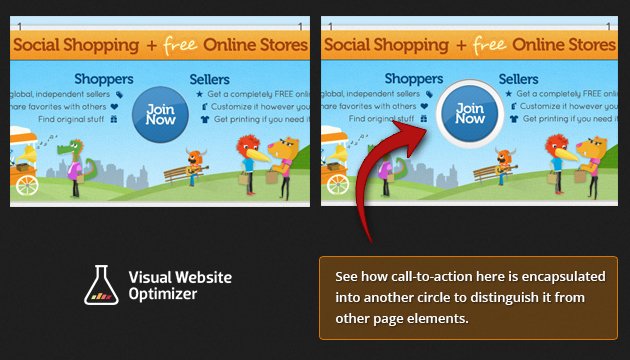
You can make your CTA pop by having the CTA button in a container. This way, it draws more attention to it.
Furthermore, you can have your CTA button color contrasting with your background color, making it pop more.
When it comes to color, use a color wheel to find the best color combination for your website. Or you can use a website color scheme generator like Canva colors or Coolors.
The colors you use on your website evoke emotions like surprise or calmness, which can push your potential customers into a buying decision.
Note: No one color has been found to drive more conversion. So, you should pick the ones that best suit you and your website.
To determine how well the colors you’ve chosen work together, and most importantly, if they make the CTA stand out, you should test them with your audience.
So, if your potential customers are more responsive to a specific color scheme, use it for your website and enjoy having more conversions.
3. Use directional cues to point to your CTA
As we said earlier, your whole website’s goal is to point your visitors to your CTA. Therefore, align all the elements you use to create your website with this goal.
So, create and arrange your content to direct your visitors to your CTA.
Here’s how you can do this:
- Use arrows to point to a form
- Use the “F” and “Z” reading pattern formats to make your content flow towards the CTA
- Photos that show your product should have everything point towards that product. For example, using whitespace to make the product and CTA button pop, or if a person is part of the photo, have them look at the product and CTA button so your visitors can instinctively focus on the product too
4. Keep your CTA above the fold
Most people on the internet rarely scroll to see what’s below the fold. So, to keep your potential customers from clicking away without taking any action, have your CTA above the fold.
This means that your web visitors won’t have to scroll down to find the CTA button.
So, your potential customers will find the CTA button fast, giving you a better chance to convert more of them into paying customers.
5. Have forms with minimal questions
You know how annoying it is when you start filling a form only to find more than 3 pages with over 10 fields per page that you need to fill?
Now, imagine how many potential customers will get bored before completing your signup forms if you require so much information from them.
So, to make sure your visitors fill up your signup form, have no more than 3 questions in the form.
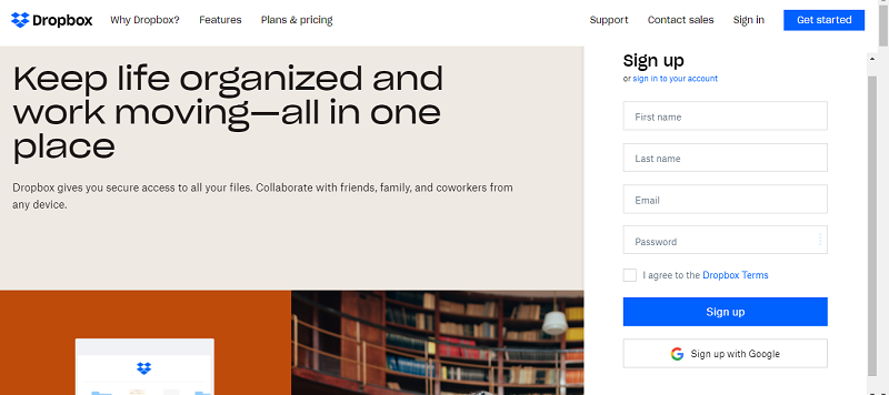
The most essential information you need from a visitor is:
- Their name
- Email address
- Credit card details to make a purchase
So, if you can only have these three fields for your customers, it makes their work easier and makes them feel that you value their time.
What’s more, most of your visitors won’t hesitate to give you this information because they’ll view it as standard procedure to provide it and not that you’re prying.
Improving user experience boosts your conversions
The secret to getting more conversions on your site is improving your visitors’ user experience. The better your visitors can interact with your site, the easier it is for them to buy from you. In summary:
- Ensure that your customers can easily navigate your website to find what they need to make a buying decision.
- Position your content in a way that creates more impact. The easier it is for your potential customers to find all the information they need to make a buying decision, the faster they buy from you.
- Finally, ensure you have a clear CTA, so your web visitors know what you want them to do once they land on your site. But more importantly, position the CTA button so that they can’t miss it.
Where To Learn More
To learn how to make better, more usable websites and applications, consider taking the following online courses by the Interaction Design Foundation:
User experience has a direct impact on a business’s ROI—both positively and negatively. Find out how to hire for, position, and empower a UX team effectively. In UX Management: Strategy and Tactics, CEO of award-winning design consultancy Experience Dynamics, Frank Spillers shares his experience from two decades of working with enterprise, midsize, and start-up companies across a wide range of industries. You will be able to learn from, and avoid, the mistakes he’s come across, and apply the best practices he’s developed over time in order to move towards managing your UX team in an optimal way.
If you’re new to UX design, you might be interested in the course Become a UX Designer from Scratch. Good luck on your learning journey!

