People get a lot of emails. Inboxes are fuller than ever and expected to get fuller, and many email clients now offer segmented inboxes that make it even harder for marketers to get through.
How can you stand out from the crowd?
Well you’ve got to get the message, targeting and timing right, of course. But once a person has your email open, how do you keep yourself on their screen?
Even when readers do open emails, they’re scanning and browsing aimlessly – you have to give them a reason to engage, to read further right there on the page, or risk losing them. Emails have to compel attention and seize imaginations in order to drive conversions.
Goals
This starts with simplicity of goals. Your emails should be designed to do one thing: convert. The reader’s attention is what makes that possible, but extraneous design elements, linking options, or anything else that pulls the reader in any other direction than conversion should be cut.
Visuals
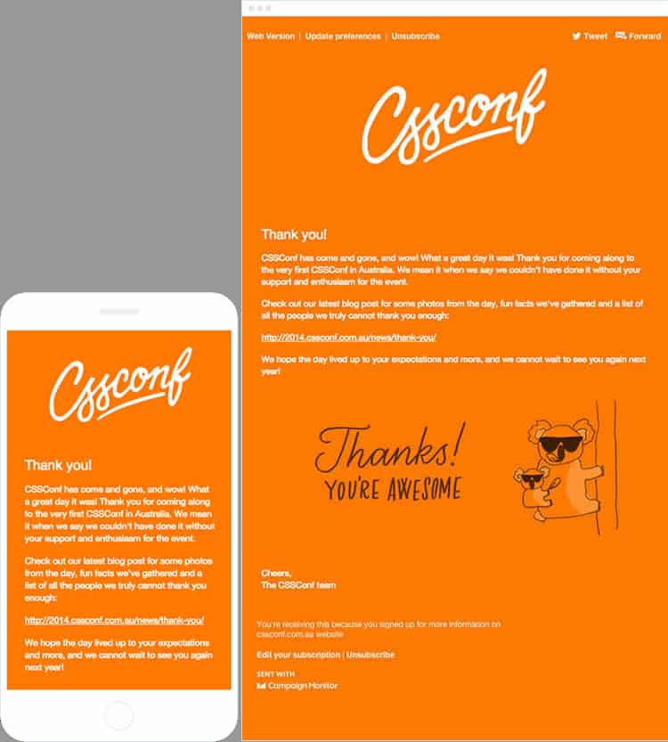
Visual design affects the way we interact with content significantly. Design simplicity has been a watchword on the web for a long time. Just like a good website, a good email should be clear and simple to navigate and understand. Make CTAs (Calls To Action) clear and bold. Make buttons impossible to miss and impossible not to press! (There’s a Chrome add-on that lets you perform your own “squint test” to examine the visual impact of your emails.)
Visual simplicity serves two purposes. One, it makes it easier to read your copy, view your images and select (hopefully) to take the next step. It’s easier to do that in a 50-word email with one bold image and a big clear button than it is to play Where’s Wally with an email that looks like Times Square. The other purpose is that it makes it possible to view that email on more devices because there’s less to render. Much has been written on website load speed; little on email render speed. But when most email clients will cut you off at 100kb, is that extra GIF really worth it?

Colors: Let your logo pick the colors. If your logo is blue and white, but your emails go out in purple and yellow, one question: why? You already paid a graphic designer once, for the logo. Get them to (or DIY) color match it for the majority of the email’s theme and you’ll have something that looks good and carries on your visual branding into the content itself.
Fonts: Leave those fonts alone. Use standard fonts in standard sizes so readers don’t have to go to any extra effort to read your material. Times, Arial, Georgia are good choices.
Structure: Stack, section, subheading. A chaotic bunch of images and text turns people away. Make the process of understanding how your content is laid out intuitive by segmenting it visually. Stack visual content and divide text into easy-to-scan subheadings.
Images: There’s a tightrope to walk with images. An increasingly visual audience wants images, but email clients don’t always play well with them. First, images soak up time and memory. Several images in an email can mean it doesn’t open at all or opens very slowly. And some email clients play less well than others with images.
Inspiration: Find it here, here, here, here, and here.
Make the very act of reading your emails pleasurable so that readers are getting value right there in their inbox. I strongly recommend an email marketing suite such as GetResponse, which makes it simple to design responsive emails from in-built templates and (inexpensively) integrate it with your landing pages and drip campaigns.
Email Clients
Websites are viewed on a small range of browsers. You can probably name every major browser off the top of your head. Emails are viewed on a far wider combination of browsers and devices. That means you need email marketing software that takes device and client differences into account. Your email looks great on a Mac in Apple Mail. That’s good – but what about in Google Mail on Android?
Email clients support different, sometimes-overlapping-sometimes-not subsets of CSS and HTML, the technology used to render and display email content. The biggest villain here is Outlook, whose CSS support is minimal. It doesn’t support background images at all, for instance; so if your customer base uses Outlook to any extent, you’ll need to make sure that you never put anything important in as a background image.
But any difference can affect box modelling and visual display, which is exactly as ominous as it sounds for your carefully-laid out emails. In a blog post, Litmus recommends that email designers use standardized tables to achieve adaptability across email clients.
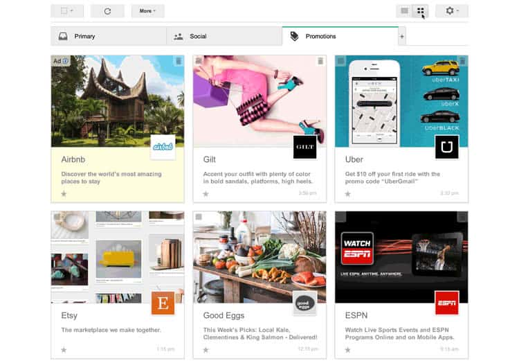
Gmail’s Grid View, which rolled out as a trial only to opting-in Gmail users, worked by displaying large graphics in an infinite-scrolling ‘promotions’ tab. This tiled view turns your inbox from a headache to a huge opportunity for email designers who can make their work stand out visually and places an even greater premium on image selection.

While Gmail discontinued what it called a “field test,” this could definitely be the look of things to come. And since where Google’s opt-ins lead, everyone else frequently follows, we’d as well to get to grips with it now. Inboxes that look like a list of subject lines – pure text, arranged as a list – will probably go the way of search results that looked that way, and sooner rather than later.
Devices
Even responsive emails often fail on different devices. When that happens, your users will patiently sift their way through them anyw— yeah, right. They’ll delete them without a second thought, just like you would. It has to not happen. How can we make sure our emails look great on every device?
Email device detection is one answer. It allows you to know which devices your emails are being opened on so you can alter your design to suit them. But I can answer that for you. It’s mobile. Mobile open rates are pushing 50% and rising, so all emails need to be designed to fit mobile. That means a mobile-first design strategy.
Mobile emails will look fine on desktop and tablet; desktop optimized emails won’t always look great on other devices. What about the range of iPhones, with their different screen sizes? That’s no small question: iPhones topped email opens in 2015 so far.
Building single-column emails will mean the only “responsive” element is width, with no other alterations necessary, so it’s a popular choice. Multicolumn emails may have to stack on mobile: will readers scroll that far? Will that email look OK across every device and every client? If you’re not sure, go with a 600-pixel width single-column email format.
Finally, when you’re putting anything interactive into your emails look at the size of your pointer and the size of your finger. Mobile buttons need to be big, with plenty of room between them, to stop them being off-puttingly frustrating to use.
In Conclusion
Getting your emails opened is only half the battle. Once you have someone’s attention you need to reward them immediately.
At the same time, a lot of work goes into the content strategy that draws readers through emails to landing pages – and both structural and visual design have to be arranged around this.
Design your emails with bold, clear layouts, arresting images, and a clear process that leads intuitively to the CTA. Make it straightforward for the reader to convert. Lastly, remember to test emails across devices, browsers and email clients: use Outlook’s mobile app as your first filter.
Want to learn more?
If you’re interested in the intersection between UX and UI Design, then consider to take the online course UI Design Patterns for Successful Software and alternatively Design Thinking: The Beginner’s Guide. If, on the other hand, you want to brush up on the basics of UX and Usability, you might take the online course on User Experience (or another design topic). Good luck on your learning journey!
(Lead image: Depositphotos)
