Email marketers often focus on creating a compelling email message with a great offer, and they’re right about it. Still, you need some page that will showcase more details about the offer and push the user further through the sales funnel. A post-click landing page is exactly this kind of page, though it’s often under-thought compared to an email offer. So, let’s discuss in this article the importance of landing pages for email campaigns and how to optimize them for maximum performance and a better user experience.
What does a landing page do for email marketing?
Surely, if the offer disseminated in email is the same you have on your main page, you may use it as a landing page. But in many cases, email offers are for a specific product/service, or the nature of the proposal is different, and then you need a separate landing page for it. Think of it as an analog to a typical CPC campaign – your email is an ad, and the landing page is the page designed to convince your user to fulfill the required action, be it buying new sneakers or subscribing to a free trial.
How to optimize landing pages to increase conversions?
If users receive an email from you with some offer and even get interested in it, it doesn’t mean that they will buy or order it immediately. So, your next task is to take them to a well-optimized landing page that will convince them to convert. Let’s see how to do that and what approaches to use.
1. Be yourself when building trust
Since you’re emailing people who have previously subscribed, it is not a cold contact. They already know you and are already engaged with you. In this sense, it is important to keep being “you” in a corporate sense – you already have some style and tone, and it works since the target audience has already subscribed. So, it is better to stick to being brand-consistent, using the same colors, designs, and tone of voice they liked when they subscribed. Maybe it’s even more critical to understand who your subscribers are, speak with them in their language, and offer a personalized user experience.
Here are some overwhelming statistics that personalization improves conversions:
- Epsilon research shows that 80% of shoppers prefer to buy from a brand that offers a personalized experience.
- Forrester research demonstrated that 77% of customers have chosen the brand, recommended it, or spent more money if the brand offered personalized service or experience.
- An Infosys study found that 86% of purchasers claim that personalization influences their decision to buy.
There are several sources of data that can be used for personalization of user experience for your post-click landing page:
- Google Analytics or similar tool data;
- Email marketing software;
- CRM/eCommerce system on your site.
For example, imagine a SaaS provider who offers business intelligence software that sells several packages for businesses ranging from small start-ups to established corporate giants.
The Problem: Your home page focuses on a full enterprise solution and features some reviews from mega-corps who use your services. You realize most of your branding efforts may have alienated smaller and medium-sized customers.
The Strategy: You could set up a landing page designed specifically with small and medium-sized companies in mind, then initiate an email campaign detailing “XyZSoft brings enterprise solutions to 600+ small-medium businesses around the world, find out how”.
The Result: With a landing page in place, and an offer to drive interest and education that your product is relevant for all companies, potential leads will take a higher interest in the offer pertaining to their particular needs.
2. Let your message be brief & clear
Clarity and being to the point often help conversion. Visitors from the email campaign are already somewhat familiar with your business. There was some information in the email too, so it gives you the extra advantage of not starting from 0 and focusing on a solution.
Remember who your customers are, and talk to them in their language to help clarity.
A hypothesis among conversion optimization specialists is called the 1:1 Conversion ratio, which means that one landing page should offer only one conversion action. Stick to it to improve your user experience since this principle was heavily tested in thousands of landing pages.
As an example, this is how the landing page for Hello Bar looks:
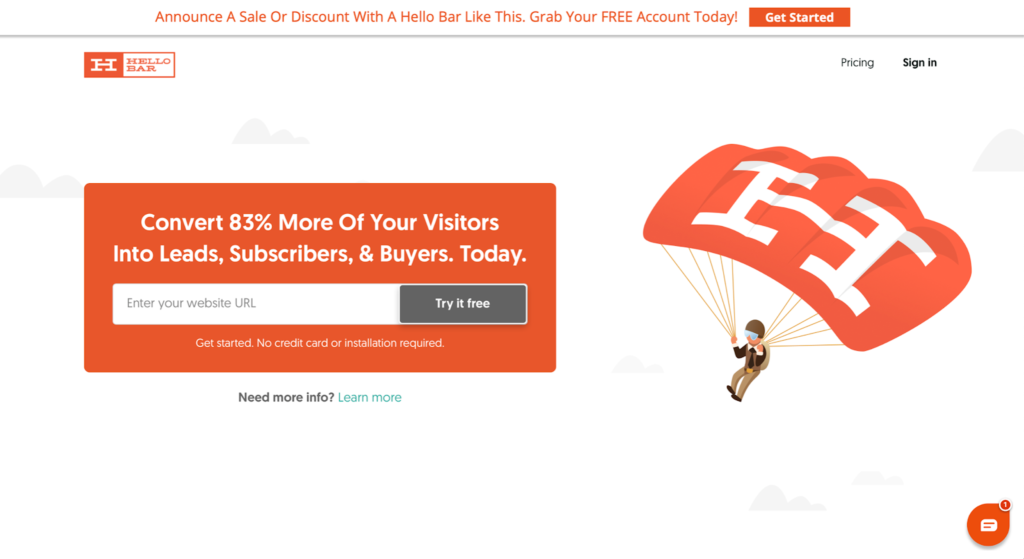
- Just one screen with no scrolling.
- Almost no text (Hello Bar is a well-known product in its niche, so there’s no need to explain what it does in the copy).
- Offer value.
- Product demonstration (this bar at the top is exactly what Hello Bar does).
- Only one conversion action – try it for free, which is the same as Get Started on the top.
- Almost no navigation: there are only Pricing and Learn More buttons at the top.
Hello Bar’s founder is Neil Patel, a well-known digital marketer, and you can bet that this landing page was tested for conversion optimization and user experience in and out.
3. Create a value instead of annoying FOMO
Fear-of-missing-out or FOMO is indeed a powerful psychological trigger and a popular user experience trick. However, it’s been so overused that the public is growing a natural “shield” against it. Remember how often you roll your eyes when you see another countdown timer on the landing page of the product you’ve been interested in.
Yes, there can be natural time limits or scarcity, like selling tickets to a concert that has set dates, and there are indeed only a certain amount of tickets remaining. But if you keep saying in the offer that your discount of 25% is only active for two days, and then you just roll back the timer and run it again, that’s fake. If you keep pushing such offers onto your email subscribers, they may stop reacting, unsubscribe, or consider your product of low value if it requires you to constantly clickbait them. In this case, you probably need to think about what value you’re offering.
There are several ways to explain the value of an offer without involving psychological “magic” or other user experience trickery:
- Explain what problem you solve and how this problem affects your customers.
- Address customers’ potential concerns. They may be tempted to accept but have fears of things not working the way they want. Show what is appropriate – from guarantees to refunds and “no card required.”
- Focus on showing value. It is a value that moves customers from the current “before” state to the promised “after” state, and it consists of three components:
- The perceived gap between “before” and “after” states. As an example, think of orthodontics. It is not about fixing customer teeth irregularities. It is about moving them from being constantly embarrassed to smile (their “before” state) to having a Hollywood-type perfect smile (their “after” state). It’s a huge gap to cover and a huge value to customers. That’s why tooth brackets cost so much.
- The comfort of moving from “before” to “after.” This is where all these “5-minute setups with no technical skills” or “one-click purchase” come in.
- The alternatives. The more alternatives there are, the lesser the value feels. This is why you need to articulate your differentiating points, what you’re doing better/easier/faster/cheaper than the competition.
4. Build synergy between email & landing page
In some ways, humans are simplistic in their user experience expectations. If they subscribe to the New Balance Deals email newsletter on your site, you send them such a deal, and they click, they expect to see (you guessed it) a great deal on New Balance sneakers you’ve just promised them. If they click on an ad and get redirected to a vast catalog of sneakers of all possible brands, even including New Balance, they’d quite likely hit the back button and try another link since this is not what they expected.
That’s why you need to ensure your landing page matches the email leading to it. It should have the same offer, which is fully described, and answer all possible questions. On the post-click landing page, you should give more info on the product/service, show its advantages, and provide an easy way to buy or order it. And of course, such a page should also be styled similarly:
- Use the same headlines and titles as in the email;
- Same fonts, colors;
- Same visual assets.
5. Run quick on-page SEO optimization
You should not forget to optimize your landing page for a better user experience. Ensure the following guidelines are met:
- Load speed – make sure the page loads fast. People quickly abandon slow sites. 1 in 4 people will leave the site if it doesn’t load in 4 seconds.
- Image optimization – the graphics used on the page should be compressed to the maximum extent allowed without degrading quality.
- Content quality – ensure your titles, headlines, text, and CTAs are crystal clear. However, mind that the personalized content performs better than an over-optimized technical text created for Google bots.
- SEO for the text content – check keyword density, titles and meta descriptions, and other tags in the text.
- Mobile-friendliness – the page should have a mobile-first responsive design for a better user experience. Nowadays, more than 54% of traffic comes from mobile devices.
- Technical issues – check the page URL structure, domain parameters, index status, internal and external links present on the page, etc.
- Navigation – keep it simple and to the absolute bare minimum so that the user isn’t distracted and moved away from the landing page.
You can check how your landing pages stand in user experience and SEO sense with the On-Page SEO Checker from SE Ranking. It provides complete reports on content, UX, and technical issues. The tool will give you many ideas on how to improve the content along with the headings as well as fix possible usability issues.
6. Find triggers apart from Call to Action
Sure, you’ve got a great offer, copy, and the CTA is obvious, but you need to supplement your page with other user experience elements helping lead people towards converting:
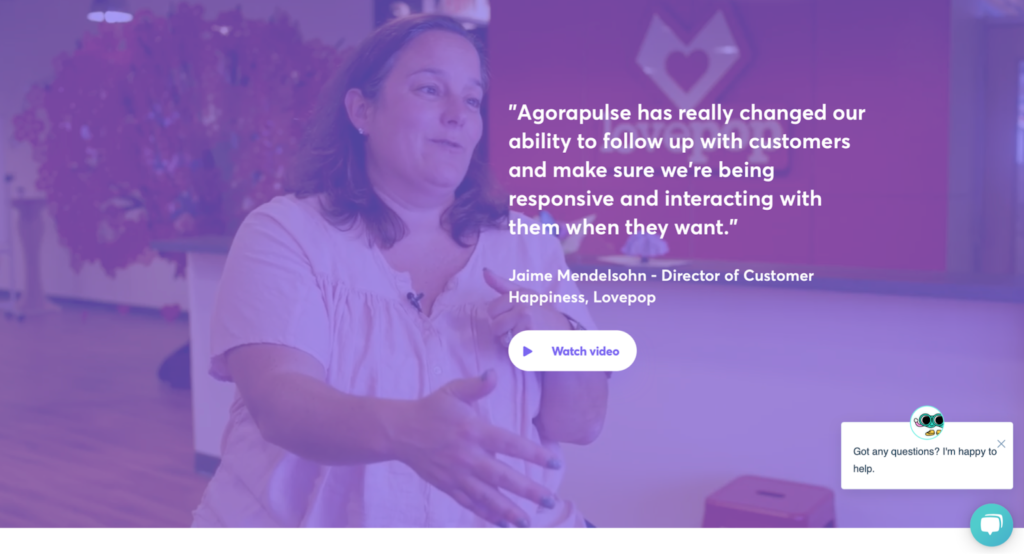
Testimonials and reviews – let others know what your customers or media/bloggers think of your product.
Explainers – if it is anyhow challenging to understand what your product does or its valuable benefits, use infographics, schematics, or video explainers, demonstrating it better than the text.
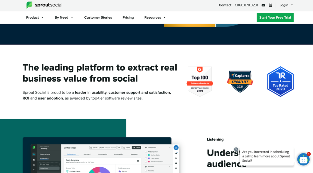
Guarantees and trust badges – clearly state your guarantee, refund offer if any, and show you’re using trusted payment providers and your compliance to industry standards.
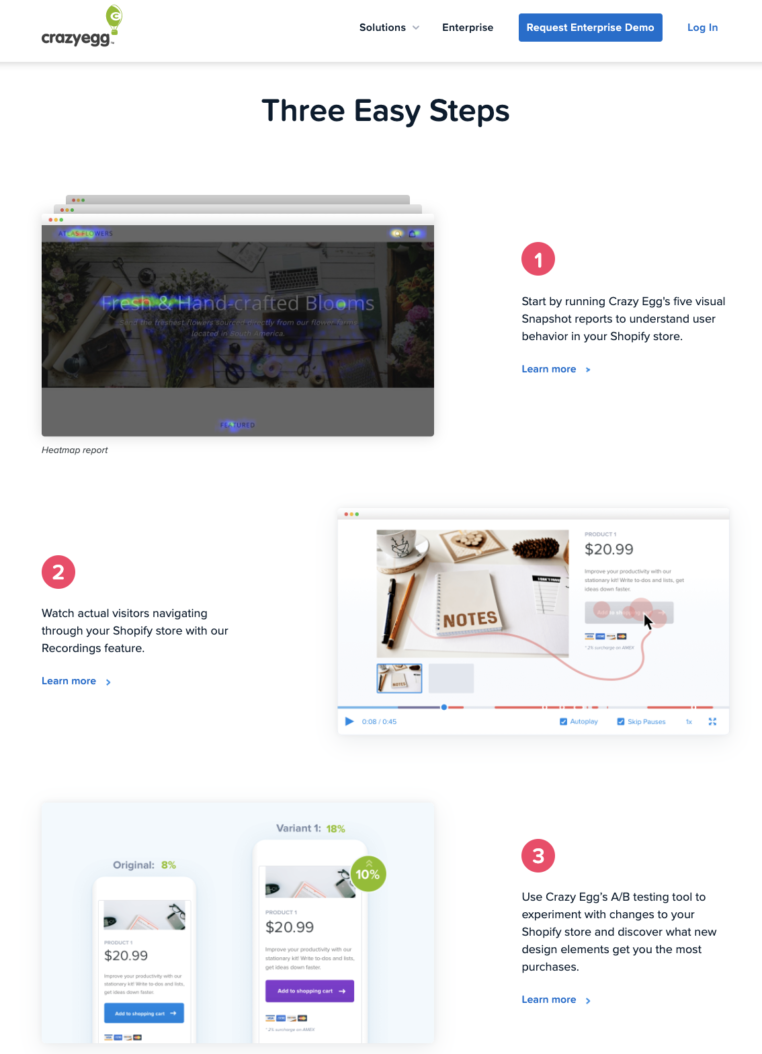
Set expectations – people may not convert if they imagine more friction than there actually is. If you tell them up front that they’ll need to answer just three questions or that there will be only three steps to complete, they know what will be waiting for them.
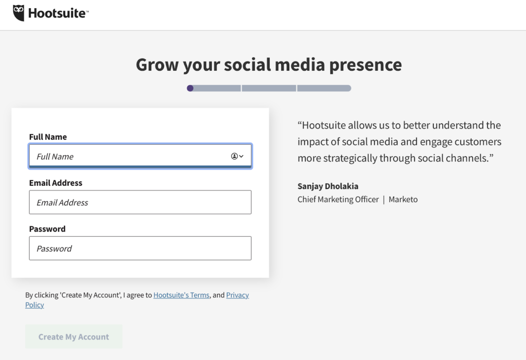
Simplify the process – use as few fields in a form or steps in the setup process as possible. The simpler it is, the less the bounce and the better the conversions.
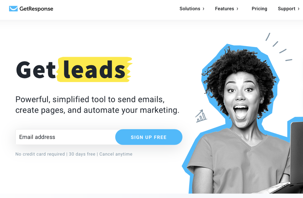
7. Reinforce the decision to take action
Sometimes people need some last extra reason to take your offer right now. If they’re already inclined to buy from you, offering them a bit more than they planned could be a great user experience for them. Try to convince them with the following:
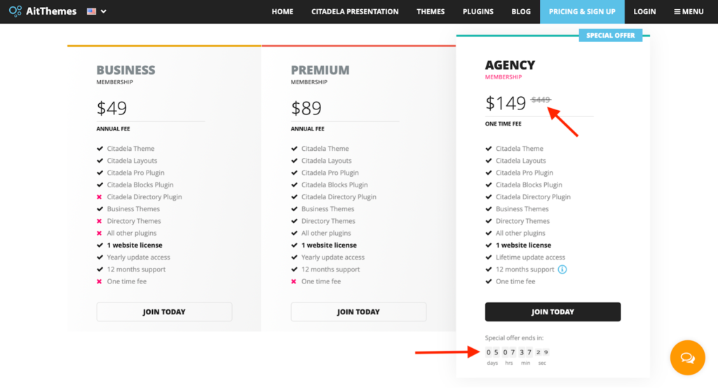
- Scarcity or limited offers: Yes, they work, but only when they’re genuine! Your agency may take only three new clients this month. You produce handcrafted rings, and there are only ten pieces of this model left, and you’re not making them anymore. This is genuine scarcity. But there is no reason to try to push people into a live-only webinar that will run in 2 hours, and you somehow don’t provide a recording (why???).
This is how AitThemes does it. They sell WordPress themes and offer a considerable discount which makes lifetime access equivalent to less than two years of Premium subscription, which runs for another five days. Great deal, if you ask us!
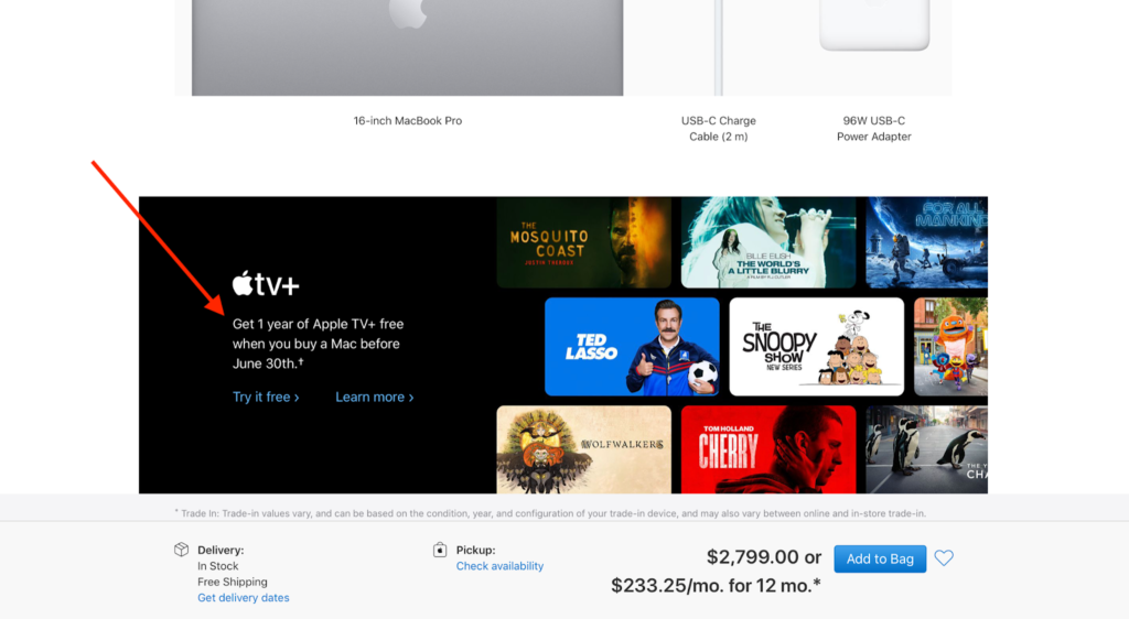
- Something extra: Those TV shops certainly know what they’re doing when they claim “… and that’s not all! You will also get this and this and that if you buy now”. Yes, a discount, a freebie, a coupon for the following purchases, or access to otherwise unavailable features can come in handy.
And don’t think of it as some cheap user experience trick. Even Apple does it.
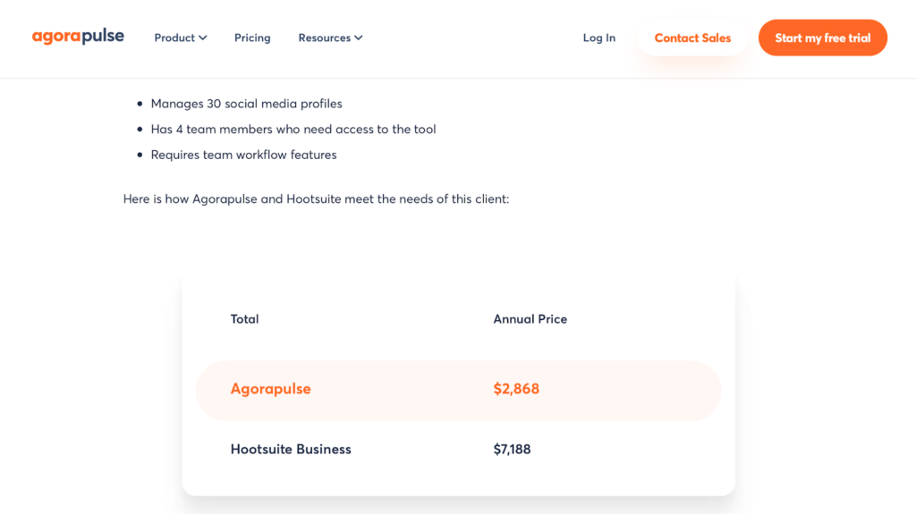
- Price comparison: If you feel the price might be an issue, there are ways to demonstrate it from another angle. Compare it to something negligible, like a price of a cup of coffee per day to get rid of a great problem the customer has. You can also mention the price of NOT taking your offer – the customer stays with the problem, which costs them money, nerves, and time, while your offer can help them get rid of it completely. If the price is your direct advantage over the competition, you can show how it compares, but make sure you follow local laws for mentioning competition. AgoraPulse has a dedicated page comparing itself to its major competitor HootSuite. And, of course, it shows a killing price comparison.
8. Eliminate distraction elements on the way to conversion
Do not offer too many options for the visitor, especially escape options like navigation. It’s better not to distract the customer with different buttons, links, and other elements.
There is often a temptation to provide a “fallback” option to your main offer. Like if the customers are not immediately taking the main offer, ask them to do something else – like downloading a guide, whitepaper, or whatever mini-conversion you have. Avoid it.
The same is for navigation: minimize it, don’t let the customer get away from your landing page just because there is a menu on the top bar.
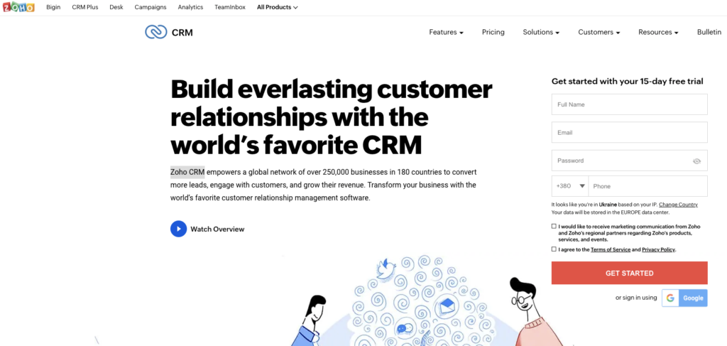
Have a look at how the home page for Zoho CRM looks. It’s a very typical home page with lots of options and navigation.
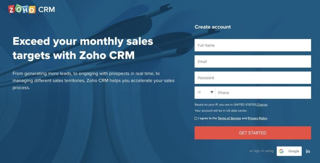
And here is how their post-click landing page looks, which is used in PPC and email offers. No navigation, no chance to escape, and very focused on making users convert to the simple offer.
9. Stay open-minded when running A/B tests
Not all ideas are great. While you do your best trying to formulate your offer based on the understanding of your audience, there is always room for improvement. The best way to find out anything in the user experience field is A/B testing.
- Test all parts of your offer: you can easily A/B test your landing page using Google Optimize or another similar tool.
- Headlines/titles – they’re probably the most important part as they’re read first.
- Copy – as always, the copy can be a great support in converting.
- The order of the sections on the page – some sections may spark extra interest, and some may not even be scrolled to. Try Hotjar or other tools to record the visitor’s on-page behavior and scroll depth.
- CTA – a lot depends on what you call the user to do, so test different versions.
- Test the email distribution part: since your post-click page is a part of an email marketing campaign, email messages should also be tested. Most of the email marketing software offers A/B testing capabilities. If you’re just a beginner, follow the email marketing guide to test everything properly:
- sending times;
- email subject fields;
- email copy;
- level of personalization;
- CTAs used in the email.
Don’t stop when you have a successful test. Accept the result, update the campaign with the winning variant and continue to test something else.
Summary
A post-click landing page is essential if not defining element of an email marketing campaign. With that in mind, you need to take it seriously and make the landing page truly optimized and well-converting.
Follow the guidelines above to optimize the user experience on landing pages and be blown away with your email marketing results!
Where to Learn More
To learn more about user experience design check out the world’s largest open-source library of UX literature here.
You can also consider the following online courses to dive deeper into the nuances of UX design:
- Data-Driven Design: Quantitative Research for UX: William Hudson, CEO of Syntagm gives you the complete guide to running quantitative research tests, measuring the results, and analyzing data – no math required!
- Psychology of Interaction Design: The Ultimate Guide: An advanced course to understand what the user sees when confronted by your product.
- Get Your Product Used: Adoption and Appropriation: Prof Alan Dix helps you take your products up a notch (or two!) by going beyond user experience and usability, towards adoption and appropriation.
Happy learning!
