Let us talk about Peter. He has just bought a great shirt. It is on trend. The feel, and the price point was a bargain. He gets home, and it feels great. But then. It starts with a tickle, then a scratch, then he realises the label is digging into his skin. When his friend asks how it was, the annoying scratchiness is all he feels like mentioning. However, he is still going to wear it.
Commit the similar kind of sin in a mobile app, and unfortunately, your users are probably not going to be this tolerant. After all, patience is thin, and expectations are exceptionally high among the mobile crowd. Your app users are one of the most complicated audiences you are going to have to reckon with.
We have compiled below some of the top mobile app user peeves that tend to get missed. Repeatedly falling prey to one of these things is likely to annoy some section of your base.
1. You Have Not Designed For Delays

We already know users do not want to experience long wait times each time they interact with your app. However, some responses will still not be immediate. For these cases, it is all about how you present this reality to your users.
The worst you can present during a wait is nothing. However, the loading spinner (spinning wheel of doom) is not a much better visual cue if it gives no estimation or information regarding the length of the process.
This also connects to how you handle the micro-interactions taking place within your app in general. Do it well, and your UX will not just be tolerable, it will be enjoyable.
Solution
If you have not already, you need to talk to your users’ subjective perceptions of time. If you can assess how long things will take, a ‘progress status’ indication is always a good idea. If you cannot provide this, consider a gradually loading skeleton UI solution to clarify that content is incoming content (see Facebook’s Shimmer libraries).
2. Your Users Cannot Read It

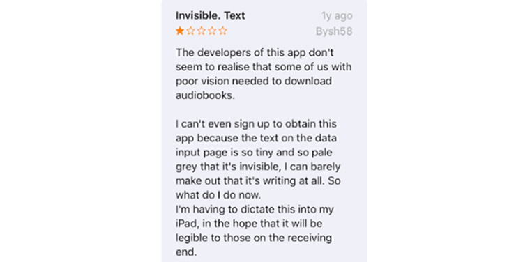
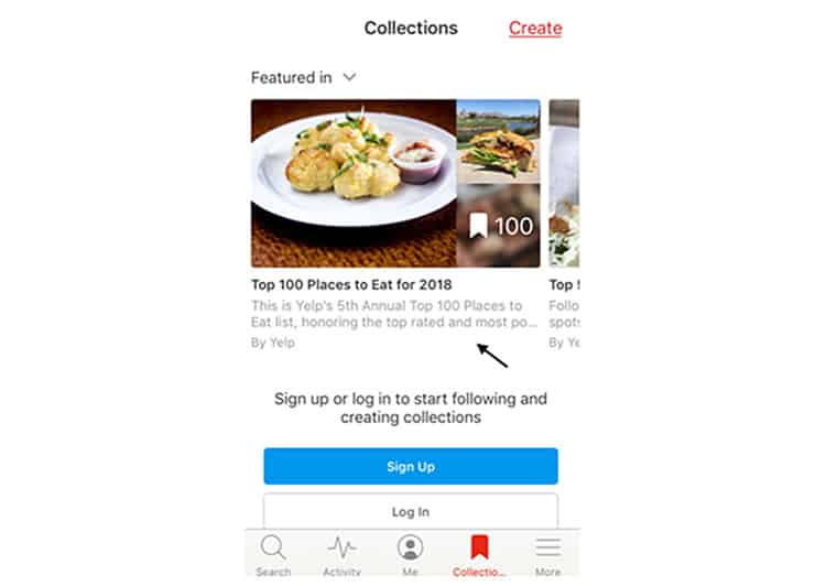
Vision is something that is going to vary wildly across any customer base. While one size might not fit all, there are ways to ensure you’re meeting as many needs as possible. Typography standards have been around for a while, and we are confident that most apps today are adhering to the recommended standards.

You do not want to be remembered as the app forcing users to adjust the font size in their phone settings, so this is worth paying attention to. Surprisingly, we still encounter even some big players who succumb to moments where this standard has not been met.
Solution
It is OK to incorporate text-based graphics and images below the standard size recommendations but if you do, ensure you have enabled the pinch to zoom feature as a workaround for those that need it. If your app is primarily text-heavy, you may also want to consider incorporating an in-app ‘change font size’ option. There are several tools out there which can recognise when a gesture has been unresponsive – with their help, you can figure out if your app users are repeatedly trying to zoom in or adjust a view to no avail.
3. You Are Taking People Somewhere Against Their Will

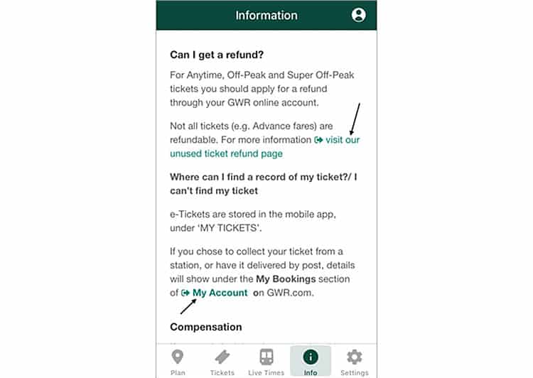
Your users are visiting your app for a reason. They might have accessed your mobile site before, but now they have chosen to experience your full-blown mobile app. In reality, you should avoid sending them somewhere else at all costs. If you are selling goods through your app, do not link customers to the returns policy on your website. If you are signposting customers to video content, it is best to avoid forcing them to open up Youtube. If web linking repeatedly happens within your app, not only are your users going to negatively associate your brand with their frustration, they will also conclude the product is a half-baked solution and perhaps your mobile web experience would be.
Solution
It is always best to reformat any essential content that is hosted on your website and put it directly into your app if you can. This is especially the case if the content is primarily text-based and you are just linking outside to save time. Sometimes, however, the reality is that it is going to take some time for your app to be able to offer a specific feature.
In these cases, you have got a couple of options. Consider whether your app needs to show or feature the content at all. If not, axe it. If you need the content there, you could explore integrating an in-app browser, but this should be a last resort. It would help if you also made it clear to your users that you are going to do this before it happens and show them how they can return to the previous app screen throughout.
4. You Keep Kicking Your Users Out

All kinds of apps today hold sensitive information, so session timeout is often a touchy subject when it comes to security policy.
Still, mobile users operate within a hyper-context switching environment, so if you are automatically ending sessions earlier than expected, you are probably frustrating a few.
Solution
Pay attention to what others in your category are doing. If they are allowing considerably longer between their automatic session timeouts, it is something to investigate. Most banking apps follow a minimum 10-minute session length before automatically signing users out, so if your app is less sensitive than this, you could probably afford longer.
Touch ID has made the repeat login process much more comfortable for most. So if your app requires a login and requires frequent time-outs, get this feature enabled if you have not already.
If your app only works with a login, it is also worth considering whether this necessary. In most cases, you can continue to provide the experience (such as choosing and adding products to a cart) before presenting a login screen.
When it comes to requiring users to log back in for a new session, you will need to figure out a “sweet spot” regarding timing. To achieve that, it is essential that you closely monitor your average number of sessions per week (and compare across demographics), set up session cohorts for particular time buckets, and conduct a couple of split tests. These initiatives will allow you to accurately assess the impact of triggering sign-in requirements on user engagement.
5. Your User Controls Are Set Too Close Together

Tapping the wrong button on an app continues to be one of the most annoying experiences for any user. For gesture-heavy apps (think games or image editing), falling victim to this one bugbear for any screen size can trigger a spike in app kills and negative feedback. It is also worth remembering that your users may be holding their phone in different ways.
Solution
Depending on where you look, the current guidelines for touch targets of c. 40px is based on actual average widths of adult fingers. The thing is, these guidelines are ideals. To get this right, the size of the screen and actual use need to be monitored. If the success of your app relies on a lot of interaction (especially quick ones) a heat mapping tool can help you visualise exactly how your users are interacting with these screens in practice. You can check out this curated list of the best mobile app analytics platforms to assess your options for tracking usability and UX.
In Summary
The reality today is that delivering much less than a perfect mobile UX is likely to have an impact on your app’s ratings and overall conversion targets. Just as perfection is probably a target that continually moves into the distance, in the courtroom of mobile app judgement, all the small things do matter, and your job as a UX designer is never entirely complete.
Still, hopefully, you will be able to confidently say your app is not annoying anyone for the time being.
Want to learn more?
If you’re interested in mobile UX, you could take the online course on Mobile User Experience. It includes templates you can use in your own projects and you’ll get an industry-recognized certificate to improve your career. If, on the other hand, you’d like to…
- learn all the details of Usability Testing
- get easy-to-use templates
- learn how to properly quantify the usability of a system/service/product/app/etc
- learn how to communicate the result to your management
… then you might take the online course Conducting Usability Testing.
Lastly, if you want to brush up on the basics of UX and Usability, the online course on User Experience could provide you with the necessary knowledge. Good luck on your learning journey!
(Lead image: Depositphotos. All other photos in this article are screenshots taken when visiting the respective apps. They are being shown in this article for explanation purposes.)
