
As at October 2013, there are approximately 767 million websites amounting to 3.9 billion web pages. And the reality is that a number of them are competing with your site – trying to penetrate your market or increase their market share … the same market you are operating in. They are trying to attract the same users that you are trying to get … or worse still, they are trying to take a piece of your market or user base. Of course, the exact number depends on the industry you are operating in, the targeted users, whether you are targeting users on a regional, national or international basis and other factors.
However, from a seven-year experience that I have in SEO consultancy, I can testify that each market is competitive. It it true that some markets are more competitive and evolve more quickly than others. However, what is common is that in this extremely competitive platform, that is the web, you want to find a way to make yourself and your business stand out from the rest. The question is how?
A strong, memorable web design is one of the best ways to stand out. You want something that captures your viewers in those first few seconds before they get bored and click away to look at the latest cat video.
Attracting Interest Via Horizontal Scrolling
Horizontal scrolling (aka horizontal navigation) has always been considered as a controversial web design technique and for a long time, it used to be one of the biggest web design faux-pas that a website could make. Then again, horizontal scrolling has been around since the early days of the internet and occasionally makes a strong comeback – to the point that during these comebacks, horizontally designed websites are for a (brief) period considered as the latest and most modern design layout to have.
With the advent of devices such as tablets, the swiping movement has enabled a comeback for horizontal scrolling. Could it be that because of the swiping movement, users have become more accustomed to horizontal navigation? A well-designed horizontal website can catch people’s attention, cause them to want to look a little longer, and make them remember your site. So how can you do it well?

Ask Yourself – Am I Sure That I Want Horizontal Scrolling?
A statement like this, as the first point in an article that offers best practices about horizontal scrolling seems a bit counter-productive, right? Well, given that horizontal scrolling has been, like I said, a subject of dispute between designers and advocates of user experience, it is more than reasonable that you stop and think if this is the only way that you can take in order to attract user attention. In a recent study, user experience guru Jakob Nielsen has found that only 1% of users view information that was initially hidden because of horizontal scrolling. On the other hand, horizontal scrolling, done right, can create some interesting user experience. For instance, there are some very interesting implementations of horizontal scrolling combined with a parallax effect. And how to create great user experience through horizontal scrolling is after all, the objective of this article.

When Horizontal Scrolling is Great For User Experience
According to Damian Rees, there are 4 scenarios where horizontal scrolling creates a good user experience:
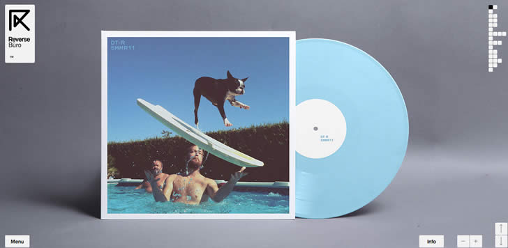
- 1. Displaying several images (e.g. for a photography site or a design portfolio)
- 2. Displaying information in a large visual area that is not easy to see at a glance (e.g. a map)
- 3. Displaying discreet sections or slides of information on applications
- 4. Displaying a large catalogue of products or items so that different product categories can be easily shown
Careful Planning
Any web designer knows that this is one of the first things you learn about design. However, after a while we can get a little lazy and decide just to wing it. With a horizontal design you definitely want to take the time to plan it out, draw paper prototypes and mock-ups, and figure out where and how everything is going to fit. There are a lot of things to consider and because it is not what most designers or visitors or used to, you have to plan a lot more than you might with a vertical site.
Horizontal Navigation
This seems to be the biggest complaint of visitors to horizontal websites. Even those that look incredible can end up confusing and turning off visitors who will just leave your website and find one that is easier to get around on.
Your navigation needs to be obvious and attractive. It needs to look like and behave like users expect it to. People don’t want to have to click on and slide a horizontal scroll bar. Most of us use our mouse wheel or arrow keys to scroll and have all but forgotten that you can click on and move the scroll bar in the first place. It’s become more of a visual gauge of where you are on a page than a tool for many people, particularly the younger generation which is likely who you are trying to target with a horizontal design in the first place. That said, don’t remove it. When it comes down to it at least people know what it’s for.
Your navigation should be easy to find and easy to use. It should be fairly intuitive so your visitors don’t have to sit on your page for too long trying to determine how to get somewhere.
Basic Navigation
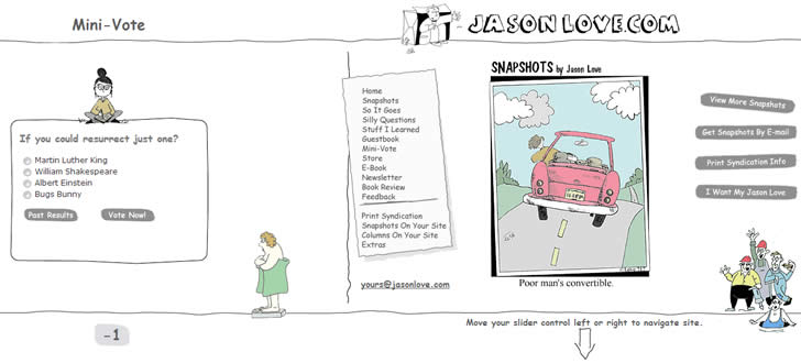
It’s still important that your visitors be able to get to your information, so don’t abandon the fundamentals of good navigation. Make sure there is a clearly visible and easy to use menu of some kind that will get them to the information they want, especially the home page. In this way they can enjoy the uniqueness of your design for awhile, but then still get to the important information about your business and what you have to offer.

menu and a menu in the footer as well that provide easy access to all of the pages
Use Labels
Understand that horizontal sites are not as intuitive to visitors as vertical sites which they see all day, every day. It shouldn’t be difficult for them to understand what’s going on or how to use something. Use labels. Your visitors would much rather be told what each thing is than have to click around to figure out how each thing works even if it makes complete sense to you as the designer.
Users would rather have everything spelled out than look or feel stupid when they don’t know something and can’t figure it out. Also, as I keep mentioning, if your visitors can’t figure it all out fast enough, they’ll leave.

Don’t Neglect Your Content
When creating your horizontal design you may be tempted to let the design speak for itself, especially as horizontal designs are typically used by trendy sites that are image heavy. This is perfectly acceptable, but remember that your website should actually have a purpose beyond ‘look at all of this cool stuff’ (unless, of course, your site is literally just to allow people to look at cool stuff). Make sure that there is still information about the business, the products or services, the contact and order information, etc.
Giving your site a horizontal design does not make the content of it any less important than it would be if it had a vertical design. Remember that “contagious content” is critical if you want to bring visitors back time and time again.
Coding
This may come as a no-brainer, but I’m going to mention it because it could also be too easily overlooked. Most coding intuitively lends itself to a vertical design because that’s what we’re used to and what most of us find most comfortable and appealing. Therefore it actually takes a bit of effort to code a horizontal website and you may not actually know how to do it yet.
There are a few different methods you can use to achieve this effect. Here is a great tutorial that will actually break down the essential HTML and CSS elements to creating a cool and functional horizontal website. That is only one way to do it, though. There are also other ways to create the effect.
One Final Word Of Caution (Yes, Another One!)
Your horizontal design may catch your visitors’ attention and get them to fiddle around with your site more than others, but when it comes down to it, they want to be able to get in, get what they want to see, and get back out again. Trying to trick them into staying by making your site confusing and hard to navigate will only make them go somewhere else. Remember that it is easy for users to scroll vertically using their mouse scroll wheel.
Horizontal scrolling involves more effort since users typically have to move their mouse pointer to a specifically designated area on the screen and drag (while holding the mouse button) or click. In addition to this, some horizontal scrolling implementations make the design judder and hence impair user experience. Finally, remember that users have become accustomed to scanning page content and scrolling downwards. Introducing horizontal scrolling especially for pages with lots of text will also be bad for user experience.
If you still think that horizontal scrolling will be beneficial for your users, then do go for it. Remember, your whole focus is your user. Make your horizontal designs aesthetically pleasing, but also ensure that they are usable so that your users will achieve their objectives and keep coming back for more.
Want to learn more?
If you’re interested in the intersection between UX and UI Design, then consider to take the online course UI Design Patterns for Successful Software and alternatively Design Thinking: The Beginner’s Guide. If, on the other hand, you want to brush up on the basics of UX and Usability, you might take the online course on User Experience (or another design topic). Good luck on your learning journey!
(Lead image: Depositphotos)
