Consistency is key for User Experience. And while consistency throughout a channel such as the company’s website is seldomly ignored, not the same can be said about consistency across different channels.
The Need For Cross-Channel User Experience
We live in a world where books, magazines and newspapers are found in various digital formats, yet still exist in the traditional printed form and where shopping catalogues are still received via postal mail or viewed online or on an app. This essentially shatters what we always dream when a new technology comes along – that it will replace the current way of doing things. It is true that for example the usage of certain traditional marketing channels have lost popularity, while innovative online marketing strategies have become more popular. The result is that companies have at their disposal a multitude of marketing channels to send out their message. While an advantage, this poses a challenge to ensure that a consistent user experience is transmitted simultaneously across all offline and online marketing channels.
As UXMatters correctly explained it, “Seamless, cross-channel user experiences are the way of the future, as technology fades into the background and the personal, physical, and social context determine the methods we use to interact with information”.
Heineken Departure Roulette Campaign – The Video
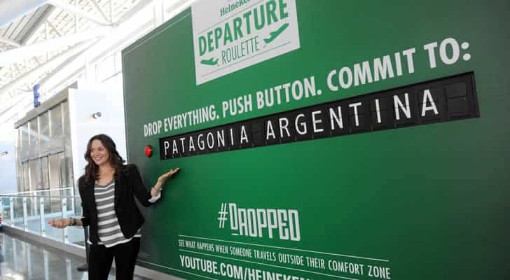
Last week I came across a video that has just been launched by Heineken. Picture this – you are at the ultra-busy New York’s John F. Kennedy airport – specifically at Terminal 8. You are ready to embark and are offered a once in a lifetime opportunity to change your plans to go to a totally different destination for free – all flight and accommodation expenses paid … plus $2,000 spending money.
The catch? The destination is chosen at random when you press a button on a billboard and you have to ditch your current plans and leave now! This essentially sums up the Heineken Departure Roulette Campaign. Watch the video below:
The Heineken Departure Roulette campaign forms part of the Dutch beer company’s ‘Dropped’ campaign. Personally, I find the video as being awesome for many reasons. Originality and excitement apart, it makes you think of all the possibilities you come across in life. Very often we grumble about how dull our lives are, and how tough life is. We are immersed in our jobs and commitments. But what if, for once we are given an opportunity to do something that breaks away from the traditional? Something exciting, almost dream-like… yet real! Would we take it? This is the message that the Heineken Departure Roulette Campaign sends.
As you can see in the video, some people take the plunge and play the game and they go on to win a dream holiday in Morocco, Laos, Thailand and Cyprus. There were others who did not take up the challenge because they said they were going for a business trip, a bachelor party or quite simply they wanted to go home.
Heineken Departure Roulette Video & Cross-Channel UX
The Heineken Departure Roulette video is not an isolated campaign. It is intended to promote a web series entitled “Dropped” which is about three men – Rikar, Stavros and William who have been randomly dropped into remote destinations around the world – Alaska, Cambodia and Morocco respectively. A fourth, yet unnamed man will be dropped in August in another remote location. The gist of Heineken’s ‘Dropped’ campaign is to show that a legendary journey is not planned but is one that is born out of spontaneity.
The cross-channel User Experience to send out this message is immediately visible in the re-branding that has been effected on Heineken’s official website, YouTube channel, Facebook page, Twitter channel and Instagram account. What I find as being particularly interesting is that the branding has been effected on the official channels and not on sub-channels which have been created for this particular campaign. This continues to emphasize the concentrated effort to send a clear, cross-channel user experience by eliminating the possibility that the user gets a mixed message by visiting an ‘official’ channel and a campaign-specific channel.
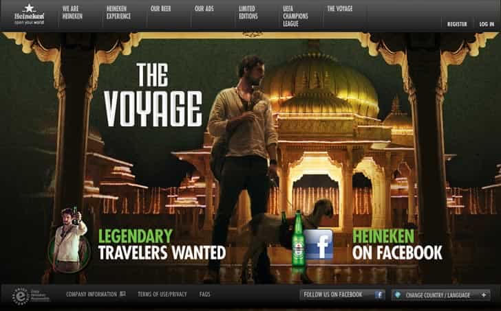
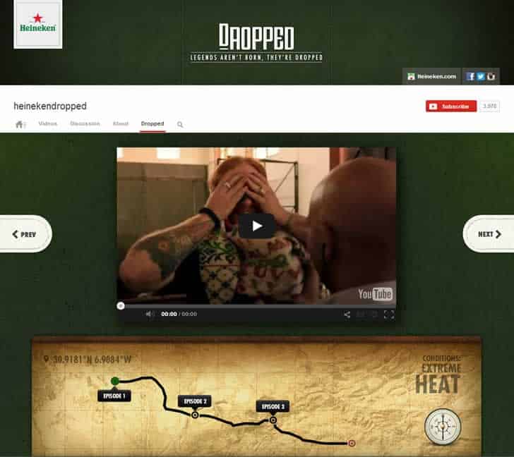
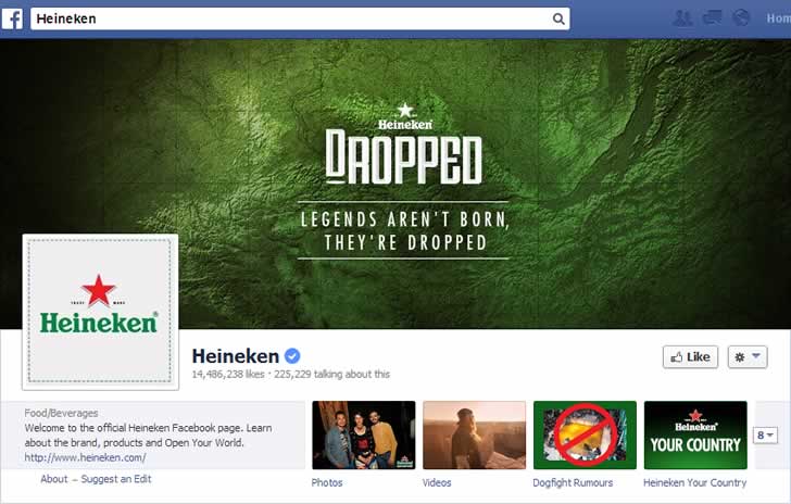
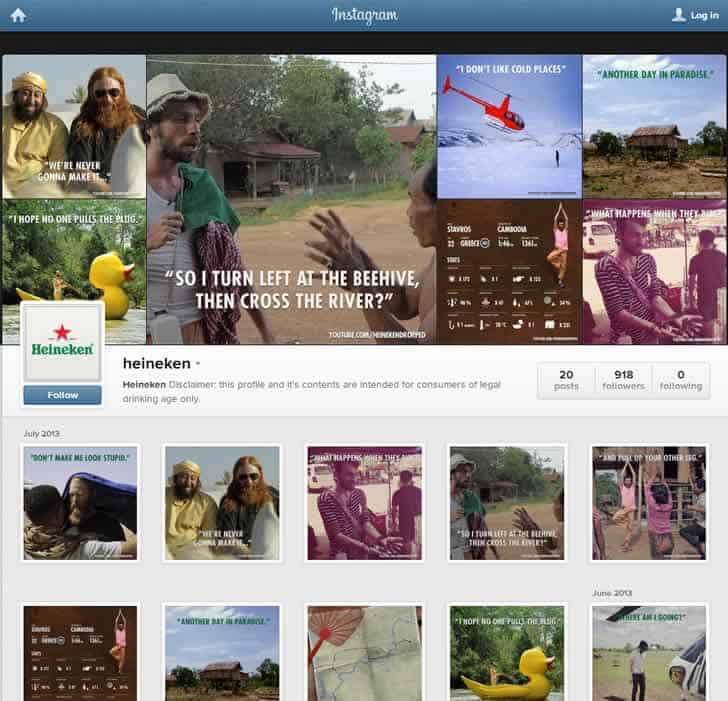
Every user who comes in touch with Heineken will get the same message, emotion and user experience due to the consistent imagery, look and feel of how anything Heineken has been re-branded for the “Dropped” campaign. This, in essence is a great example of how cross-channel user experience can be ensured in today’s competitive retail environment.
And as for the Heineken Departure Roulette … would you have done it?
Disclaimer: This is a “sponsored review”. I am not affiliated in any way with the company behind it. Regardless, I only publish reviews of products or services that I believe will be good for my readers. I am disclosing this in accordance with the Federal Trade Commission’s 16 CFR, Part 255: “Guides Concerning the Use of Endorsements and Testimonials in Advertising.
Want to learn more?
If you’d like to become an expert in UX Design, Design Thinking, UI Design, or another related design topic, then consider to take an online UX course from the Interaction Design Foundation. For example, Design Thinking, Become a UX Designer from Scratch, Conducting Usability Testing or User Research – Methods and Best Practices. Good luck on your learning journey!
