Customer sentiment is an important metric for any online product team to track. An overall negative sentiment likely means you’re hemorrhaging customers, forcing them to flee to a friendlier competitor product. An overall positive sentiment, on the other hand, means your customers love you – and are likely recommending you to their friends and coworkers.
Today, online businesses rely on two methods to measure customer sentiment, whether positive or negative. Those methods can be described as direct or passive.
Direct Feedback Fails Both You and Your Customers
What we mean by direct feedback is those methods of gauging frustration that require user participation, e.g. “Tell us your dissatisfaction.” Tools like surveys, support tickets, contact forms, and, yes, feedback widgets, all function as a direct read on the customer experience.
Directly measuring sentiment can be useful because the responses come “straight from the horse’s mouth,” as they say, but this method is not without its drawbacks. When it comes to measuring sentiment directly:
Direct methods require the customer to do the hard work
Filling out contact forms, using chat support, placing phone calls, or going on dreaded social media rants, requires the customer to perform the heavy lifting in order to express their frustration. If they’re already having a negative experience using your product, an untimely intrusion or difficult hurdle to climb will only make it more negative. Your feedback widget could be actively nudging your customer sentiment in the wrong direction.
Direct methods select for a particular type of customer and feedback
Customers who are willing to go through the above hassle represent a very small set of your total users. The resulting data tends to be slanted towards squeaky-wheel customers and very negative feedback. It will likely miss low-level frustration – the kinds of things that customers will grumble about, though not report.
Some direct methods assume a customer can articulate their frustration
Have you ever been in a bad mood but you weren’t exactly sure why? Feedback widgets and contact forms require your customer to be able to pinpoint the moment or interaction that pushed them over the edge, when in reality their frustration might stem from a general negative impression or a series of frustrating events.
In short, directly measuring customer sentiment is a tricky task and prone to backfiring. If the points above don’t convince you, just trust us: your users don’t want yet another pop-up modal, glowing bubble, or chat robot asking them to rate their visit with stars or radio buttons or comment entry boxes.
Lighten Your Customers’ Load by Collecting Passive Feedback
Passive methods for measuring online experiences show a great deal of promise when it comes to understanding customer frustration, and thanks to the advent of detailed session-capture and playback technology, we can now analyze and understand all the little minutiae of customer behavior patterns.
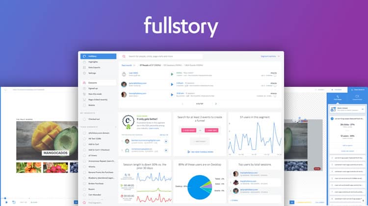
Here at FullStory, we developed Rage Clicks to surface moments where your customers pummel their mice in frustration, and since introducing them in 2015, they’ve caught on like wildfire across web analytics products. Rage Clicks intelligently locate and bring attention to customer frustration, and unlike “dumb” metrics like bounce rate or (in)active time, it’s much easier to pinpoint exact moments of frustration as well as the elements of your site or app causing them.
Each drawback of direct feedback-gathering techniques is solved by passive feedback:
- Your customers don’t have to do any work to convey their frustration.
- Your sample comprises every single customer, not just those who are more predisposed to voice their concerns.
- Your customer isn’t required to articulate their own frustration: you can relive the frustration by virtually watching over their shoulder as they navigate your site.
How to Implement – and Analyze – Passive Feedback
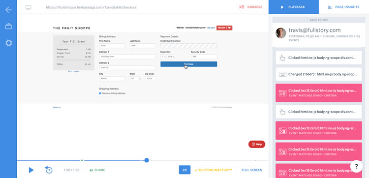
First, choose and install a session replay tool. These surpass traditional analytics tools like Google Analytics or Kissmetrics when it comes to capturing each tiny mouse movement or click event in a customer’s session, and of course, allowing you to replay the session and see with your very own eyes the cause of any frustration.

Now decide what behaviors indicate frustration (or success, to measure positive sentiment) in your app. In FullStory, we use a combination of the aforementioned Rage Clicks, as well as Error Clicks (clicks that generate JavaScript console errors), Dead Clicks (clicks with no reaction), form abandonment, “thrashing” mouse movements, funnel-evacuation, and more.
Watch a good sample of sessions that exhibit these behaviors to spot trends. It should be extremely clear if there’s a particular page, button, or interaction that produces a spike in frustration signals.
(Alternatively, if you’re using FullStory, you can instantly see your most Rage Clicked, Error Clicked or Dead Clicked links and elements automatically using our smart analytics.)

Once you’ve figured out what’s causing frustration, change that flow or element and see if your frustration signals drop.
See How Your Customer Frustration Compares Against Your Competitors with Rage Grade
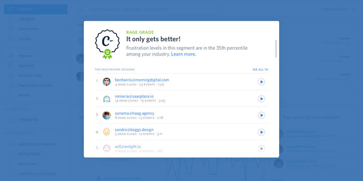
If you’ve ever wondered whether your customer sentiment is better or worse than other sites or apps in your industry, wonder no longer. We’ve just introduced Rage Grade, a measurement that intelligently combines FullStory’s proprietary frustration metrics to show you the most enraging parts of your app as well as a benchmark showing how your frustration score stacks up against other companies’ like yours.

Rage Grade doesn’t just give you a score though. You’ll also see the top 10 frustrated sessions that contributed towards your grade, totally short-circuiting any need for manual digging and segmenting.
Check out these sessions to see exactly where and why customers are getting frustrated while using your app, then use your newfound wisdom to improve your customer experience and bring up your grade.
Be a Customer Frustration Psychic. Switch to Passive Feedback
Say bye-bye to widgets and popups. Now you’re prepared to intuit your customers’ frustration proactively, reducing the mental load on your customers to advocate for themselves and making your product team look like mind-reading superheroes in the process.
Disclaimer: This content is sponsored via Syndicate Ads.
Want to learn more?
If you’d like to become an expert in UX Design, Design Thinking, UI Design, or another related design topic, then consider to take an online UX course from the Interaction Design Foundation. For example, Design Thinking, Become a UX Designer from Scratch, Conducting Usability Testing or User Research – Methods and Best Practices. Good luck on your learning journey!
