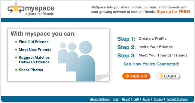
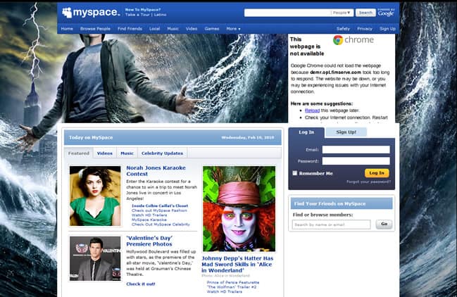
Here’s a scenario for you to ponder. About 6 years, the groundbreaking social media site MySpace was on top of the world. MySpace enjoyed unprecedented success as an online social networking company largely because there wasn’t any real competition. MySpace might have looked like a cluttered mess of ads slapped onto a hastily designed interface, but that didn’t really stop the company from signing up hundreds of millions of followers.
Then comes Facebook, the social media platform which came out of nowhere in late 2006/early 2007 to take the world by storm. MySpace stood no chance against Facebook, which easily supplanted it as the number one social media network within a few short months of opening its doors to all users.
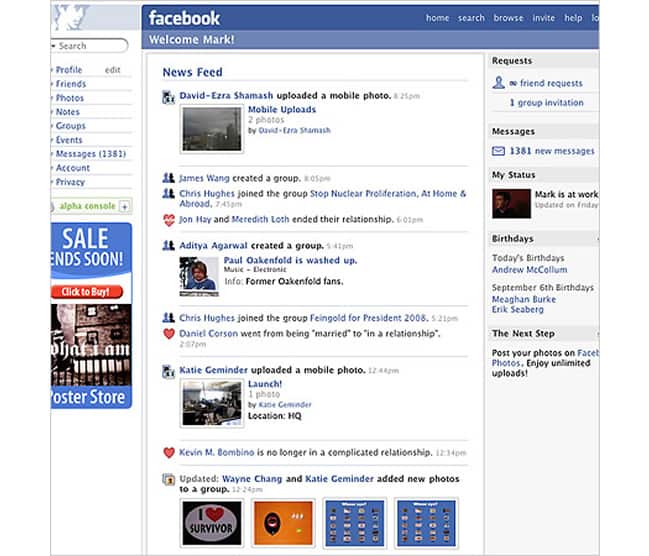
In my opinion, it was the simplicity and clean aesthetic of Facebook’s layout that ultimately won over the public. Gone were the spammy ads and poorly thought out layout that MySpace got away with for so long—Facebook had a catchy color scheme and an intuitive interface that appealed to most users. The Facebook wall, the ability to tag friends in photos, the way that you could keep tabs on your friend all reflected the fact that Mark Zuckerberg and his designers put a lot of thought into the way that people would use the social media service. This stood in stark contrast to MySpace, which had long since had an aesthetic that basically said, “We don’t need to make this any easier, let the user figure it out.”
Personally I think that Facebook is now becoming the MySpace in this new era of social media. Sure, Facebook is the undisputed king of the genre, boasting nearly a billion users and countless tie-ins with other online services like Spotify and iTunes that help solidify it’s relevancy in today’s thriving web market. Everyone was so confident about the company’s invincibility that Facebook went public. Much to the consternation of Mark Zuckerberg and a host of investors, Facebook has failed to keep both its stock prices or its profits high.
So what happened?
In my opinion this is the MySpace story all over again. Facebook is suffering from some major usability issues as a result of its huge success: the site is covered with targeted ads and every other status update is from some sponsor or third-party tie in trying to get you to sign up for a new service. Facebook’s simple and austere interface has had more alterations and face lifts than I care to count, often to the chagrin of its millions of users. I think that Facebook needs to clean up its act (and most importantly its interface) soon before they go the way of MySpace.
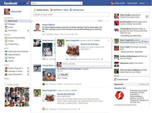
Newer online services are enjoying huge successes because they’ve embraced the simple and clean aesthetics that appeal to all web users. Think about the basic layout of hugely popular online services like Pinterest—they’re stripped down to the most basic elements and features, and consumers can’t seem to get enough of it. I fear that Facebook won’t enjoy success much longer if they don’t listen to users and revert to the minimalistic feel that has always served it so well.
What do you think about the usability of Facebook? Does it work for you, or do you want something different from them?
Want to learn more?
If you’re interested in the intersection between UX and UI Design, then consider to take the online course UI Design Patterns for Successful Software and alternatively Design Thinking: The Beginner’s Guide. If, on the other hand, you want to brush up on the basics of UX and Usability, you might take the online course on User Experience (or another design topic). Good luck on your learning journey!
(Lead image: Depositphotos)
