
Data plays a huge role in the digital age and the new technologies we have for collecting and collating data are absolutely crucial for everything to run the way it does. The web in fact is entirely built on data – with the essential purpose being to make the entire world’s information easily accessible for all.
But this can create a problem. There is now so much data available that it’s getting difficult to convey. Every site we visit has its own set of with numbers, statistics and facts and often those numbers are dizzying. This creates something akin to information overload for visitors and essentially ruins the user experience.
So how do you get around this? Simple! By coming up with new and unique ways to convey that information that will be intuitive and attractive and that will clearly communicate what that data is saying.
Infographics
The above scenario is essentially what has given rise to the infographic – an image that essentially makes an ‘infodump’ a lot more bearable by using graphics, charts and more to convey that information. An infographic can chart pretty much capture anything, from the rise in popularity of a mobile operating system, to market shares in a particular industry.
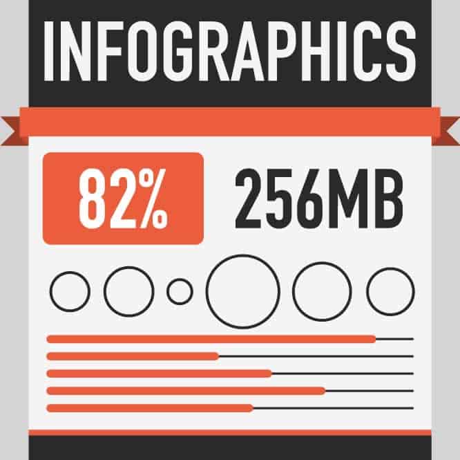
Unfortunately infographics have become over-used and as such have started to develop something of a bad reputation as generic ‘filler’. If you still want to use infographics then you need to make sure yours stands out as well designed – and that you take full advantage of the format (you need to justify your use of infographics over regular content). You should also know when something demands an inforgraphic. The ‘when’ is essentially wherever your text becomes too dry, boring or complicated.
What makes a good infographic is a clear narrative structure that makes it simple to follow. Don’t just throw lots of facts and charts onto a page – but rather organise them in a logical manner. This can be anything from chronological organisation to one that is designed for maximum impact. An infographic should guide the user through the information.
At the same time an infographic should break up the data to make it less dense. That means that you should be able to step back and look at the whole thing to get an overall picture. At the same time you should then be able look closer in more detail in order to learn more specifics with regards to statistics and figures.
Avoid making your infograhpic look cheesy or making it condescending. It should be an accessible and colourful way to communicate dry data, but if it looks like it belongs in a children’s textbook then you will be offending your users.
Charts and Graphs
Of course charts and graphs also have a place on the web and can be a very powerful tool for quickly communicating information. Why do you think business presentations so often start with a line chart showing projected profits? It’s much more effective than just saying ‘our profits are going up’.
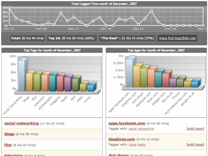
Be warned though that using charts and graphs can risk making a page look too corporate. While in some scenarios this is actually an advantage – especially if you want to enhance your reputation, in others it might put some readers off. Charts and graphs can also sometimes look manipulative – an unfortunate repercussion of so many dodgy sites using them to sell eBooks.
If you are going to use charts and graphs, then make sure they don’t look out of place, and make sure that they’re factual and useful.
‘Beautiful Data’
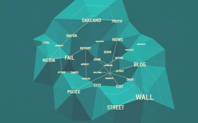
To avoid making your site look like a maths text book, you need to get a bit more creative with how you are going to display your information. Beautiful data is something of a buzz word at the moment, with many designers coming up with new and attractive ways to show statistics that look like abstract fractals or constellations at first glance.
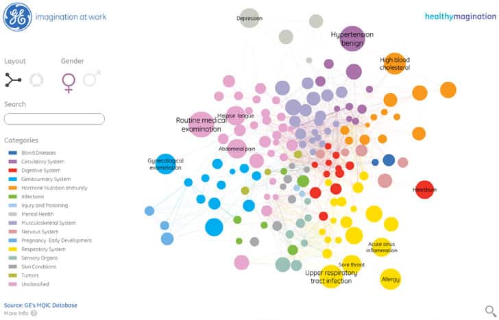
These can then be coloured without looking childish. They will also aid in the reader’s understanding of the article, while at the same time hopefully piquing their interest and encouraging them to read more.
If you are interested in what ‘beautiful data’ can look like, then try typing the phrase into Google Images for inspiration. Here you’ll find plenty of examples of images that embed data in an attractive-yet-systematic manner – using shades of colours, relational positions and sizes and keys and indexes to make sense of information.
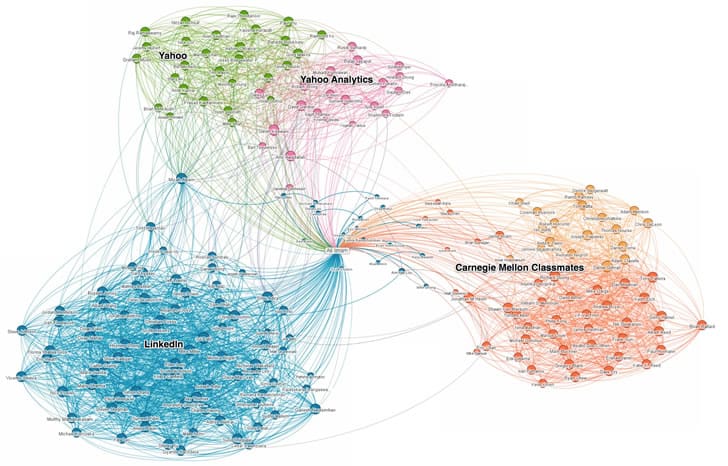
If you’re stuck for ideas, then just create a scatter graph and then try toying with the appearance – could you add a colour code on top? Could you bend the scatter graph around itself? Could it be made to look like some kind of explosion or nebula?
Other Types of Information
Data doesn’t just have to mean numbers and stats though. There is a host of different types of data and information that the typical website will try to convey. Better still, there are many imaginative ways you can do this and many imaginative contexts in which it will be suitable.
For a great example, take a look at most tube maps or metro maps. This is a potentially very dense and complicated chunk of information which would be almost impossible to convey textually. Yet a single image manages to show how to get around the city and how each station and line interconnect (and in most cases these images have little bearing on the actual geographic locations of stations).

In some way, all images on your site will convey information and tell some kind of story. The key is to take this further by giving your images a real narrative and ensuring that they really add to the article you’re writing. The famous ascent of man picture conveys information about our evolution for instance while still remaining predominantly a piece of artwork rather than a graph. Add a temporal or spatial element to a regular image and you’ll be surprised just how much more meaning you can give it.
Some useful sources for data visualisation and beautiful data inspiration
Want to learn more?
Want to get an industry-recognized Course Certificate in UX Design, Design Thinking, UI Design, or another related design topic? Online UX courses from the Interaction Design Foundation can provide you with industry-relevant skills to advance your UX career. For example, Design Thinking, Become a UX Designer from Scratch, Conducting Usability Testing or User Research – Methods and Best Practices are some of the most popular courses. Good luck on your learning journey!
(Lead image: Depositphotos)
