Even though minimal website design is the trend right now, it is not always possible to summarize our information into succinct blurbs that fit nicely on the page. Some websites need robust content to convey value to their site’s visitors – but that does not mean they have to sacrifice style.
With new, content-rich design techniques, these sites do not have to be the black sheep of the web anymore. It is now possible to achieve beautiful, sophisticated design without appearing cluttered, even if your site is content-heavy.
1. Make a Plan
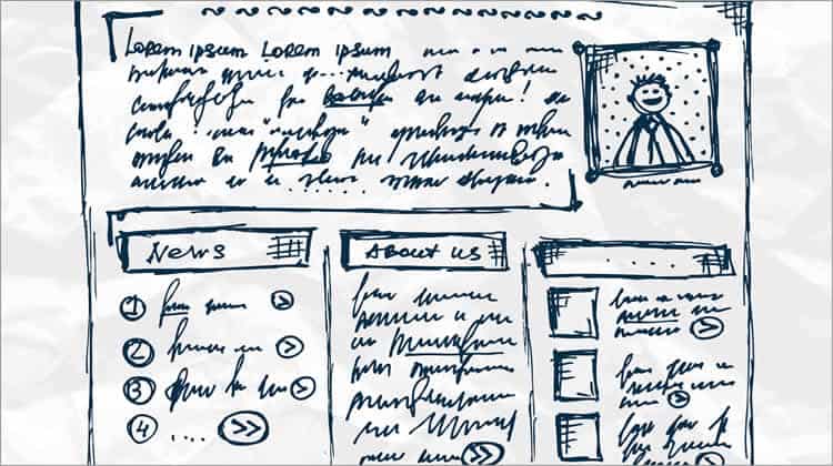
Like every good idea, a lot of careful planning leads up to its proper execution. You have already written your content and may already have a website up and running. Now it is time to create detailed page layouts. You can sketch them with pen and paper, use a wire-framing tool, or a graphics program. As long as you solidify your ideas and turn them into tangible concepts, you will be able to move forward with confidence.
When planning your layout design, it is important to make room for white space. Since your site is already content-rich, you will need to incorporate as much white space as you can, and in a manner that maximizes your aesthetic appeal. Consider breaking up your content with subheadings and lists, or other elements such as visuals or boxes. Categorize all your information and get a firm idea of how you would like it to look on the page.
Don’t forget typography. With the amount of text you have on your site, it is incredibly important to take due care in choosing what that text will look like. Readers need to be able to skim your content and leave with a takeaway. If a user does not consciously notice the layout of your text, you have achieved your goal. Users should not have to think about your text, or notice that it is too small, too squished, or too hard to read.
2. Incorporate Photos and Artwork
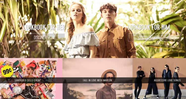
Photos are a user favorite, provided that they add value to the content. Breaking up your information into a photo collage, with each photo a clickable link to some part of your website – like this example – is a great way to stay aesthetically pleasing while still including as much content as you need to. You can also choose a photo grid system layout, which is similar but makes use of space as well as the collage aspect.

Another idea to make your content-rich website “pop” is to take the rustic approach and do a hand-drawn sitemap for your front page, with doodles or interesting animations that bring users to certain areas of content. For example, this website uses animation to catch attention, while still including the large amount of content the company needed. While this example site may at first seem cluttered, it is an organized clutter, and its aesthetics are appealing and unique.
If you don’t like the collage or hand-drawn approach, you can keep your site clean and simple with monochrome backgrounds and plain graphics – which keep the photo appeal of links but also present a structured, uniform front to users. Or, you can make your top-priority content take the form of larger photo links, with smaller tidbits of information on the side, such as this example from MSN.com.
These photo and artwork options are both visually stunning and unique, while still encompassing text-heavy content. Instead of bombarding your users with text upon first glance, let them explore your site using appealing graphics, and discover your content on their own. If you take the photo approach, make sure you use high-quality photos (and optimize them for web) for the most success.
3. Keep it Neat and Elegant
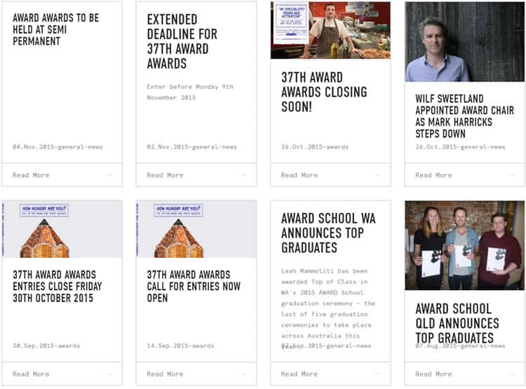
There is nothing worse than pairing text-heavy content with sloppy design. If you are going to fit all the necessary information you need into one website, the least you can do is make it easy for users to navigate. The key to simple navigation with content-rich websites is to stick to a rigid main structure, such as a tiled layout with titles and minimal subtext.
Loading all your content onto the front page or even having a welcome page with a pull-down menu of options can overwhelm your visitors and make them bounce around without retaining any of what they have read. Instead, keep your site clean and organized, and reveal your content bit-by-bit, tantalizing the user and making them want to read more.
Information overload is a huge roadblock for content-heavy websites and can be avoided using a few smart web design techniques, such as implementing ample white space and using boxes or borders to categorize information. The Award Online website is a great example of using both white space and boxes to keep a lot of information neat and concise, without overwhelming the reader.

4. Incorporate Other Types of Content
Ever considered replacing your written content with video content? Studies show that video trends are steadily on the rise, especially across mobile devices. If you don’t think you are capable of producing smart, elegant video content, think again. Revising your content and integrating eye-catching video is easier than ever before, with plenty of helpful resources for every level of expertise.
Making your content responsive is another big step toward improving a content-heavy website. The newest trend that websites are expected to accommodate is responsive content for mobile devices, which change and evolve according to what the user wants. On top of responsive design, mobile users are also leaning toward simplicity and elegance in web design, as well as other mobile design trends.
To keep up with the times, you need to jump onboard the bandwagon and convert your text-heavy content to more user-friendly outlets, without compromising what you have to say. Using video or photo content that is relevant to your text is a great way to hook users and keep them interested, increasing conversion rates and spreading brand awareness organically, while not losing any of your content.
The Importance of Visualization
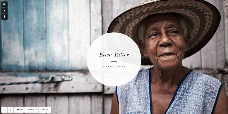
The common factor in every standout content-rich website is the use of visual aids. Stunning photography backdrops go a long way toward making your site user friendly, and keep bulky contextual information away from the main draw. Once users are intrigued, they are much more willing to explore your site and see what other stunning visuals you have to offer.

Whether you make one beautiful image your backdrop or break your layout into multiple photo options, using photos to get your message across is just a part of what makes a website visually stunning. You also need to understand how different colors effect user reactions and the many color theories surrounding web design. There are helpful tools available if you don’t know the first thing about color theory. Optimizing color on your webpage can make more of a difference than you realize when it comes to user engagement and willingness to stay on your site.
You also need to make use of interactive visuals that react to your user’s commands, especially when optimizing your website for mobile use or creating a mobile app. Make your photo links swipe-able or responsive to user activity. This way, your user will be encouraged to engage with your website physically – a strong appeal to those who access websites primarily from their mobile devices.
Want to learn more?
If you’re interested in the intersection between UX and UI Design, then consider to take the online course UI Design Patterns for Successful Software and alternatively Design Thinking: The Beginner’s Guide. If, on the other hand, you want to brush up on the basics of UX and Usability, you might take the online course on User Experience (or another design topic). Good luck on your learning journey!
(Lead image: Depositphotos)
