According to a study by Jakob Nielsen, users will look at your site for 10 to 20 seconds before deciding whether they should proceed on reading more or leaving. Needless to say, those few seconds can make or break you. We have already written about why website usability is important for a company and how to shift your business structure to provide a better user experience. In this article we take a slightly different approach.
The Experiment
In this article I performed a small experiment. I took 5 websites of the same genre and analysed them through the viewpoint of a normal user. I allowed myself 15 seconds to voice out (and record) my opinion about each website. What follows is my analysis of the observations I recorded. Please note that this is not a full heuristic evaluation of each website. For an example of a more in-depth usability analysis of a website, please head over to this article. Indeed, if I were to perform a heuristic evaluation on these websites, I would be able to identify several usability guidelines which have been violated. The objective is to gather what is likely to be the user’s first impression of each website.
The Twist … All 5 Websites Promote Dark Tourism
For this experiment I opted to avoid taking a cliche route of analyzing e-commerce websites. I wanted to explore a rare category of websites. This is why I went for websites promoting dark tourist attractions. This odd but no less emerging tourism market known as dark tourism is the 180-degree opposite of the museum/beach/good-times tourism that makes up the bulk of the tourism industry worldwide.
Rather than the beaches of Crimea, lovers of dark tourism seek out the desolation of Chernobyl. Instead of the Statue of Liberty, the dark tourist wants to see Ground Zero. Forget about the Louvre, Alhambra, and Rodeo Drive. Dark tourism promotes Auschwitz, Hiroshima, and the slums of Mumbai. The experiences of death, disaster, destruction, and darkness show another side of humanity, but how are they promoted? While Disney World can create fantastical websites and hotels can show high class luxury living, how do you promote Auschwitz, Hiroshima, Ground Zero, Chernobyl, and convince tourists to take a walk through the nastier parts of Mumbai?
From a user experience perspective, this raises an interesting debate: does the experience of dark tourism mean that the user experience of websites that promote such sites will also be dark? The experiment discussed in this article using the following five sites will shed some light on the art of marketing and creating user experiences based on darkness.
1. Auschwitz (Poland)
The Website: http://en.auschwitz.org/z/
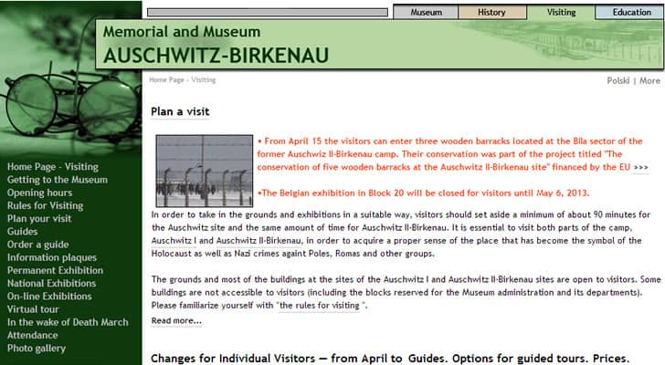
User Interface: Auschwitz has a straightforward and an almost late 90’s style website. The core objective of the site seems to be more for information purposes than for marketing. Still, like other museums, it also contains articles that are relevant to the site. While the actual Auschwitz site in Poland is a relatively simple site with few buildings and railroad tracks, the website is far from simple. Two navigation styles, both horizontal and vertical, as well as text from side to side make the site a bit messy. It should be noted that one of the challenges of the Auschwitz site is that it caters for an international audience.
User Experience: The site downplays the drive for dark tourism and replaces it with an almost aloof experience. Because of the horrors of the site, this straightforward approach is fitting. It is clear that the Auschwitz website does not want to market its experience as a playground for dark tourism, but instead wants to maintain a kind of solemnity. If solemnity was the desired effect of the user experience designers, then they have succeeded. This is probably the type of website that the majority of tourists would expect of Auschwitz. The website has been translated in to twenty three languages, so the text based style, as opposed to images, may be out of necessity.
Verdict: Solemnity does not mean simplicity and from the graphic style to the navigation, the Auschwitz website does not fully reflect the real-life site.
2. Ground Zero (United States)
The Website: http://www.911memorial.org/
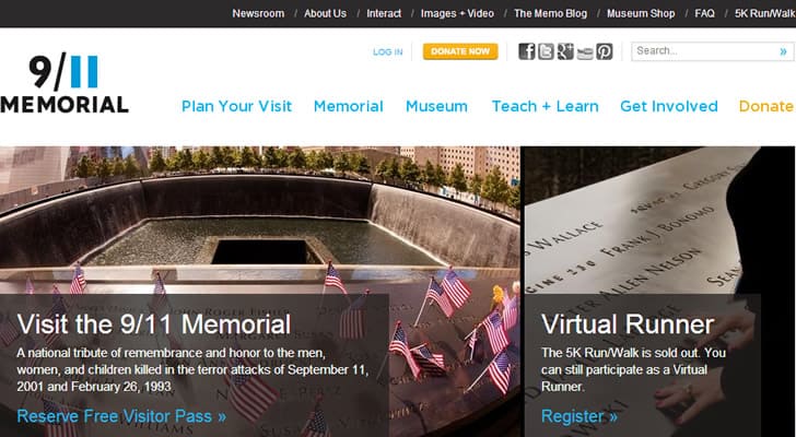
User Interface: The first thing that strikes you about the 9/11 Memorial page is its use of a bright color scheme coupled with pastel blue links and imagery that shows sunny days. In terms of typical dark tourism websites, this website probably would not appeal to the dark tourist. This is because rather than focus on the tragedy, this website focuses on coping with tragedy and moving forward in the face of adversity.
User Experience: In terms of the overall user experience, the 9/11 Memorial website has a more modern feel. Instead of a quiet remembrance, the 9/11 Memorial website conveys a message that is both patriotic and hopeful. It has a succinct navigational style, but presents what, in my opinion is an overwhelming header with sixteen buttons, a search, and five social networking links. If dark tourists were looking for darkness, they have come to the wrong site.
Verdict: The 9/11 Memorial is colorful and hopeful, but it needs some design revisions to reduce clutter and add simplicity. The design approach can also be as a result that the site itself has a recent history and hence, the design had to reflect that. I would classify this website as a work in progress. The narrative is beginning to be solidified, but it has yet to find a “voice”.
3. Hiroshima (Japan)
The Website: http://visithiroshima.net/world_heritage/a-bomb_dome.html
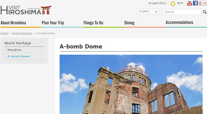
User Interface: Like the 9/11 Memorial website, this site is probably not so pleasing for the typical dark tourist looking to see the evil in the world. The website is colorful and image oriented. While Hiroshima was the site of a terrible tragedy, the focus of the site is to promote peace – so the design is also meant to be relaxed. It is clear that the designers put thought in to the conundrum of showing a dark chapter of human history without creating a depressing design. The A-bomb Dome is surrounded by beautiful parks and a place where visitors can leave prayers for world peace. The website clearly mirrors these sentiments.
User Experience: Focusing on peace is far from the solemnity of Auschwitz, and although it may be similar to the 9/11 site in its brightness, it is different in that it has a different user objective. While the 9/11 Memorial website is a tribute to those who perished in the 9/11 attacks at the World Trade Center, the Hirosima’s A-bomb Dome is a call for peace rather than a remembrance of the fallen. This experience might not appeal to dark tourists, but as the user experience objective is clearly achieved. The layout is simple and unobstructed, and the navigation is simple and a delight to use as well.
Verdict: This site is probably not the typical dark tourism website and will probably not appeal to the stereotypical user who is into dark tourism. It has a bright and smooth web design and user experience.
4. Chernobyl (Ukraine)
The Website: http://tour2chernobyl.com/
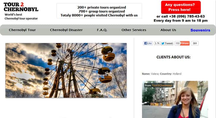
User Interface: Although this is not the official website for the tragedy, I feel that this website is the epitome of dark tourism. The goal here was to create something unsophisticated but with enough features to set it apart from its “competitors” in terms of dark tourism. The use of video, sliding images, and big-name logos helps to breathe some life in to a web design that is otherwise as empty and sad as the Chernobyl site itself.
User Experience: Doom and gloom at its finest. Forget solemnity, hope, and peace, this website clearly conveys the sense of loneliness and disaster that surrounds the place. The website features an explanation of what visitors will see, coupled with pictures of desiccation and topped off with cheap souvenirs like mugs, water bottles, t-shirts, and postcards. It should be noted that the website for this travel company is the only one to feature videos of all five reviewed sites. Videos here are important because the experience the site promotes is one of desolation and lack of human life, yet the tour operators have to breathe life in to the tour itself by promoting the shared experience.
Verdict: This is probably the closest it comes to a website that mirrors the user experience of the actual site. The problem here is that it is unlikely that this was the website owner’s intention.
5. Mumbai’s Slums (India)
The Website: http://www.realitytoursandtravel.com/tours/slum-tours/
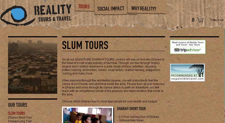
User Interface: Last but not least, the website depicting the experience of visiting Mumbai’s slums. This is by far the the best example of how a website can convey the same user experience as visiting the real site. First and foremost, it has a unique and fitting style. The cardboard background speaks to the level of poverty, yet the text discusses community. The copy-writing is solid. The page uses imagery of poverty along with physical elements that reflect “cheapness” like cardboard texture and a map of Mumbai with trash and plants blocking it. The angles give the page an uneasiness that also adds to the effect.
User Experience: Since slums are rarely tourist attractions, it is important to make it clear what the tourist will see on this kind of tour. Rather than seeing a site, dark tourists are interested in seeing people. It is unethical to make people in to a tourist attraction. So the tour operators focuses on different industries. It does, however, include an excursion to the red light district of Mumbai where tourists can see depravity from a vehicle (leaving the vehicle is prohibited). It is fair to assume that the tour and the tour site match one another.
Verdict: This site put thought in to both their web design and their audience. As twisted and sad as might be, the user experience is as authentic as ever.
Conclusion
With the launch of HBO’s co-production with VICE, it is possible that there will be an influx of tourists interested in experiencing the effects of genocide, natural disasters, and war. This is not a new phenomenon. Pompeii has been a tourist attraction for decades, and battlegrounds like Gettysburg, Normandy, and the Somme have sustained popularity.
History buffs may be attracted to historical sites of death and destruction, just as dark tourists may go out of their way to find dungeons and places of human suffering. What is clear here is that websites try to downplay the doom and gloom in favor of offering a different user experience. They offer tourists an experience built on solemnity in place of doom, hope in the wake of tragedy, and community even in the most poverty stricken areas on planet Earth.
Want to learn more?
If you’re interested in the intersection between UX and UI Design, then consider to take the online course UI Design Patterns for Successful Software and alternatively Design Thinking: The Beginner’s Guide. If, on the other hand, you want to brush up on the basics of UX and Usability, you might take the online course on User Experience (or another design topic). Good luck on your learning journey!
(Lead image: Depositphotos)

