User testing is a cornerstone of effective user experience and design. This is constantly reiterated in the world of design and development but there is a cognitive dissonance when faced with budget and time restraints. Without user research there is a hit or miss of UX mentality that can result in a great deal of time wasted and a return to the drawing board.
Some of the key tenets of user testing are widely known, focus groups, surveys, even card sorting with target users. The technicalities increase with more investment and more time.
The Focus Group
Hosting focus groups is a general UX method, but in user testing for web and mobile design the focus group shouldn’t be a “group”. One on one interviews help give more honest answers and mitigate any chance of group-think. There are two types of questions a UX researcher can ask: the open ended question and the closed inquiry.
Open ended questions work best when there is no product, no design, and researchers are in the earliest stage of design and development. This helps get a feel for what the target user may expect with limited references to work off of. It can be the most genuine and valuable material when beginning design.
The closed inquiry, be it multiple choice, yes or no, or spectrum scaling is best used when a developed design can be offered. Mixing these two up can cause serious delays for designers.
Knowing the kind of user who will be in the focus group is critical. Defining the target user means identifying the industry that would motivate the target user’s use of the app, as well as, how the targeted industry will respond to it.
The Focus of the Focus Group
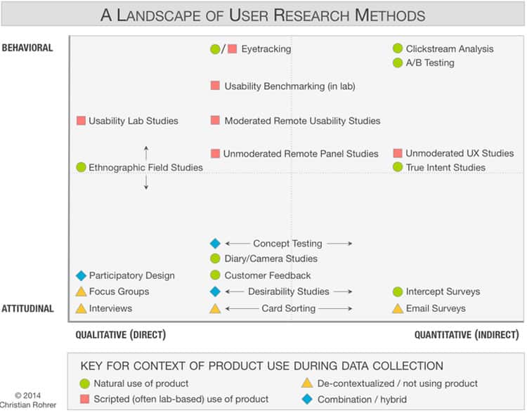
The Nielsen Norman Group has a great deal of primary and empirical data on the testing process itself. One of the pillars of analyzing is the difference between what is called attitudinal responses and behavioral responses to testing.
As their article states: “This distinction can be summed up by contrasting “what people say” versus “what people do” (very often the two are quite different)”. Clearly, functional designers are very interested in the behavioral aspect, because it easily quantifiable and can be referenced.
The closed question set works very well with behavioral analysis because tested users are forced to make a decision that is reflective of their experience.
Correlation and Organization: User Research Methods and Derived Value
The research methods incorporating behavior and attitudinal approaches necessitate a variety of specific user tests, including:
- Usability Lab Studies
- Benchmarking
- Clickstream Analysis
- Email Surveys
- Customer Feedback
- Participatory Design
Each of those fall into a particular use. User testing is the umbrella term for all of these modalities. The Nielsen Norman Group provided the following chart to illustrate how behavioral and attitudinal testing is correlated with the qualitative and quantitative derivable data from those tests:

What are the Other Guys Doing?
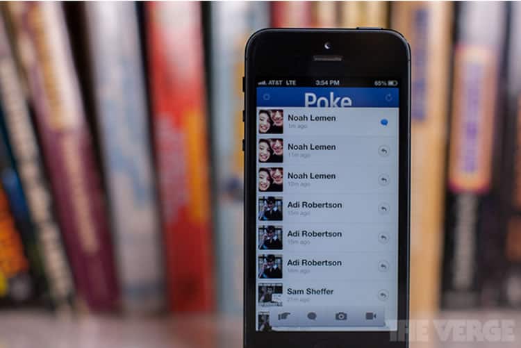
As mentioned earlier, with deadlines it may be tough to do thorough user testing. Sometimes this lack of testing is inexplicably avoided in a meaningful way. Some real world examples include Facebook’s attempt at a SnapChat-like platform called Poke.

The application features were nearly identical to Snapchat in every way. The only difference between them was using Facebook contacts instead of phone numbers or ambiguous usernames. The Verge reported that it took 12 days to build.
That is indeed impressive, but then again Facebook is worth billions of dollars and failed to properly user test the attitudinal and qualitative data that would attract new users and convert SnapChat users to Poke users. It was a failure and was removed from the app store mere months after launch. The overcompensation on features users would have known instead of new innovative features precluded it from making a splash.
What about Google+? That was tested a great deal to incorporate features users would be familiar with. In a hodgepodge compilation of features, users would be familiar with how to share posts, and use hangouts if they’re Google users already. Obviously Google+ may have a ways to go in terms of meaningful engagement, but the user testing resulted in an understandable and intuitive experience while using Google+. There was no innovative feature that made it stand out other than participating in the Google Services Suite.
We can learn a great deal by defining the immediate goal of a particular test as it relates to one function, module, feature and where it fits in a particular system, be it a web or mobile application. Start small and build up in an organized fashion to really get the best out of available opportunities for user testing.
Want to learn more?
If you’d like to improve your skills in User Research, then consider to take the online course User Research – Methods and Best Practices. Alternatively, there is an entire course on Usability Testing which includes templates you can use in your own projects. Lastly, if you want to brush up on the basics of UX and Usability, you might take the online course on User Experience. Good luck on your learning journey!
(Lead image: Depositphotos)
