Let’s be real:
Very few people outside the realm of design visit a site to admire the creativity found there. Even fewer people are interested in the web development practices that brought it to fruition.
Most visitors care about content. They come for information.
I am a content strategist, you know. I work with texts, and I hardly care about all those “you-don’t-understand-web-design-trends-all-visitors-love” things designers use to dictate their vision of what looks “beautiful” at websites.
Very often, it’s me who writes the content found on a site, and I want it to look good online. And yes, I consider designers and developers responsible for making that content easy to use.
When I pass off my amazing compositions (yes, modesty is not my long suit) I wait for all those usability geeks to make my texts look perfect online.
So, I believe it would be a good practice to listen to some tips on ultimate usability from a content writer (read: your humble narrator) who looks at online texts from a reader’s perspective.
Color Says It All!
I understand all designers focus on creating a website that looks good – this is a visual representation of their skills. However, color plays a much more important role than cohesive design, branding efforts or psychological reactions.
Color affects readability in a big way. If you don’t use the right color combo, visitors won’t glean any value from the written words.
You have no idea how many websites with unreadable texts I find online! The question is: “Do they really believe anyone will read their texts after that?”.
Sorry, Penny Juice… Nothing personal:
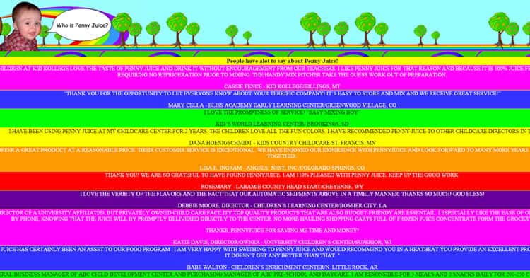
In a perfect world, designers would use white (100% brightness) with black (0% brightness) – you can’t get more of a contrast than that!
The best color scheme for optimal readability is when the brightness contrast is as high as possible between the text and background. Hue is another thing to consider. Like brightness, contrast is key.
Therefore, using hues from opposite sides of the color wheel are best. Guys, make it easier for people to read texts at websites! Ple-e-e-ease! (yes, that’s my cry from the depths in a Gollum voice).
Good Bye, Times New Roman…
Being a designer, you know that sans-serif typeface works perfect for texts online; so, please use it even if your favorite font is Times Roman! Serif typeface is easier to read when texts appear in print, and, probably, that’s why Tommy from GQ (Friends with Benefits movie) loved serif fonts so much:
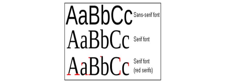
Sans-serif typefaces were specifically designed for the web. These simpler fonts are easier for the eye to read on pixel-based displays. There is less distraction and more white space between the letters.
Links Attack!
It’s high time for confession:
I do fight against temptation to add many links to the texts of mine!
Links are one of the quickest and most efficient ways to navigate a site. Therefore, they quickly become one of the most important features. As a content writer, I want to share much useful information with readers; I want to add as many links in my articles as possible to provide more information…
But I understand such tactics doesn’t work for usability, and people will hardly read my text if there are dozens of links in it. Don’t let your texts look like this:

And here some advice for designers go:
- Make sure readers know a link is a link. Use a different color for the hyperlink so it stands out. Don’t use a tiny font – if it’s clickable, make sure readers know it is clickable! I meet many websites that don’t do that, so their links are just invisible (read: useless) for readers.
- Use redirects to avoid error messages. No matter how cute your wording is on those pages, error messages are still annoying. Use things like 301-redirects and 410 status codes to keep your site’s navigation clean and tidy.
Magic of Three, or Left Side Rocks
Working with designers, I do know the temptation they all wrestle against: they wanna flex their web creation skills!
Guys, you all are cool! But please, for the visitor’s sake, show some restraint.
Don’t use more than three different font sizes – one for the header, one for subheadings, and one for the text body. Some experts argue 16 pixel font is the best size; however, with all the varying display types, it might be best to use percentages.
Three is the magic number. More than that is confusing and distracting for the user.
My cry from the depths #2:
With my 5-year writing experience, I can say for certain: designers and developers do not listen to content writers! And it’s particularly acute for the difference I see between the drafts I send and the results I get. Sending a formatted text (with all subheadings, lists, bold-italic writings, images, tables, paragraphs, etc.), I sometimes find my article published like this:
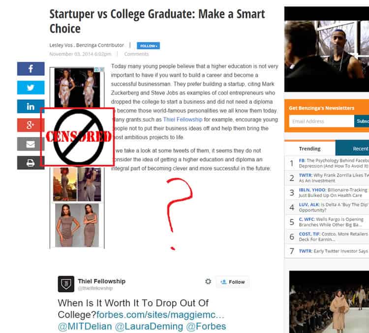
I refuse to believe formatting can be a difficult task for a good designer or developer! So, my advice here would be the following: don’t be lazy, guys! Or… go and learn the rules of web texts formatting. Amen to that!
One more thing:
The alignment of a site’s text may seem insignificant, but it really isn’t. Left-aligned copy is so much easier to read. We all read left-to-right, so this makes sense.
You are NOT a Master of Disguise!
Sometimes, pagination is necessary. For example, you wouldn’t want all your e-commerce products listed on the same page. It would take forever to load.
However, pagination for the wrong reasons just frustrates the reader. In most instances, there is no reason to split content into multiple pages. For example, a blog article – even a really long one – should be on one page. That’s what was made with one of my articles:
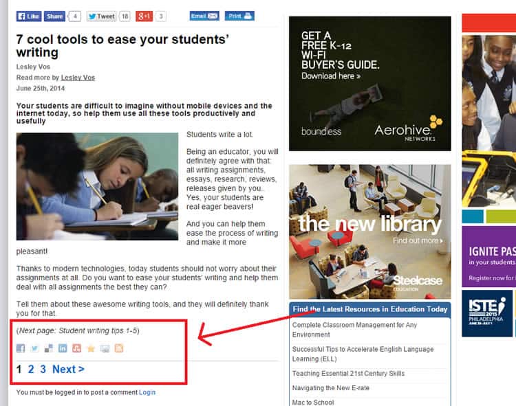
The website is awesome, the text is… well, let’s call it awesome, too (please, don’t blame me!). But they decided to split my article into three pages what was a very bad tactic in the eyes of usability, imho.
While many things affect a site’s usability, the way you design and implement the content is perhaps the most influential. After all, the visitors came looking for information. Don’t let your creative juices obscure the site’s primary function.
Want to learn more?
Want to get an industry-recognized Course Certificate in UX Design, Design Thinking, UI Design, or another related design topic? Online UX courses from the Interaction Design Foundation can provide you with industry-relevant skills to advance your UX career. For example, Design Thinking, Become a UX Designer from Scratch, Conducting Usability Testing or User Research – Methods and Best Practices are some of the most popular courses. Good luck on your learning journey!
(Lead image: Depositphotos)
