
The sheer amount of digital products being launched today is too substantial to count. Still, many of them fail along the way, never manage to generate profit or establish themselves in the consensus by gaining a market share. Even when dealing with aspirations for a social change or solutions for the benefit of our daily lives, misses still occur. Among the various reasons for a product to fail or succeed, too many could be attributed to lacking user experience, one that does not meet the standard, one that is inconsistent and therefore fails to meet the targets for which it was created. As a result, the number of systems in need of a re-planning or of an improvement to their experience in various organisations is significant.
As UXers who look at a system for the first time, we see things half-critically on the one hand, and with awe on the other, because we can evaluate the amount of work invested. In parallel, we honestly ask ourselves, could we come up with such ideas? Alternatively, better still, could we make this experience better with one that improves upon the product and the processes, even slightly? For us experience designers, it is a safe bet to say that we have all been there, somewhere along the way. It is transparent for “simple users”, as it should be, but as professionals, the first thought that pops to mind is “how could we have done it better?”.
My goal this time is to simplify the process and get the product on a correct and consistent path. By doing this, I will try to make life a bit easier for the product manager, the UX planner, as well as the person who came up with the idea. How do we reach a state in which the product meets the expectations of its users? What is a product that behaves appropriately and does not miss the point?

As a UXer and as a consumer myself, I would like to find good experiences when working with products. So before you pitch your idea to a professional or an agency to make it happen, or before you dive in and start designing wireframes, I would be happy to share some thoughts with you readers to make the processes more efficient and to define a correct characterisation from the start. From there, it is smooth sailing.
On The Starting Line
Picture this. It is daytime, in an office or a coffee shop. There is us, our trusted laptop and a client/product manager in front of us. Everyone is using many words: data, requirements, requests, suggestions, aspirations, anecdotes – a bit of everything. Hands are being shaken, and it becomes our task to sort through all the information we have received. A function of translating this mass of information and converting it into usability in a specific system. Our first response is – how do we start? How do we make the first step? Cheer up! Remember, beginnings generally require more investment of energy!

The first step – what did the client ask us? Translate into simple words. We should always begin with that, even by placing this as the first step in our roadmap. The client’s description often makes it sound like we are dealing with seven different products and several, slightly different goals. With essential but still partial understanding, we often tend to start creating wireframes and designing interfaces. Whatever it takes, as long as we are coming up with deliverables, and we make progress! Wait. It is an incorrect approach, and the chance for us missing the point is too high.
For a moment there, assume that the entire system has one central interface, and one requirement to meet. This is our task, to catalogue the primary interface. Meaning – leading the client to pick the correct “category” to the system. Eventually, this will take you where you should be going.
The definition of an interface is a concept easily missed, and it is a preliminary requirement to cataloguing. A good definition I have found claims that: “the interface is the part of the system that is presented to its user and the place in which the user interacts with the system. ‘A system’, for that matter, is a program, a machine or a device that were made to be used by a person”.
Therefore, we can say that an interface is a screen or a part of a screen. In other words, it is the area that comes into contact with the user. It means that the overall system is a collection of interfaces, each one with different values and usages, but they all work to meet one central goal. This leads us to the question: “what is the representative interface?”. When can we point at a screen or a set of screens and state – “this is the core of the system”?
Based on my personal experience and from examining systems we meet today, we see a common denominator in many leading products: they have one central purpose and one consistent usage pattern in every case. Streamline your ideas and plan an interface that is both the gravitational pull of the system. To avoid the sense of “where to start” I have described earlier, focus the product, its purpose and your work process. Remember that it is almost always possible to catalogue a system via its core interface, into 1 of 3 major types.
At this point, I assume that you are asking yourselves “how should I choose – and what from?”. To answer that, let us begin by saying that systems will strive to have one core interface, and to find it, we can go with the following methods:
Take a look at the situation from a marketer’s standpoint for a second, and try to summarise the system in one sentence: “the best X to ever reach the market”, “the most professional/fast X” and so on. Finding the X (we will talk about it in a moment) will help us and the client to consolidate.
In some cases, it is harder than usual since, although certain systems are not necessarily ‘the best’, they must still have their centre of attraction to justify their place under the sun. I can try to answer the questions with the main KPI, the client’s preferences, the competition, market research and so on. Here, we will modify our question: “what makes the system to stand out? What is so special about it?”.
Using these approaches will help us focus and understand what the core interface of the new product is. These approaches will also help us narrow down all the words said in the meeting. Finally, we would be in a position to pick “the one” around which we can design a product that has a consistent and clear experience.
Three Core Interfaces
Remember I have said that I choose core interfaces from a variety of 3? Let us see what they are! During the entire process of design, remember that our primary goal is to stick to our well-defined path, instead of exploring different approaches.
Core Interface #1 – The Shop
Naturally, every system whose primary purpose is to sell, or help the user in purchasing. In other words, a system that is being approached by a user with buyer’s intent. Typically, in such a system, we will see a particular set of screens, all of which are purchase-oriented, that lead the person using them to the purchase of the items they are interested in. This kind of experience should be pre-tuned to is a client’s experience. It is easy to attribute such systems to Amazon and eBay, but products such as Shutterstock, local supermarket systems or even the app for your favourite pizza place/coffee shop meet the same parameters.
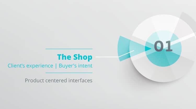
By saying “client’s experiences”, I mean that the core interface consists of a process that results in a successful purchase, and every step of the way must serve this purpose. I am not referring only to upsells, but also to leading the user and assisting them in favour of completing the process with a sense of security. It is important to say: in “shop”-type systems, the purchase process is the top priority. In other words, failure to complete a purchase is a failure of the entire system (as opposed to a minor failure, for example: not being able to replace the profile picture).
During work, it is important to note the user’s state of mind: they are ready to be sold to, prepared to hear about special offers, willing to “take” commercials and in general. Moreover, they are there to spend money. The system must help the user, and the purchase experience will determine the overall system’s quality.
Core Interface #2 – The Utility
Here I catalogue all the systems whose purpose is to make it easier for the user to accomplish a specific task. These kind of interfaces are the most varied because these are the systems we use daily to manage our time, to navigate, to communicate, to create and even to have fun. It is easy to think about such systems as the most basic concept of the user’s experience (or – accomplisher’s experience), and the system is supposed to place its main function transparently in the centre. Because such interfaces meet the most significant amount of returning users, it is advisable to reflect and allow users to quickly deduce the kind of work the system does, whether it is to create an event, reach a destination, exchange messages or edit something.
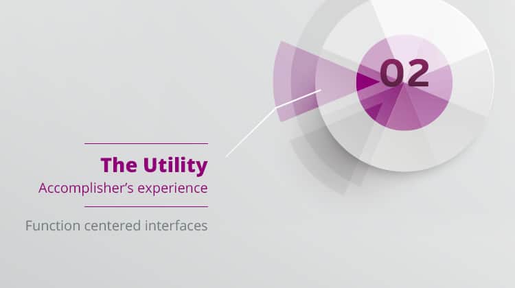
In utilities, we should see the user’s completion of the primary task as the top priority. Meaning, even if there are parallel interfaces and additional interests to meet, we, as the planners must make sure that a user that expects to be able to perform a specific task will be able to do it. Therefore, if our system is meant to allow communication between users, we must provide the framework and the interface to enable uninterrupted communication. The entire experience depends on us being able to deliver a practical solution to a specific activity. Because of that, we should realise that the user arrives with the intent to complete the task with maximal ease and with the least amount of challenges. Even if our goal is to “sell” something (e.g. the premium service), it is crucial to understand precisely when is the user prepared for such a message.
Core Interface #3 – The Feed
When there is a product whose core interface is the feed, it usually means an endless flow of information about various topics, commonly by personal preference. Users of such systems arrive with the notion of being passive, to “lean back” – as most of the examples of feeds are leisure-related. Here, concerning intent, it is all about the consumption of information, so I refer to it as listener’s experience. Users often expect to be able to express themselves with small gestures: to “like” or to comment about something – and yet the experience remains information-driven. The prominent examples are Facebook, Twitter, news sites, but I also see Tinder as a feed of endless scrolling information, displayed based on preference.
Such systems place the information in the centre. The entire system is evaluated by the continuity of the flow and by its ability to present the user with suitable, relevant and context-based content. We, as the planners, must place the data in the centre and to correctly characterise it. By this I am referring to considerations such as – what is the information, how is it consumed by the user, what are the relations between various items, what interactions we allow the user to express themselves by (while giving the system a chance to adapt) and so on.
The goals can vary, but it is important to remember that the information flow is continuous (endless and uninterrupted) and most users come into contact with these systems in a more relaxed state, while willing to consume information (other messages can distract – which justifies the use of ad-blockers). Therefore, we will try to remain relevant, to make the feed smooth and ongoing. We will work to allow personal adjustments (otherwise, the data might not be suitable to the user) and perhaps an option to “use” the information (to pin on Pinterest, to share from the feed, and the like).
In contrary to the previous two categories, here we do not have a clear purpose of selling anything, and in most cases, there are no tasks to perform. Thus, we measure the experience by our ability to provide the content in an exciting and flowing manner.
Do you have a system that belongs to a different category? Great. We can apply this method to cases that differ from the above three, as the purpose remains to ask yourselves if the action contributes to the system critically. Also, a disclaimer, games do not follow these rules, but to make our lives easier, I have tried to generalise and speak behalf of the leading three that suit most of the projects we are being hired to work on.
It is true that during work, naturally, many ideas are being suggested by the client and the team. The purpose here is to stick to one clear path and to remind that to everyone, ourselves included.
It is not enough that someone on your team pitches a neat idea they came up with last night, or that competitors went live with the day before. If it is not an interface-y way of helping you reach your goal, I suggest you stick to your choice of a core interface, as agreed on in the beginning, out of rationale.
So – now that we have picked our one core interface – what about the others?
Every system offers a wide array of interfaces, all of which are parts of a greater whole. Personally, I tend to look at non-core interfaces as parts of my professional toolbox. Each comes with a predetermined set of rules, and each requires some tune-up to be in sync with the overall experience our product aims to offer.
To make it a bit more visual, this is how I see it:
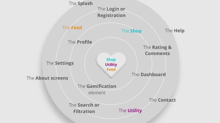
The above diagram is only a partial list, but it helps in conveying the message. The system has login screens, profile pages, landing pages and help screens – each of them requires tending to. However, they are not the core. By the way, the shop, the utility and the feed could be non-core interfaces too. For example, although LinkedIn is a utility that helps us in managing our professional life and acts as CV, it also includes a feed.
The overall experience quality is the average of all the experiences offered by the interfaces. You will never hear someone saying “editing my profile was awesome, really makes up for the fact that I can’t complete a purchase…”. It is our responsibility to make the system functional, consistent, pleasant and comfortable – as a whole.
I have recently attended a lecture by Adrian Swinscoe, who said in one of his slides: “Make it brilliant!”. I agree. I want the users of the systems I plan to enjoy a brilliant experience, but how do I measure it? If anything, what is the “gold standard” for systems, that we can aspire to?
Values To A Gold Standard
I will not leave you hanging. To be able to meet my own Gold Standard, after picking my one core interface I had to think of 5 values an interface must adhere to reach a final result that is suitable and pleasant for human beings. In every interface I am planning, I always try to put the result through these five filters, and see how well it measures up. Here they are.
Value #1 – Applied Psychology
I intentionally begin with this one, because it sounds intimidating and I would like to lighten it up a bit. We do it intuitively. We all use various psychological tools to lead our users to a goal and are subjected to similar tools ourselves. It is correct to expect a response from most users when feelings are addressed (happiness, security, pleasure, empathy, stress, and the like). It is crucial for us to know how to alleviate stress before “big” actions, or even how to invoke some stress to emphasise urgency.
I often use Gett to hail taxis. The initial view of the application displays all the cars around me, in real time. This view provides a sense of security, among others – “you’re in good hands, the data is live, we have drivers nearby, and we’ll help you soon”. It is much better than having another bland loader or a textual screen. Additionally, as entering a cab can be somewhat unpleasant, they tried to help it by sharing the drivers’ hobbies with me. Why do they not they ask the user to state their hobbies too, you might ask? They do not because it does not help in alleviating the specific stress. I get that, and if I could have offered them a feature, it would be nice to have a checkbox that says “I would like to have a quiet ride” while looking for a taxi.
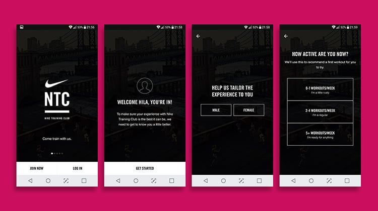
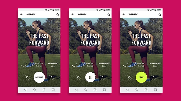
Here is another example. Take a look at Nike’s onboarding process. Although our mantra as UX designers is to save as many clicks as possible, Nike has divided the process into several, easy to deal with parts, each targeting a different “state of mind”. Each screen escorts the user a bit closer to the core interface. Instead of taking full advantage of the space and asking all the questions at once, they have created ease by splitting the effort. Personally, it made me more motivated to begin my workout!
Value #2 – Clarity
Interfaces should be clear as the sky! The obvious reason is that they should help any user to understand where they are, what comes next and hint on what happened before.
It is a prevailing opinion that clarity can be addressed only with onboarding, but this statement imprecise and even incorrect. The highlighting of elements, usage of a clear and consistent tone of the text and short steps are those that get the job done. Clarity should also be used when warning users before making or undoing an action. This practice should be beside using a ‘disabled’ state for elements that cannot be hidden. You know what? It is a lovely, reassuring feeling for us users to feel shielded from error, knowing we cannot go wrong, either technically or due to the system helping us understand what we are doing.
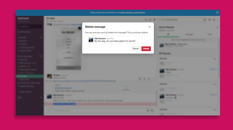
I have recently used Slack to chat with a colleague and tried to delete a message. We all assume that the message would get deleted – but where? On my end? On his? What happens if the other party has already seen the message? It is unclear. Users adapt, and just like WhatsApp had added the ability to delete a message from a group chat and all participants – Slack’s users might end up feeling unclear about whether Slack offer this functionality too. By the way, the message gets deleted on both ends, but in Slack’s case, there is no indication.
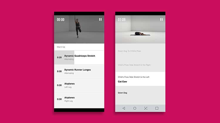
Let us return to Nike’s example: their app helps us exercise. Clarity plays a significant role here, because the app assists us, users, without demanding particular attention. It is straightforward to see our progress within a specific exercise, to have an overall look at the workout and the particular set. There is only a minimal chance that users might misinterpret the interface – and it is safe to assume that every user will understand it the same way.
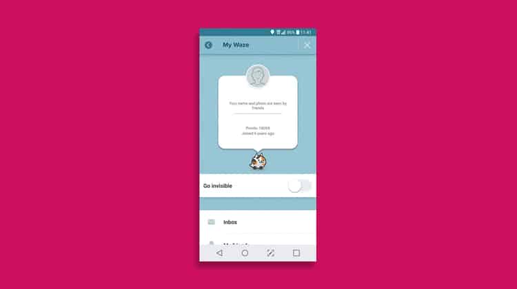
Another example of clarity which I liked: Waze’s invisibility mode. Here we have a UI element coming into play. It is easy to see when I am visible and when I am not, as the entire toggle changes. They did not settle for the toggle alone, but chose to hide the kitten avatar and made it into a ghost. Besides being cute, there is no uncertainty regarding whether I am invisible or not.
Value #3 – Delight
Delight is often referred to as a state in which something “fun” happens in the system (an animation, a graphic, a small surprise), but I define it from a more practical standpoint – it is a situation in which the solution precedes the problem.
I consider delight as the opportunity to provide a “5-star” experience to the user, and this is when they “fall in love” with the product.
It happens when Waze notify me that my route has been recalculated and X minutes were saved, or when Expedia match their car rental and hotel offers to the weather and alert you a day before a flight so that you won’t miss it. It feels fantastic, to see that someone has invested thought in advance and prevented a problem from happening. Users respond to that and return to “5-star experiences” over and over again.
Today, people opt to use premium Spotify subscriptions when they have YouTube for free, or single-payment music player apps they can buy. Why?
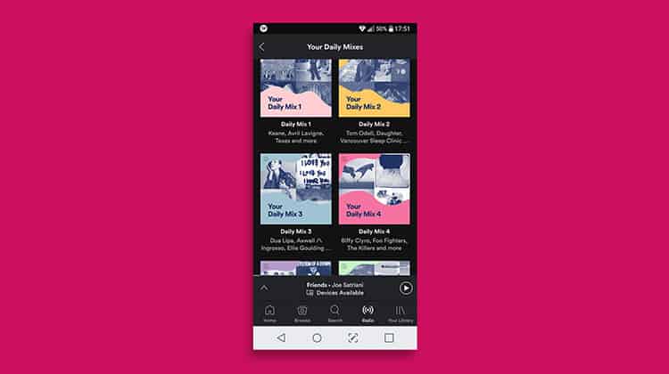
Besides their clear and approachable experience, it happens due to their daily mixes and the fantastic underlying AI. Most of us are musically-diverse, and they can offer us combinations of our favourite music, split into genres, and most of their suggestions are “on-spot”. In YouTube, on the other hand, you can be listening to Ed Sheeran’s latest single, and five songs in, you are greeted with some J-Pop. Additionally, like in most music players these days, Spotify pause your music for incoming calls. There’s no need to worry that the other party will hear your guilty pleasures – and the music will fade back in when the call ends. Perfect timing!
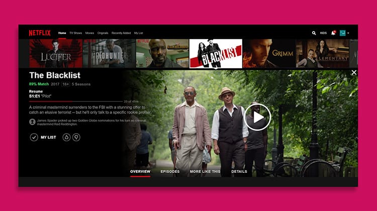
Another point, delight also comes into play in Netflix’s cross-platform experience. I can start listening to a stand-up show in my car, continue from the same spot when I arrive home, and finish watching the same show on my tablet. Even in cases of sudden power outages – the show, the episode and my position in it are saved. This happens even without mentioning the renowned “Skip intro” button that allows us all to binge uninterrupted. In short – fun!
Value #4 – Measurement and Research
We can’t speak about UX without mentioning this pair, right?
All experiences should be measurable – qualitative and quantitative alike. When talking about “measurement”, I mainly refer to “how many” – the statistics, the numbers and the conclusions. “Research”, on the other hand, refers to the “why” – user research, asking questions, analysing answers. Keep an open mind for both, because users can surprise us, and remember it’s tough to create delightful experiences without basing our work on measurement and research.
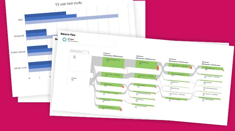
Here you can see an “Analytics” graph from one of my projects. The grey lines depict user traffic, the green boxes are the actual interfaces, and the red “tails” are the users that dropped out. It’s easy to see which interfaces were problematic due to high desertion rate – and we can start tending to them. Obviously, to know “why”, we had to ask. We’ve spoken to representative audiences and tried to understand why they chose to leave specific activities. Numbers, in context of great experiences, always provide insight and upgrade each assumption into a statistical fact.
Value #5 – Information Architecture
My top spot! I cherish IA because I believe it’s the key to understanding things. UXers are often presented as data architects – and I agree. We are tasked with understanding what goes where, what precedes what, how to logically sort everything and where users will turn to find their target activities. Menus play a significant part, but I am not necessarily limiting it to navigation since IA is also about activities and functions.
We hold the responsibility of figuring out what preliminary knowledge we can rely on, and what ground rules we must place. We are establishing expectations for users, and meet those expectations with our interfaces. IA deals with the ability to assume that a user that enters a news site for the latest Kim Kardashian gossip will scroll down to the “Celebs” section. It implies that most users will expect to get their notifications and updates in descending chronological order or expect to be able to edit their email address on the profile page.
Information architecture deals with order and position – not necessarily with importance, but sometimes it is possible to deduce significance from the information pyramid. The ability to organise data is the key to prediction, for the existence of bots, AR and VR experiences and more – not only for apps and websites.
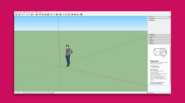
I have never used Google SketchUp in my life, but the screen that welcomed me looked inviting and utility-like. At the top of the window, I find the regular “file, edit…” items I am used to seeing in OS-es. These are followed by a toolbox of elements and common activities. On the right side, there is a panel whose headlines suggest the functionalities it offers – while the central space is my work area.
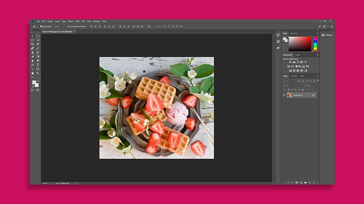
Photoshop has been doing it for nearly 30 years. Photoshop offers thousands of tools and functions – and the default screen looks like it. A toolbox on the left, a central working space, parameters on top and contextual panels on the right. We all know how complicated Photoshop is, and without robust information architecture, it would never reach a state of being so well agreed-on in the market.
It has been awhile since we last mentioned Nike!
Let us take one last look on this specific screen. This is a de-facto example of information architecture at work – for functions and not for menus. See the central button? It has three features: to begin the download, to pause the download and to start the workout. Yes, a button for three purposes is not the first thing we would think of when planning a system, but why not? It is logical that we prepare, pause and begin the activity from the same place.
Here they are. Of course, there are more, but these five are to never leave home without. For me, they are the essential requirements for every interface I work on. I aspire for it to meet my Gold Standard, out of the realisation that an amazing experience must always be complete on several fronts. I believe that achieving these five values can almost guarantee that the interface will be accessible and as successful as possible.
To Conclude
To put things into context – we have seen how to catalogue a system into one of 3 major “branches”, each of them defined by one core interface (most commonly: shop, utility & feed). Core interfaces cannot exist on their own, so it is up to us to surround them with layers of supporting interfaces (login screens, profile pages, and the like).
Then, we have seen how it all can reach a successful conclusion when an interface and a system offer a prime and comfortable experience while acknowledging five essential values. I suggest taking all of them into account when working on every interface of the overall system. When doing so, I believe it is easier to assume that our product will meet a high standard, hopefully – the Gold one.
Good luck!

Want to learn more?
Are you interested in the intersection between UX and UI Design? The online courses on UI Design Patterns for Successful Software and Design Thinking: The Beginner’s Guide can teach you skills you need. If you take a course, you will earn an industry-recognized course certificate to advance your career. On the other hand, if you want to brush up on the basics of UX and Usability, try the online course on User Experience (or another design topic). Good luck on your learning journey!
(Lead image: Ben Kolde on Unsplash)
