Businesses with an online presence face one unified challenge – getting more people to visit and stay engaged on their websites. Websites are continually increasing and online businesses are constantly striving to capture visitors’ ever-shortening attention spans. With that in mind, here are four tips to help shift your business structure to provide a better user experience for your users.
1. Change Your UI From Tech-focused to User-Focused
I won’t forget the first time I read an article posted by Whitney Hess, owner of Pleasure and Pain, a blog centered on improving the human experience. She said one thing that really resonated with me and made looking at my business structure crystal clear – “The user is not like me” – the words of her professor, Bonnie John. It’s as simple as that.
For business and site owners, it is very simple to lose sight of the objectivity in your site and product. Viewing it objectively can fade with the dedication that you put into your company and brand. It’s okay – we completely understand that you are eager to make your product the best, most functional, and most usable out there. With that in mind, it is crucial to remember that the user is not like you.
With a purely functional yet highly technical product, you will run into one huge issue – your user interface will be difficult to understand. Some of your users will have no idea how to use your product and will most likely abandon your brand; the ones who are technical enough to know how to use your product will also abandon your brand because fiddling with technical aspects of your product will waste their precious time. Although different, these two typical users of your product’s UI, have identical needs, according to Robert Hoekman Jr. – “they both want to get the hell off this screen.” “Despite hearing it all the time from designers and executives alike,” he states, “the notion that tech-savvy users will be more amenable to difficult interfaces is, in a word, crazy.” Your users do not know your product like you do. Building a simple and clean user interface will make the difference between creating a one-time user and securing your dedicated, lifetime customer.
2. Inspire Your Support Team To Exceed User Expectations
“First thing I do,” says Ross Shafer, describing his hotel experience at the Orlando Marriott, “is I reach for that room service menu…see a picture of a mushroom bacon cheeseburger, which, as you know, is perfect for late night dining. So, I get a Diet Coke to offset the effect. And it comes up in in 20 minutes. That was less time than they said! And the picture didn’t even do justice to this amazing hamburger…the steak fries were golden brown, perfect, everything so hot…and she brought me a Diet Pepsi. I don’t like Diet Pepsi. I’m fussy about that one thing. I like Diet Coke better. Not even thirty seconds later – BAM BAM BAM – she’s knocking on my door with an ice cold Diet Coke. She said, “I found this four floors down at the machine, thought you’d like to have it.”
I take inspiration from this customer service story for one reason – emotion!
In one of my posts about the difference between User Interface and User Experience, I highlight a valuable statement that can change the way you promote your business philosophy – You have great power in your hands – the power to influence the way your users feel.
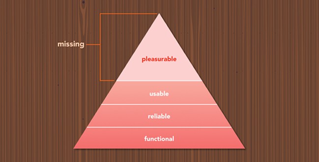
Just like Maria made Ross Shafer’s experience at the Orlando Marriott pleasurable and emotional by going out of her way to make his stay perfect, your support team can do the same, ensuring that not only your interface is functional, but pleasurable. Taking note of the re-working of Maslow’s hierarchy of needs, Treehouse – influencer in Technology education – asserts that interfaces must be functional and reliable, but pleasurable as well, as “personality is the platform for emotion.”

Be a Maria Garcia. Show your users that you are human. Do not hesitate to branch out into other departments in your business and utilize the powers of a support team. Influence your support team to not only maintain usability, but provide usability and pleasure on your interface. Your users will not only undergo a positive user experience, but according to Treehouse, they will attain a sense of trust with your brand, overlooking any flaws that might arise in your interface.
3. Make Yourself Reachable & Inviting For Your Users
“WE WANT TO TALK TO YOU!” – this message is a huge part of making your site pleasurable and inviting to your users.
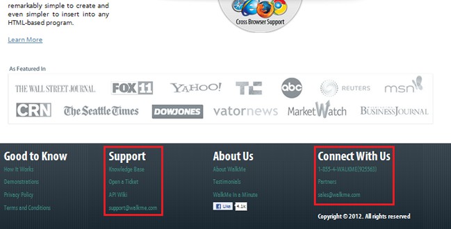
Take, for example, WalkMe, the World’s First Interactive Website Guidance System. Ben Snyder, owner and editor of A Better User Experience, had the opportunity to experience what WalkMe was all about. In his review of WalkMe, Ben stated one crucial sentence: “A special mention goes out to their support team. Just look at their site…it drips with their desire to talk to us.” That one line distinguished WalkMe from a site that offers a good user experience to a great one.
WalkMe did not literally take the message “talk to us” and place it all over their user interface. Rather, they made themselves reachable and inviting for their visitors, displaying several, varied calls-to-action for connecting: a toll-free number where the support team can be reached literally 24 hours of the day, 7 days a week; a direct support email address; a knowledge base; a forum; and a ticket center strategically placed throughout their site.

“They didn’t just give me a phone number,” Snyder says, “they gave me an account rep for the free plan. That’s pretty remarkable,” states Synder. “It seems funny to think that I’d need an account manager for this kind of app, but I appreciate their attention to customer service.”
We are in an age of instant gratification, where tech-users, even those who aren’t tech-savvy, do not have the time or patience to figure out how your overly-technical user interface works. WalkMe kept this in mind, pleasing its users even more with its soon-to-be-implemented chat option, in conjunction with LivePerson’s real-time chat system.
4. Adopt A Proactive Approach To Help Your Users Succeed
Your website design is about your user, not your product.
Every website should be built with the user in mind; however, I’ve unfortunately come across a number of websites and applications that offer great services, but despite my technical capabilities, I still need help using the application after I’ve started my trial of the product.
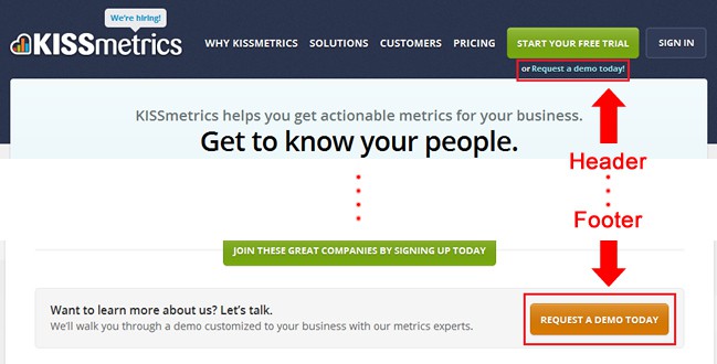
KissMetrics, on the other hand, does a great job of letting its users know that they are there to thoroughly guide them through their application, no matter what. They use key elements on their UI, the “Request a Demo” button, that are placed well throughout the website. I, as a user, know that if I have no clue how to function the software, then I would like the KissMetrics staff to show me how to use the software. They’re available, with just a click of a button – that’s what makes me a happy user.

Not only does KissMetrics offer advice and guidance in order to be successful with the application, but they offer tips how to be successful as a business, listing crucial benefits of using the product. Your user sees that you’ve thought about how they can succeed in their business, not just how your product can succeed. Implementing these elements onto your site relieves your users from even calling up support to make sure they’ve used the application correctly.
Want to learn more?
Want to get an industry-recognized Course Certificate in UX Design, Design Thinking, UI Design, or another related design topic? Online UX courses from the Interaction Design Foundation can provide you with industry-relevant skills to advance your UX career. For example, Design Thinking, Become a UX Designer from Scratch, Conducting Usability Testing or User Research – Methods and Best Practices are some of the most popular courses. Good luck on your learning journey!
(Lead image: qimono via Pixabay)
