If you have been ignoring your office group chat or simply avoiding Twitter, you may have missed the news: Earlier this month, Slack unveiled their brand new logo redesign, sparking praise, backlash, endless memes, and comparisons to everything from rubber ducks to a ‘sweatier version of the original’.
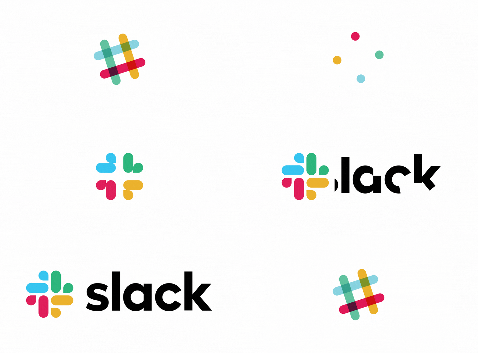
To accompany the revamped logo’s debut, Slack authored a press release detailing the impetus behind its departure from their previous multi-coloured hashtag, citing complicated visual guidelines and a lack of brand cohesion. On top of the provided reasons, some suggested the new logo is just part of a broader brand realignment strategy for Slack’s forthcoming IPO.
However, I am not here to speculate on the inner workings of Slack’s marketing department, or analyse the decision from a business perspective. I am more interested in examining the overhauled logo from a design standpoint: what is new, what is the same, and what does it say about broader trends in logo design?
Octothorpe
If you have not read the press release (or just skipped to its TL;DR), the new logo was a collaboration between Slack’s internal branding team and Pentagram, the design firm led by celebrated graphic designer Michael Beirut. Beirut is a senior critic at the Yale School of Art and a founder of lauded design blog Design Observer. He is probably best known as the creator of Hillary Clinton’s campaign logo in the 2016 Presidential election.
Beirut is peerless when it comes to branding and design, and dissecting the interviews he has given, along with Pentagram’s case study about the logo, offers quite a bit of insight into his design strategy. One of his most interesting (and controversial) decisions: ditching Slack’s iconic hashtag logo.
Or did he? While it is nearly unrecognisable now, Slack’s trademark hashtag (referred to as the ‘octothorpe’ by the company) is still somewhat represented in the design. It makes sense to keep it as a holdover. Besides leveraging Slack’s existing brand identity, the hashtag is heavily tied to Slack’s functionality.
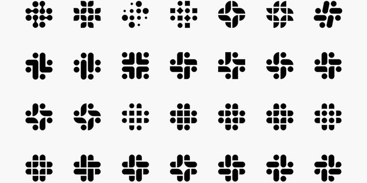
We can see the desire to preserve Slack’s octothorpe in the redesign process – take a look at the different variations the design team played with.
However, why should one depart from the hashtag at all? In an interview with Fast Company, Beirut argues that the ostensibly iconic symbol isn’t as perfect a logo as you might think. “I sort of think a hashtag and plaid, as a shape and motif, both kind of arrive pretty much finished. The hashtag is certainly not own-able . . . it came into its own on Twitter,” Beirut says.
The eventual winner of the octothorpes shown above was the one made out of what Beirut calls droplets (or perhaps more appropriately, ‘speech bubbles’) and lozenges, four of each. Beirut posits that these shapes are much more versatile and malleable than the hashtag’s parallel lines, and can be “atomized, reconstructed, and generate a lot of things.”
What Beirut means here is that the speech bubbles and lozenges are flexible enough to be repurposed for different branding applications. Indeed, his team mocked up a few examples of how Slack could leverage their logo in creative ways for various marketing campaigns.

Colour Scheme
One of the most distinctive features of the original Slack was its color palette. Comprised of eleven (!) different colors, the plaid logo jumped off the screen. It was unmistakable.
However, it came with challenges. Both Slack’s press release and Pentagram’s case study noted that the logo’s vibrant colors often looked muddled or downright ugly against any backgrounds other than white. Also, Slack’s graphics team accurately stated that, when your logo has eleven colors in it, it is pretty easy to get wrong.
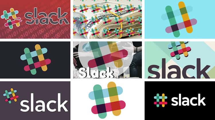
In the same FastCompany interview, Beirut acknowledges the fun, more freewheeling spirit of the old logo. “The plaid was useful exuberance. Why not have 11 colors? This is fun!” said Beirut. “But then it becomes a tartan that’s associated with its clan in an immutable sort of way.”
The solution was to cut. Pentagram reduced the loud eleven colors to a more conservative four, all of which are basic primary colors (they did keep Slack’s distinctive shade of purple as well).
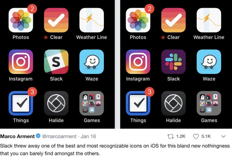
Pentagram’s intended effect works like a charm. The colors are more practical, more comfortable to replicate, and hard to screw up. However, in the process, they sacrificed a brand identity that was wholly unique.
Evolving A Brand Through Design
Again, some say that the evolution of Slack’s brand identity from fun, silly startup to the buttoned-up billion-dollar corporation is advisable, maybe even necessary. Also, while there is no shortage of opinions on Slack’s new logo, everyone seems to agree on one thing: we will get used to it.
Until then, it is telling to see what design choices currently signify ‘professional’ or ‘global conglomerate’ – the primary colors, the pinwheel-like shape, even the colder sans-serif font change.
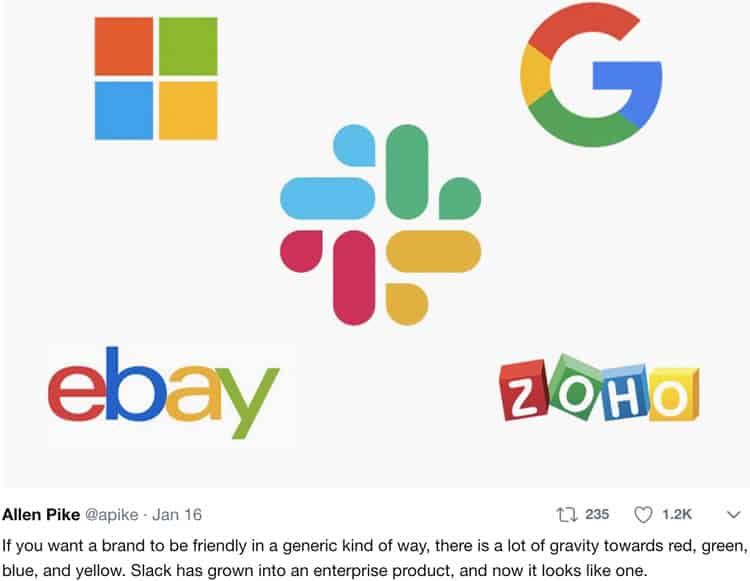
The overall result is a more monolithic design landscape. Companies like the ones shown above are supposed to be innovative design leaders, but the visual representations they have chosen are strikingly homogenous.
Want to learn more?
If you’d like to become an expert in UX Design, Design Thinking, UI Design, or another related design topic, then consider to take an online UX course from the Interaction Design Foundation. For example, Design Thinking, Become a UX Designer from Scratch, Conducting Usability Testing or User Research – Methods and Best Practices. Good luck on your learning journey!
(Lead image: Slack)
