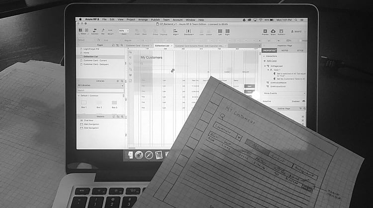
Axure RP has received a face-lift in the form of Axure RP 8.
Axure RP, along with Sketch and Invisionapp, is among the most popular pieces of software for prototyping and wireframing, so it is only natural that UX designers see updates every-so-often. This one has bumped Axure RP to version 8.
Some UX specialists will be more excited than others, but one thing is for sure: most of Codal’s UX designers love the update.
The changes introduced in Axure RP 8 include:
- An updated workspace and toolbar
- New features and functionalities
- Improvements and updates to the AxShare sharing system
1. Updated Workspace and Toolbar
Workspace
Among the most prominent changes in Axure RP 8 is the updated workspace which has, overall, made Axure look cleaner and less cluttered. This effect has been achieved through a substantial reduction in icons as well as through updated icon styles.
These changes may introduce a few minor hiccups to the UX designer’s workflow – at least until they have figured out which icons now house the features that they use the most.
Toolbar
The toolbar has seen a number of changes in version 8, mainly of the aesthetic variety. Changes include:
- Title has been removed from “Selection Mode” to list out the individual actions of each tool
- Moved existing features into a “More” list
- “Format Painter” has been moved up from a section below in the “More” list
- “Pen Tool” has been added as a new software feature
- Components re-styled: “Preview”, “Axshare”, and “Publish”
- Item added to the toolbar: “Axshare Login Status”
The pen tool deserves a special mention because it is just plain awesome. It integrates very nicely with the now default FontAwesome library (also new to Axure RP 8), to help designers create their own custom icons in Axure, for use in their designs. It is relatively easy to use, but it may take some getting used to.
Pages Panel
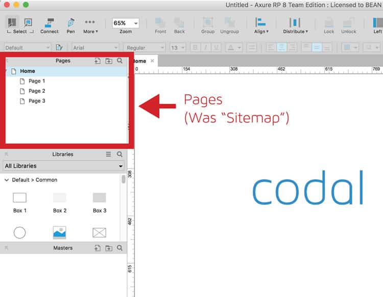
The title of the “Sitemap” has been changed to “Pages” in the new update. Although this is not too big of a change, the wording is more relevant to the functionality of this section of Axure RP 8.
In the new update, some of the icons for “pop-out arrow”, “add pages”, “add folder” and “search” were changed and moved. Some of the icons were even completely eliminated, such as “move page up/down”, “indent page” and “delete page”.
Some of the eliminated icons were nice to have and might even be a considered a downside to the new Axure RP update. Having the icons for some of these actions were very accommodating. They made it easier and quicker to move or delete pages.
Libraries Panel
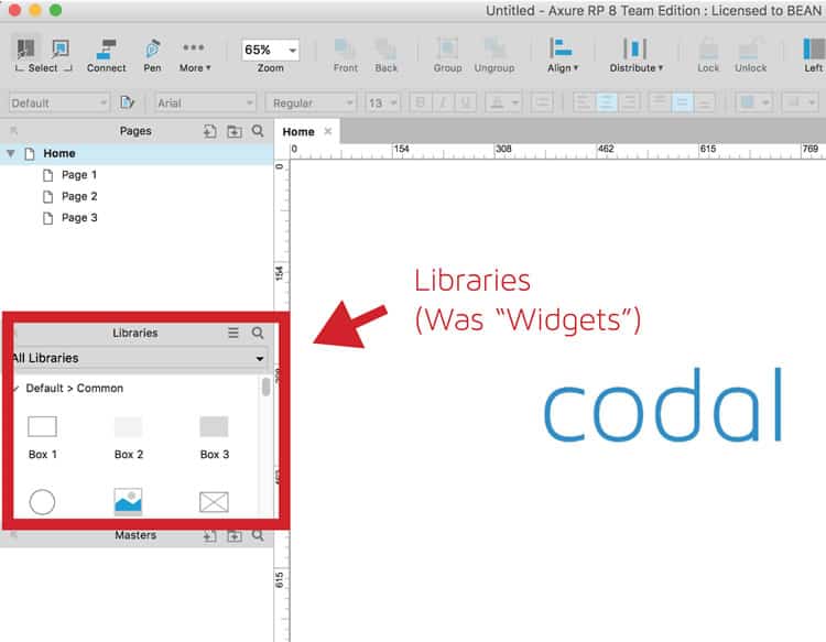
The libraries panel may seem new to veteran users of Axure RP. However this is not the case. It is merely a rebranding of what UX designers have come to know as “Widgets”. To most designers, this will likely feel like a change that has been a long time coming.
Further changes to the libraries panel include:
- Moved and changed icons for options and search
- Visual change for selected library makes libraries always present with a drop-down for easy switching (two thumbs up! Our designers had about 6 or 7 libraries in Axure RP 7 and they always complained that they did not know which one they were on)
- New items added to the default library: newly styled boxes, buttons and links, ellipse, markup widgets – snapshot arrows, sticky notes, circle and drop markers. (Finally an ellipse widget! No more dragging a rectangle then selecting the ellipse shape!)
- A built in FontAwesome library was added
Adding the Font Awesome library was a very wise decision for Axure RP 8 and one that has been a long time coming since professionals have been using it in their prototypes for a number of years.
The best thing about having the FontAwesome library is that designers no longer need to be linking the CSS font link within the web fonts and generating the HTML or making sure that everyone has the font installed on their computer, because now it is default in Axure RP 8.
Inspector Panel
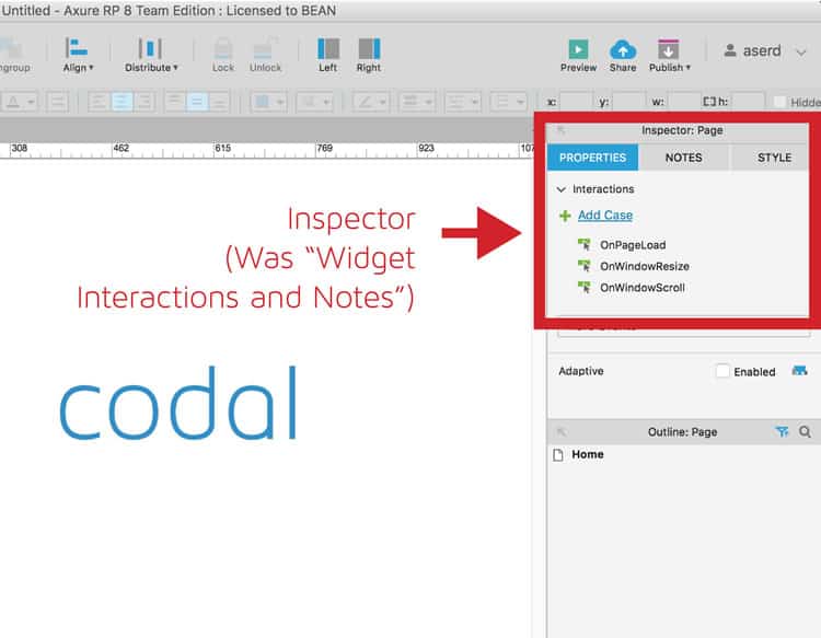
In keeping with the trend of changing poor naming schemes to something a little more logical, Axure RP 8 has changed what used to be known as “Widget Interactions and Notes” to “Inspector”.
Additional changes include:
- Tabs have been reformatted and restructured into three tabs called “properties”, “notes” and “style”, making it significantly easier to find what you are looking for.
- Styling functionality has been incorporated into widget styles, namely: page alignment, background colors, and images (previously in bottom panel).
- Interactions have been incorporated into the properties tab (previously in another section). Page interactions have been added to this section instead of at the bottom, like they were in Axure RP 7. The frustrating thing about this addition is that you have to click ON the background in order to display the page section, whereas before, you could just select what you need from the bottom.
- “Notes” has been given its own tab, along with the ability to customize fields for different sections and types of notes. In addition, new formatting abilities, such as the ability to add direct links to related documents, are now possible.
- The ability to select adaptive views on a per-page basis is new. In version 7, this feature was hidden but as responsive design has become more and more popular, Axure decided to make this a main feature. Finally!
Page Outline
As has been the trend thus far, the title has changed from “widget manager” to “outline: page”. The icons for “search”, “expand panel” and “filter” have moved and changed, while the icons for “add state”, “duplicate state”, “move up”, “move down” and “delete” have been deleted (although the keystrokes will still work).
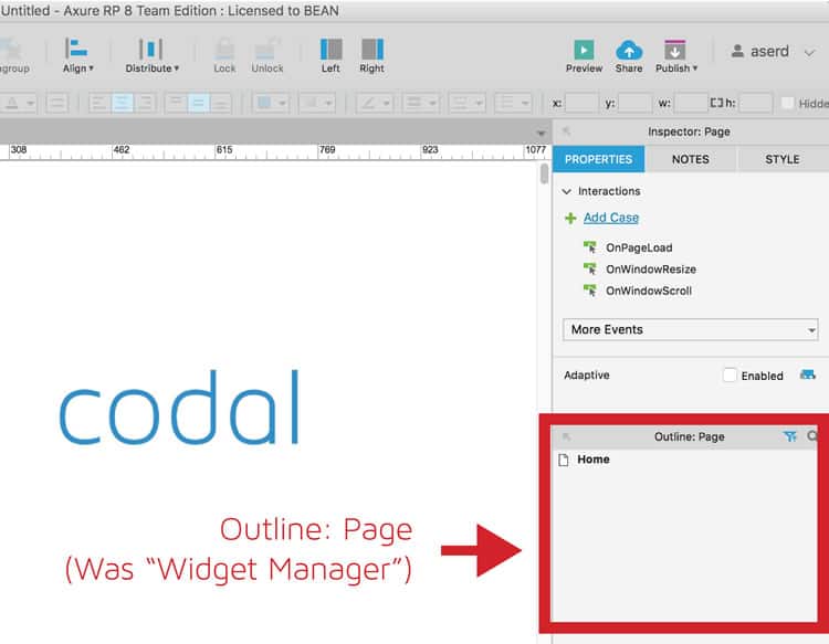
The functionality has changed a little bit to show all widgets on the active page instead of just interactions. Additionally, new options for “sort and filter” are now available in version 8, including the ability to sort “front to back” as well as “back to front”.
2. New Features & Functionality in Axure RP 8
Group Interactions
Multiple widgets can now be grouped to form group properties, which include “interaction” and “actions”. This means there is no more need to have so many dynamic panels on the page!
Actions and Animations
As of Axure RP 8, simultaneous actions can now be triggered. New actions have also been added including: “Flip”, “Set Size” and “Fire Event”, “Set Opacity” and “Rotate Around an Anchor”. These actions are good for setting up multiple actions on an item (or multiple items at the same time).
Now, designers can easily change the size of an element, add (limited) “flip” interactions and trigger multiple page events at a time with a single interaction. If you are creating wireframes in Axure RP for an eCommerce site, we would recommend utilizing this new awesome feature as it can be extremely helpful.
New Events
New events include: “OnRotate”, “OnSelected”, “OnUnSelected”, “OnResize” (dynamic panels) and “OnItemResize” (repeater). Of these, perhaps the most useful events are “OnSelected” and “OnUnSelected”, simply because they will get rid of the need to use “if then else if” statements in the conditions and cases.
Snapshot Widget
New features in Snapshot include the ability to show full-page screenshots, inner-page screenshots and screenshots of any master events. This is because the snapshots will update automatically when the referenced page is updated. This is a great feature for flows and sitemaps or even to show a second state without having to create case 1 and case 2.
Repeaters
A few small interaction updates have been made to repeaters but the primary advantage is in product images and image galleries, which are now much easier to create.
Box Border & Corner Radius
UX designers can now style custom boxes in Axure RP 8. This feature is one the favorites among Codal UX designers, because often times they may want to create tabs where only the top corners have a corner radius, while the bottom border is kept from showing.
Flow Diagrams and Connections
Another excellent addition to the flow diagrams is the “new image” feature. Connecting images with flows creates a more seamless look and allows for a simply better site flow.
New end lines and curved connector points can now be added to shapes and images. Prior to the update, UX designers were limited to only one type of point on each end. This allows for much customization.
Print Configurations
If your UX team prints out your wireframes, then this functionality is extremely useful. Paper sizes can now be changed, print guides can be viewed, multiple print configurations can be added and pages can be selected for print.
Codal’s UX team typically only presents their wireframes digitally during client meetings, so this new function was not too exhilarating. However, teams similar to us might start changing their ways due to this new functionality. It could be beneficial for brainstorming sessions and writing notes directly on the printed pages.
3. AxShare in Axure RP 8
HTML Sidebar
The new HTML sidebar allows quick access to notes, file details and discussions with stakeholders. It has been redesigned to give more of a modern look and feel.
I personally am not a big fan of the “discussions” or “notes” tab on the new HTML sidebar simply because it is always hidden. You have to click on the tab to see the sections.
– Allie Serd, UX Designer, Codal Inc.
Widget Libraries
Prior to this update, at Codal, a library would have to be created and loaded from our Google Drive that we share between teams. With this new feature, libraries can now be loaded directly from AxShare.
This ensures that everyone in the UX team always has the latest version, without having to collaborate to find out which designer has which version.
Team Projects
With SVN still available, the new option to post team projects directly to AxShare is one of the greatest new features, especially for large UX teams who work together on the same files.
This feature is probably my all-time favorite, simply because prior to this update, no matter what the circumstance, the original owner was the only person who could publish a file. Now, my team can work collaboratively on a file and anyone can publish it.
– Allie Serd, UX Designer, Codal Inc.
Conclusion: New Face, Same Personality
The new Axure RP 8 is cleaner and more aesthetically pleasing to the eyes. Although the core functions of Axure RP 8 are similar to those in RP 7, the UX and UI of the platform has been improved in a major way.
Not only does it look better, but it allows UX teams to work together more collaboratively while making it easier for teams that are not located in the same office to participate on the same wireframe.
The new Axure RP 8 is great, but there are still some things that the platform is missing that the UX world would like to see in a wireframing platform. One major thing that our Axure specialists here at Codal would like to see in the next Axure RP update is the ablility to comment directly on the wireframe, instead of putting comments in the left sidebar. Redpen.io is a great example of a platform that allows you to do this. Another flaw that has yet to be updated is the fact that you cannot apply one interaction to multiple buttons at once. Instead, you have to click on every button and change the action individually.
We are interested in hearing from you! What do you think of Axure RP 8 and would you like to see in the next update?
Want to learn more?
Are you interested in the intersection between UX and UI Design? The online courses on UI Design Patterns for Successful Software and Design Thinking: The Beginner’s Guide can teach you skills you need. If you take a course, you will earn an industry-recognized course certificate to advance your career. On the other hand, if you want to brush up on the basics of UX and Usability, try the online course on User Experience (or another design topic). Good luck on your learning journey!
