
When was the last time you literally had to stop for a second (or a few) to think about how to use an app or a specific feature? Exactly. You see, most of the popular apps we use on a daily basis have such an intuitive and well-optimised user experience, that we do not even know it is there. The user experience melts into the natural flow, and that is part of what makes you come back to these apps every day.
So what happens when your UX is not optimised in one of your app’s most important functions, like the in-app search, for example? Well, to name just a few adverse outcomes: this could easily lead to high quit rates, low conversion rate, low retention and poor engagement. No big deal, right? Wrong.
But hey, let us not focus on the negative side. After all, some apps optimise their in-app search UX brilliantly, and we are here to be inspired.
We have handpicked three apps that stand out to us in terms of stellar search UX.
Take a look at how they built their in-app search experience and see how you can infuse that same smooth usability into your own app.
1. Momondo
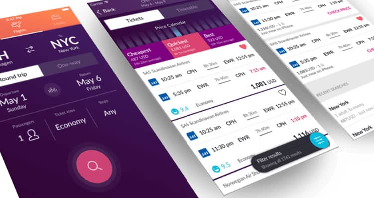
Launch the Momondo travel app on Android, and the first thing you will be greeted with is the search screen, in all its glory. As with many other travel apps, the search function comprises a considerable part of the purchase process. It acts as a flashlight, guiding users in the darkness, helping them find what they are looking for.
Here is what I like about Momondo’s in-app search UX:
- Design-wise the search button is just begging for your attention. It is bigger than the rest of the design elements, has a different, bold color from the rest of the screen and has this subtle glow-like effect surrounding it. All I want to do is fill in the rest of the details so I can finally tap this button.
- I appreciate how accurate and productive the search function is. When tapping the “From” section, you are given the option to show “Nearby airports” based on your current location. If you choose to type in the location yourself, location-suggestions based on your keystrokes are shown lightning quick and accurately. When tapping the “To” section, before typing in anything, you are greeted with a little globe icon saying “Wondering where to go? Search flights to anywhere”. Nice micro interaction!
- As more and more apps now use swiping gestures as the primary way to navigate between screens, I cannot help but try to swipe in every app I use. When my swipes are unresponsive, I get frustrated, leading me to be less forgiving with the rest of the UX. Luckily, this is not the case here. Swiping is exceptionally intuitive, and there is a very satisfying slide animation when swiping from left to right and vice versa. That is how you navigate between the “Flights” search section to the “Hotels” section.
2. Farfetch: Shop Designer Brands
Similar to travel apps, shopping and eCommerce apps also rely heavily on their search functionality and accuracy. Your shopping app should better have an optimised search experience if you want users to find what they are looking for (and what they did not even know they were looking for) and then complete the purchase.
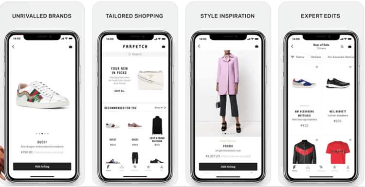
What I immediately noticed when launching the Farfetch app (iOS) is how busy the search screen is. Now, usually when I say busy, this is not a good thing – some designers tend to overcomplicate things and push as many features as they can to one screen.
While I usually enjoy the minimalistic approach, I have to say that I am a fan of what Farfetch did with their search screen. Here is why:
- Farfetch’s search screen is eye-catching, trendy and full of suggested items, providing users with quick access to relevant things before they even begin their search. At the end of the day, we (humans) are visual beings. Moreover, Farfetch’s designer is clearly utilising that. I can easily see how this UI could lead to higher conversion rates from search.
- I really like how the entire search screen has been divided into different sections. You have got the more traditional search bar up top, and then there is “Your New In Picks” where you can see a single item from a new collection that is relevant to you. Lastly, the bottom of the screen is entirely dedicated to the “Recommended For You” section where you can see multiple “hand-picked” recommended items and jump right into the item page with a single tap. In-app personalisation at its finest.
3. Google Maps
I know, I know. You are probably thinking “well, of course, the search giant will have a great search UX”. So yes, it is a bit unfair, but trust me, what Google has been doing with its Maps app on both Android and iOS is nothing short of amazing.
Here is why:
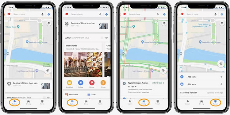
- First, there is a floating top search-bar that will never leave you or betray on you, no matter how you interact with the screen- it will be there until you finish searching or exploring.
- Then there is an entire “hidden universe” waiting for you to expand it from the bottom of the screen. Swiping up on the bottom bar will reveal the Explore, Driving and Transit tabs. Swipe up again, and you are greeted with more features of the specific tab you are in. For example, as seen in the images below, swipe up on Explore to find out what is around you (restaurants, gas stations, shopping, etcetera). Super fun to play with and super useful at the same time.
- I admit it; I am a sucker for material design. Google’s (relatively) new design language is aesthetically pleasing, yet very productive. The entire app UX is full of subtle animations, providing the user with great reassuring feedback all across the board which can contribute to better engagement from the users.
How to Optimise your App Search UX: Tools and Tips
We now know what makes excellent in-app search UX, thanks to the three apps we have analysed. It is time to look at how you can monitor and optimise your in-app search.
As a rule of thumb, I would suggest that you base your search UX decisions primarily on qualitative analytics rather than quantitative analytics.
In a nutshell, qualitative analytics help in understanding user behaviour. They allow you to observe users’ interactions with your app and learn about their preferences. User experience (UX) encompasses all aspects of the end user’s interaction with your product. In this regard, UX can only be measured and optimised via qualitative analytics solutions.
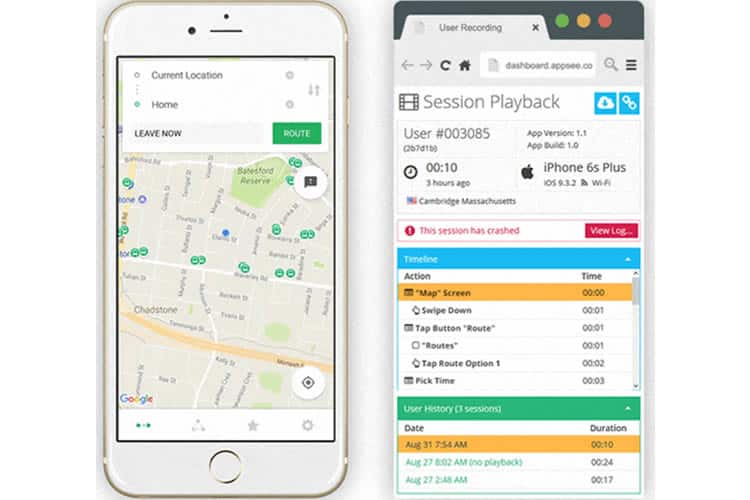
User session recordings are one (unbiased) way to observe how users interact with your search functionality and optimise your UI and UX accordingly to achieve better results. This tool will give you the opportunity to see exactly how users interact with your app’s search function.
Every tap, swipe, and action is recorded, allowing you to gain instant, actionable insights and optimise accordingly.
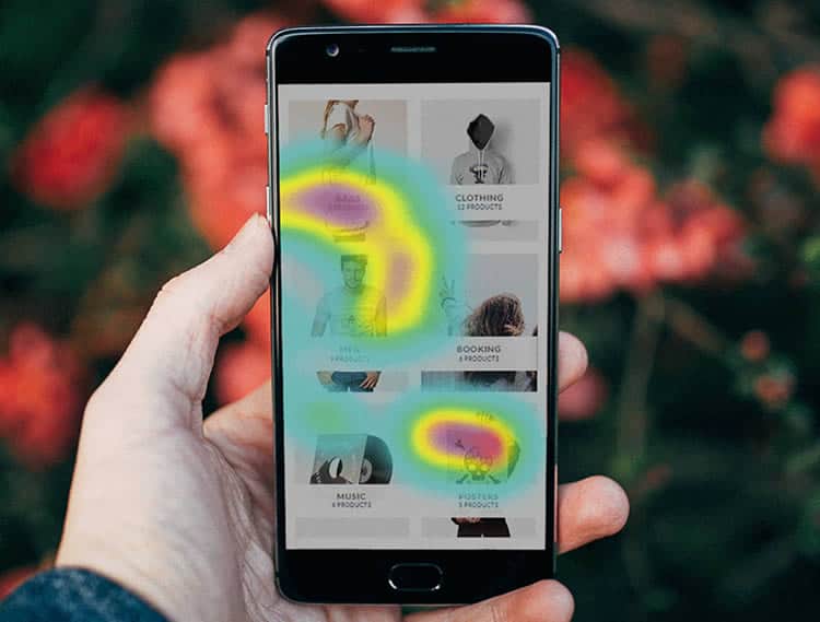
When it comes to observing your in-app gestures, especially with your search function, there really is no better option than utilising touch heatmaps. Touch heatmaps aggregate all the data on various gestures used to interact with the app (taps, double-taps, swipes, pinches, etcetera.). The data is then presented as a heat map, on a layer placed over the actual app.
Seeing exactly where users interact with the screen and when/where their gestures are unresponsive will allow you to optimise more easily and offer superb UX. Needless to say, the smallest unresponsive gesture can have a significant impact on retention and churn.
Final Thoughts
Whether your product is a travel, shopping or transportation app, you rely on your in-app search to bring users to the finish line (checkout, cart or destination). You can have the most aesthetically-pleasing search screen, but if the usability is flawed, you are only hurting yourself. Actually, you are hurting your users too. In short, optimising your in-app search UX is a must. There are great tools out there – use them wisely to learn more about your users’ preferences and do not be afraid to take inspiration from market-leading apps.
Want to learn more?
If you’re interested in the intersection between UX and UI Design, then consider to take the online course UI Design Patterns for Successful Software and alternatively Design Thinking: The Beginner’s Guide. If, on the other hand, you want to brush up on the basics of UX and Usability, you might take the online course on User Experience (or another design topic). Good luck on your learning journey!
(Lead image: Depositphotos – affiliate link)
