Apps are like little worlds of their own. They hold mountains of features dotted with microinteractions, oceans of data, and cities of users with their creations and contributions. App designers wield power to construct these worlds and hone them to perfection, making navigation easy and creating accessible open roads. Whenever a user launches an app, the first thing they have to do is navigate. When that road diverges, it is important to give users a map and make it easy to read.
In this article, you will be presented with some of the most common navigation errors that UX and UI designers make, and why these mistakes make users run for the hills. Bearing these in mind will help you learn from others’ mistakes so that you do not repeat them. At the same time, your users will not need a navigation app to use your app.
1. Your Menu Has Too Many Options
Have you ever sat down at a restaurant and been given a menu that was so long, you thought Dickens must have written it? When you are given so many choices, it is often hard to make a decision, and you wind up feeling confused and overwhelmed. Apps are no different. If users see a list of options so long that it is challenging to digest quickly, they will just abandon the menu altogether. It is better to keep the list short enough to take in with just a quick scan. Hick’s law is an excellent way to make sure you are not serving too many options.
2. Your Menu Does Not Have Enough Options
Some menus, on the other hand, include so few items that users find it difficult to understand which features can be found where. While it is often wise to strive for minimalism in UX design, especially for mobile’s small screens, there is a hidden catch. If you try to loop in too many options under each category just for the sake of having three icons on a menu, users will have to guess where to go first.
Finding the screen or function that they want could take a long journey of taps. They will try to guess, for instance, if “My Friend List” goes under “Profile” or “Settings”, and they will wonder if “Store Locations” can be seen on the “Contact Us” screen or the “Home” screen – basically, a more choppy user journey. Worse, when they do not find what they are looking for, users could lose their patience and look for an alternative.
3. Your Menu Is Not Visible
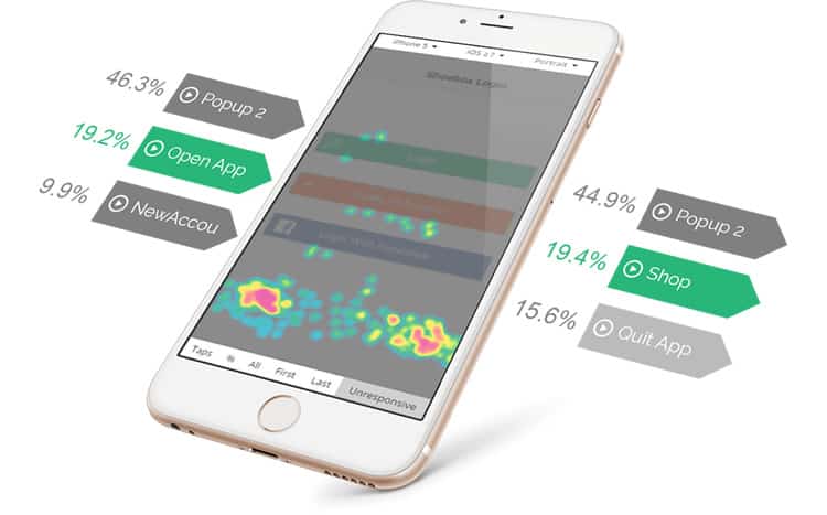
Much has been written about the hamburger icon, with some deeming it a necessary part of app design and others going as far as calling it the devil in app icon form. The problem is not so much the icon itself, but more with the idea of hiding the menu behind yet another tap. Users should be able to access as much of the app’s content with as few taps as possible. Hidden menus can cause users to get lost and not find what they need. When users cannot locate the menu or screen they wanted, they will start tapping and swiping away randomly, and quickly get fed up. It can be challenging to pinpoint where users are encountering navigation errors, such as unresponsive gestures. Touch heatmaps can help visualise the problem areas and improve navigation.

4. You Are Trying To Reinvent The Navigation Wheel
Getting enthusiastic about new ideas for interface design is easy. Shaking things up in the mobile app industry can undoubtedly lead to great things, but there are a time and place for that, and it is not going to be in your app’s navigation. Unusual navigation rules that might seem innovative, but ultimately are not intuitive for your users, can have severe implications for an app’s success. By this point in the history of mobile apps, the majority of users are already accustomed to certain elements being in certain places. Their eyes will shoot over to the bottom of the screen to look for a bottom navigation menu, or to the top left-hand corner to see if there is a “back” button there. Unless they are very adventurous and patient, they will not want to go on a treasure hunt for the screen they need. It is better to have a place for every icon and keep every icon in its place and save the creativity for other, meatier features of the app.
5. You Are Using Unfamiliar Icons
Just as users are accustomed to traditional menus, they are also accustomed to specific icon designs. Unclear or unfamiliar icon designs are some of the worst UX offenders – using a company logo instead of the heart, star, or bookmark icon, or using any other icon but the camera icon for a camera feature. These changes seem innocent and even creative, but they make users feel like they are in a different country, where everyone speaks a different language. This is a very common mistake that leads to navigation difficulty. Nick Babich gives some great icon tips that can help solve this issue, including the 5-second rule: “if it takes you more than 5 seconds to think of an appropriate icon for something, it is unlikely that an icon can effectively communicate that meaning.”
6. You Are Not Telling Users Where They Are
This is a common mistake in mobile apps. Just as it is helpful to follow your little moving dot while using a navigation app, it is also beneficial to know where you are while using an app. Giving users a visible indicator of which screen they are looking at – for example, by highlighting the selected icon – helps keep navigation uncomplicated and takes some of the guesswork out of using the app.

3 Apps That Get Their Navigation And Menus Right
Despite these common mistakes, some apps really get their navigation and menus right. Here is a shout-out to three such apps:
1. Tastemade
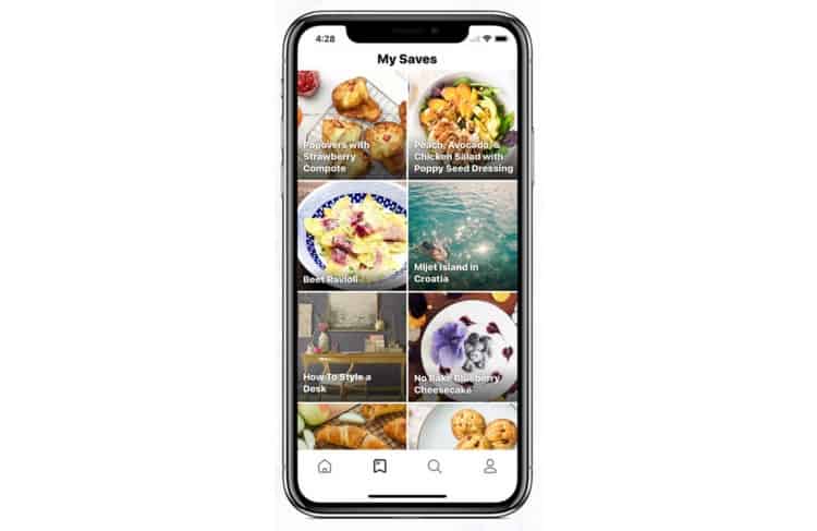
The foodie video network, gives us a great example of the bottom navigation bar. The icons are all easily recognisable: a house-like home button, a search button shaped like a magnifying glass, and a classic bookmark and personal profile button. With the recommended number being 2-5 icons, four is a perfect balance. These familiar symbols provide an easy and quick onboarding and ensure that returning users can merely immerse themselves in the app’s primary features.

2. Duolingo
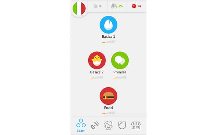
As an education app, has to make all of its content and categories easy to discover and digest. Despite the significant amount of content that language learning apps contain, Duolingo manages to get along just fine without hiding menus to the left or right of the screen. Instead, it features a bottom navigation menu with five icons in greyscale. When an icon is selected, it is coloured in blue, and the name of the screen appears below it. Showing the name of only the highlighted icon keeps the screen minimalistic and lightweight, while still giving a helping hand to users just getting to know the app. [ Bonus: See our UX Case Study of the Duolingo Mobile App! ]

3. Airbnb
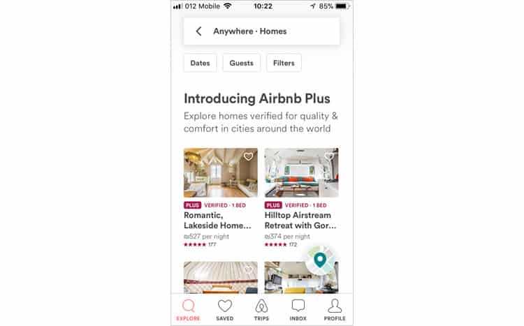
Airbnb’s app has used a small smartphone screen to facilitate a task usually done with dozens of open browser tabs and much frustration: choosing lodgings in a foreign city. The smartest aspect of Airbnb’s navigation design is the choice to separate the entire user journey into five separate screens, and then to display the icons for each screen visibly and in the right order. Users can toggle between the homes in their search results, the ones they have saved, the ones they have already booked, and the hosts they are communicating with. This makes browsing and deciding on a place to stay easy and intuitive.

Closing Remarks
Apps may be little, but they are fierce. To make an app that packs a punch but is also onboarding-friendly and fun to use, it is important to make sure you are making it easy for your users to tap and swipe their way through the mobile universe you have created for them. To understand how a user experiences your app’s navigation, you must first walk a mile in their shoes – by using mobile app analytics, reviewers and testers, and a little sprinkling of empathy and common sense.
Want to learn more?
If you’re interested in mobile UX, then taking the course on Mobile User Experience, which includes templates you can use in your own projects. If, on the other hand, you’d like to…
- learn all the details of Usability Testing
- get easy-to-use templates
- learn how to properly quantify the usability of a system/service/product/app/etc
- learn how to communicate the result to your management
… then consider to take the online course Conducting Usability Testing.
Lastly, if you want to brush up on the basics of UX and Usability, the online course on User Experience could provide you with the necessary knowledge. Good luck on your learning journey!
(Lead image: Depositphotos – affiliate link)
