In a blogosphere full of articles honing in on single, often granular components of user experience design, Codal‘s UX Case Study aims to examine UX from a holistic perspective, panning the camera back to explore how an experience functions as a whole.
Last month, we placed popular mobile app Bumble under the UX microscope, identifying the platform’s pain points and recognising its design successes. In this instalment of UX Case Study, we will be departing from the dating scene and diving into the education sector.

With over 150 million users registered around the world, Duolingo is one of the most popular language-learning apps on the market today. It takes a gamification approach to education, attempting to make study and practice more engaging than a game of Candy Crush.
That is already a tall order, but Duolingo’s UX team have more daunting challenges as well. Duolingo may offer courses in 23 languages, but the app design itself must speak in a universal tongue, and provide an experience that transcends any cultural or linguistic barriers.
All of this makes Duolingo the perfect candidate for us to explore how a user experience functions as an uninterrupted whole. I downloaded the latest version of Duolingo to my iOS device and started my investigation.
Iconography
Before we even open the app, I want to parse Duolingo’s logo quickly. The app icon itself, a close-up of a cartoon bird with a vibrant green plumage, makes the app look like a fun, even addictive, mobile game.
![]()
It seems insignificant, but we will see it is crucial for Duolingo’s business model that you regularly use their application as much as possible. That begins with an icon design that is playful, fun, and much more inviting to click on than some other time-draining app, like Facebook or Twitter.
Initial Screen
Duolingo’s initial screen maintains the app’s disguise as a fun, even silly video game, featuring a cartoonish blue background with passing clouds. I love how Duolingo’s opener is just one screen -many apps have been following the usual trend of having multiple screens for the user to swipe through, that usually function as tutorials or explainers.
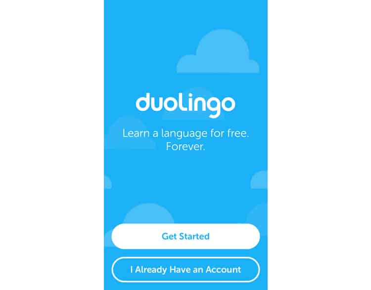
Their message, “Learn a language for free. Forever.” summarises the app’s purpose, and accentuates its two major draws:
- It is free and
- It works
The language skills you learn here will not deteriorate like your sophomore year Spanish class.
From a more aesthetic perspective, the design of initial screen (and the app itself) subscribes to the school of flat design, with hints of Google’s material design language as well.
Finally, no primer screen would be complete without large CTA’s lining the bottom of the page. We see two, simple, unadorned buttons — nothing flashy or trendy here at Duolingo — reading “Get Started” and “I Already Have An Account”. I press the former, and we are off!
Onboarding?
Now, this is interesting.

When I pressed “Get Started”, I expected a screen that would prompt me to create a Duolingo account or profile. Most applications would be assigning my busy work, a form of fields to populate with my name, email, or password. Not Duolingo.
Instead, I find myself staring at a bare-bones screen displaying a list of languages, topped with a header simply reading “Choose a Course”. The screen itself is not very visually interesting – just a two-tone colour scheme slapped on a basic list – but at least it is easy to navigate.
My only nitpicking complaint is the lack of a search bar. With the number of languages Duolingo offers, this list ends up being too long, and I should not have to scroll to find the language I want to learn endlessly. For simplicity, I choose the first option, Spanish.
The app takes me to a screen that is immediately interrupted by our old enemy, the “we would like to send you notifications” pop-up. Often a necessary evil, the key to well-designed notification ask is to explain
- Why you are asking and
- How pressing ‘yes’ benefits the user
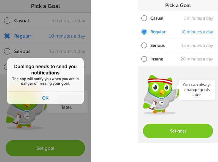
For the most part, Duolingo checks both of these boxes, answering “The app will notify you when you are in danger of missing your goal.” I did not know I had a goal – all I have said is I want to learn Spanish, but I can see in the grayed-out screen in the background this screen is called “Pick A Goal”, so I suppose that question will be answered.
Regardless, I think it would be more intuitive for Duolingo to hit the user with this pop-up after I have selected my goal, not before. I select ‘Regular’ (satisfied by the Duolingo owl reassuring that my choice is not permanent) and move on.
Learning
Next, Duolingo takes me to what appears to be their home screen, the hub of the app’s interface. I cannot see much of it right now though. Their whimsical mascot has returned to prompt me with another question and finalise Duolingo’s push to get me into the learning process as quickly as possible. I say I am a beginner and am immediately dropped into my first lesson.
While I cannot comment on the effectiveness of the teaching strategies Duolingo employs, I can say their course screens are clean, well-designed, and extremely easy to use. We see echoes of Google’s material design here, especially in the illustrations.
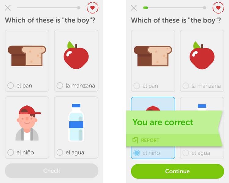
As I select each option, a voice providing the Spanish pronunciation plays through my earbuds. I wonder if Duolingo would have prompted me to turn up the volume or find a pair of headphones if I did not have them in already.
When I select my answer and tap the Check” button, I am rewarded with a cheerful “ding” and a “you are correct” banner. I also learn that the grey line at the top of the screen is a progress bar, as a splash of green appears on the left-hand side. Still not sure what the heart does in the top right-hand corner. Tapping it yields no response.

The lesson proceeds similarly, teaching me Spanish grammar and vocabulary both explicitly and implicitly. I notice there is no option to go back and review previous questions, which is not an issue for a lesson this basic but could prove frustrating for more advanced topics.
I finish my first lesson, and the “Lesson Complete” screen appears. Staying faithful to their gamification strategy, I earn “XP” and watch a circle fill up with orange, denoting I have completed half of my daily goal.
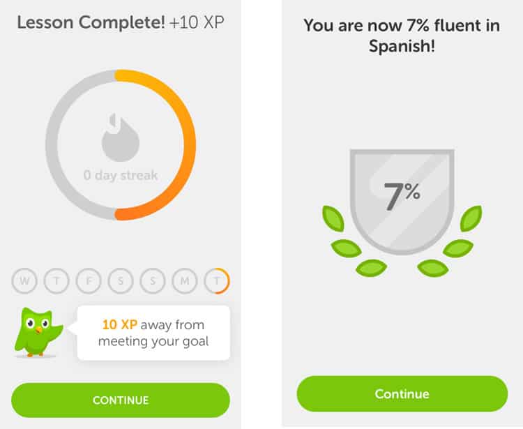
I press continue and am taken to a screen that claims I am now 7% fluent in Spanish. I am not sure if I believe that, but it is an excellent statistic to give the user. Everything in this app is designed so that you keep using Duolingo.
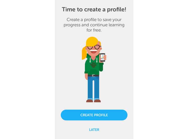
And now, finally, I am asked to create a profile. It is a bit counterintuitive, but I think this “play first, profile second” UX strategy is one of Duolingo’s smartest moves. They have made an incredibly strong case for why I should make one: I have already completed a lesson, earned XP, and learned how easy it was to hit nearly 10% fluency — all in under fifteen minutes. I have done so much in a short amount of time, why wouldn’t I make a profile and continue my success?
Profile
And after waiting so long to spring the question, Duolingo makes its account creation one of the most painless I have ever seen. Three screens: name, email, password. No frills. White background, the field to fill, and a progress marker (?) in the top right-hand corner.
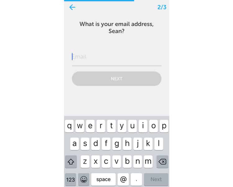
This is as basic as basic gets. Duolingo wants you to create a profile and get back to learning ASAP. If they cannot make account creation fun, then they want to minimise it as much as possible. Their model in one mantra: the more you learn, the more you return.
Final Verdict
As always, the vastness of a platform’s user experience forces us to restrain from exploring all of Duolingo’s functionalities. Their in-app store for instance, or their “clubs” feature. But we have charted a considerable amount of the app’s user experience and identified some takeaways.
First, the good. Duolingo’s UX is consistent and perfectly aligned with their educational strategy of gamification. From the App Store logo to the actual course screens, the app is jam-packed with fun and playful design. The “all-business” portions, like profile creation, are minimised and de-emphasized to an extreme.
Duolingo does have its pain points. Some minor navigational snags and it could be argued that some of their design elements are so simple that they come off drab or unimaginative.
But as a whole, I think Duolingo’s user experience exemplifies a consistent, well-executed design strategy that is intuitive and user-friendly enough for anyone to use.
Codal’s UX Case Study has now analysed two starkly different applications, each with their flaws, but also both ultimately passable. Next time, we will go to the other end of the spectrum, and take a look at an example that does (almost) everything wrong.
More from the UX Case Study Series
- UX Case Study: Google Maps vs. Waze Mobile Apps
- UX Case Study: Spotify Vs. Apple Music Mobile Apps
- UX Case Study: Acorns Mobile App
- UX Case Study: Lumosity Mobile App
- UX Case Study: Talkspace Mobile App
- UX Case Study: Zocdoc Mobile App
- UX Case Study: Calm Mobile App
- UX Case Study: Overcast Mobile App
- UX Case Study: SoundCloud’s Mobile App
- UX Case Study: HBO GO App
- UX Case Study: Venmo
- UX Case Study: CNN’s Mobile App
- UX Case Study: ESPN’s Fantasy App
- UX Case Study: Duolingo ← You are currently reading this
- UX Case Study: Bumble
Want to learn more?
If you’re interested in mobile UX, then taking the course on Mobile User Experience, which includes templates you can use in your own projects. If, on the other hand, you’d like to…
- learn all the details of Usability Testing
- get easy-to-use templates
- learn how to properly quantify the usability of a system/service/product/app/etc
- learn how to communicate the result to your management
… then consider to take the online course Conducting Usability Testing.
Lastly, if you want to brush up on the basics of UX and Usability, the online course on User Experience could provide you with the necessary knowledge. Good luck on your learning journey!
(Lead image: Depositphotos – affiliate link. All other photos in this article are screenshots taken during usage of the Duolingo app.)
