The sign-up screen on mobile applications – we love it, we hate it, and we definitely love to hate it. If done right, it can be the trigger to a massive user retention. If done poorly it can have the exact opposite effect.
Yet, the sign-up screen is designed poorly more frequently than anyone would love to admit.
But what does ‘getting the sign-up screen done right’ actually mean? How do we tame this wild beast? We tame it by following UX best practices and using the right analysis and optimisation techniques. That way, you will put a saddle on this beast’s back and ride it towards the top of the app charts.
The best practices for a mobile app’s login screen are (in no particular order):
- Simplify registrations
- Allow login via external accounts
- Go for email instead of usernames
- Facilitate password resetting
- Keep users logged in
By following these best practices, you can start building an amazing user experience right from the first screen, which will do wonders for user retention, as well. Let’s take a closer look:
Simplify Sign-up Forms
There is probably not a single person on the planet that enjoys filling out forms, so why would anyone enjoy creating accounts for apps or online services? Pro tip: they do not. But they know it is necessary, so they reluctantly do it. By making registration quick, app developers are showing their users they understand what annoys them, and respect their time. Empathy! One of the keys to building a stellar UX. So what does ‘making registrations quick’ mean, in practice? It means brainstorming which information is considered essential for the creation of an account, and asking just for that – nothing else.

Depending on the type of app, that could be a username, a password, and an email address. The user’s phone number or gender is probably not needed, and unless the app offers age-sensitive content, the age, as well.
Another thing that needs to be kept in mind is the account confirmation. It has become standard for all the right (security) reasons, but it is frequently executed poorly. Apps usually send a confirmation email, containing a link that, once opened, confirms the account. These emails are often lagging / late, end up in junk/spam inboxes, and include broken links, or links that need to be copied and pasted into a browser to work. The first two problems are the same for every platform, but the third is even more annoying when a person is trying to register via smartphone. Mobile app professionals sometimes forget that their platform is mobile – they do not need to be confined to the email. Voice calls, SMS, Viber / WhatsApp / Messenger, or any other chat app – all of these can be used to speed up and simplify the confirmation process. In some cases, it is possible to ask for the phone number instead of email address.
Do not forget – users typically hate filling out forms and creating accounts. Go the extra mile and make sure to create a process that is fast and uses the platform’s advantages. Users will definitely appreciate it- especially since it is part of their first impression of your app.
Allow Login Via External Account
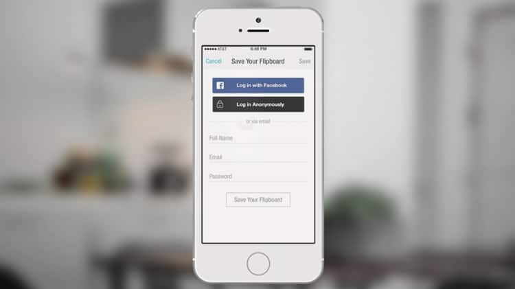
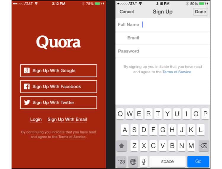
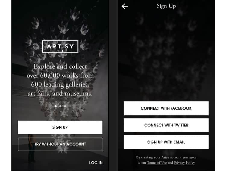
The registration process can be simplified even further, by offering a faster alternative – external accounts. By providing users with the option of registering through social media accounts, like Google, Facebook, Twitter or Pinterest, registration can be turned into a two-click process. Tread lightly, though. There is a reason this is called an ‘alternative’. Some people actually would prefer not to link their social media accounts with different mobile services. The most common reason is that they fear the app would post on these social media accounts without their permission. Make sure to communicate posting capabilities clearly, and ask for permission before posting anything.

Another caveat is that different cohorts use various social media. Teenagers/generation Z are mostly Snapchat users. Millennials are mostly Instagrammers and Facebookers. Twitter users have a universe of their own. Therefore, it is essential to offer the right social login options. Providing users with choices is a smart move – but give them too many, and they might feel overwhelmed. Knowing that registration needs to be fast and that there is limited screen real estate, this becomes somewhat tricky. App developers need to make sure they are offering the right social media options for their audience by accurately monitoring and optimising the screen. We’ll discuss how to do that further below.
Go for Email Instead of Usernames
Besides speed, convenience and security are also important aspects when creating a solid log-in screen. These are difficult to implement because simply fitting the words ‘security’ and ‘convenience’ in the same sentence is a challenge. One way to increase security, while keeping things convenient for users is to have them logging in with email addresses instead of having them create a username.

There are two big reasons for this:
- Easier to remember
- More secure
Security experts keep warning, and users keep ignoring the warnings – do not use the same passwords for multiple accounts, and change them frequently. Researchers have confirmed that users mostly ignore these warnings because they cannot remember so many passwords. Now imagine if they had to remember usernames, as well. It is simply not convenient. But if they could log in via email, especially an email address that does not show anywhere in the account, it would make it easier to remember, yet still safe to use. That’s why we recommend app developers to always go for a log-in via email, instead of username.
Another advantage of this type of log-in is that it is more secure than most log-in methods. Usernames can be seen by other app users (including malicious actors), which means those looking to hack into an account are already halfway there. By requiring to log in via email (which shows nowhere), you are adding an extra layer of security for your users, which is always a welcome approach.
Keep Users Logged In
When it comes to keeping users logged in, there is no one-size-fits-all solution, and it depends on the type of app on offer. If it is not a banking app or something similar which stores sensitive user information, then keeping users logged in might be an option. Bearing in mind that mobile users are usually on the go and with very little time or focus, it is quite helpful not to be logged out every time a user turns off an app.
Instead, just keep them logged in for as long as they like. For an extra layer of security, while maintaining things fast and running smooth, consider adding some of these features:
- Use smartphone features like the fingerprint scanner, or facial recognition, to speed up the authentication process
- Allow users to see all the devices where they are logged in
- Offer remote session termination
- Suggest a password change every few months
- Require passwords to have at least eight characters, one uppercase letter, one number and one symbol
Facilitate Resetting
Today’s mobile user is also distracted- which means they are bound to forget their password. Can you even say that you remember all your passwords? We thought so.
But there is nothing worse than forgetting a password and then having to jump through hoops to reset it.
What app developers would want to do is make sure the process of password resetting is fast and seamless. If they fail to achieve it, it might hurt the user experience, ultimately pushing users away towards their competitors. The password changing process should be very similar to registration. That means asking the right questions, and asking *just* the right questions. Unless the app is handling some extremely sensitive user information, there is no need for three secret questions AND a re-captcha. If voice calling or SMS to confirm the user’s identity can be used, choose it over email, as it is faster and more convenient.
And make sure to have the password reset feature clearly visible, and always within reach.
Analysis and Optimisation
All these user experience initiatives mean nothing if one cannot properly track and examine their effectiveness. To monitor, analyze and optimize your login screen’s user experience, app pros find the most success with qualitative analytics platforms, like Appsee. Qualitative app analytics can measure how users interact with different app elements and identify bugs, poorly designed parts of the UI, or navigation. Two tools can be put to good use here – touch heatmaps and user session recordings.
Touch heatmaps
Touch heatmaps is a feature that tracks all gesture interactions users have with the app, like tapping, double tapping or swiping. It then aggregates that information and presents it as a heatmap, allowing app pros to see exactly which UI elements are used more, which less, and which are counterintuitive/need work.

For example, let us say an app has a super high quit rate for the login screen and the publishers want to understand why it does not offer a guest account, or a “Register Later” option. With touch heatmaps tracking unresponsive gestures, app pros notice that a quarter of users keeps trying to swipe through the login screen and begin their in-app journey. This is a clear sign that the app’s audience would love the ability to register later or use the app as a guest. By adding such a feature, the user experience and retention rate can be improved, significantly.
User session recordings
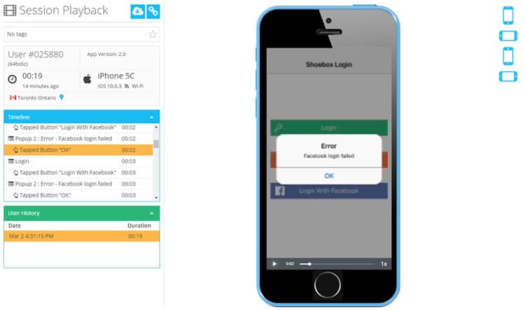
Tools like Appsee provide qualitative single-user level insights, by enabling app pros to watch videos of user sessions in real-time. It automatically detects all screens, gestures, and user actions performed within a session, helping app pros dissect unique in-app experiences and uncover bugs and poorly designed app elements.

Let us say, for the sake of argument, that 20 percent of users start but never complete the registration process. By taking a look at recorded sessions, app pros uncovered that the re-captcha feature they embedded to combat spam, is not working properly. They realise that the images provided in the re-captcha are too small and that the users are submitting the wrong answers multiple times, before eventually deciding to quit the app altogether.
Do not let the ‘Login’ turn into ‘Logout.’
Perfecting the sign-up screen is gruelling, but gratifying business. There are so many things that need to be taken into consideration, such as speed and efficiency, but also security and privacy. Nailing all the challenges presented in such (at first glance) a simple screen can boost the app’s user experience, ultimately rewarding app pros with higher retention rates.
Failing to execute properly is risky, but it is hardly the end of the world. The app is a ‘living’, constantly evolving organism. If you always keep an eye out on it, monitor and analyse it, and use insights to optimize it, there’s no reason why your login screen should not be the ace in the sleeve for retention.
Want to learn more?
If you’re interested in mobile UX, you could take the online course on Mobile User Experience. It includes templates you can use in your own projects and you’ll get an industry-recognized certificate to improve your career. If, on the other hand, you’d like to…
- learn all the details of Usability Testing
- get easy-to-use templates
- learn how to properly quantify the usability of a system/service/product/app/etc
- learn how to communicate the result to your management
… then you might take the online course Conducting Usability Testing.
Lastly, if you want to brush up on the basics of UX and Usability, the online course on User Experience could provide you with the necessary knowledge. Good luck on your learning journey!
